Blog – Entries tagged as Book
The new Yearbook of Type features White, Black. Gray!
I am happy to see my article, White, Black. Gray! – Why Sketching Matters, published in the new Yearbook of Type (#4 2019/20). It is part of a comprehensive series of instructive articles focused on various aspects of type design. My article appears at the beginning of the book in order to reflect that sketching happens at the beginning of the design process, and provides the basis for a typeface’s development.
 Cover of the Yearbook of Type 2019/20, published by Slanted Publishers.

The Yearbook of Type is a practical guide that helps typeface users stay up to date with the latest type design trends and innovations. It showcases detailed presentations of more than 150 type families from around the globe. Highly recommended!
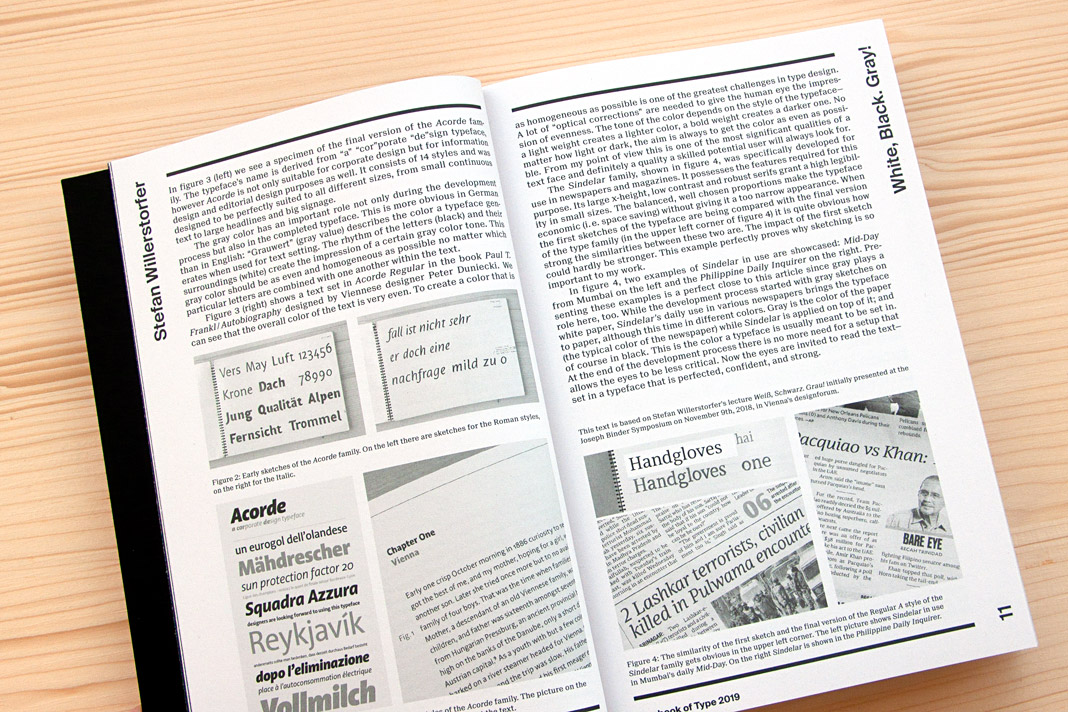 Double page spread presenting the article White, Black. Gray! – Why Sketching Matters.
Gerhard Hanappi book set in Sindelar and Acorde
Now that’s a project we are really happy about. The book about famous Austrian football (soccer) player and architect Gerhard Hanappi is entirely set in Sindelar and Acorde. The book was designed by Austrian designer Peter Duniecki and published by the Swiss publishing house Park Books.
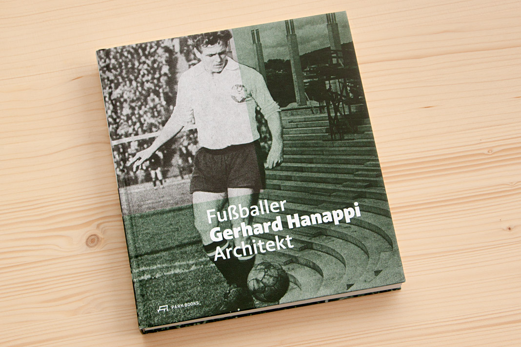 Cover of Fußballer Gerhard Hanappi Architekt, set in Acorde.
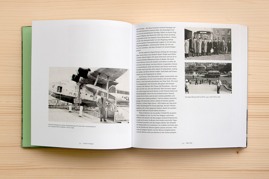
Why are we so happy about it? First, the book is really well designed, and second, we love football. As you may know, the type family Sindelar is named after famous Austrian football player Matthias Sindelar. Interestingly Sindelar and Hanappi played at the two rivalling Viennese Clubs Austria Wien and Rapid Wien (not at the same time though). The book achieves something that is not very likely in real life: One player of Austria Wien supports a project by a player of Rapid Wien. The result of this collaboration is really convincing. Just have a look yourself!
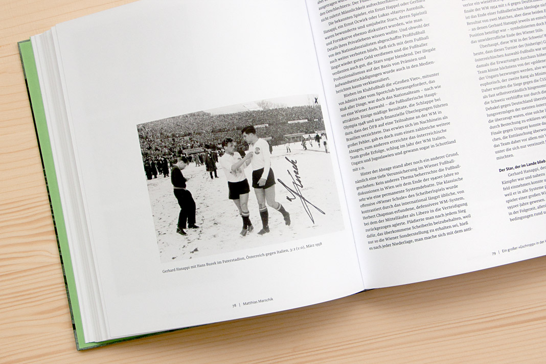
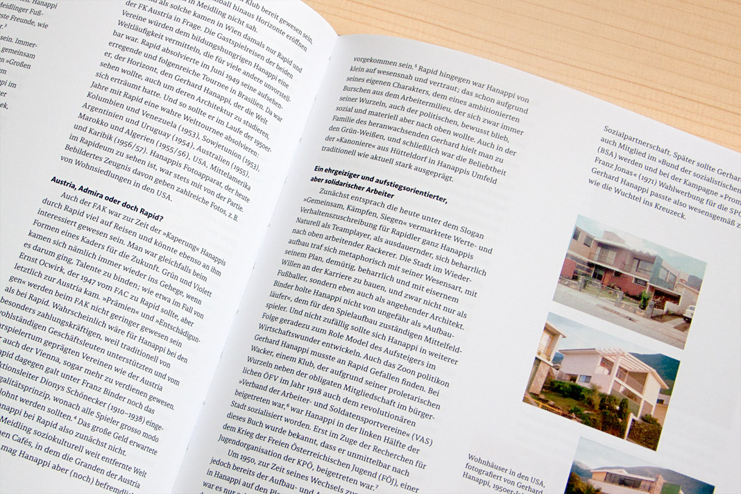
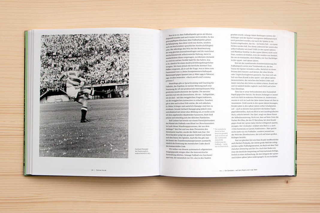
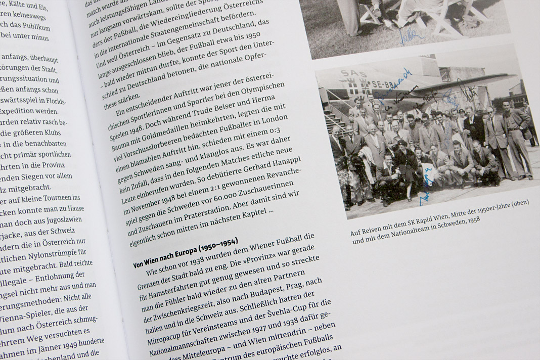
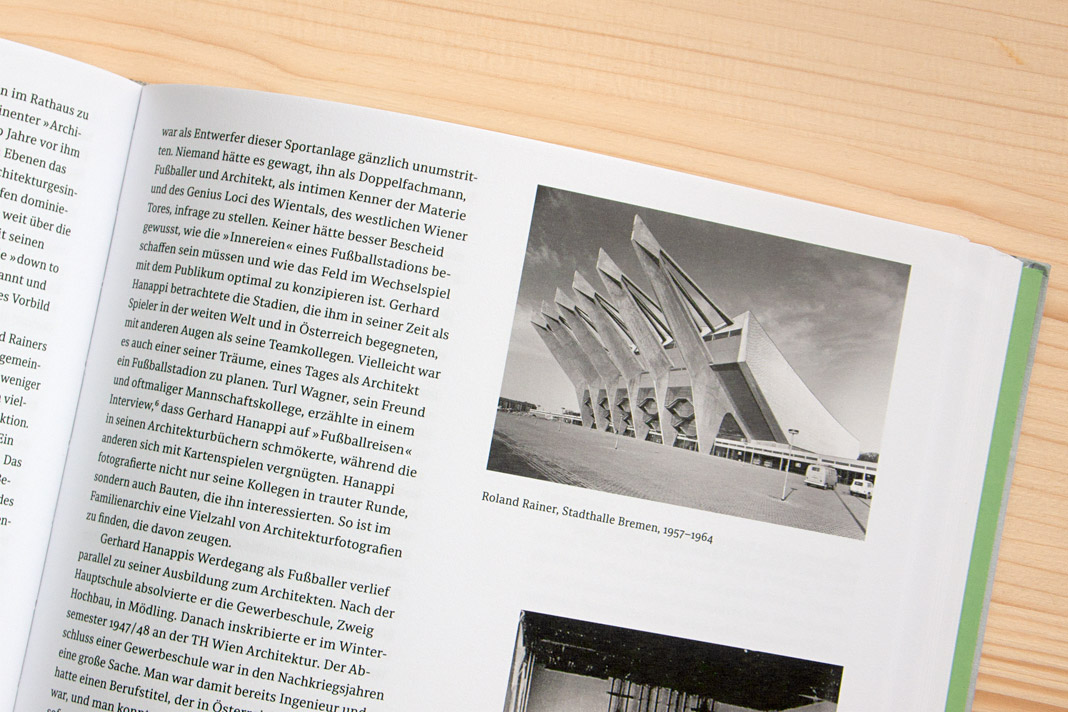 Various impressions of Fußballer Gerhard Hanappi Architekt, entirely set in Sindelar and Acorde.
Exhibition book Subtext: Typedesign is now available
You want to know more about the thriving Austrian type design scene? In case you missed the popular type design exhibition, Subtext: Typedesign, which took place in Vienna in April and May 2017: The book accompanying the exhibition is now available for purchase at the renowned Swiss publishing house Niggli. It introduces and documents the designs of more than 50 designers and foundries working locally and worldwide and presents more than 450 pages of recent Austrian type designs.
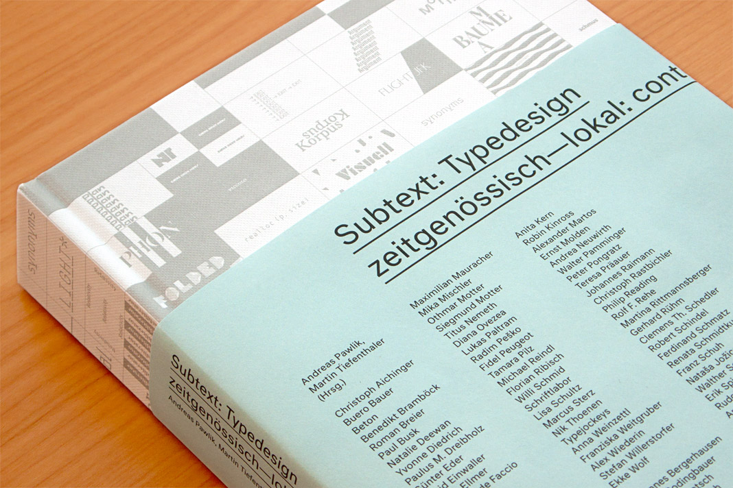 Cover of the exhibition book Subtext: Typedesign.
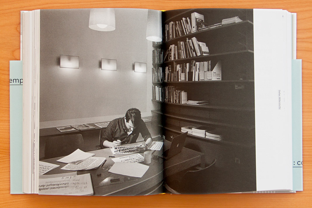 Double page spread showing a focused Stefan Willerstorfer at work.
As one of Austria’s leading foundries our work is showcased in the book in great detail. The typefaces in the book are not only shown as specimens but also in real use. In addition, the book contains a comprehensive text section in which well-known authors from various cultures and academic disciplines explore their relationships to type design. Definitely worth a read!
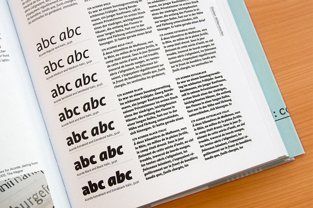
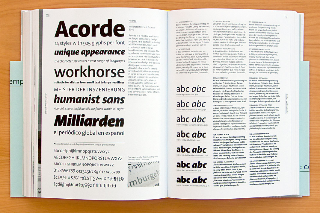 Double page spread presenting all 14 styles of Acorde.
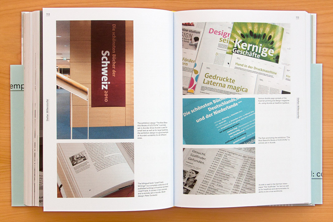 Double page spread showcasing Acorde in use.
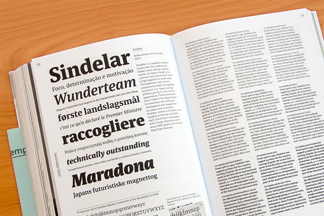 Double page spread presenting all 18 styles of Sindelar.
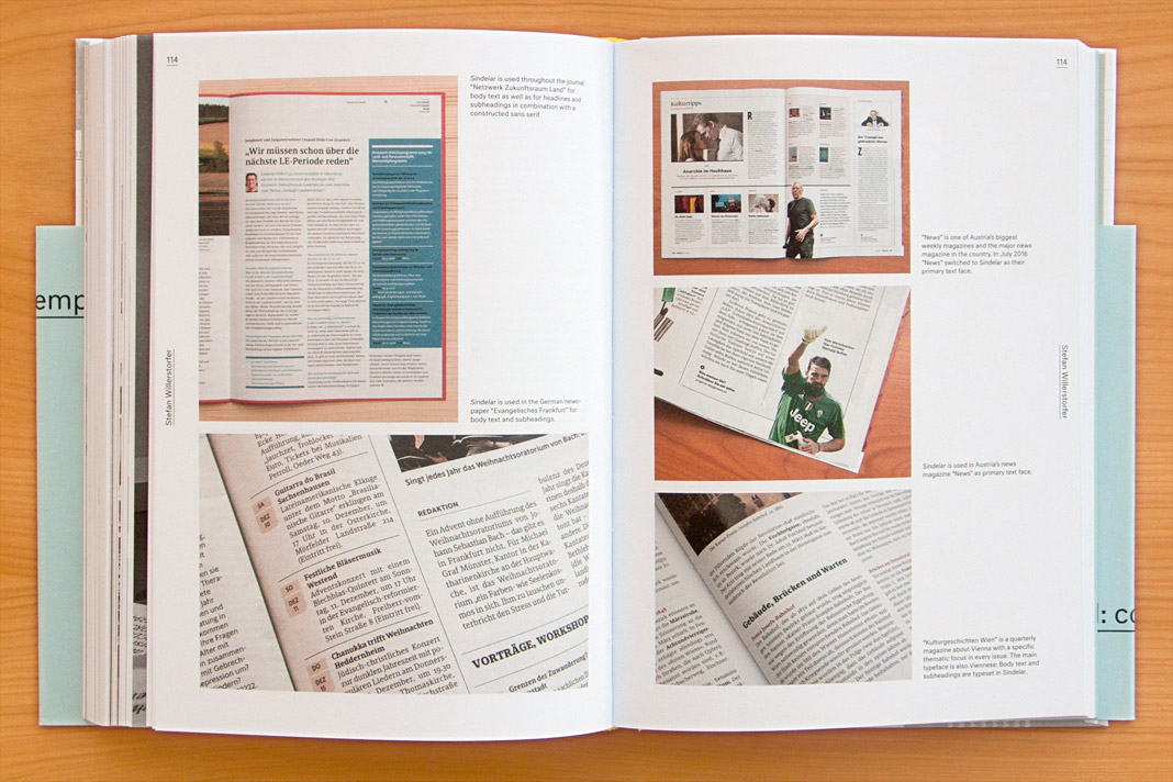 Double page spread showcasing Sindelar in use.
Paul T. Frankl’s autobiography entirely set in Acorde
Another great example of Acorde in use: Paul T. Frankl’s autobiography offers a unique insight into the rise of American modernism from an insider’s point of view. It sheds light on Paul T. Frankl and his contemporaries as well as on Austrian and American culture in the first half of the twentieth century.
The book was edited by Christopher Long and Aurora McClain and designed by Austrian book designer Peter Duniecki. It is entirely set in Acorde.
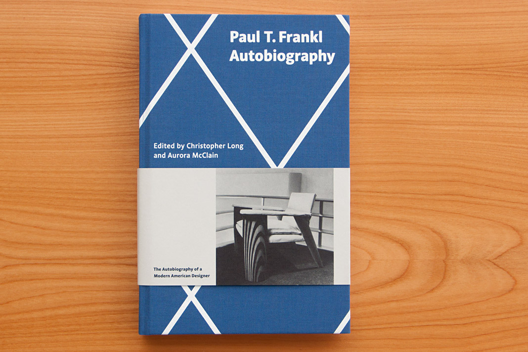 Cover of Paul T. Frankl’s autobiography, set in Acorde.
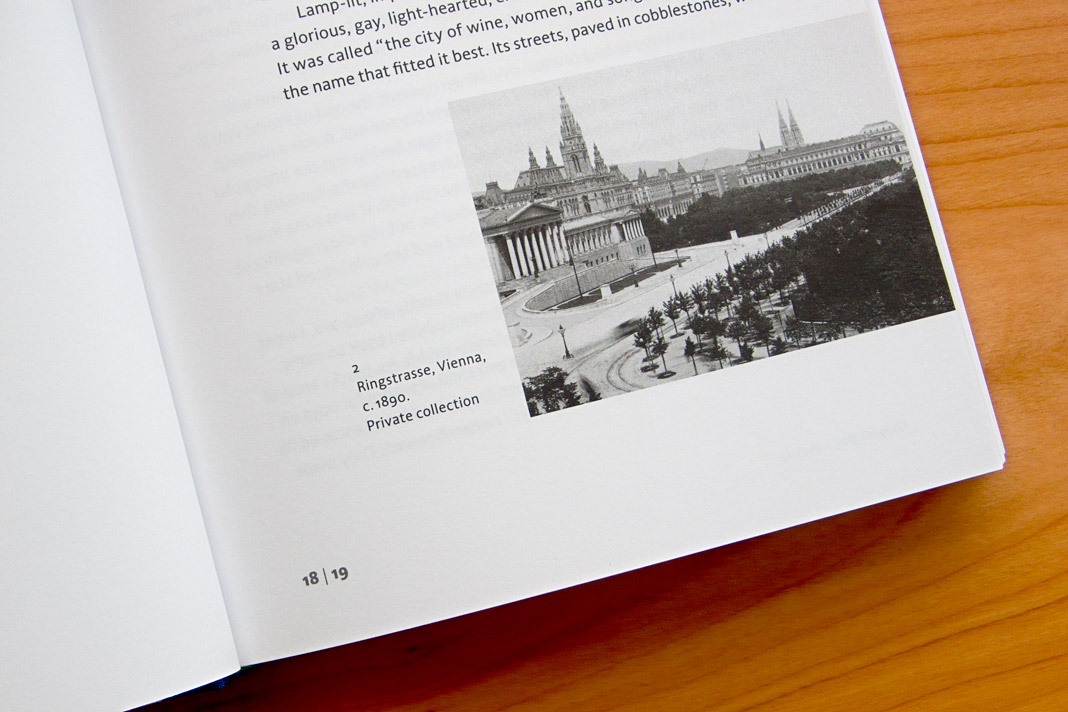
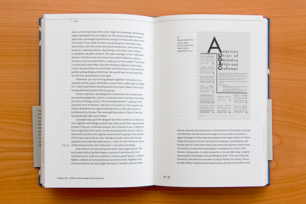
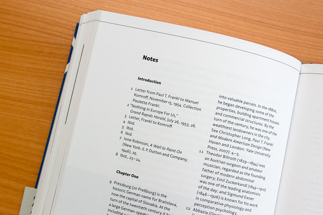
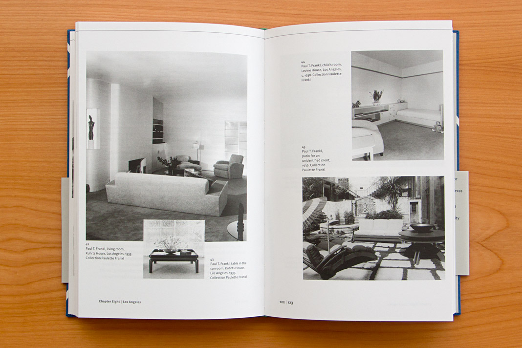
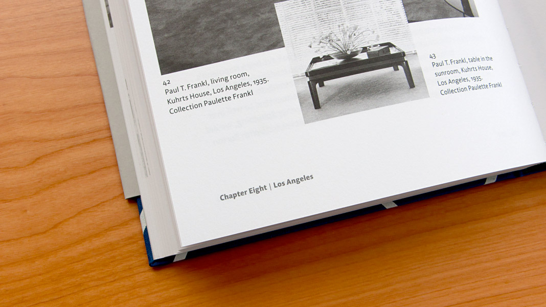
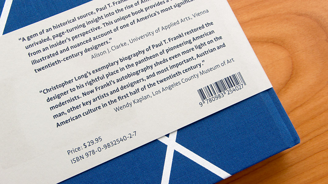 Various impressions of Frankl’s autobiography, designed by Peter Duniecki.
Yearbook of Type 2 presents Sindelar
Two years after the Yearbook of Type 1, which showcased our type family Acorde, its successor is now on the market: the Yearbook of Type 2. It’s great to contribute to this beautiful compendium again with one of our type families.
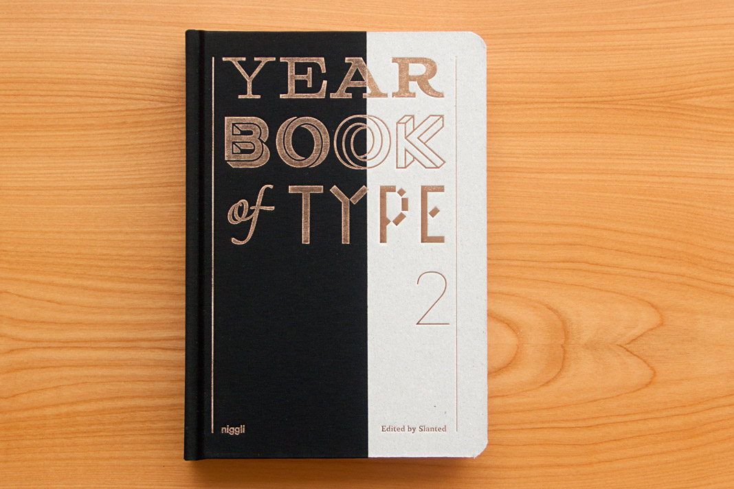 Cover of the Yearbook of Type 2, published by Niggli.
The Yearbook of Type 2 presents new type families from around the globe on more than 400 pages. The book also contains a section with various essays and provides manuals and background information on technical aspects. The book was published by the renowned Swiss publishing house Niggli.
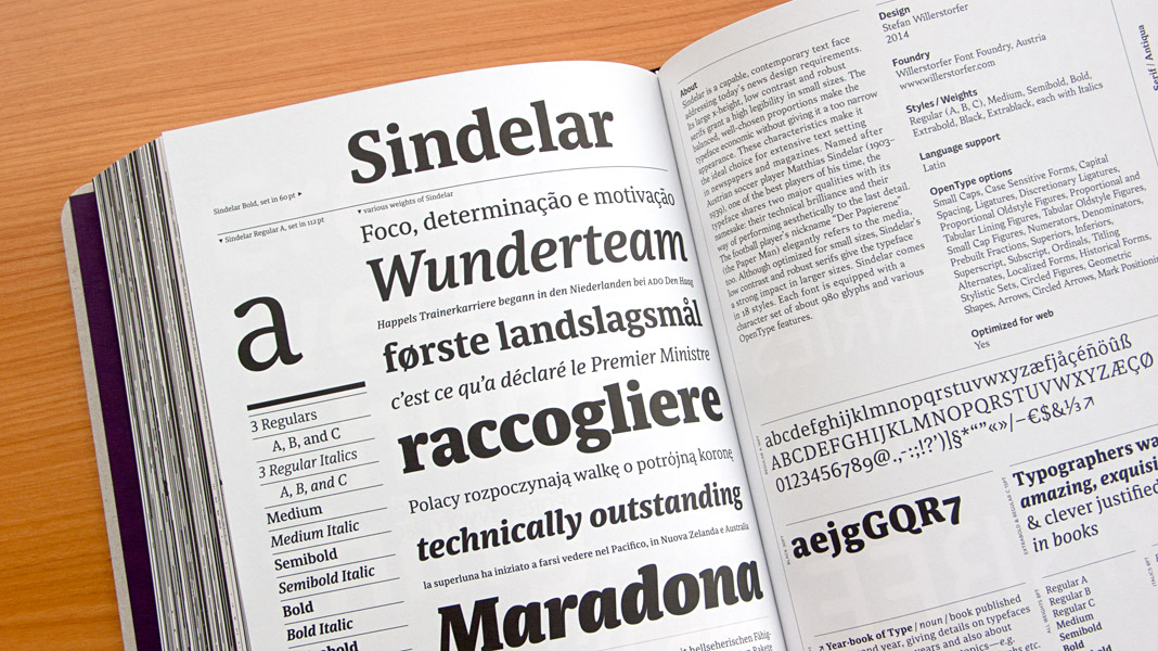
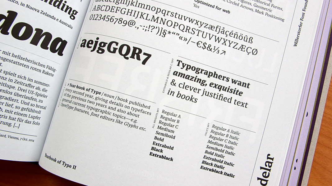 Double page spread showcasing Sindelar in great detail.
Sindelar is the Best Work of Applied Typography 26
We have already announced it in December and now you can have a look for yourself: Sindelar is the Best Work in the typeface category of Applied Typography 26 and therefore featured in the Japan Typography Yearbook 2016. Enjoy!
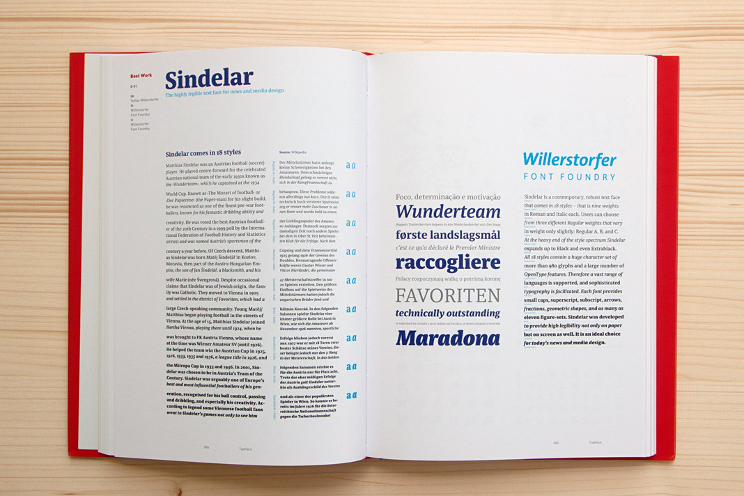
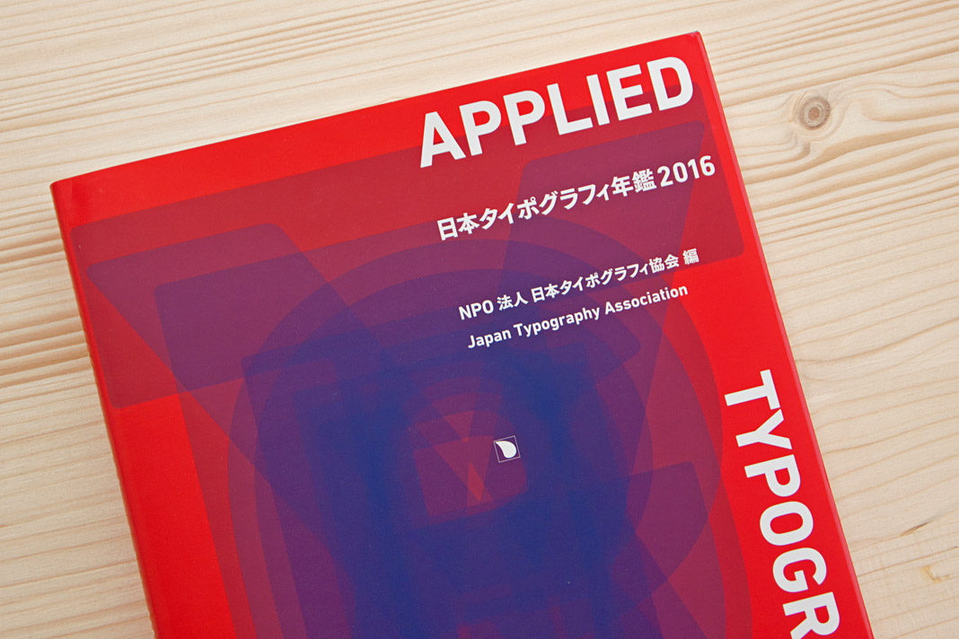
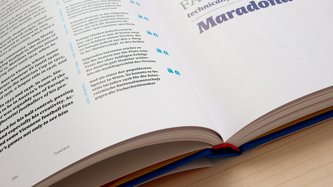
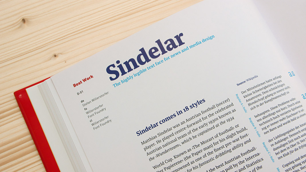 Various impressions of the Japan Typography Yearbook 2016.