Blog – Entries tagged as Sindelar
Celebrate ten years of Sindelar with us!
As you may know, our type family Sindelar turned ten in December. Over the past ten years, Sindelar has been awarded highly respected design prizes, including the prestigious »Red Dot Award: Best of the Best«, the renowned »iF Design Award in Gold«, the »Communication Arts Award of Excellence«, and the coveted »German Design Award«. Sindelar has been used in various newspapers and magazines all around the world, such as the »Philippine Daily Inquirer«, »Evangelisches Frankfurt« (Germany), »Mid-Day« (Mumbai, India), and »News« (Vienna, Austria).

To express our joy and to honour the type family, we will showcase a selection of Sindelar’s most beautiful design details throughout the year. Every other week, the details of a different lowercase letter will be presented – 26 letters in 52 weeks of 2025. We believe you’re as excited as we are, so please join us for the celebrations on Instagram – Enjoy!
Sindelar is still in the News
Austrian magazine News switched to Sindelar as their primary text face five years ago. Since then Sindelar has been offering high legibility to the magazine’s readers and is continuing to do so.
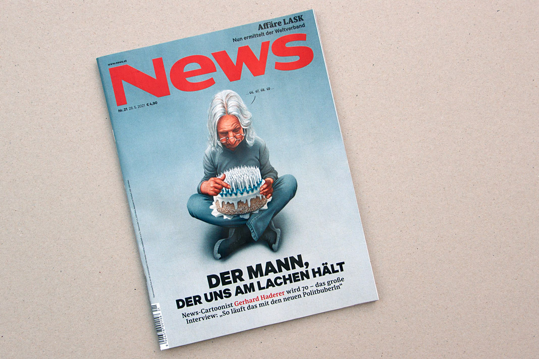 Cover of a recent issue of the magazine News.
News is one of Austria’s biggest weekly magazines and the major news magazine in the country. It has a circulation of about 160,000 copies and covers various topics such as politics, business, culture, and sports.
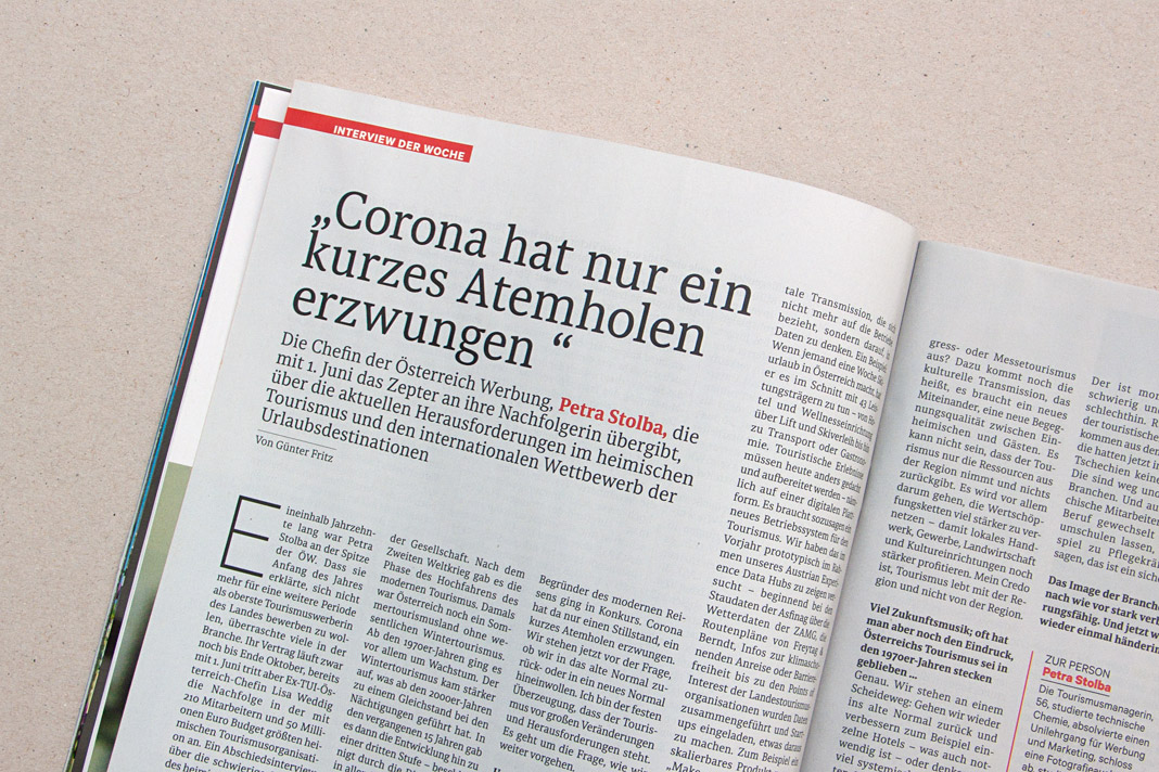
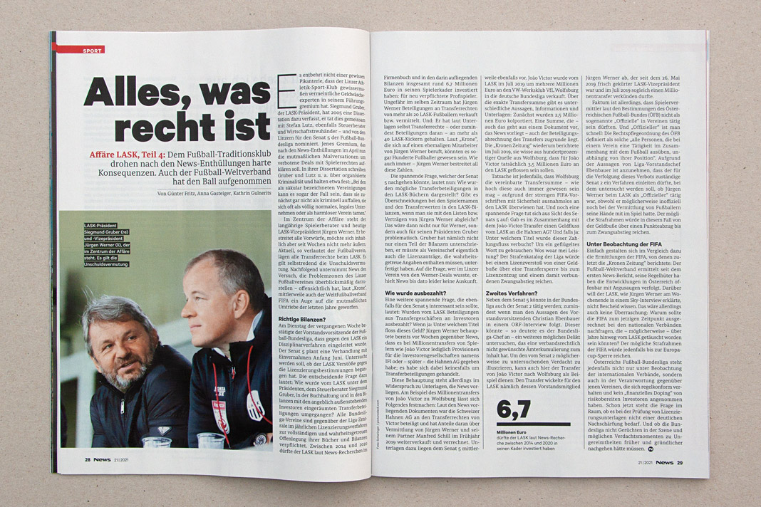
 Various impressions of a recent issue of the magazine, mainly set in Sindelar.
The new Yearbook of Type features White, Black. Gray!
I am happy to see my article, White, Black. Gray! – Why Sketching Matters, published in the new Yearbook of Type (#4 2019/20). It is part of a comprehensive series of instructive articles focused on various aspects of type design. My article appears at the beginning of the book in order to reflect that sketching happens at the beginning of the design process, and provides the basis for a typeface’s development.
 Cover of the Yearbook of Type 2019/20, published by Slanted Publishers.

The Yearbook of Type is a practical guide that helps typeface users stay up to date with the latest type design trends and innovations. It showcases detailed presentations of more than 150 type families from around the globe. Highly recommended!
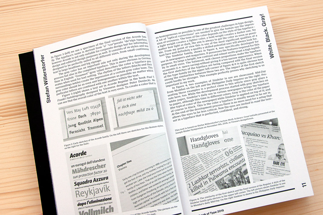 Double page spread presenting the article White, Black. Gray! – Why Sketching Matters.
Gerhard Hanappi book set in Sindelar and Acorde
Now that’s a project we are really happy about. The book about famous Austrian football (soccer) player and architect Gerhard Hanappi is entirely set in Sindelar and Acorde. The book was designed by Austrian designer Peter Duniecki and published by the Swiss publishing house Park Books.
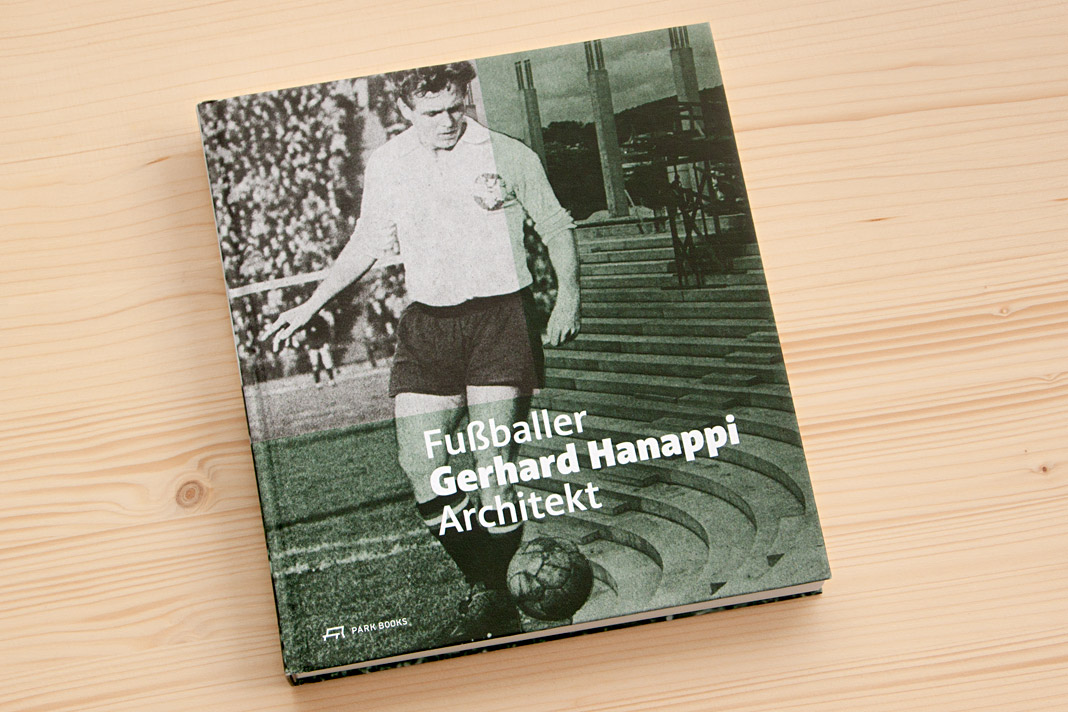 Cover of Fußballer Gerhard Hanappi Architekt, set in Acorde.
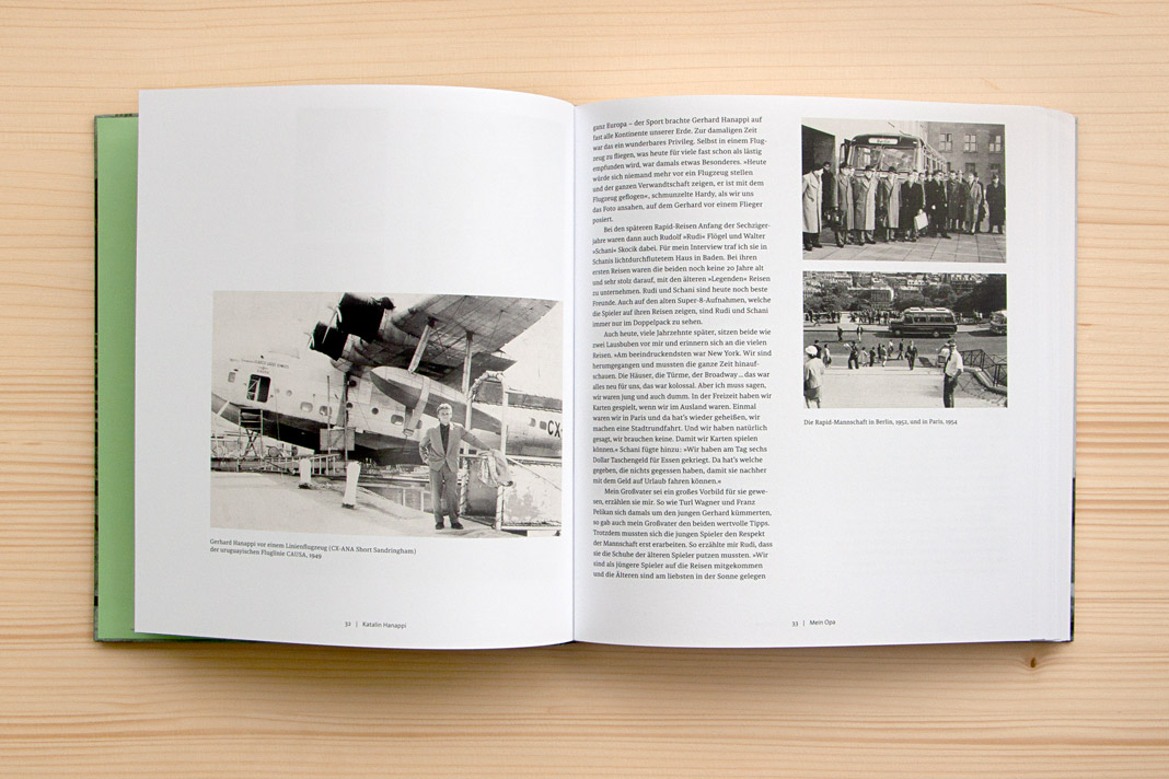
Why are we so happy about it? First, the book is really well designed, and second, we love football. As you may know, the type family Sindelar is named after famous Austrian football player Matthias Sindelar. Interestingly Sindelar and Hanappi played at the two rivalling Viennese Clubs Austria Wien and Rapid Wien (not at the same time though). The book achieves something that is not very likely in real life: One player of Austria Wien supports a project by a player of Rapid Wien. The result of this collaboration is really convincing. Just have a look yourself!
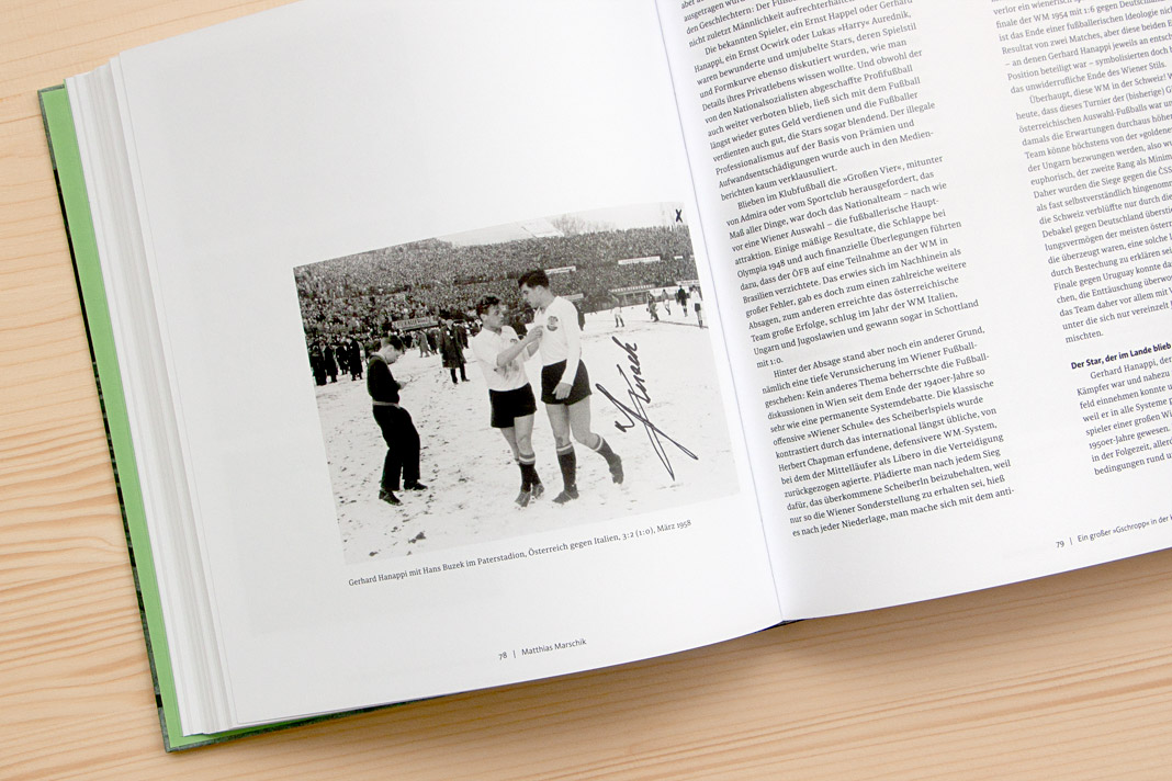
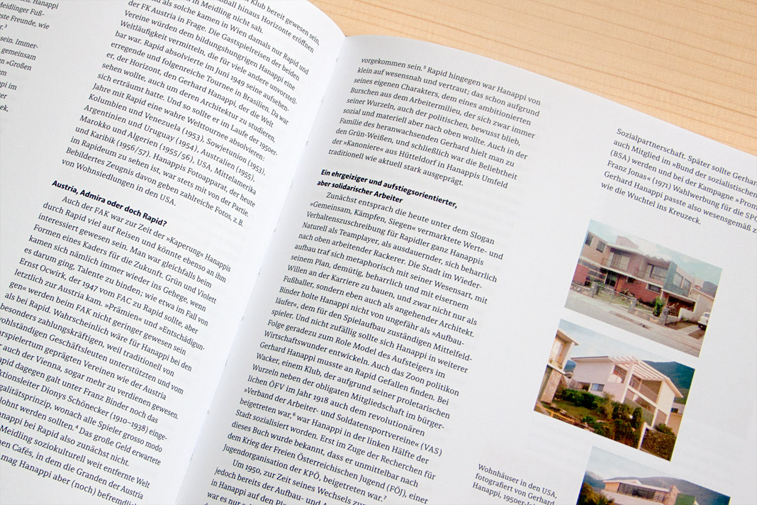
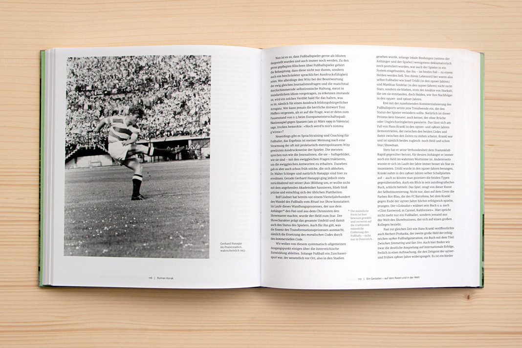
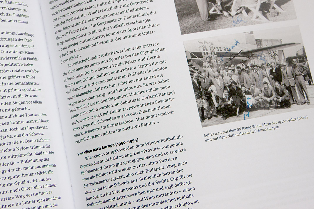
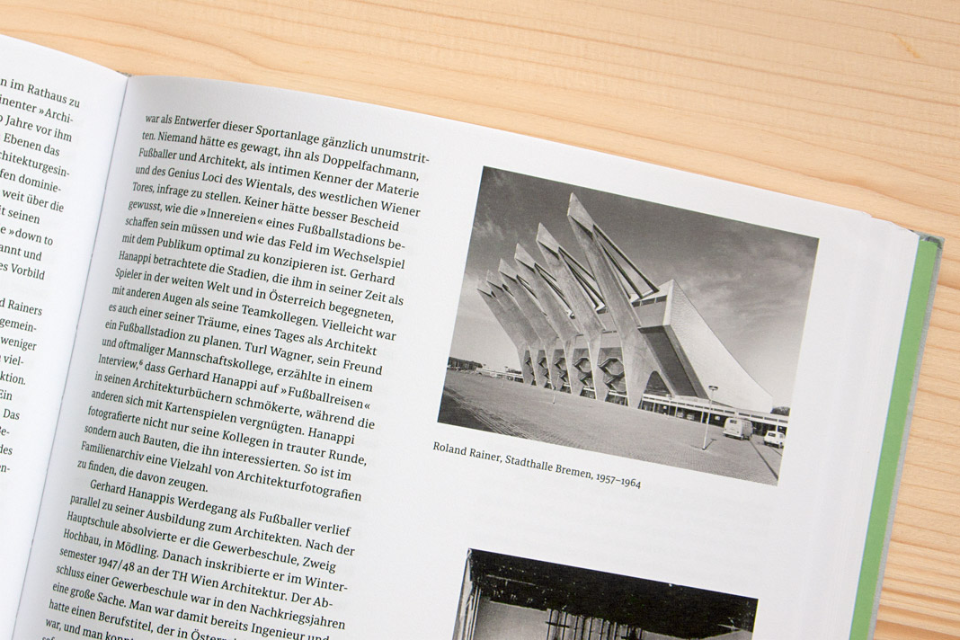 Various impressions of Fußballer Gerhard Hanappi Architekt, entirely set in Sindelar and Acorde.
Speaking at this year’s Joseph Binder Symposium in Vienna
I was invited to speak at this year’s Joseph Binder Symposium which took place two weeks ago in Vienna’s Designforum. There were twelve talks by designers and illustrators in total. All of these talks focused on the value of the sketch during the development process.
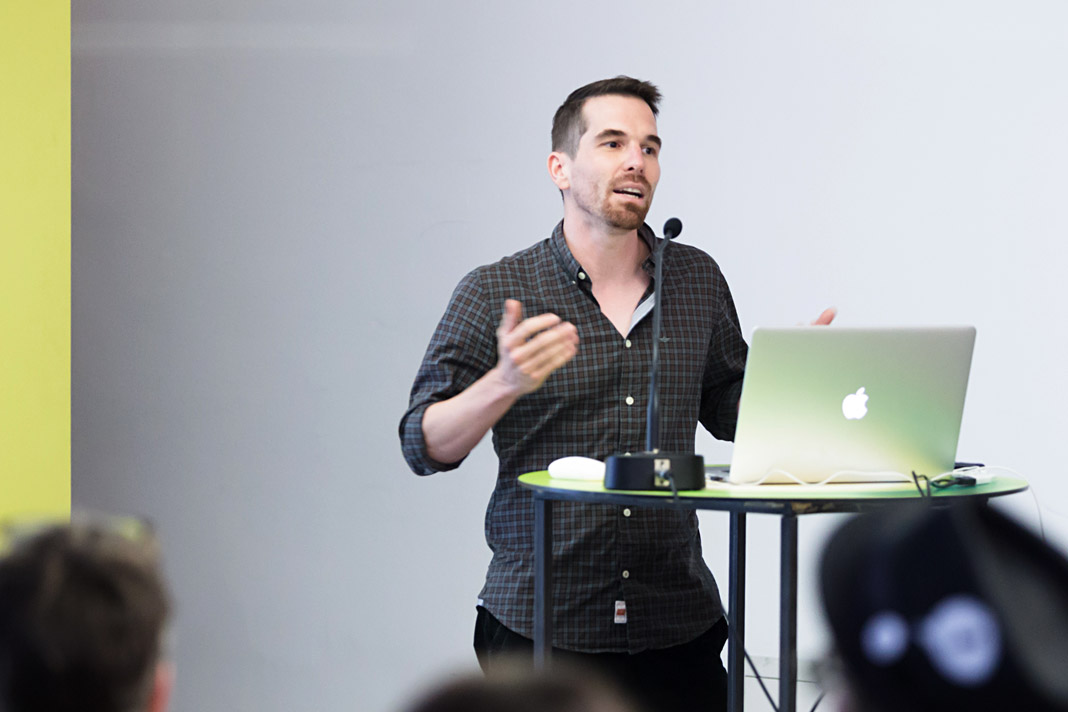
The programme was diverse and very interesting and I personally enjoyed the pleasant atmosphere. My lecture was entitled Weiß, Schwarz. Grau! (White, Black. Grey!) and I emphasized the value sketches play in the development of a typeface. It was a great experience to participate in the symposium as a speaker and also as a listener.
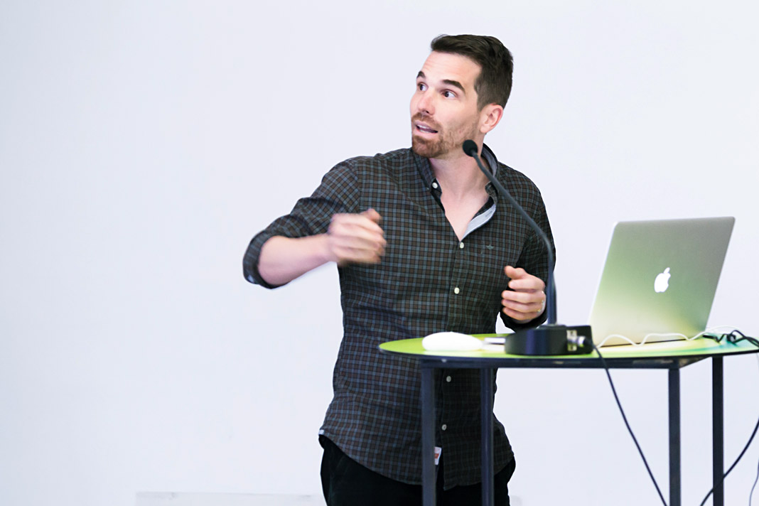 Stefan Willerstorfer emphasized the value of sketching in type design.
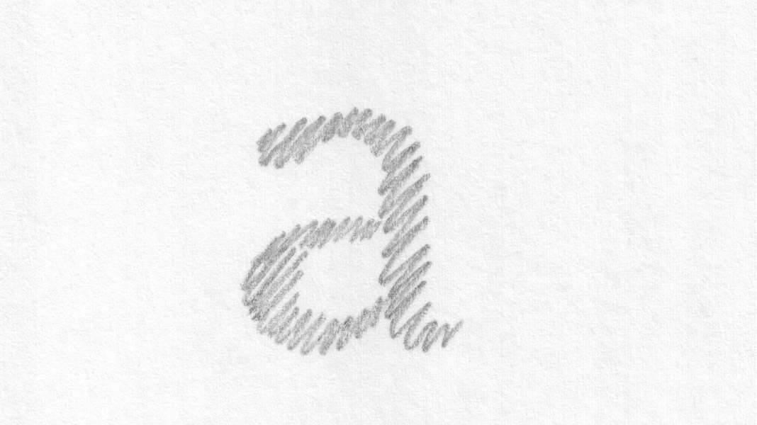 This slide shows an early sketch of the letter a of the Sindelar family.
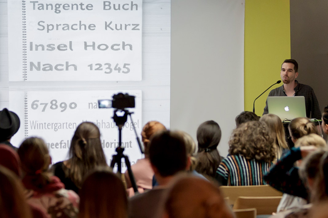
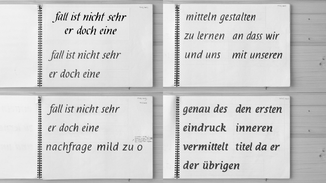 This slide shows various sketches for the Italic styles of the Acorde family.
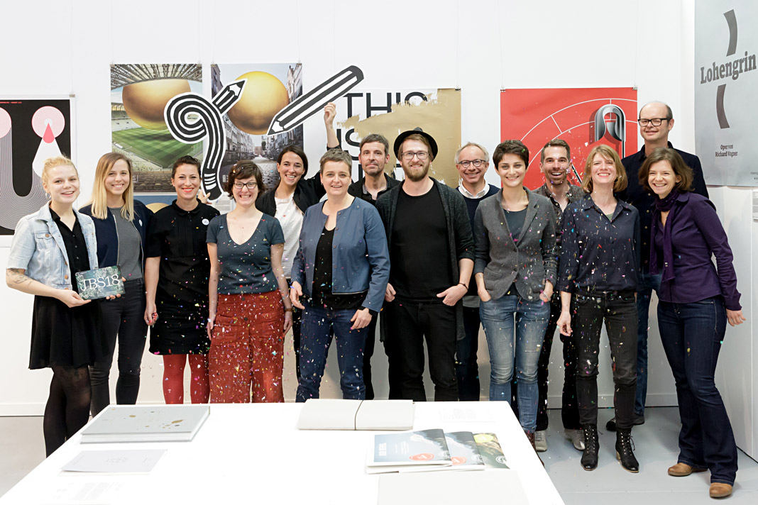 The speakers of this year’s Joseph Binder Symposium in Vienna.
Typodarium 2019 features Sindelar on October 3
»A fresh font a day keeps the boredom away« is the motto of Typodarium, the popular series of annual tear-off calendars. In its eleventh edition, Typodarium 2019 highlights chromatic typefaces that bring colour and versatility into the design process. Typodarium 2019 features 365 typefaces (one per day) designed by 229 designers from all around the world.
The calendar was designed by Florian Hauer, edited by Raban Ruddigkeit and Lars Harmsen, and published by Verlag Hermann Schmidt. Sindelar is one of the selected typefaces and has been assigned an honourable task: It gives next year’s Day of German Unity, October 3, a dignified typographic appearance.
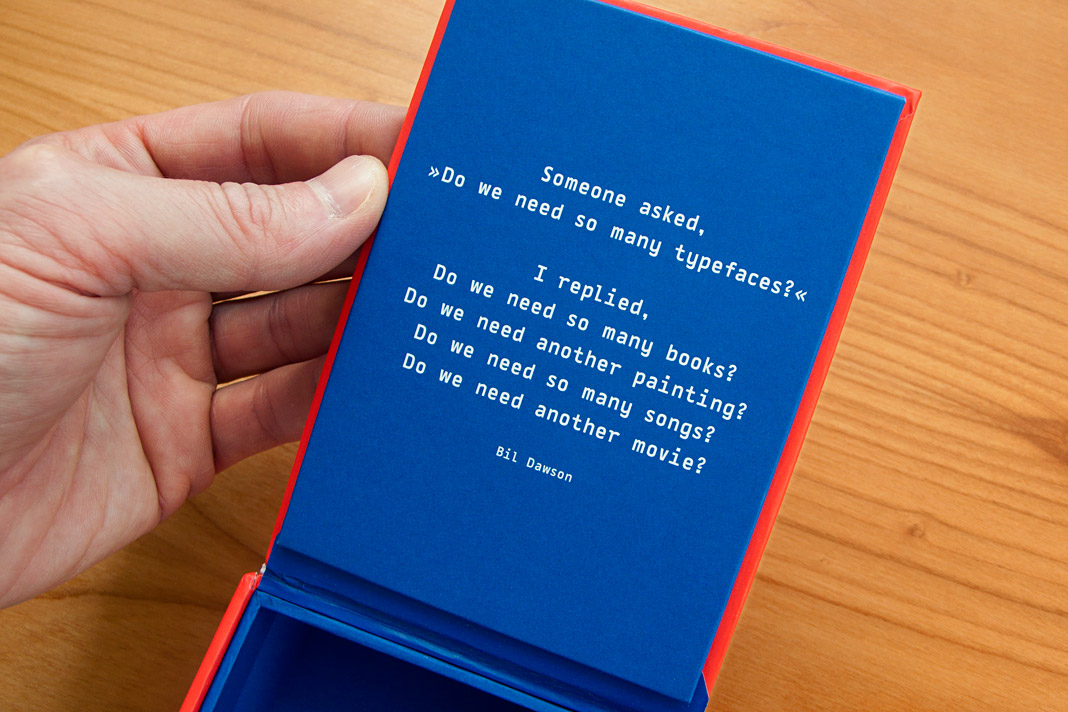 Bil Dawson’s convincing answer to a frequently asked question.
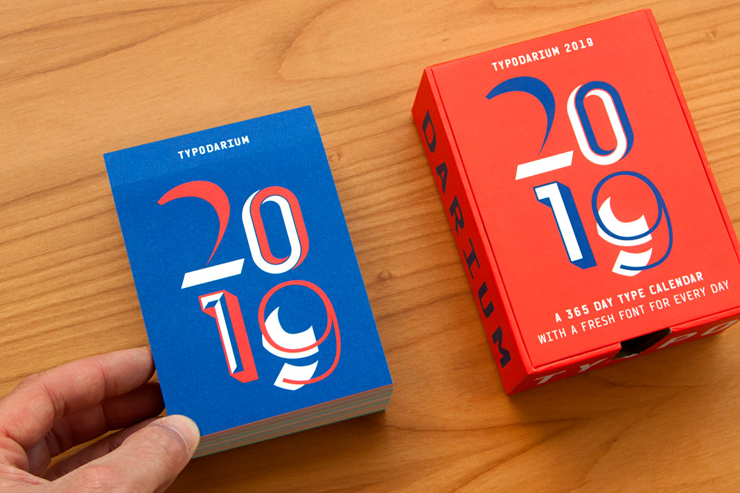 Typodarium 2019 comes with a colourful box for collecting the torn off calendar sheets.
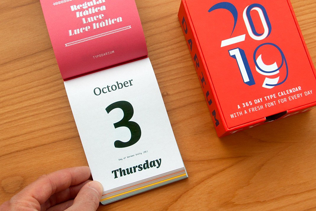 The Day of German Unity, October 3, is set in three different styles of Sindelar.
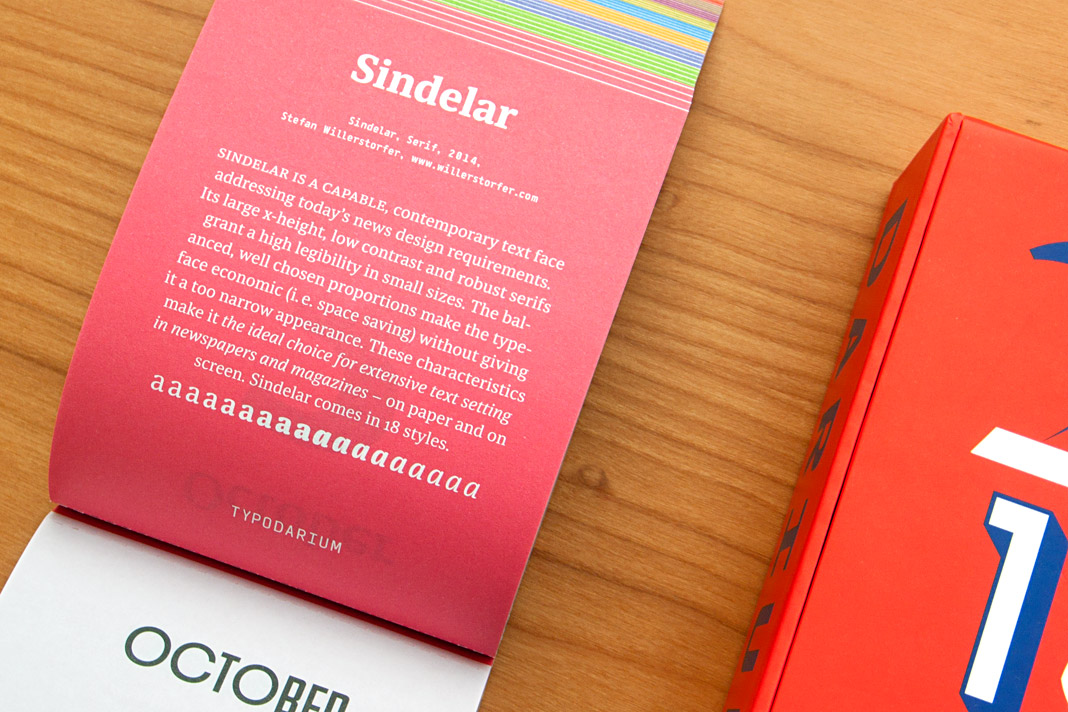 The back side of October 3 contains a short description of Sindelar.