Blog – Entries tagged as Austria
Paul T. Frankl’s autobiography entirely set in Acorde
Another great example of Acorde in use: Paul T. Frankl’s autobiography offers a unique insight into the rise of American modernism from an insider’s point of view. It sheds light on Paul T. Frankl and his contemporaries as well as on Austrian and American culture in the first half of the twentieth century.
The book was edited by Christopher Long and Aurora McClain and designed by Austrian book designer Peter Duniecki. It is entirely set in Acorde.
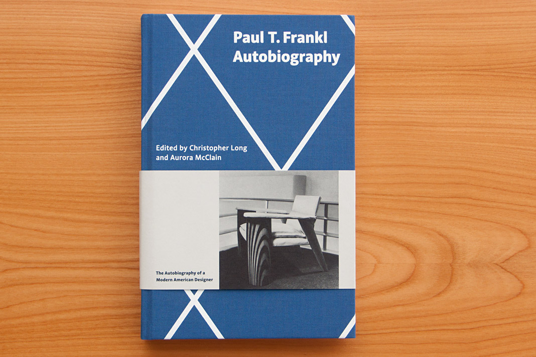 Cover of Paul T. Frankl’s autobiography, set in Acorde.
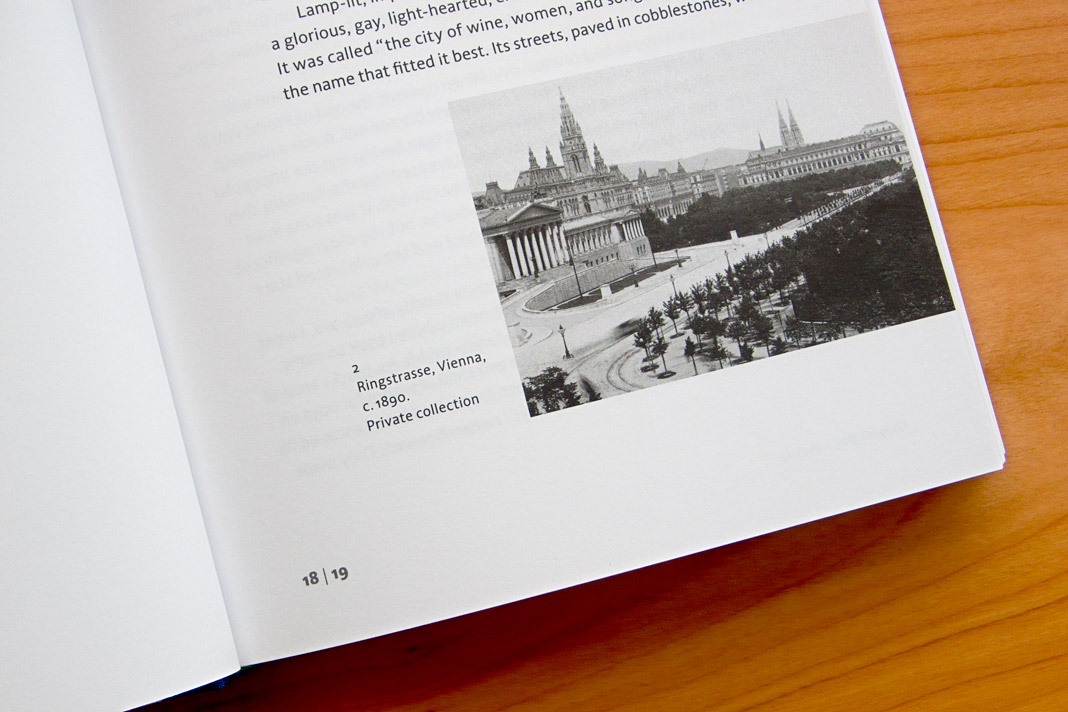
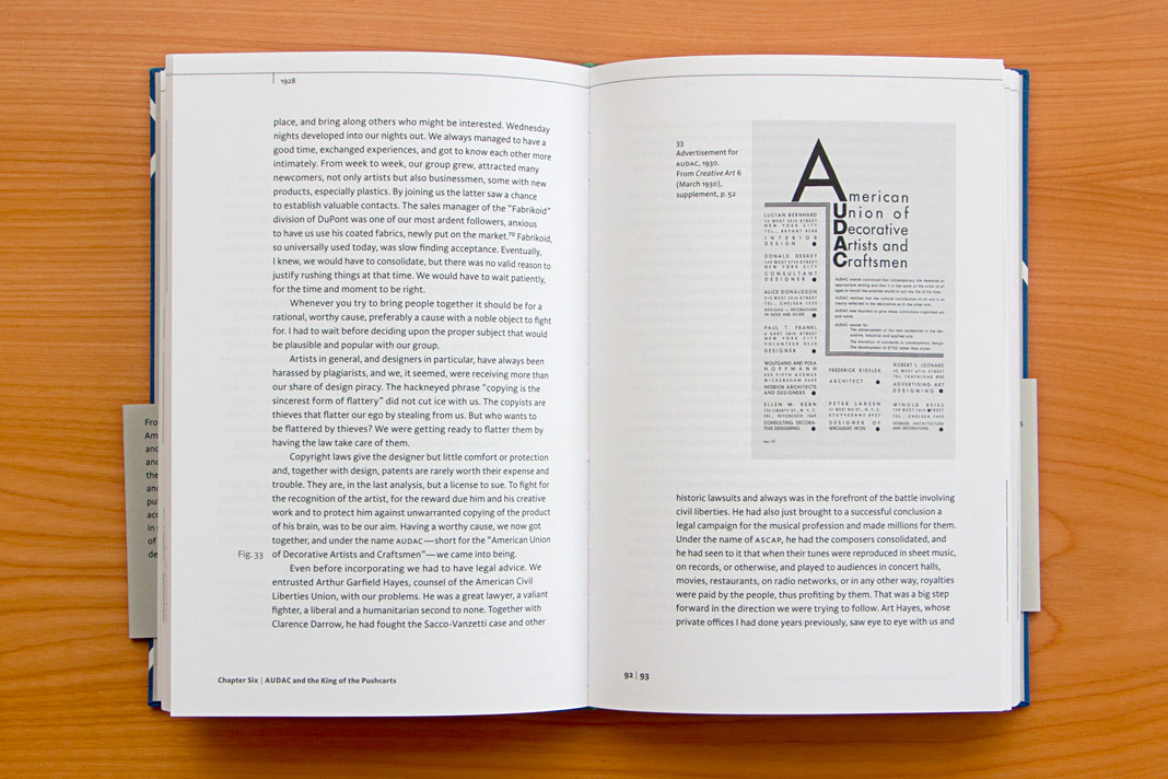
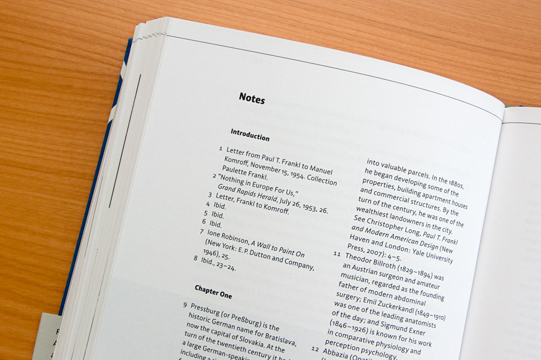
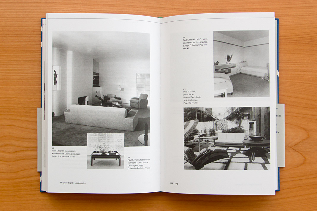
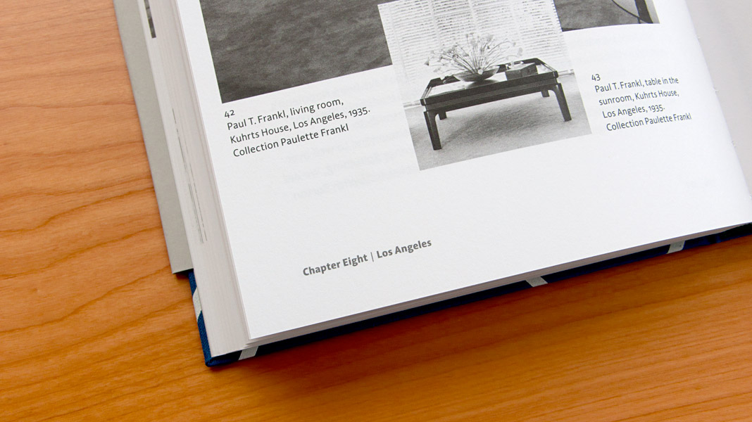
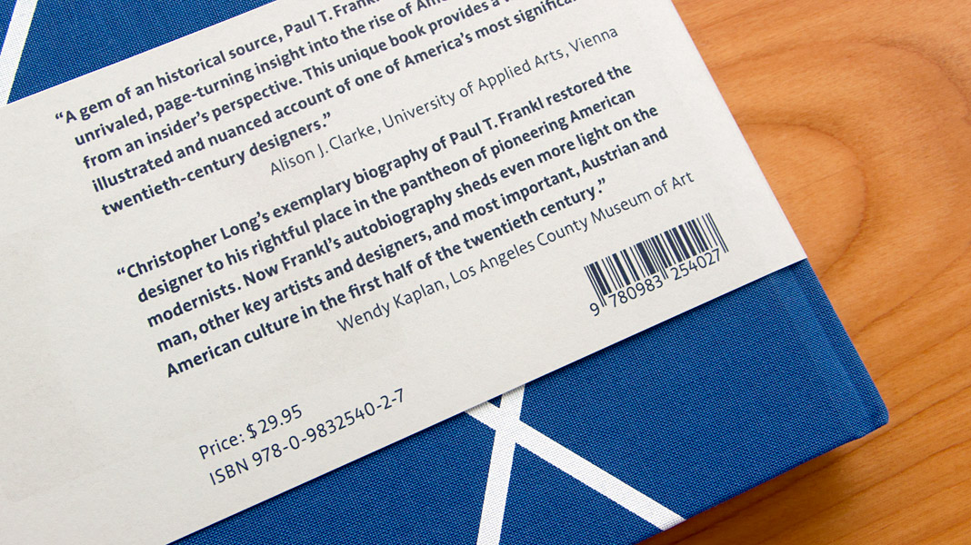 Various impressions of Frankl’s autobiography, designed by Peter Duniecki.
Magazine News switched to Sindelar as their text face
Now that’s great news: Austrian magazine News switched to Sindelar as their primary text face. Good choice!
News is one of Austria’s biggest weekly magazines and the major news magazine in the country. It has a circulation of about 160,000 copies and covers various topics such as politics, business, culture, and sports.
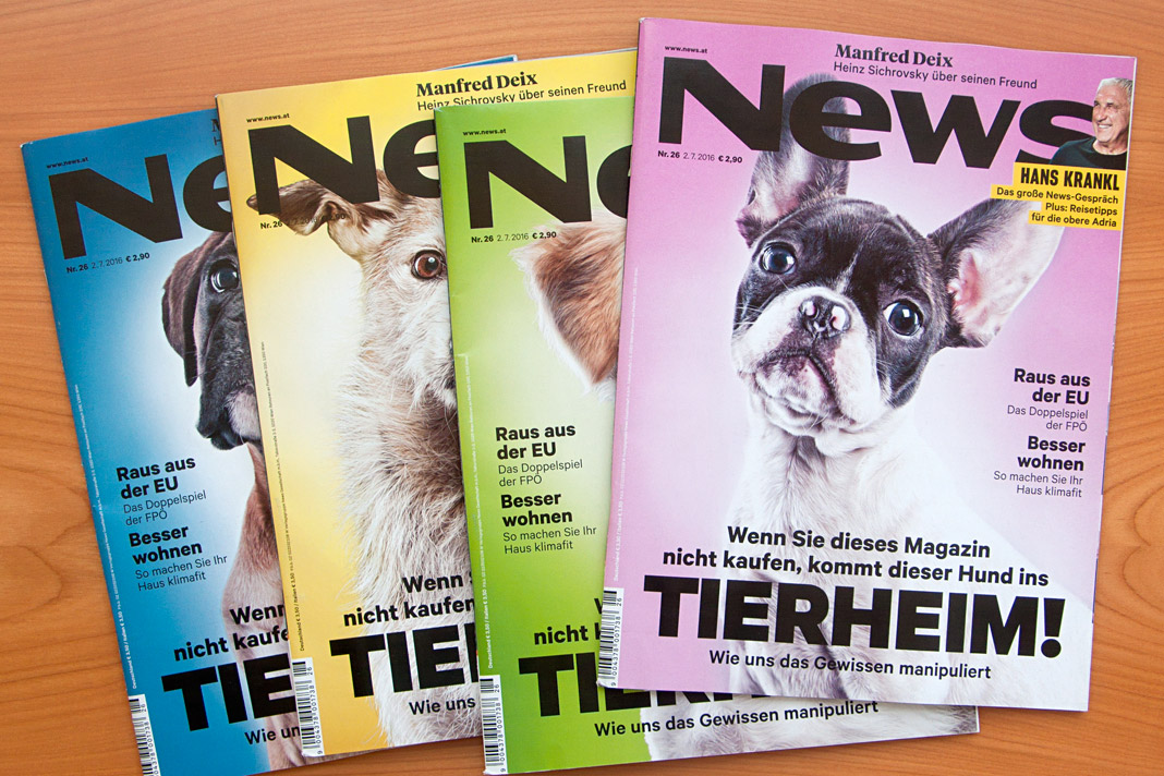
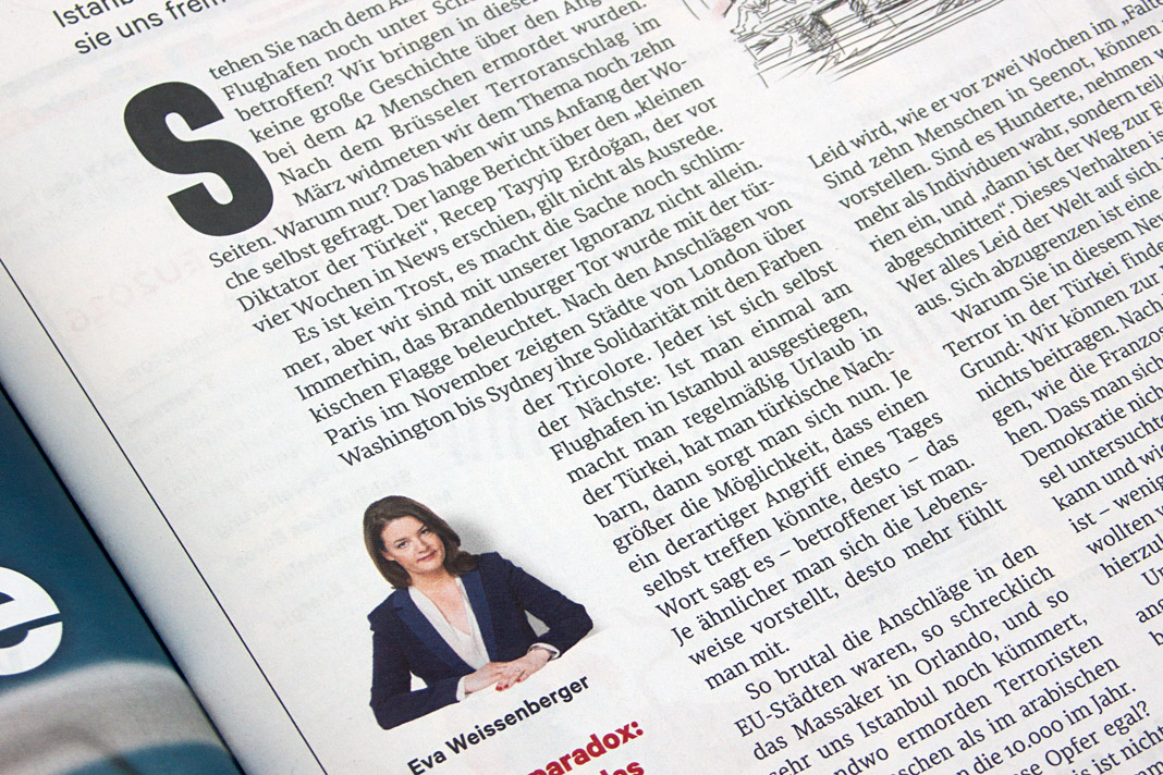
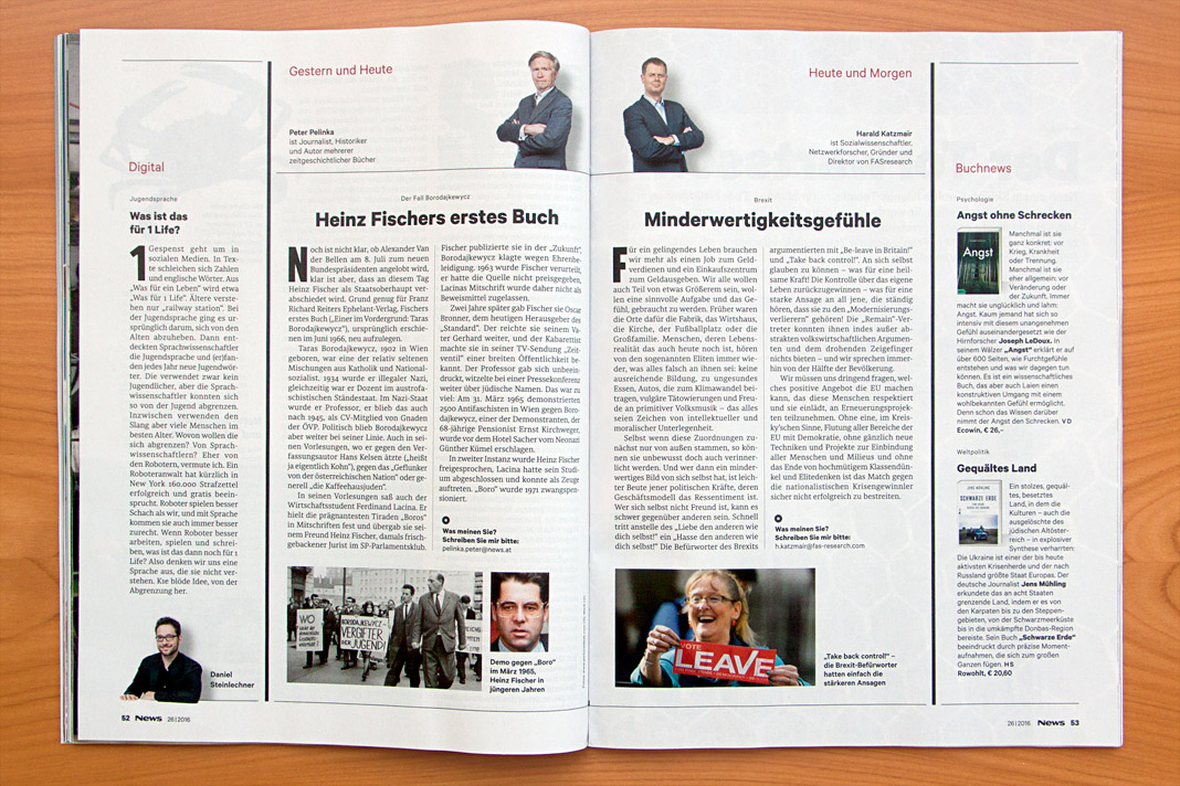
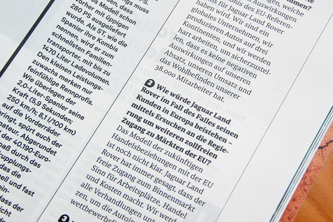
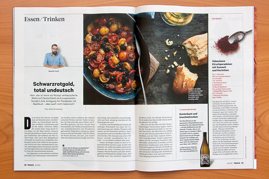
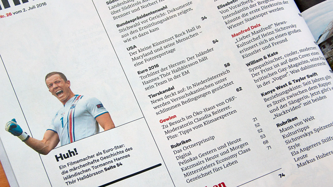
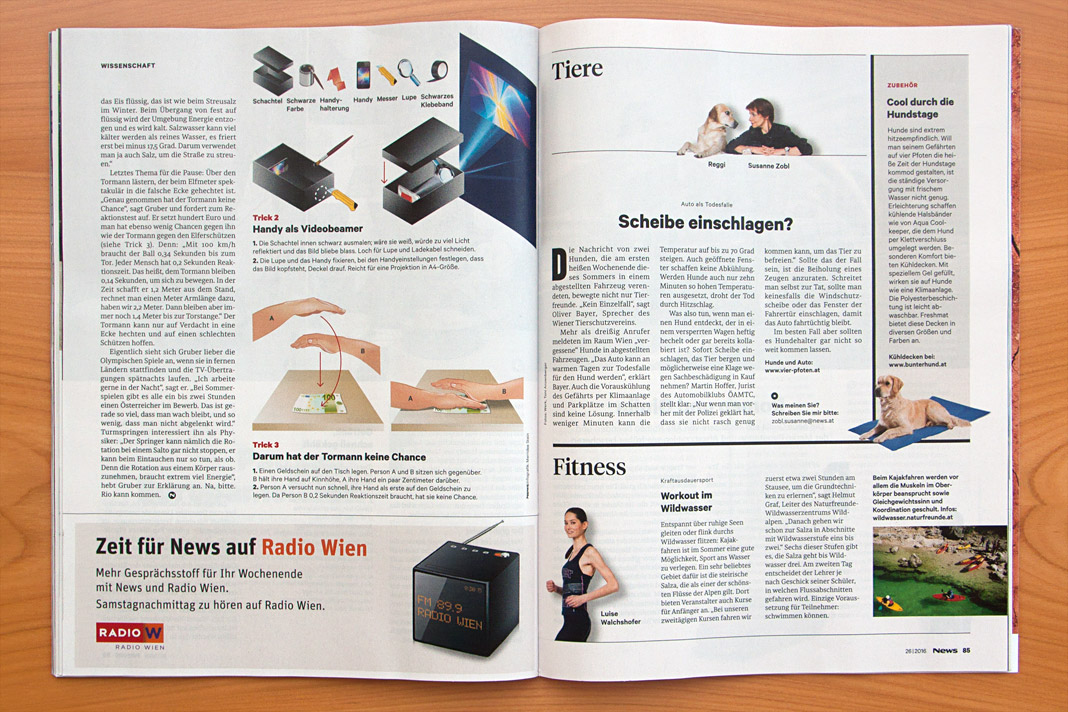
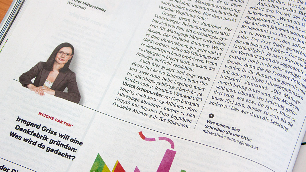
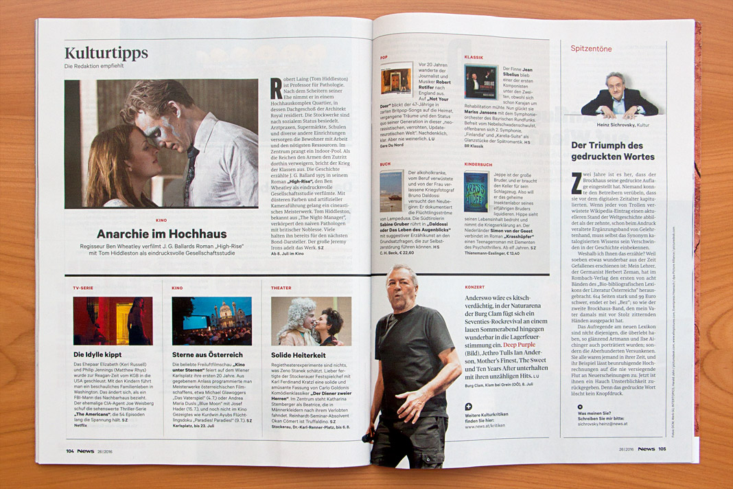
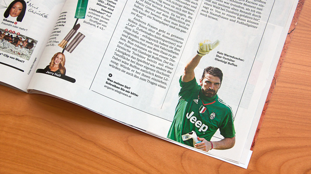 Convince yourself of Sindelar’s qualities by having a look at News’ double page spreads.
Typotopografie focuses on Vienna in its fifth issue
Typotopografie is a publication series focusing on the typographic characteristics of a selected city in each issue. Starting with Munich, followed by Düsseldorf, Berlin, and Leipzig, now it’s Vienna’s turn to be in the focus of attention.
 Cover of Typotopografie, focusing on Vienna in its fifth issue.
The publication is subtitled with The magazine about design, typography and printing in urban centres and that is what you can expect: Interviews with Vienna’s most famous type designers, the design work of graphic designers with a strong interest in typography and entertaining essays and background information.

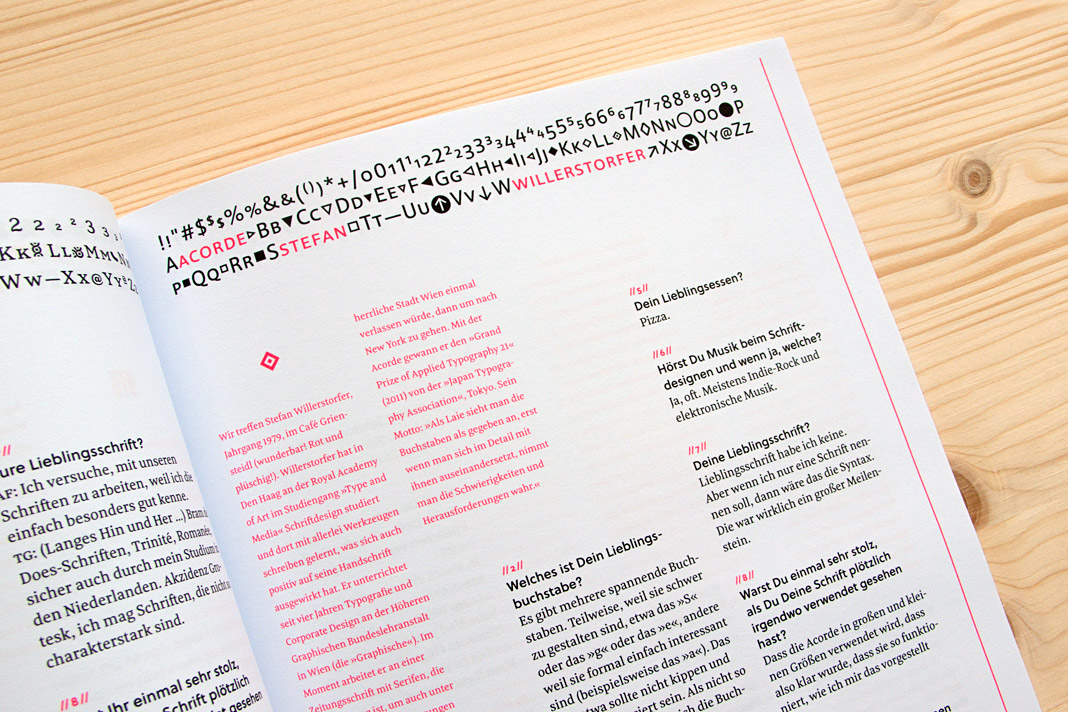
 Typotopografie features an interview with Stefan Willerstorfer.
Typefaces by Austrian Designers – No. 22: Acorde
Design Austria is the only professional association and service organisation in Austria representing the interests of designers from all creative disciplines. Among many other activities Design Austria publishes a popular series of type specimens called Schriften österreichischer DesignerInnen (Typefaces by Austrian Designers).
Issue No. 22 showcases the type family Acorde, presents all of its styles in various sizes (from small to large), its huge character set as well as the large number of supported OpenType features.
 The cover of the 22nd issue of Design Austria’s popular series of type specimens.


 Various impressions of the publication showcasing the type family Acorde.
Acorde presents the most beautiful books of A/D/CH/NL
Like every year the Typographic Society Austria (tga – Typographische Gesellschaft Austria) shows the most beautiful books of Austria, Germany, Switzerland, and the Netherlands in cooperation with the Vienna Public Libraries and the Association of Austrian Book Trade.
The most beautiful books of 2011 can be seen in the Central Library in Vienna from December 5, 2012 to February 4, 2013. Once again (since its introduction last year) the exhibition design is entirely set in the type family Acorde. Since Acorde is used for small text (labels, signs, flyers) as well as for large headlines, the exhibition design is a good example of Acorde’s suitability for all different sizes.
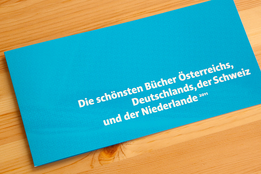
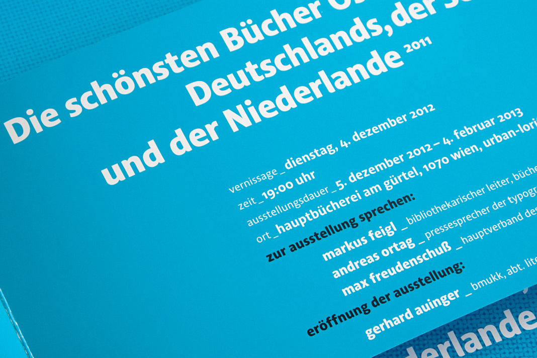 The flyer promoting the exhibition was designed by Austrian designer Erich Monitzer.
Josef Frank’s writings set in Acorde
The bilingual book Josef Frank: Writings is a complete collection of all published writings of Austrian architect Josef Frank, one of the main protagonists of Classical Modernism. It comes in two volumes and consists of nearly 900 pages in total. Since the whole publication is entirely set in Acorde, it is probably amongst the publications where Acorde’s workhorse qualities can be judged most easily.
 Both covers of the two-volume book show the enlarged signature of Josef Frank.
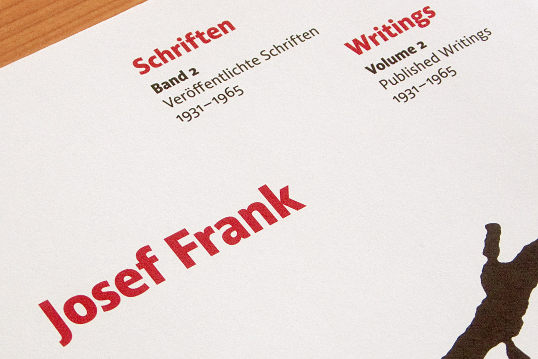
The two-volume book was designed by Austrian book designer Peter Duniecki who explains his choice of Acorde as follows. »Die verwendete Schrift spiegelt die Zeit der Wiener Moderne. Modern, klar, nicht so hart, runder, eben wienerischer als die Internationale Moderne. Ihre hervorragende Lesbarkeit würde Josef Frank zu schätzen wissen.« (The chosen typeface reflects the era of Viennese Modernism. Modern, pure, not so hard, rounder, just more Viennese than the International Modernism. Josef Frank would appreciate its outstanding legibility.)
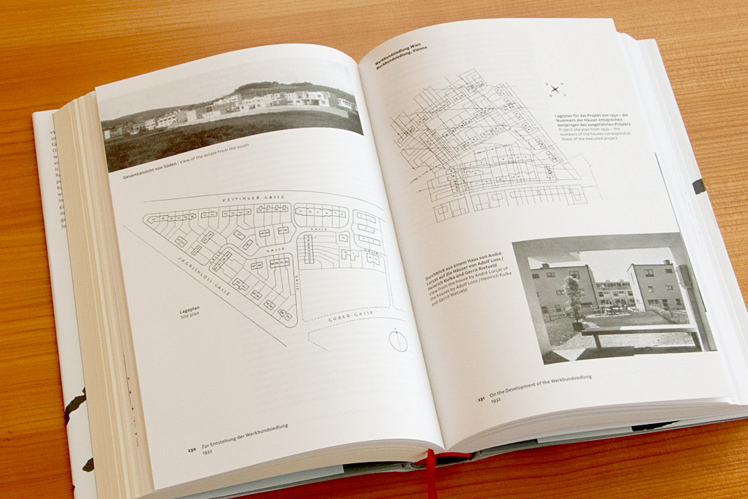
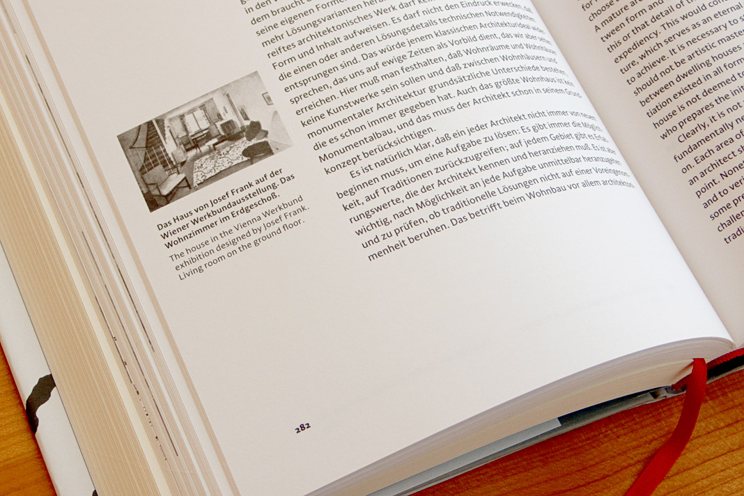
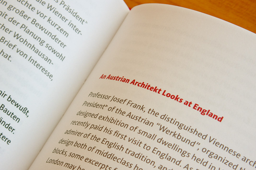 Various impressions of the publication on Josef Frank’s writings, designed by Peter Duniecki.