Blog – Entries tagged as Josef Frank
Josef Frank’s writings set in Acorde
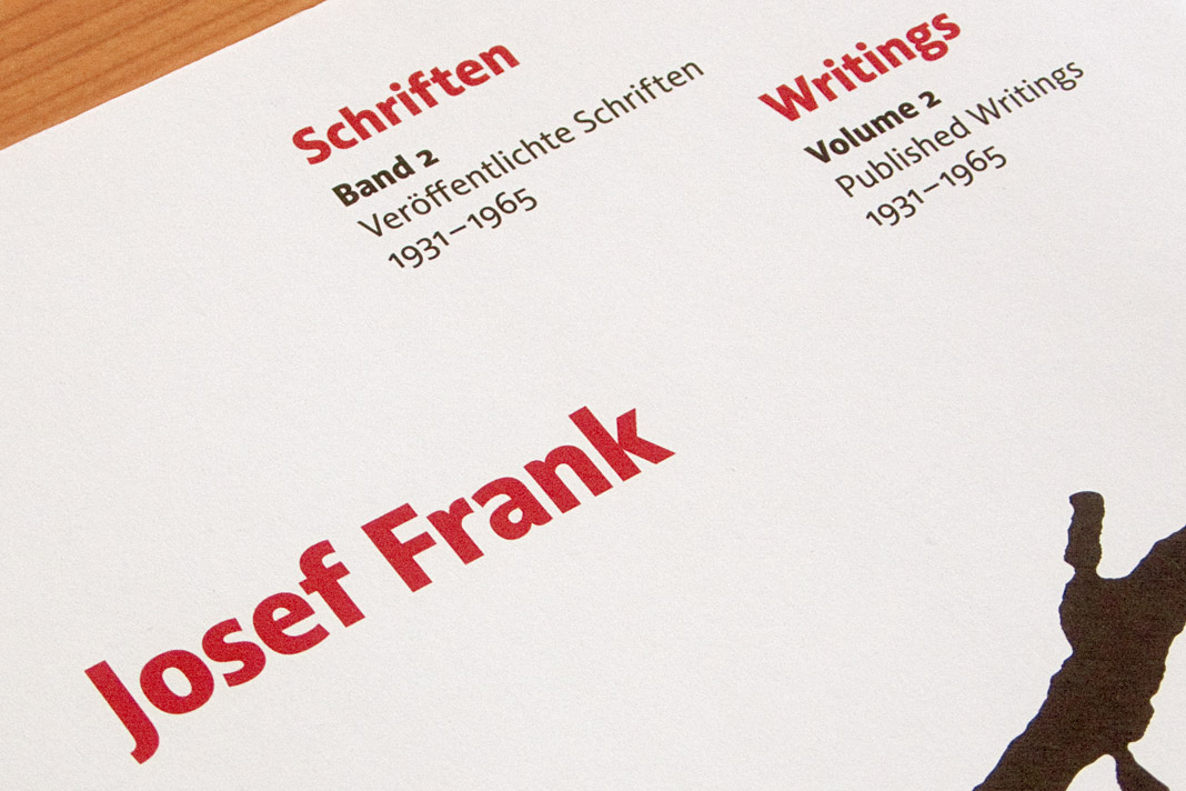
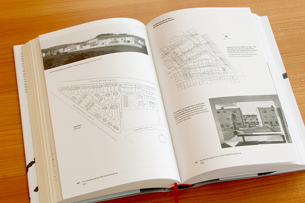
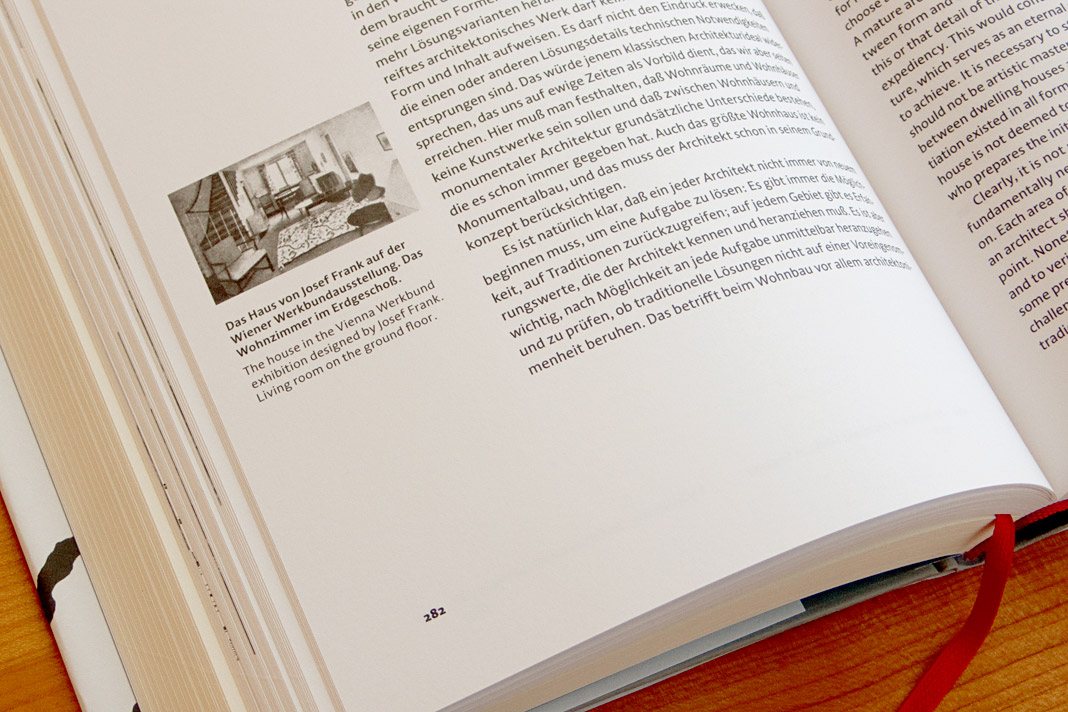
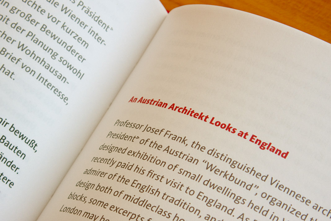
The bilingual book Josef Frank: Writings is a complete collection of all published writings of Austrian architect Josef Frank, one of the main protagonists of Classical Modernism. It comes in two volumes and consists of nearly 900 pages in total. Since the whole publication is entirely set in Acorde, it is probably amongst the publications where Acorde’s workhorse qualities can be judged most easily.
 Both covers of the two-volume book show the enlarged signature of Josef Frank.

The two-volume book was designed by Austrian book designer Peter Duniecki who explains his choice of Acorde as follows. »Die verwendete Schrift spiegelt die Zeit der Wiener Moderne. Modern, klar, nicht so hart, runder, eben wienerischer als die Internationale Moderne. Ihre hervorragende Lesbarkeit würde Josef Frank zu schätzen wissen.« (The chosen typeface reflects the era of Viennese Modernism. Modern, pure, not so hard, rounder, just more Viennese than the International Modernism. Josef Frank would appreciate its outstanding legibility.)


 Various impressions of the publication on Josef Frank’s writings, designed by Peter Duniecki.