Blog – Entries tagged as Editorial Design
Muntermacher is entirely set in our type families
Muntermacher, that’s what the quarterly journal of the market town of Moosburg in Carinthia (Austria) is called. A Muntermacher is a person or substance that wakes you up. And yes, it does. Great to see a journal from a small market town offering information to its inhabitants in such visual quality.
The magazine was conceived by Austrian architect and journalist Wojciech Czaja and by Austrian graphic designer Helga Innerhofer. As a foundry we are especially proud of this feature: The journal is entirely set in our type families Acorde and Sindelar which complement each other perfectly well.
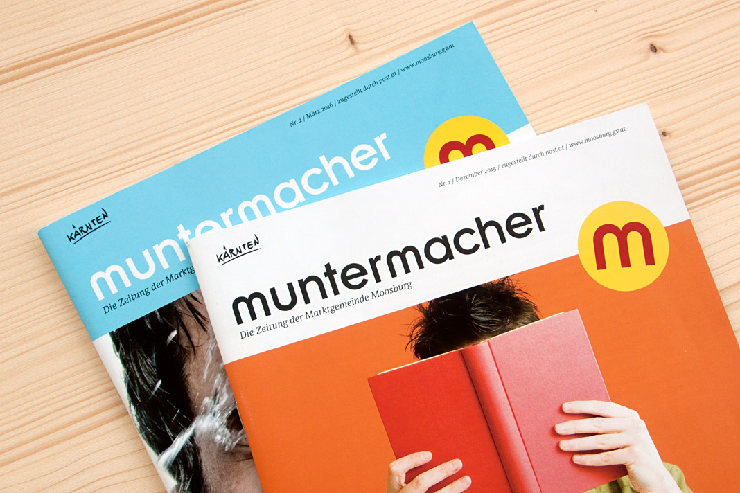 Two covers of the quarterly journal Muntermacher.
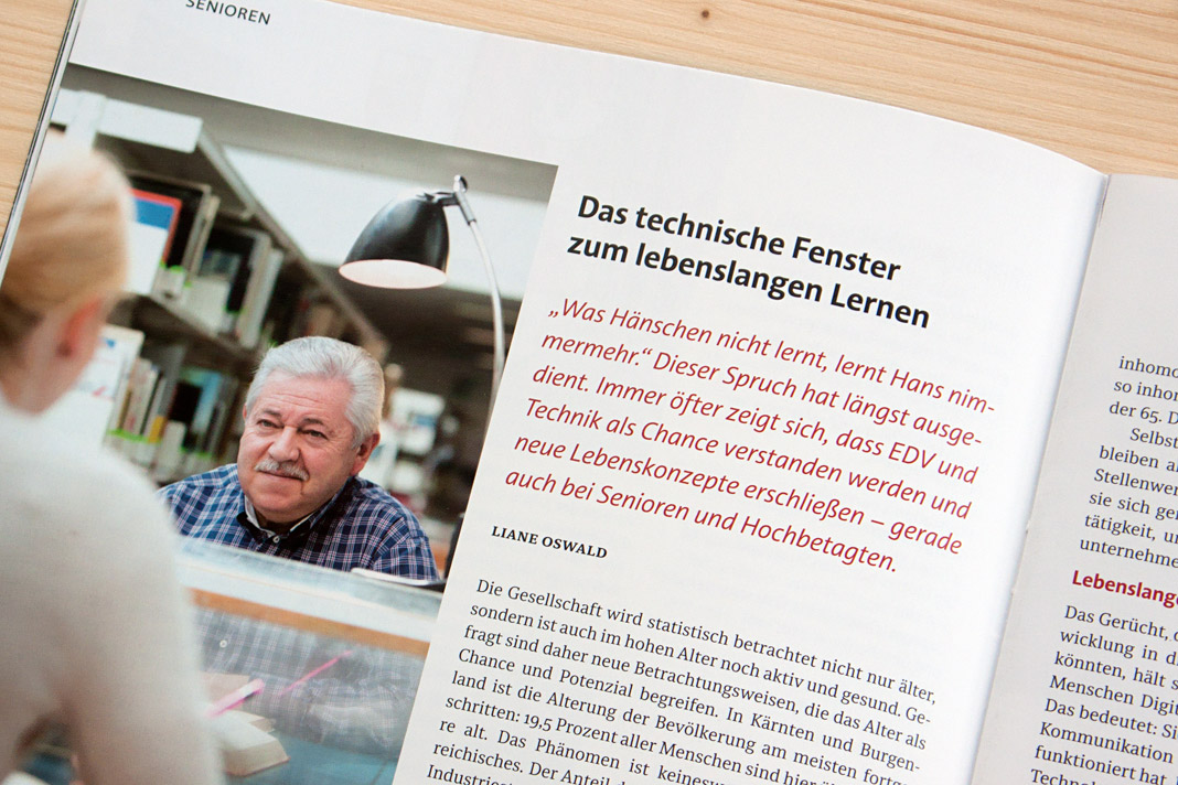
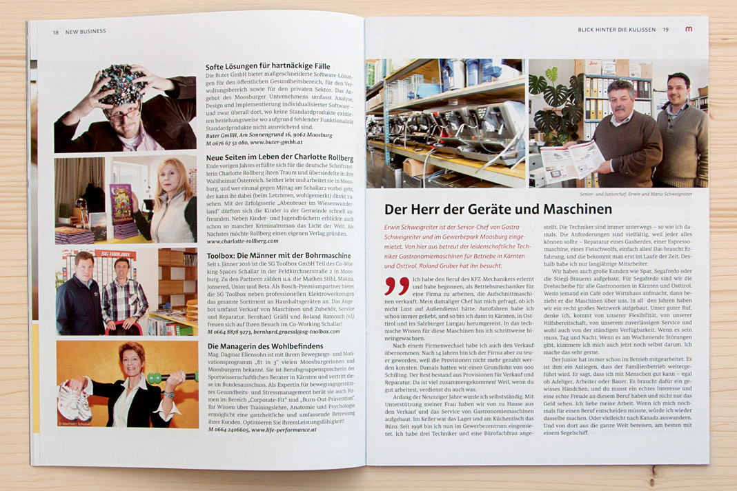
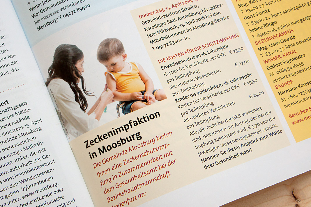
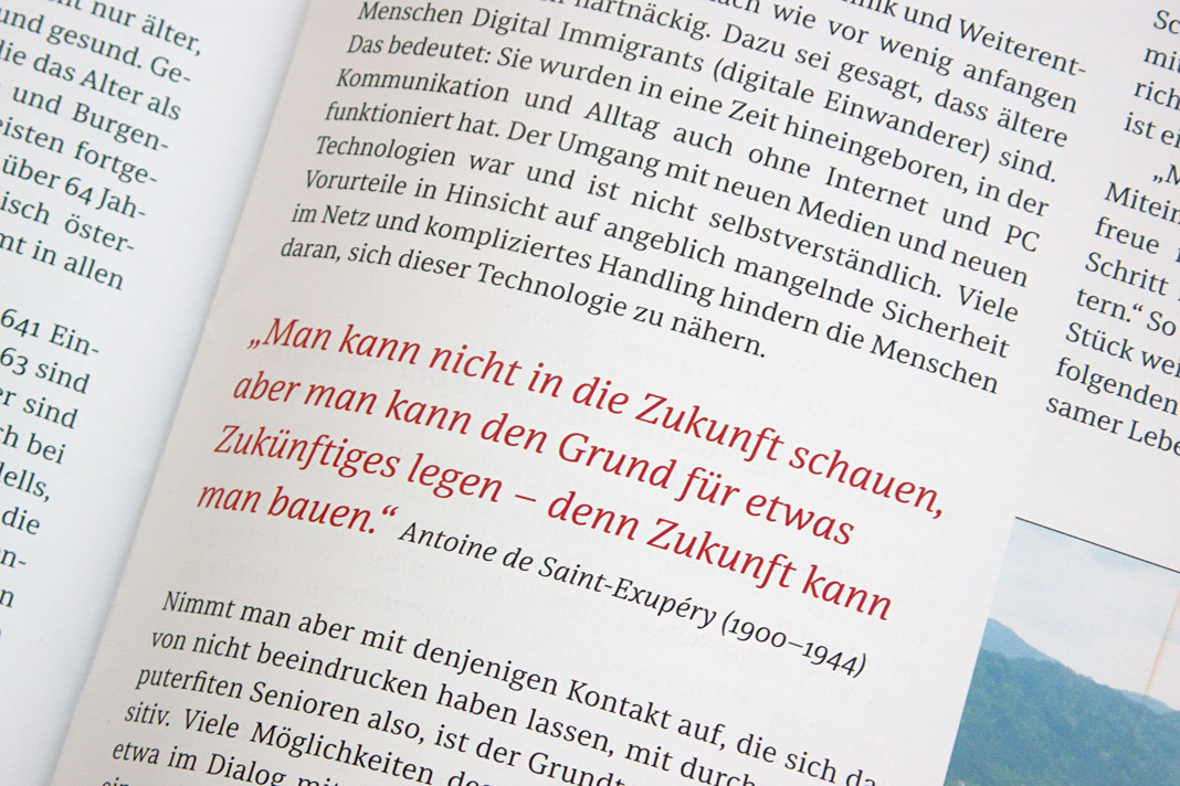
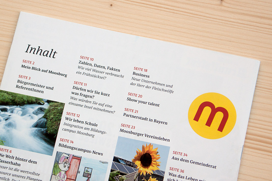 Various impressions of Muntermacher which perfectly show Acorde’s and Sindelar’s excellence.
Evangelisches Frankfurt is now typeset in Sindelar
It is always great to see when one of our typefaces perfectly contributes to a great work of design. With this newspaper that’s really the case: Evangelisches Frankfurt is the newspaper of the Protestant Church in Frankfurt. It was designed by German newspaper designer Jan Famira.
The newspaper gets published five times a year and is sent to all Protestants living in Frankfurt free of charge. It seems the newspaper’s new design has easily convinced the audience as the post by a regular reader suggests: »The new design is really well done, very beautiful, appealing, and lively. Thanks a lot for that!« As a foundry we obviously believe that Sindelar, the newspaper’s new text face, plays a major role in this respect.
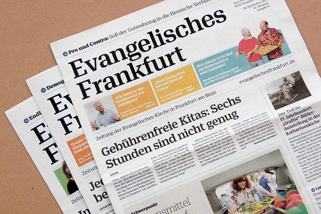 Recent covers of the newspaper of the Protestant Church in Frankfurt.
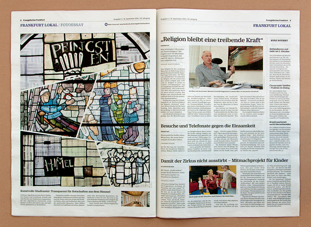
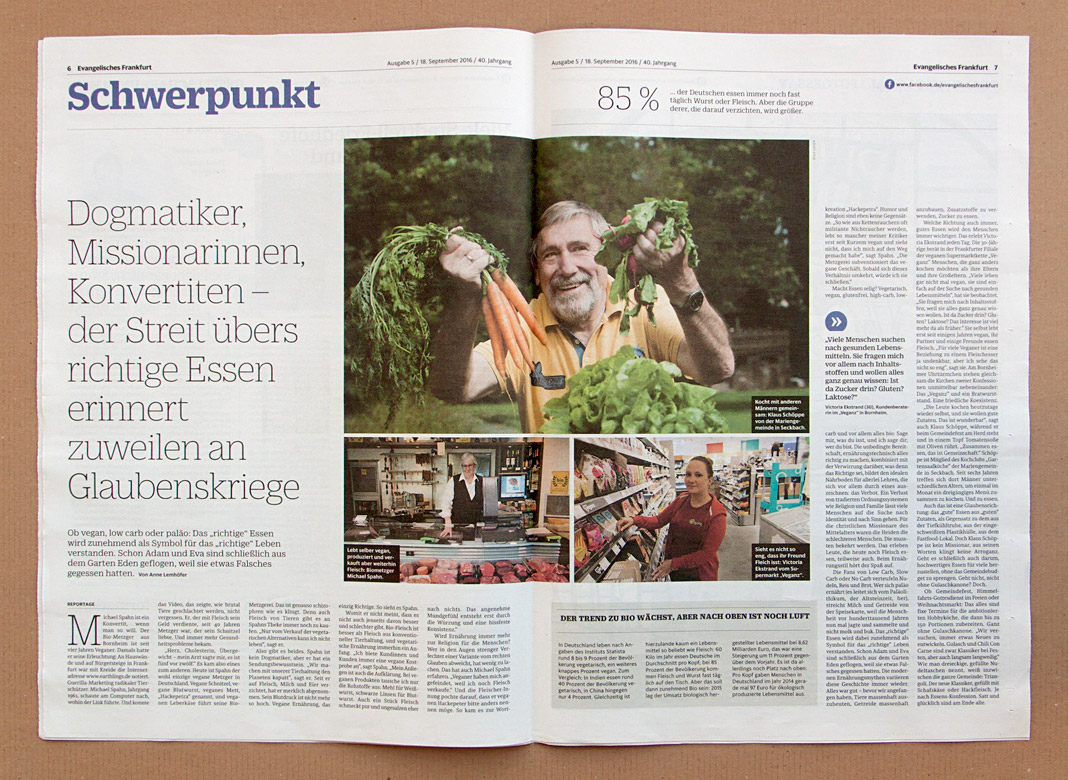
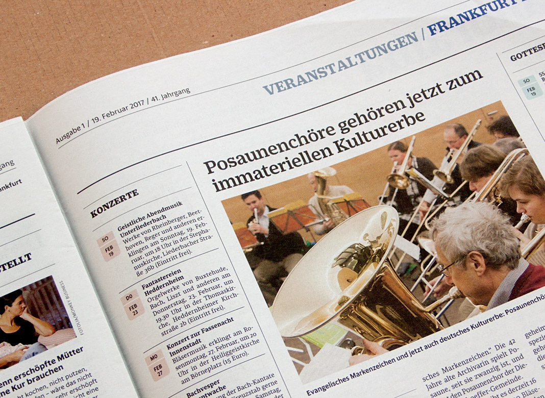
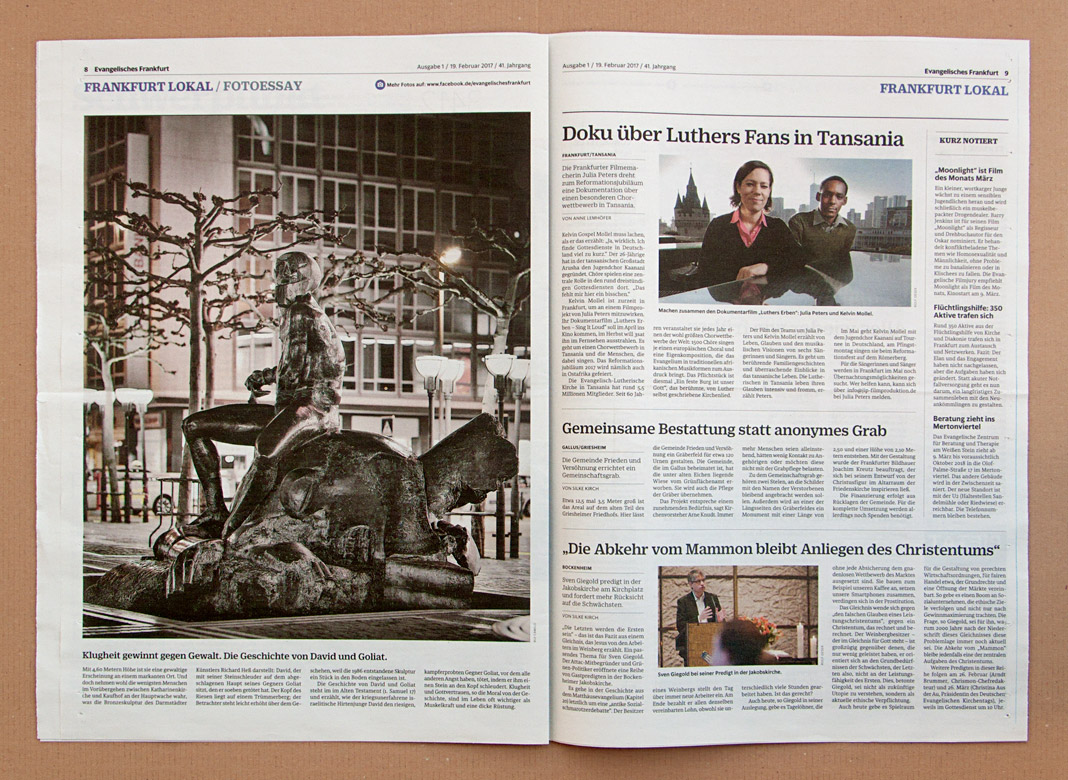
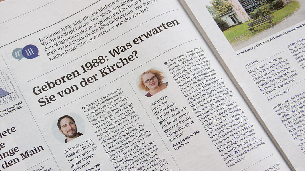
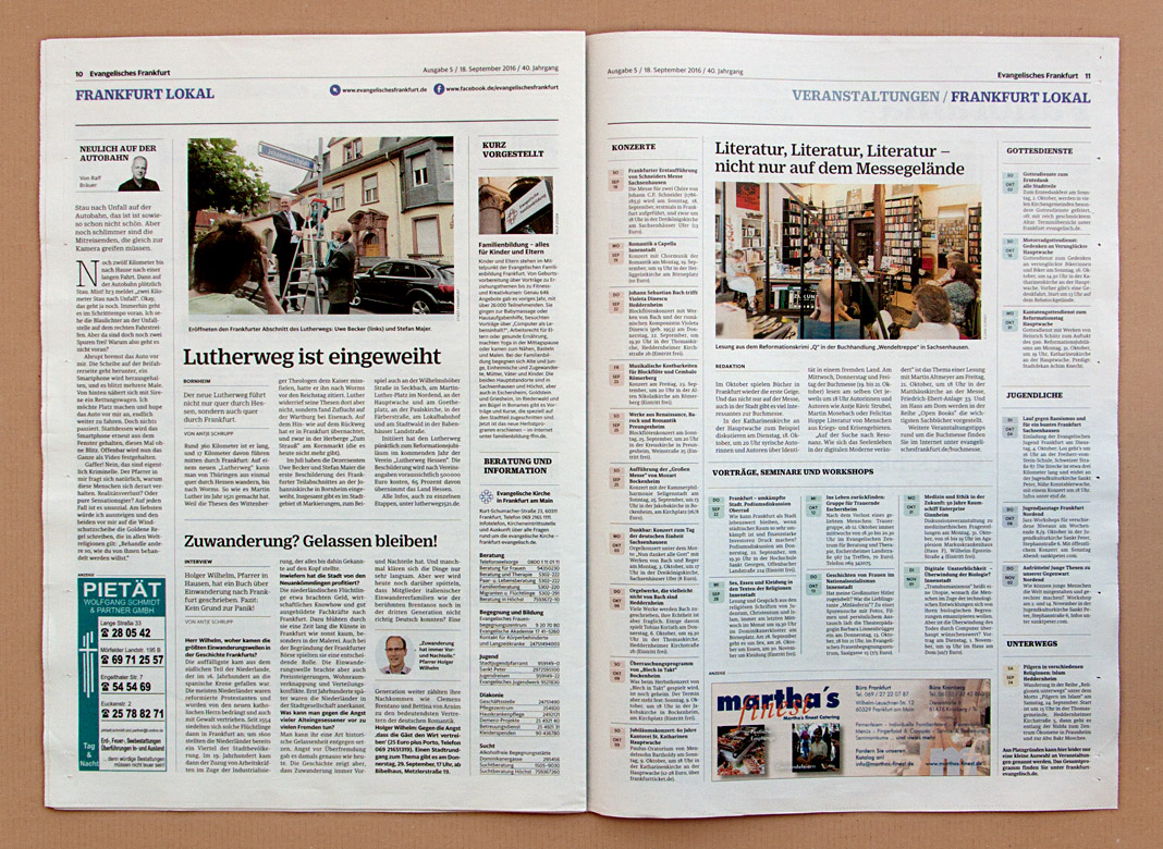 Sindelar’s great legibility qualities can been seen throughout the newspaper.
Kulturgeschichten Wien relies on Sindelar
As Viennese as it gets: Kulturgeschichten Wien is a quarterly magazine about Vienna with a specific thematic focus in every issue. The magazine’s first issue is dedicated to former Austrian Emperor Franz Joseph I. whose death was commemorated for the 100th time in 2016.
The magazine is written, designed, typeset, and printed in Vienna. Even the main typeface is Viennese: The whole body text is typeset in Sindelar.
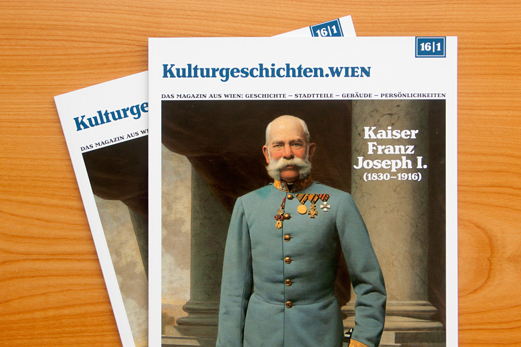 Cover of the first issue of Kulturgeschichten Wien.
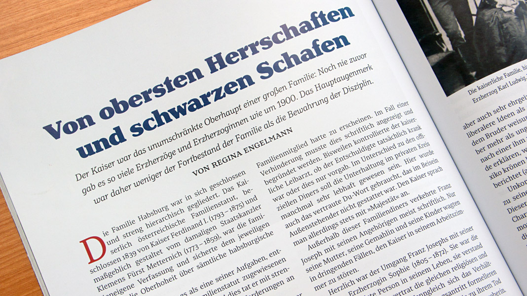
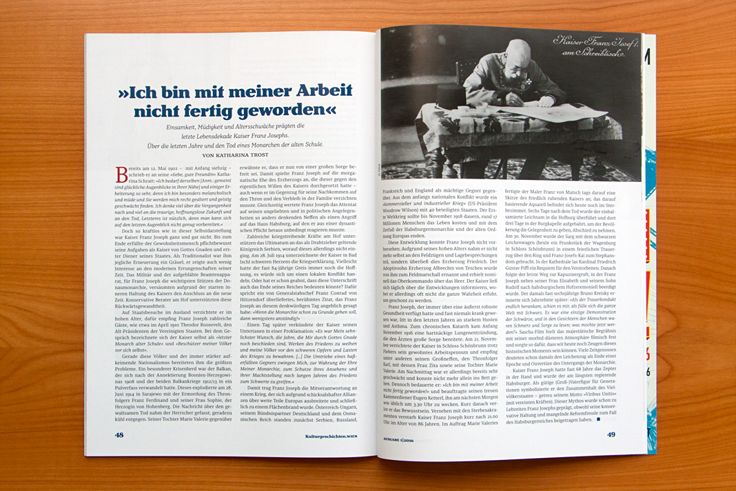
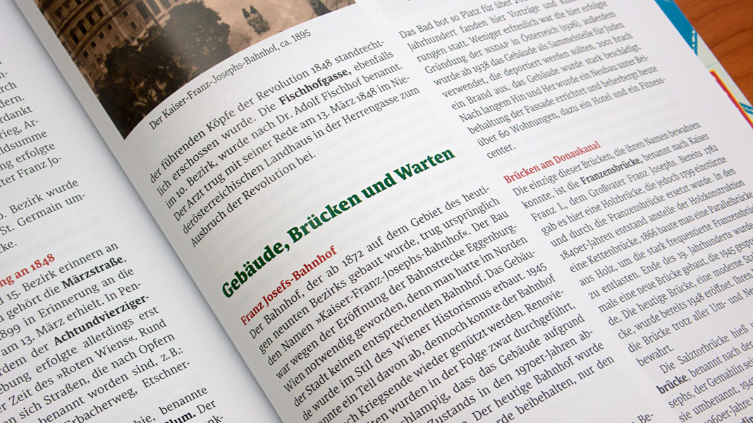
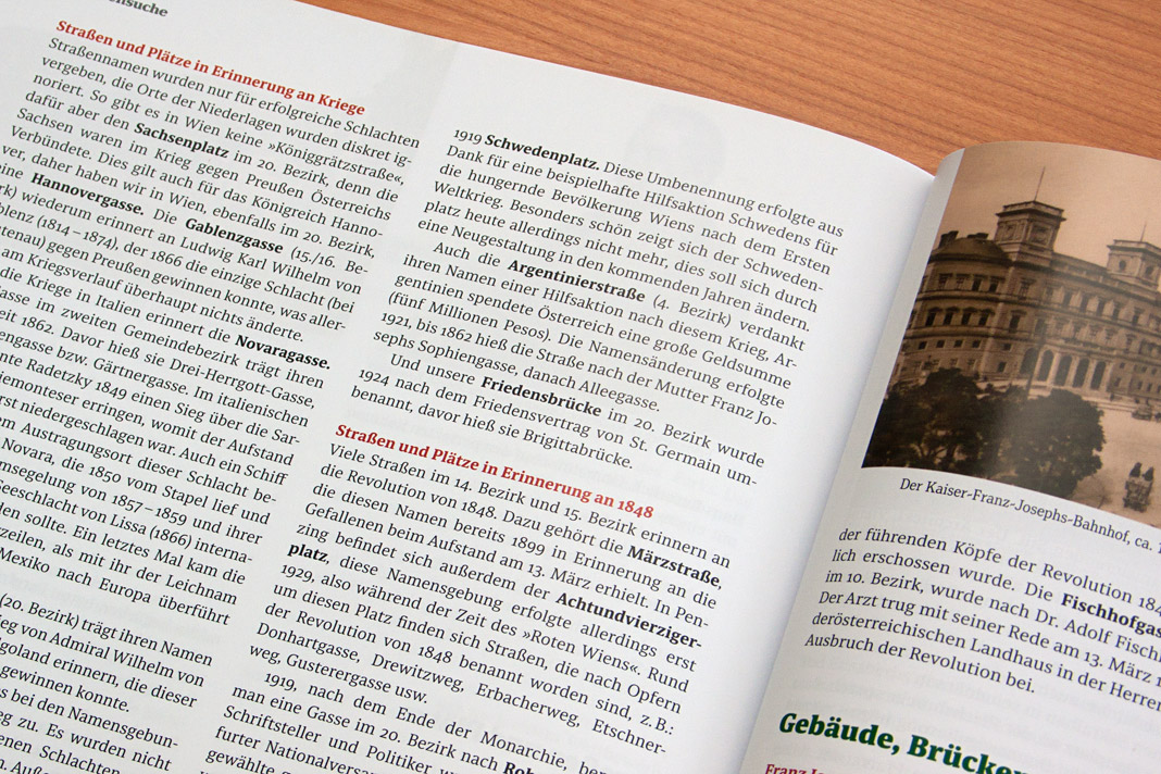
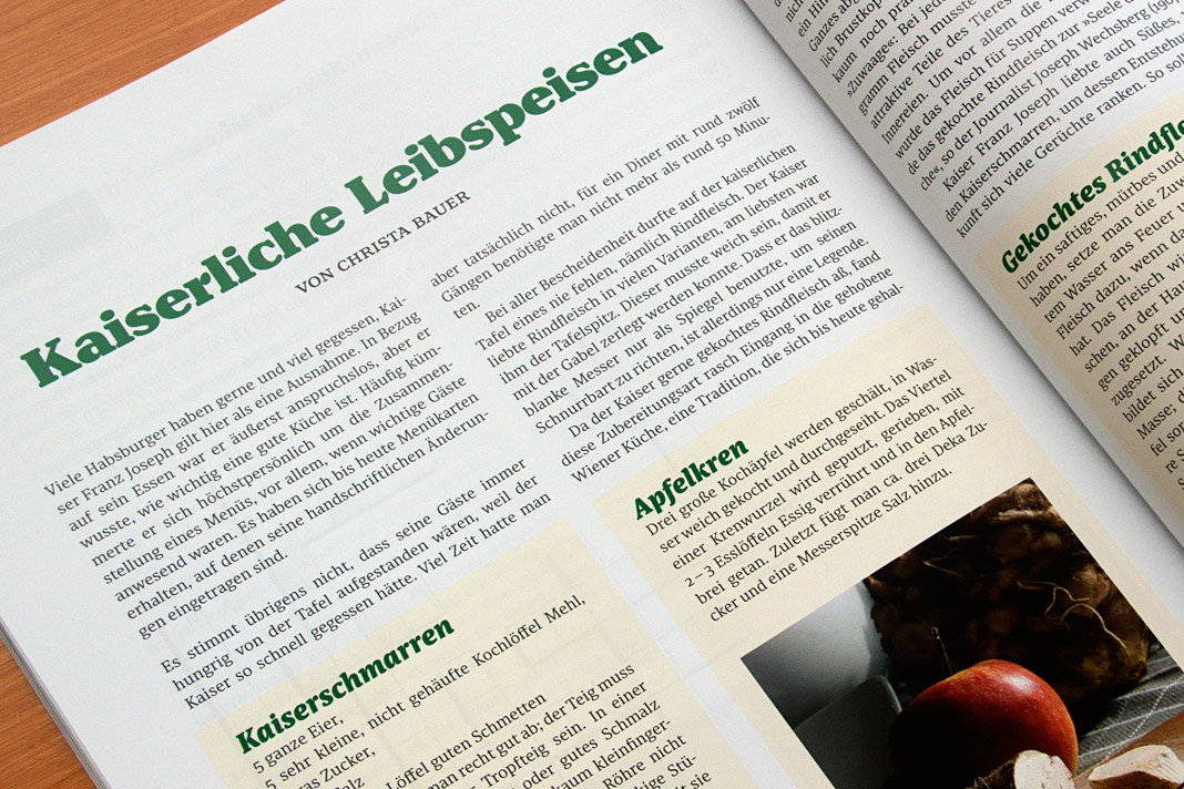 Various impressions of Kulturgeschichten Wien, designed by Gernot Winter.
Netzwerk Zukunftsraum Land is typeset in Sindelar
Another great example of Sindelar in use: Netzwerk Zukunftsraum Land is a journal for rural development published quarterly by the association of the same name. The association was installed by the Austrian Federal Ministry of Agriculture, Forestry, Environment and Water Management and acts on behalf of the Ministry.
Sindelar is used throughout the journal for body text as well as for headlines and subheadings in combination with a constructed sans serif typeface.
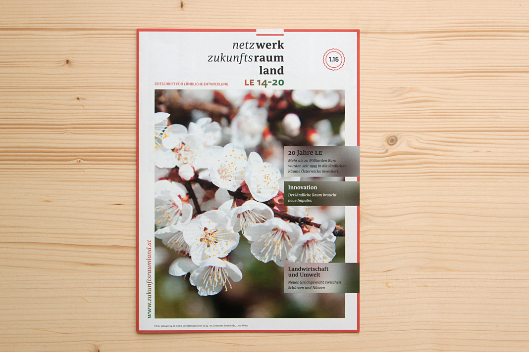 Cover of Netzwerk Zukunftsraum Land, set in Sindelar.
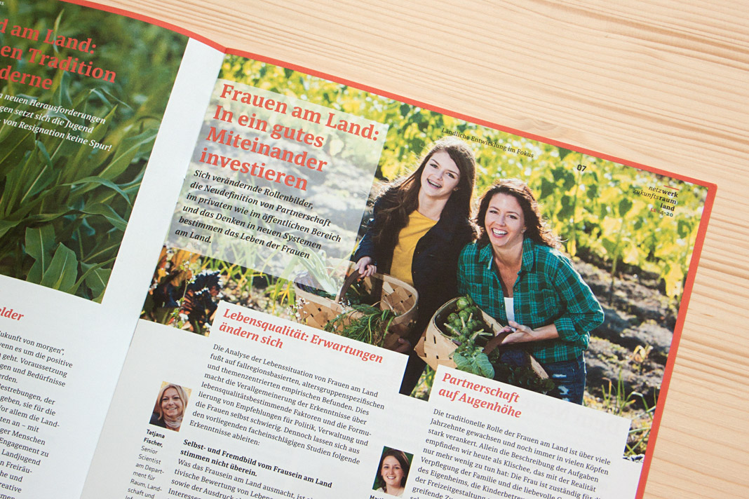
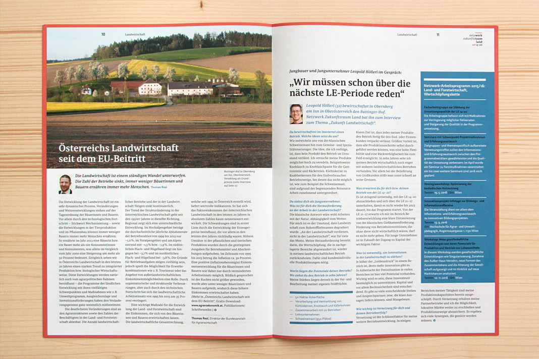
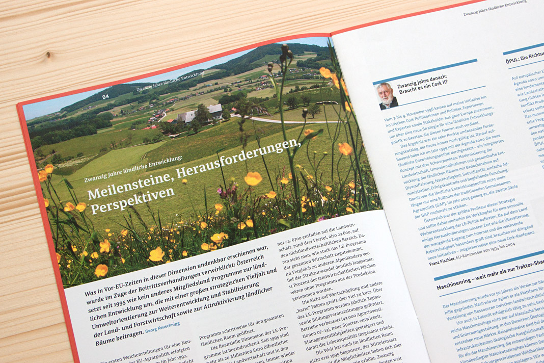
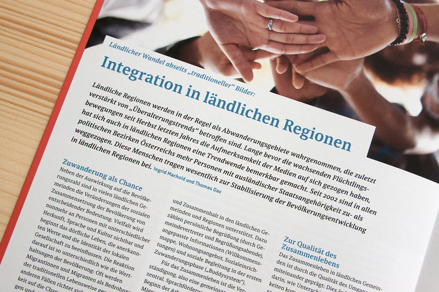
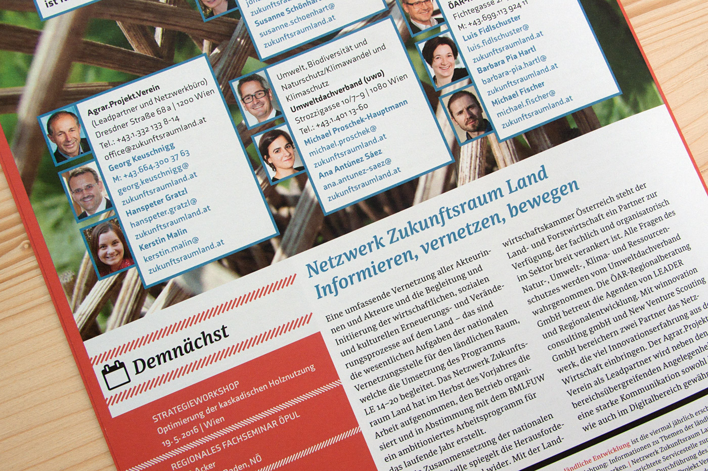 Various impressions of Netzwerk Zukunftsraum Land, designed by Andrea Neuwirth.