Blog – Entries tagged as Magazine
Sindelar is featured in German design magazine Page
In case you are already bored of using Times or Times New Roman over and over again: Check out the current issue (04/16) of German design magazine Page and inform yourself about superior alternatives to Times. Sindelar is featured as one of them. Great read!

 Sindelar is featured in the current issue of German design magazine Page.
Typotopografie focuses on Vienna in its fifth issue
Typotopografie is a publication series focusing on the typographic characteristics of a selected city in each issue. Starting with Munich, followed by Düsseldorf, Berlin, and Leipzig, now it’s Vienna’s turn to be in the focus of attention.
 Cover of Typotopografie, focusing on Vienna in its fifth issue.
The publication is subtitled with The magazine about design, typography and printing in urban centres and that is what you can expect: Interviews with Vienna’s most famous type designers, the design work of graphic designers with a strong interest in typography and entertaining essays and background information.

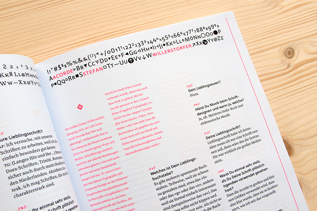
 Typotopografie features an interview with Stefan Willerstorfer.
Slanted #19 – Acorde is one of the super families
The current issue of the quarterly magazine Slanted – Typografie & Grafik Design deals with large type families, so-called super families. Due to their wide range of different styles (various weights, as well as widths or optical sizes) they are able to perform a great variety of different tasks and provide the typographer with a huge set of tools to choose from.
Acorde is one of the selected super families. It offers a large amount of different weights and was designed to be perfectly suited to all different sizes, from small continuous text to large headlines and big signage. Next to the presentation of the selected super families, the magazine also shows a large amount of family photographs taking the term super family literally. Pictures of families from various places as well as portraits of royal families.
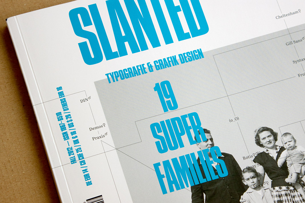 Cover of the current issue of the magazine Slanted focusing on super families.
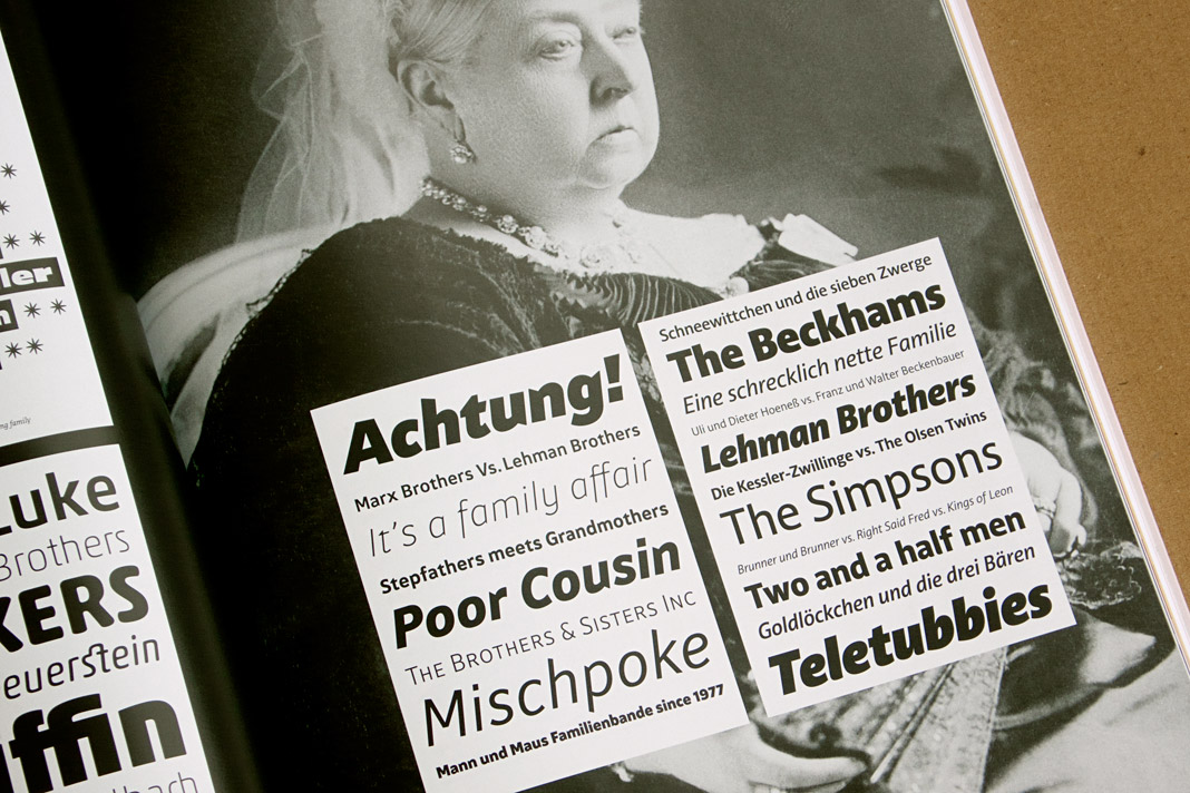 Royal family meets super family: Queen Victoria holds Acorde in her hands.
Design Journal and Rolf Rehe recommend Acorde
The Design Journal is a bi-annual magazine covering the issues of news design and journalism. It is published by the Society for News Design (SND), an international organisation for news media professionals and visual communicators. SND was founded in 1979 and has about 1000 members worldwide.
In each issue the international newspaper designer Rolf Rehe recommends three typefaces which are appropriate for application in newspaper design. To give the Design Journal’s readers the possibility of judging the qualities of the typefaces themselves, the whole magazine is set in the recommended typefaces.
In the current issue (No. 112) Acorde is used as a secondary typeface for text as well as for headlines and gives proof of its wide applicability in various sizes. »It combines cool, geometric letter elements with the warmth of humanist sans forms. This results in a friendly yet assertive appearance«, states Rolf Rehe.
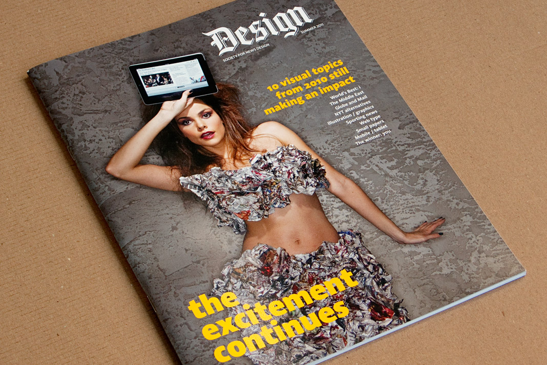 Cover of the summer issue of SND’s Design Journal entirely set in Acorde.
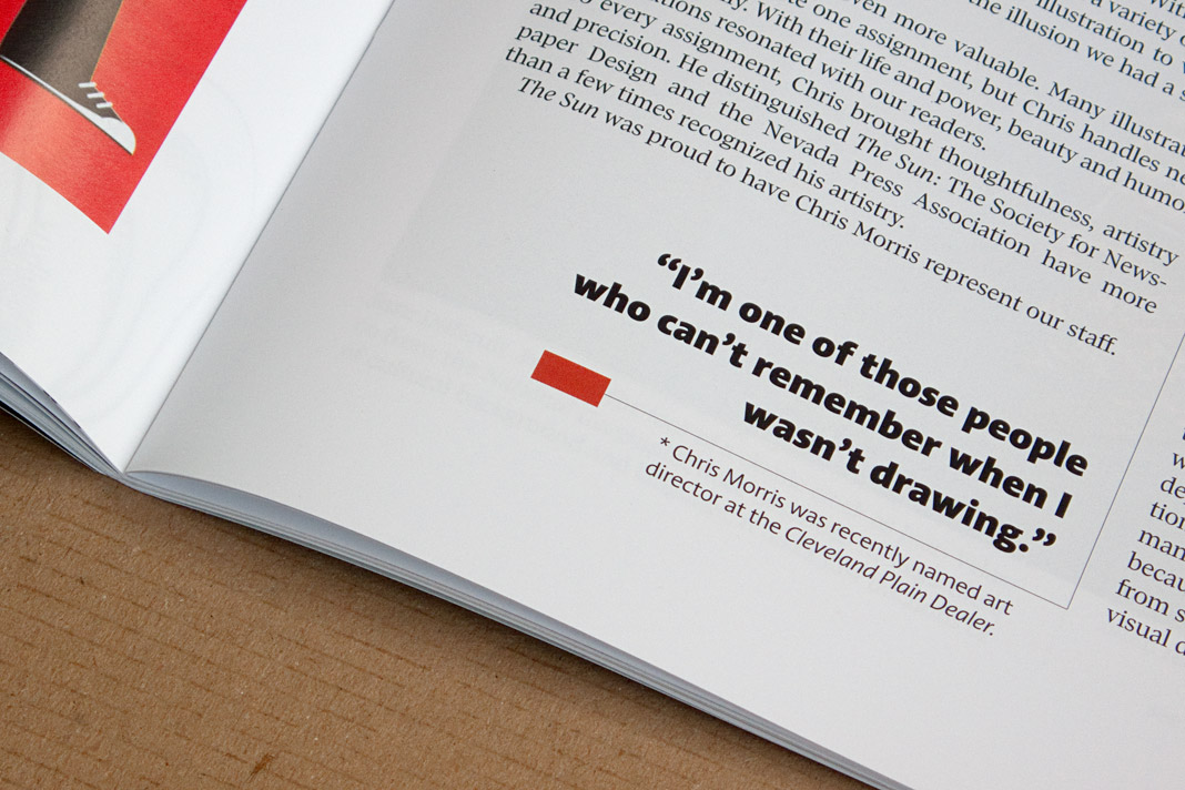
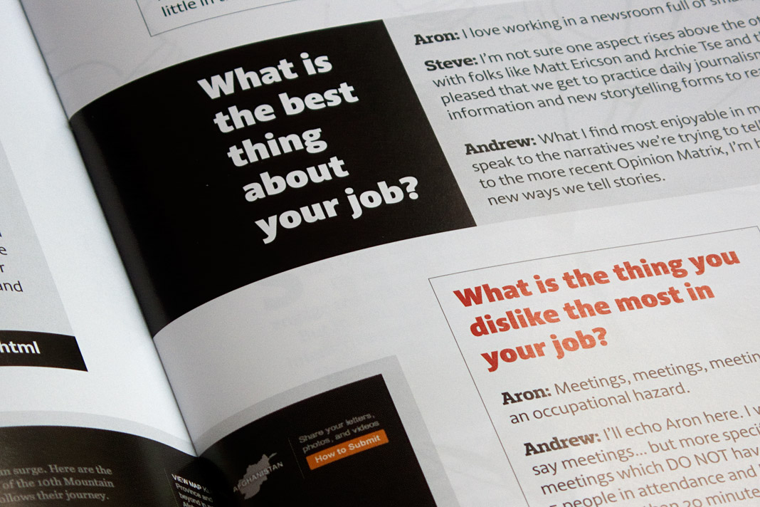
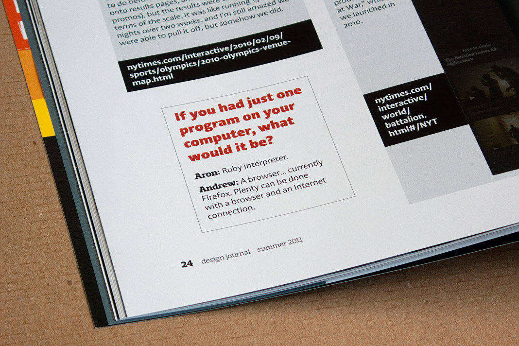
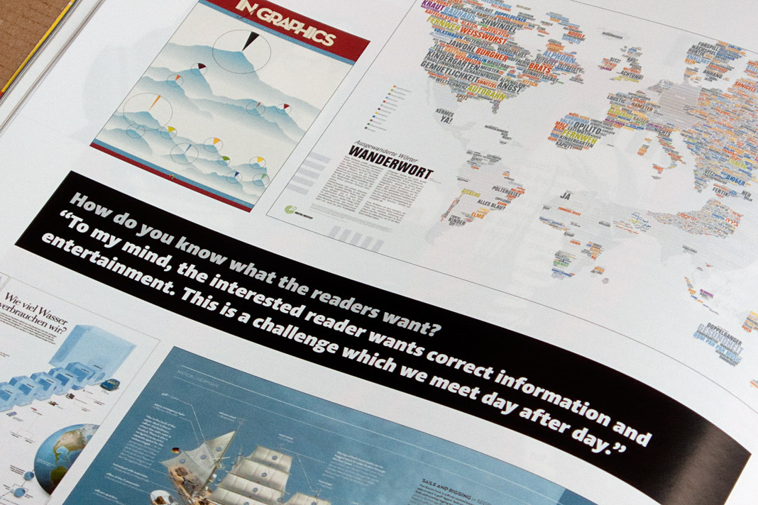
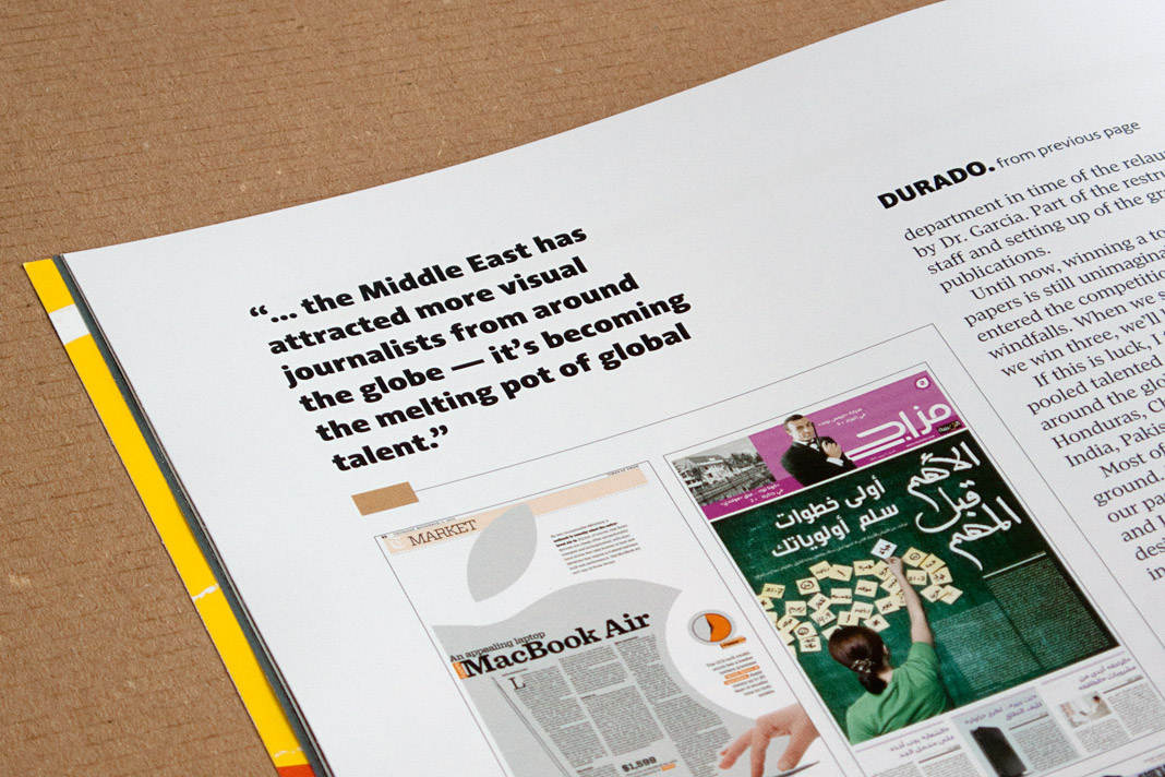
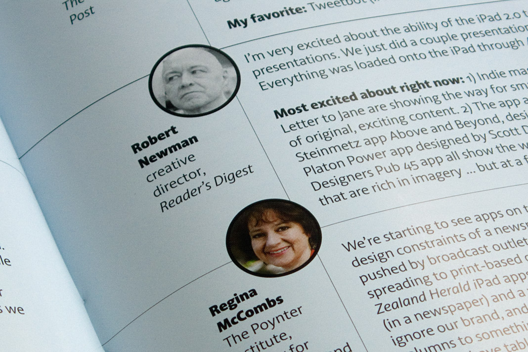
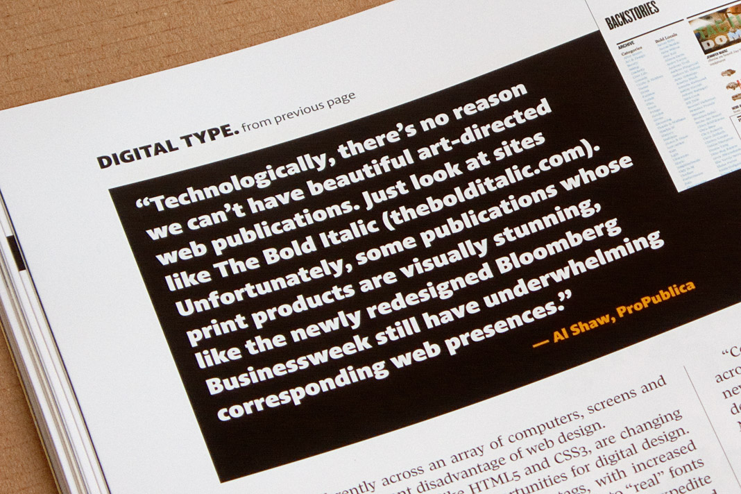
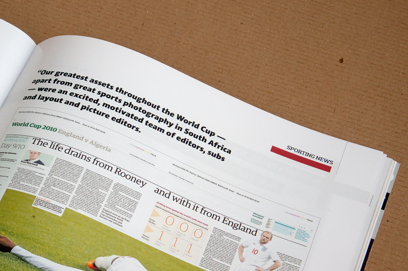 Various impressions of SND’s Design Journal using Acorde.
DA Mitteilungen presents The making of Acorde
Since my article about the making of Acorde raised a lot of interest on the world’s most popular typography blog, I Love Typography (ILT), during autumn last year, I decided to translate the article to German and to make it specially available to Austrian designers with an interest in type and typography as well.
The article was published by Design Austria, Austria’s professional association and service organisation representing the interests of designers from all creative disciplines, appearing in its quarterly published journal DA Mitteilungen (issue No. 2/2011).
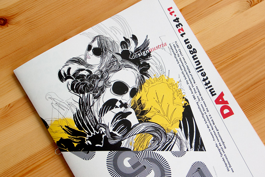 The cover of DA Mitteilungen issue No. 2/2011.
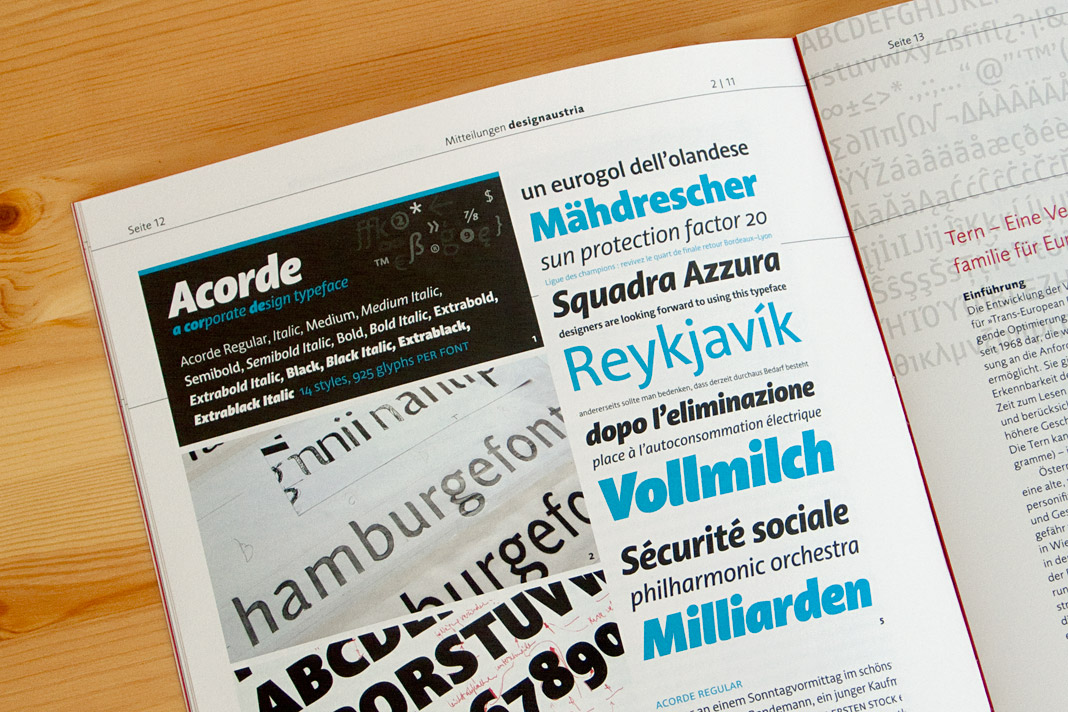 Double page spread showing the article on Acorde.
Austrian publishing magazine Periodicum presents Acorde
Vielgesichtiges Schriftbild (multifaceted type) is the title of Christian Gutschi’s article on the type family Acorde in the current issue of Periodicum (No. 2/2010), the bi-annual magazine by the corporate publishing company Egger & Lerch.
Gutschi emphasises Acorde’s workhorse qualities and its applicability for various applications, conditions and sizes as the article’s title already suggests. The article also gives information on the development process of the typeface and comments on various characteristics of Acorde.
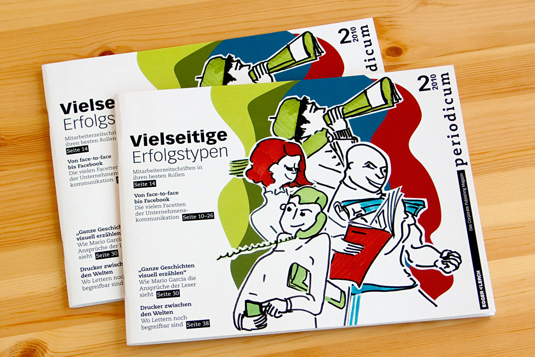 Cover of the publishing magazine Periodicum issue No. 2/2010.
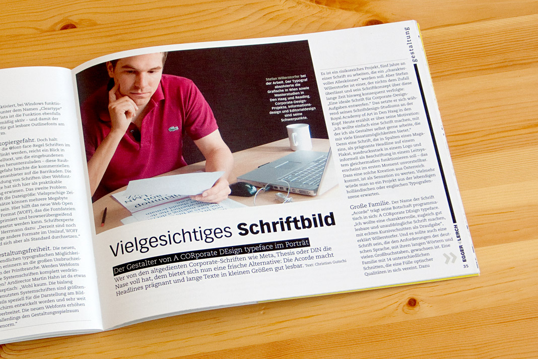
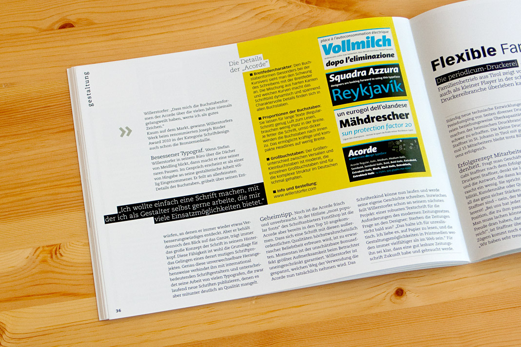 Pages showing the article inside the magazine.