Blog – Entries tagged as Magazine
Loacker redesign featured in German design magazine Page
Have you already had a look at the current issue (04/22) of Page, Germany’s most popular design magazine? Yes, you might have guessed, it contains an article we are really happy about.
 Cover of the current issue (04/22) of Germany’s popular design magazine Page.
The four-page article Detailversessen (detail-obsessed) showcases our redesign of the famous Loacker brand in great detail. As you might know, Loacker is an Italian company based in South Tyrol, producing tasty wafers and chocolate products.
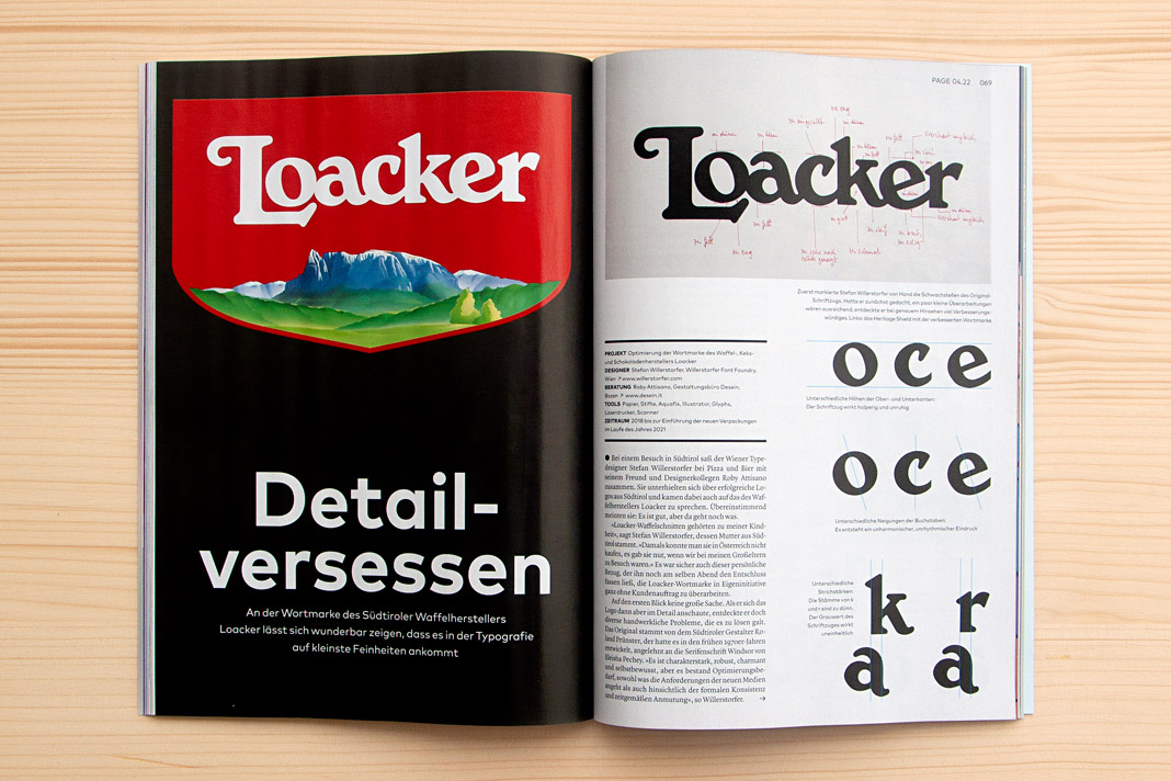 Double page spread showing the new Loacker logotype on the left and the old one on the right.
Interestingly the Loacker redesign did not begin like an ordinary project. There was no order at the beginning of the project. Just an idea – an idea that followed a vivid discussion between two designers while enjoying pizza and beer. Talk about characterful Italian (South Tyrolean) logotypes. At some point we (Roby Attisano and I) agreed that the logotype of Loacker was good but it could get even better. And then I spontaneously decided to do it, to proactively redesign the logotype without an order.
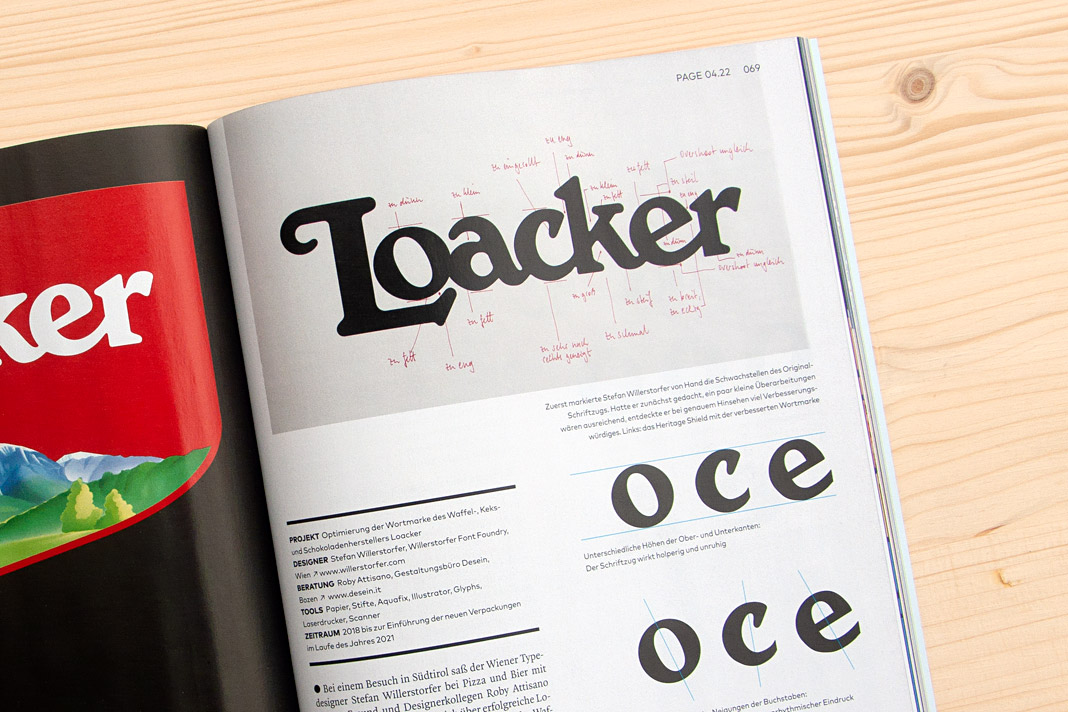 On top you can see written notes for all the corrections to be made to the old Loacker logotype.
The idea of redesigning the Loacker logotype lead to an interesting design process that I really enjoyed. The process was accompanied by Roby Attisano’s valuable feedback. Luckily the Loacker company was so convinced by the redesigned logotype that they decided to buy it and to apply it instead of the old one. We take the company’s decision as a strong compliment and honest praise. It encourages us in our way of paying attention to even small details and providing individual typographic solutions of highest quality.
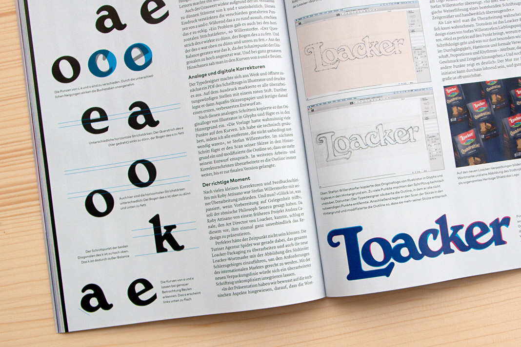 Various inconsistencies of the old logotype on the left. Stages of the design process on the right.
If you want to know more about the story (and are fluent in German) you can read the article in the current issue of Page (04/22). Enjoy the reading.
 The top of the right page shows Roby Attisano (left) and Stefan Willerstorfer in South Tyrol.
Sindelar is still in the News
Austrian magazine News switched to Sindelar as their primary text face five years ago. Since then Sindelar has been offering high legibility to the magazine’s readers and is continuing to do so.
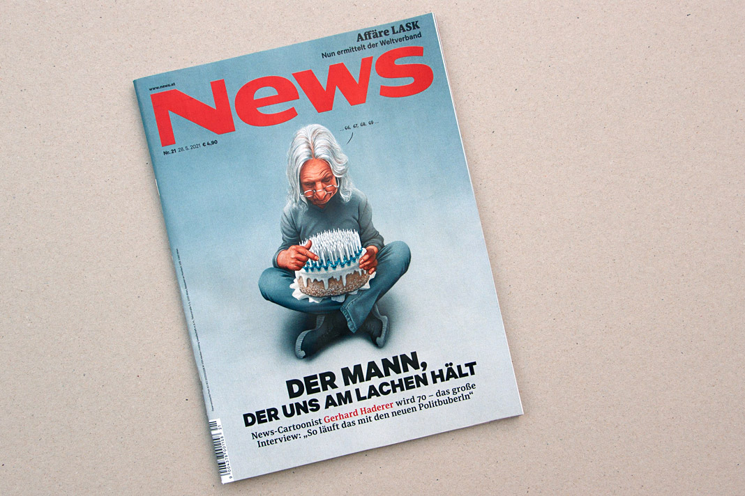 Cover of a recent issue of the magazine News.
News is one of Austria’s biggest weekly magazines and the major news magazine in the country. It has a circulation of about 160,000 copies and covers various topics such as politics, business, culture, and sports.
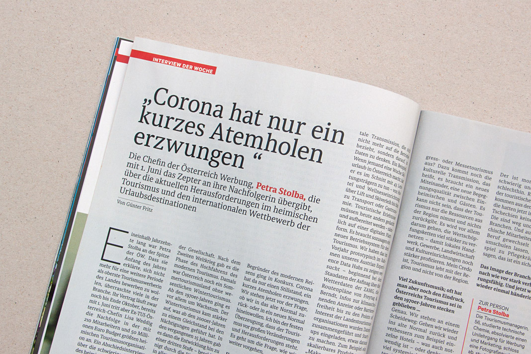
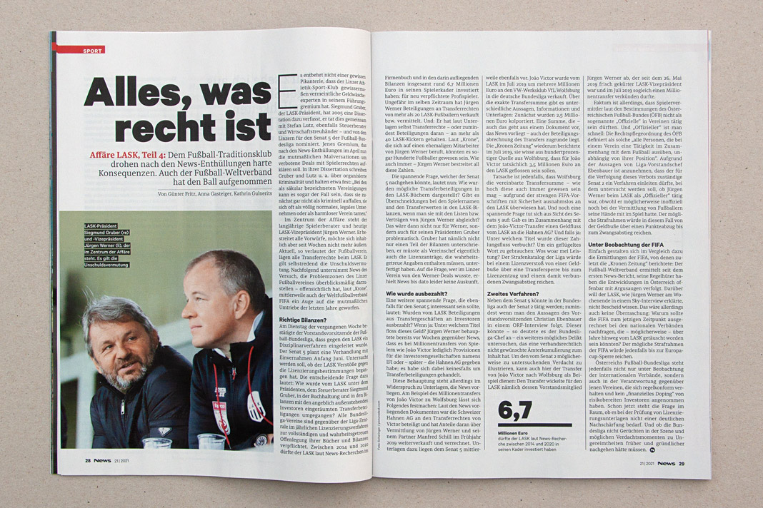
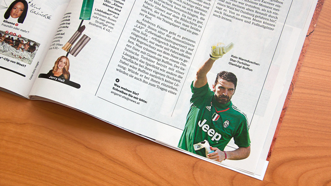
 Various impressions of a recent issue of the magazine, mainly set in Sindelar.
Muntermacher is entirely set in our type families
Muntermacher, that’s what the quarterly journal of the market town of Moosburg in Carinthia (Austria) is called. A Muntermacher is a person or substance that wakes you up. And yes, it does. Great to see a journal from a small market town offering information to its inhabitants in such visual quality.
The magazine was conceived by Austrian architect and journalist Wojciech Czaja and by Austrian graphic designer Helga Innerhofer. As a foundry we are especially proud of this feature: The journal is entirely set in our type families Acorde and Sindelar which complement each other perfectly well.
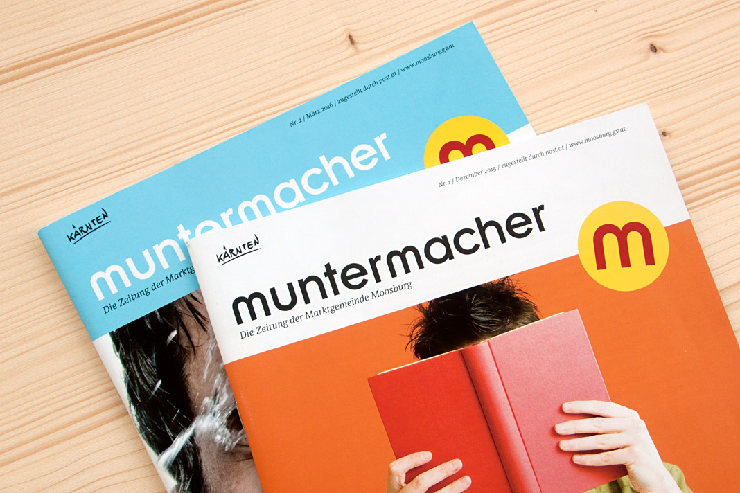 Two covers of the quarterly journal Muntermacher.
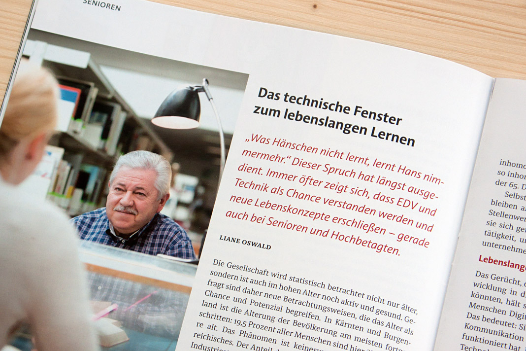
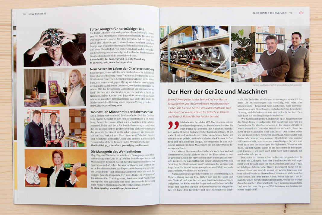
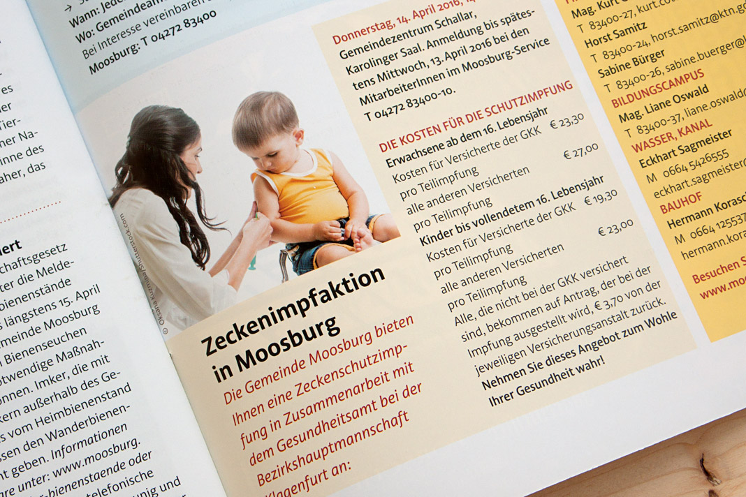
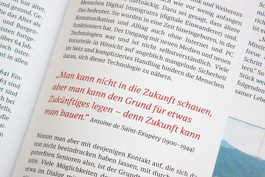
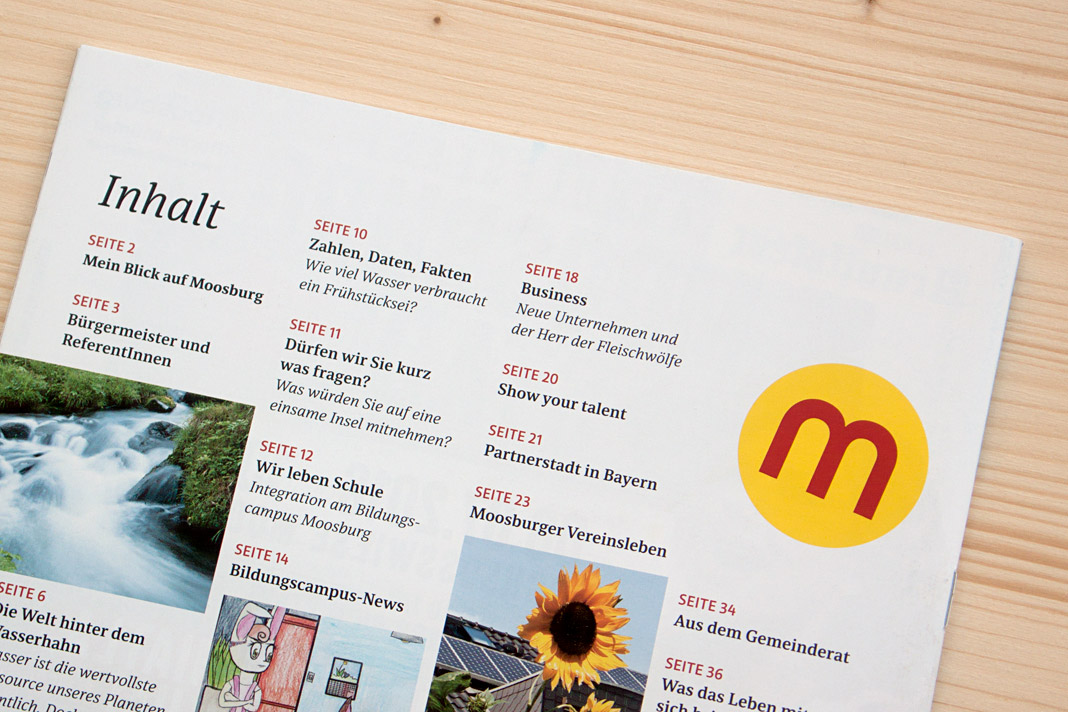 Various impressions of Muntermacher which perfectly show Acorde’s and Sindelar’s excellence.
Kulturgeschichten Wien relies on Sindelar
As Viennese as it gets: Kulturgeschichten Wien is a quarterly magazine about Vienna with a specific thematic focus in every issue. The magazine’s first issue is dedicated to former Austrian Emperor Franz Joseph I. whose death was commemorated for the 100th time in 2016.
The magazine is written, designed, typeset, and printed in Vienna. Even the main typeface is Viennese: The whole body text is typeset in Sindelar.
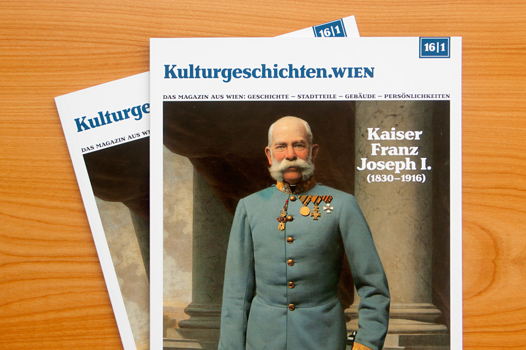 Cover of the first issue of Kulturgeschichten Wien.
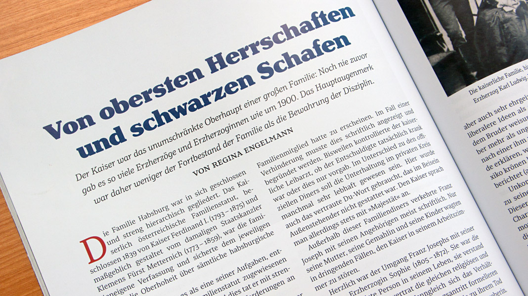
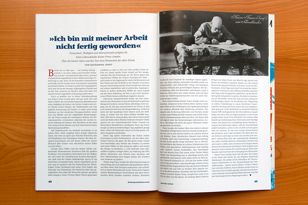
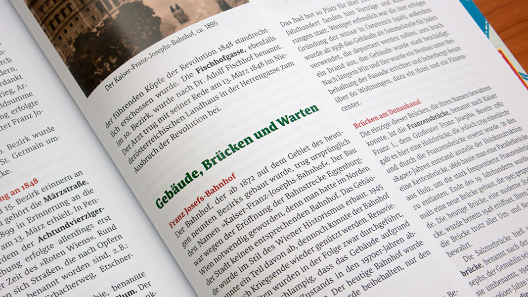
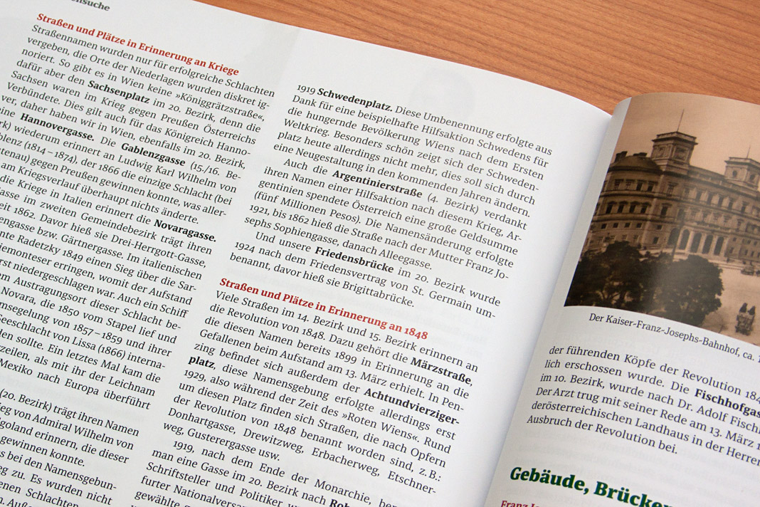
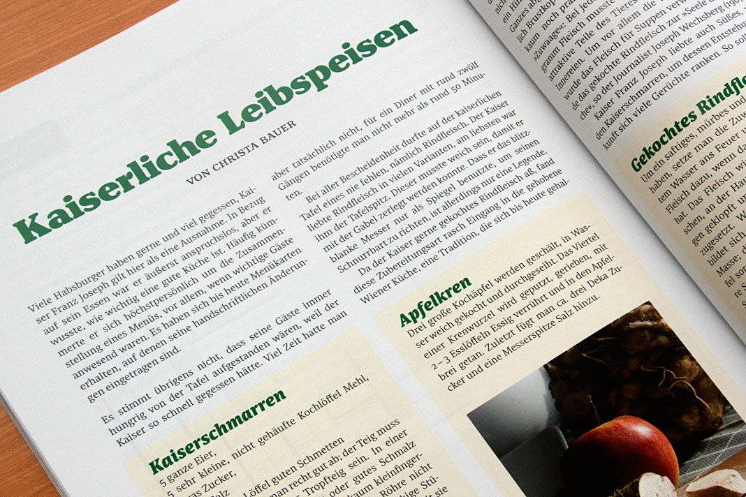 Various impressions of Kulturgeschichten Wien, designed by Gernot Winter.
Interview in Chinese design magazine Design 360°
Asia remains a great terrain for us, our typefaces and our expertise. Next to having two major newspaper clients in India (Mid-Day, Mumbai) and in the Philippines (Philippine Daily Inquirer) who use Sindelar as their text face on a daily basis in their print editions, strong interest in our work has also emerged in China.
We were approached by the concept and design magazine Design 360° based in Guangzhou, China, to express our views on quality, legibility, and proper use of western type families. Design 360° is a bi-monthly design magazine published by Sandu Publishing Co. Ltd. dedicated to international design concepts and featuring outstanding worldwide designers. Issue no. 64 is focused on western typeface design in order to live up to the emergent relevance of western typefaces and western typography in China.
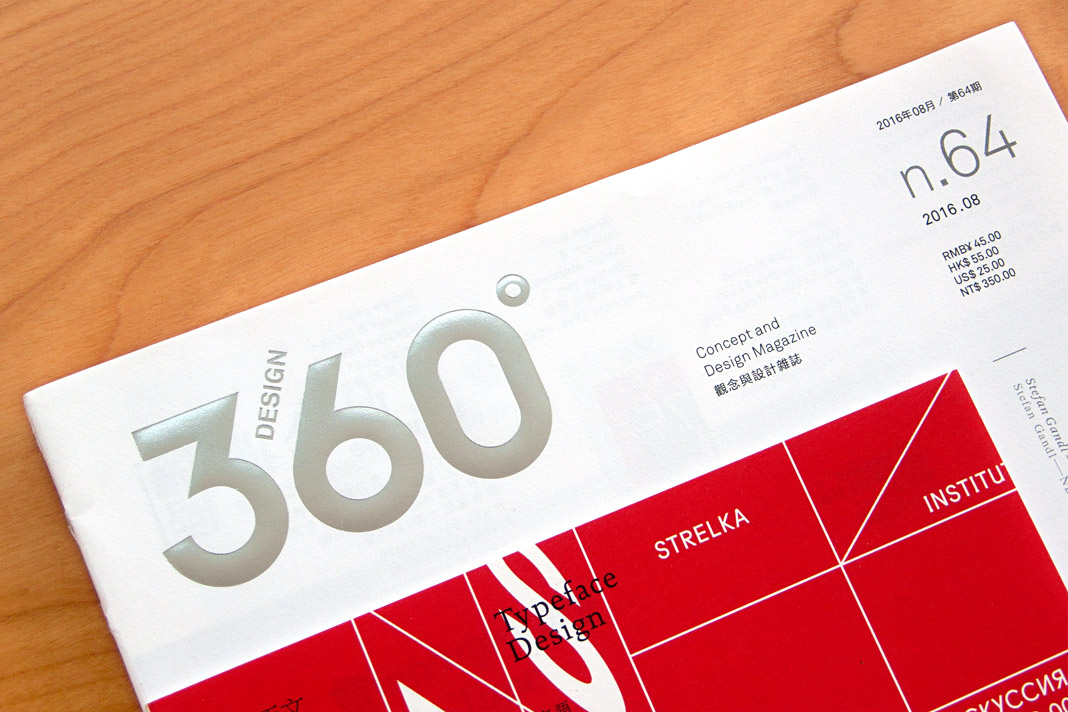 The cover of issue no. 64 of Design 360° focusing on western type design.
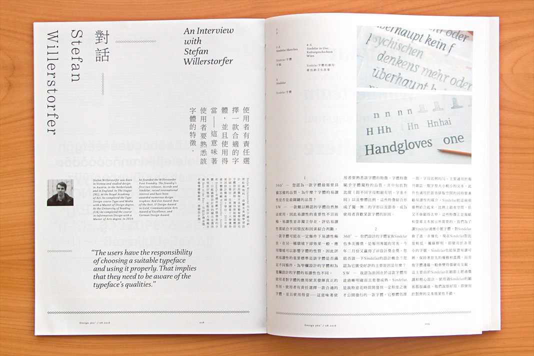
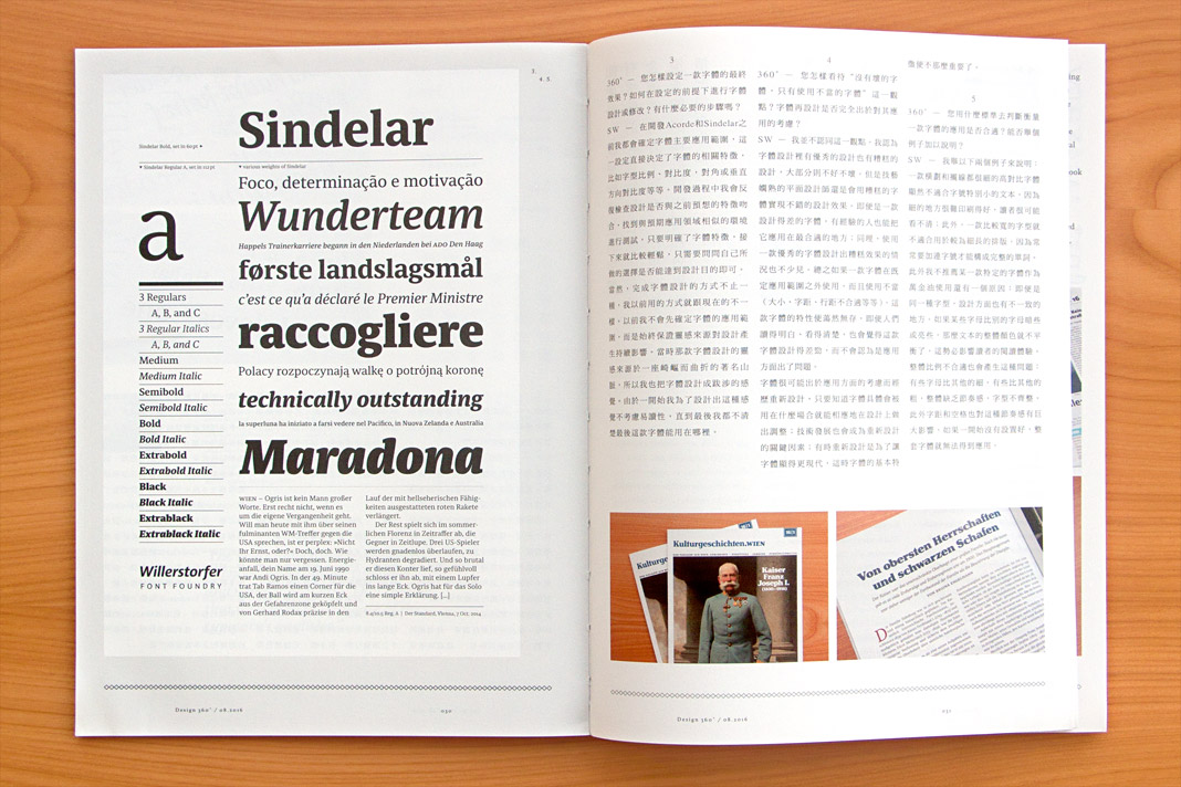 The interview is published bilingually in Chinese and English.
It was a pleasure and a great honour for me to be one of only four western type designers who was asked to talk about their work and their opinions in order to contribute to the knowledge and understanding of western type design among Chinese graphic designers.
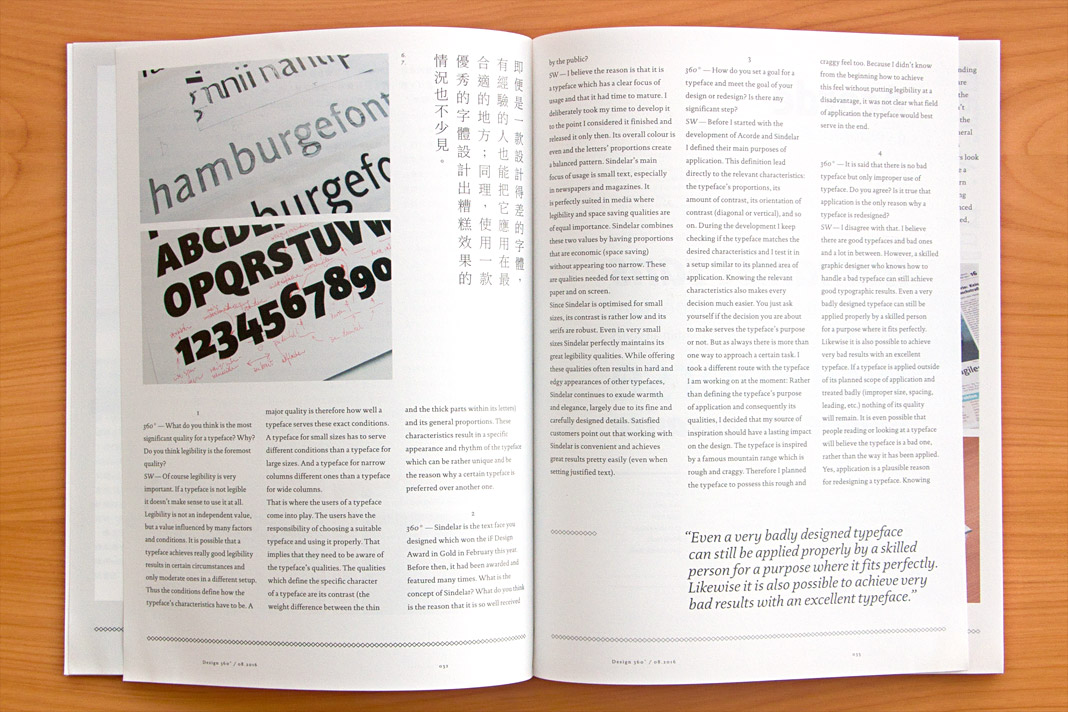
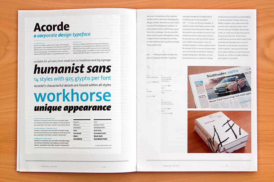 Various impressions of the interview in the concept and design magazine Design 360°.
Magazine News switched to Sindelar as their text face
Now that’s great news: Austrian magazine News switched to Sindelar as their primary text face. Good choice!
News is one of Austria’s biggest weekly magazines and the major news magazine in the country. It has a circulation of about 160,000 copies and covers various topics such as politics, business, culture, and sports.
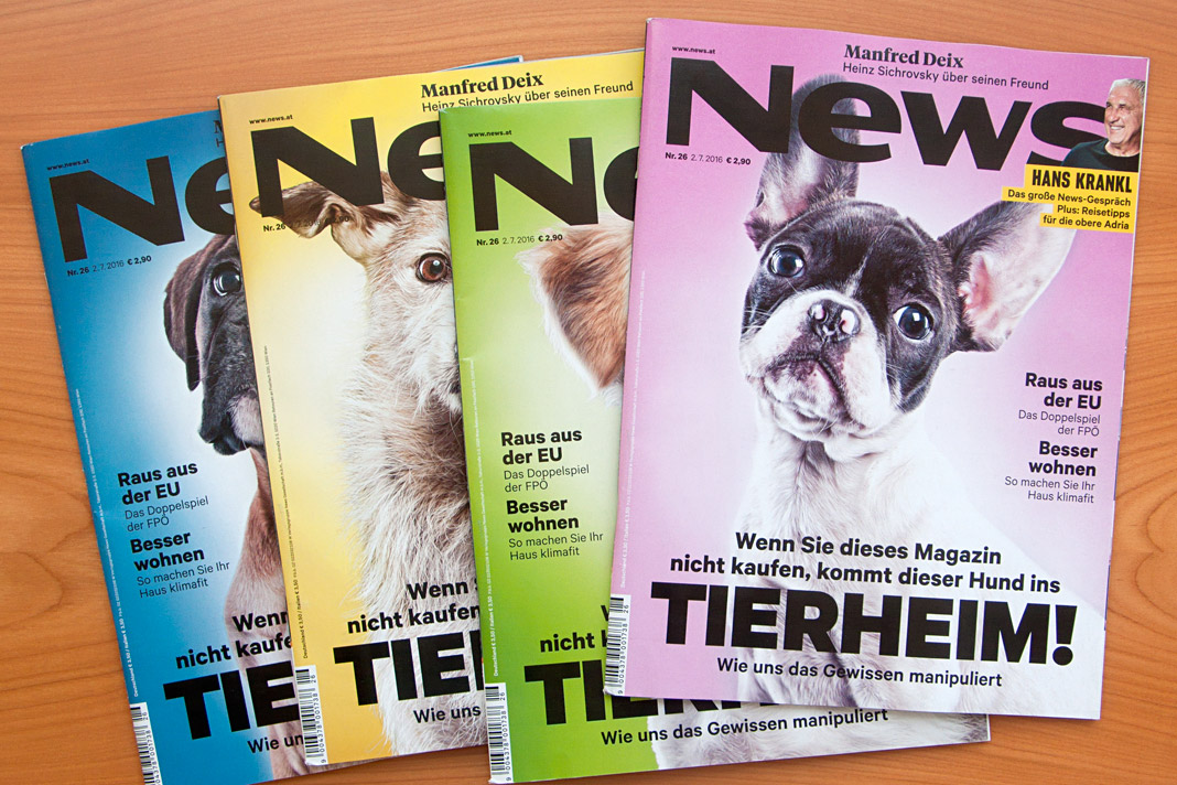
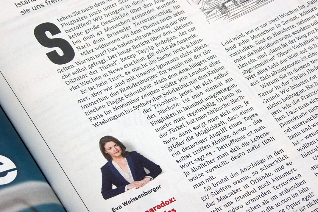
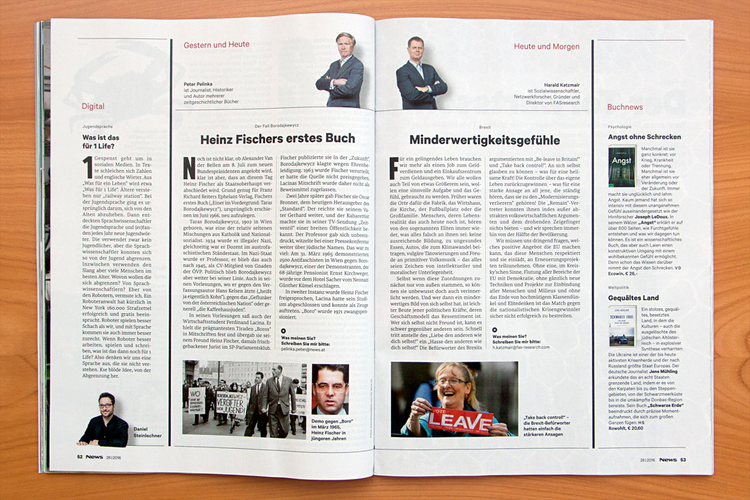
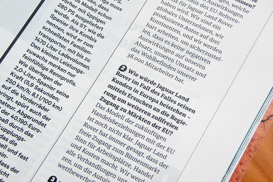
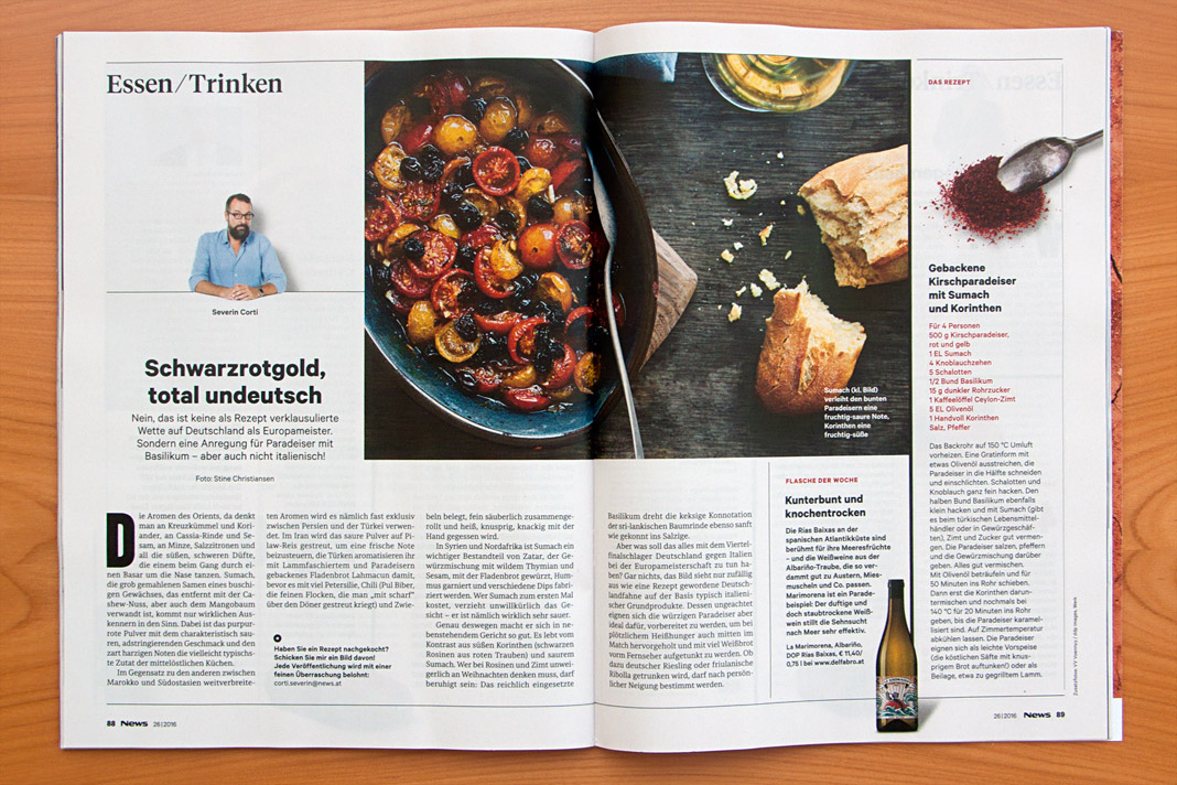
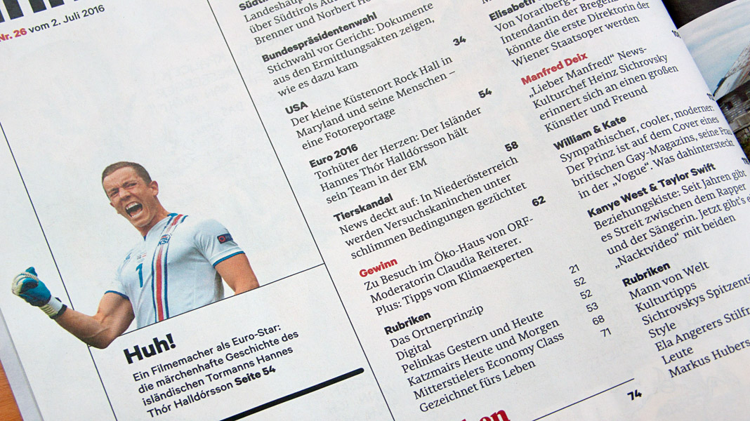
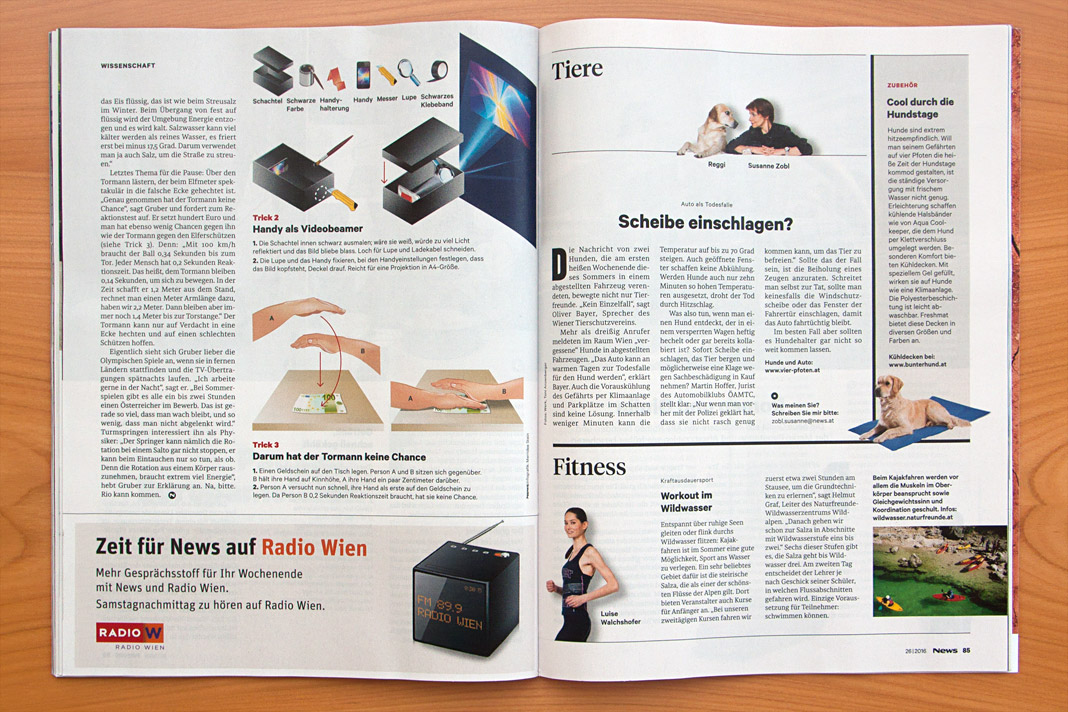
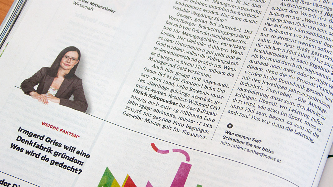
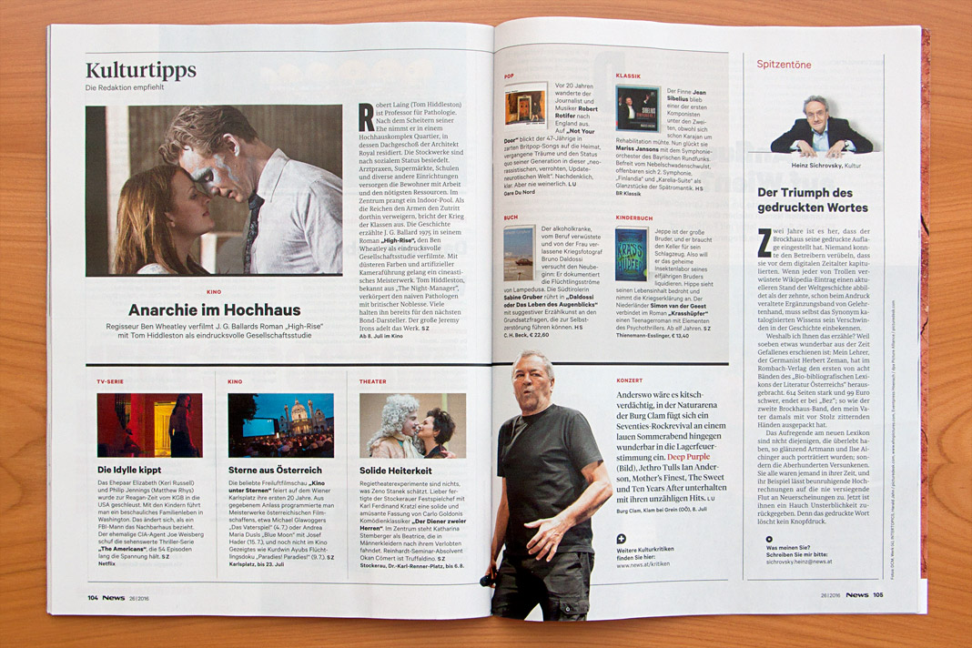
 Convince yourself of Sindelar’s qualities by having a look at News’ double page spreads.