Blog – Entries tagged as Acorde
Happy birthday, Acorde!
Happy birthday, Acorde! And it’s a significant one indeed. Ten years are really something to celebrate. Acorde has been delighting designers and readers around the globe for a decade now and will continue to do so.

In the past ten years we’ve had customers from six different continents. So there is only one continent missing. As you may have guessed, it’s Antarctica. But who knows, maybe that will change within the next decade. We are confidently looking forward to it!
The new Yearbook of Type features White, Black. Gray!
I am happy to see my article, White, Black. Gray! – Why Sketching Matters, published in the new Yearbook of Type (#4 2019/20). It is part of a comprehensive series of instructive articles focused on various aspects of type design. My article appears at the beginning of the book in order to reflect that sketching happens at the beginning of the design process, and provides the basis for a typeface’s development.
 Cover of the Yearbook of Type 2019/20, published by Slanted Publishers.

The Yearbook of Type is a practical guide that helps typeface users stay up to date with the latest type design trends and innovations. It showcases detailed presentations of more than 150 type families from around the globe. Highly recommended!
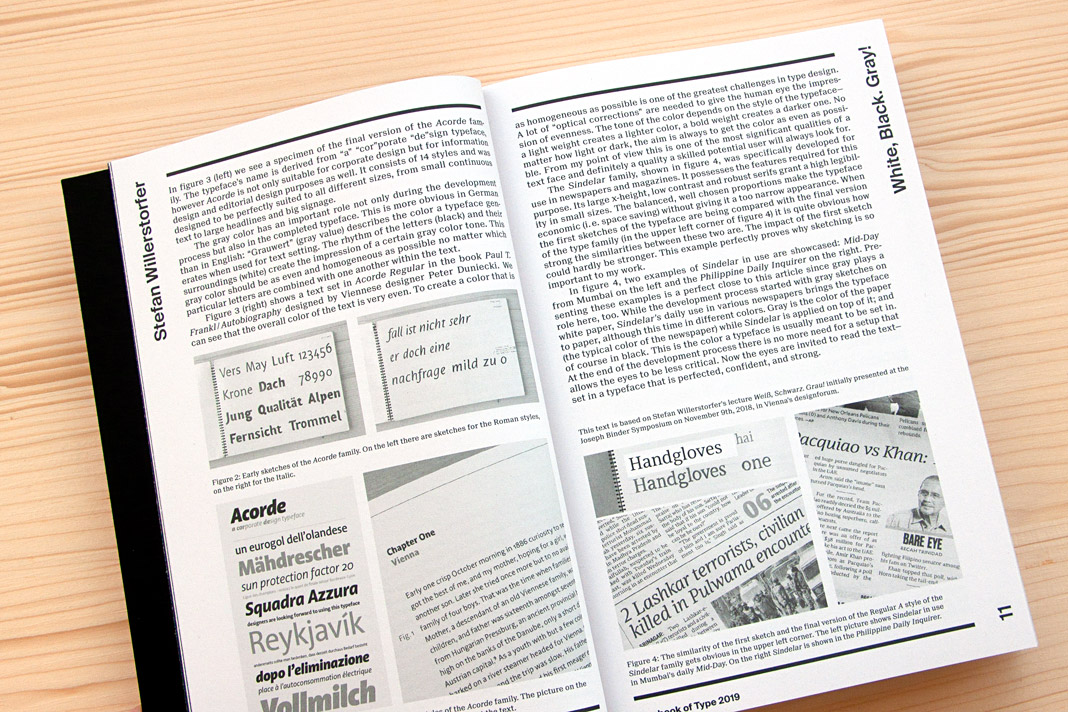 Double page spread presenting the article White, Black. Gray! – Why Sketching Matters.
Gerhard Hanappi book set in Sindelar and Acorde
Now that’s a project we are really happy about. The book about famous Austrian football (soccer) player and architect Gerhard Hanappi is entirely set in Sindelar and Acorde. The book was designed by Austrian designer Peter Duniecki and published by the Swiss publishing house Park Books.
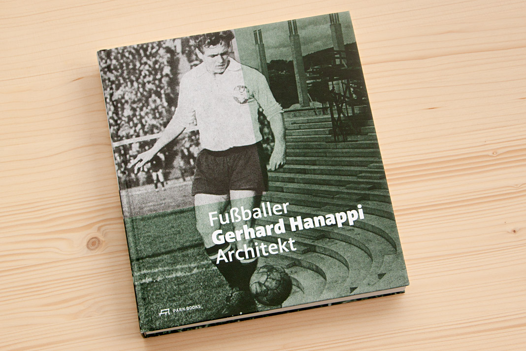 Cover of Fußballer Gerhard Hanappi Architekt, set in Acorde.
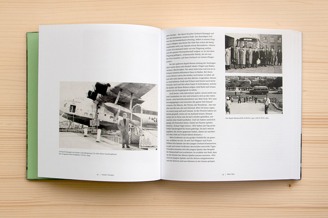
Why are we so happy about it? First, the book is really well designed, and second, we love football. As you may know, the type family Sindelar is named after famous Austrian football player Matthias Sindelar. Interestingly Sindelar and Hanappi played at the two rivalling Viennese Clubs Austria Wien and Rapid Wien (not at the same time though). The book achieves something that is not very likely in real life: One player of Austria Wien supports a project by a player of Rapid Wien. The result of this collaboration is really convincing. Just have a look yourself!
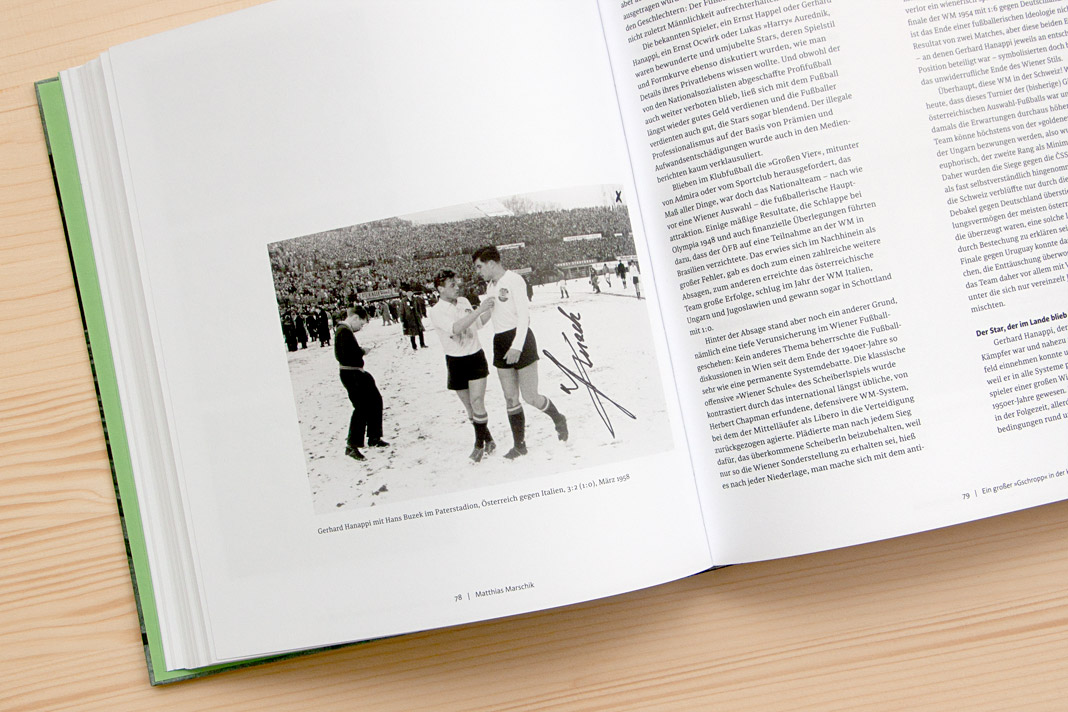
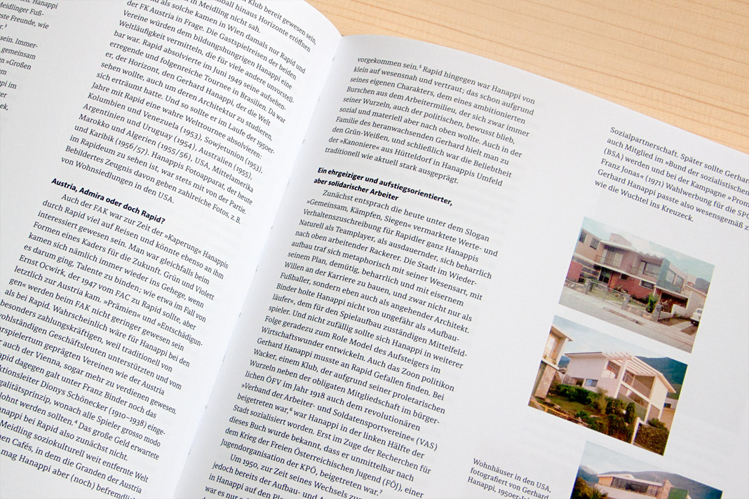
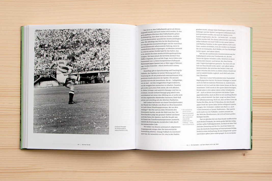
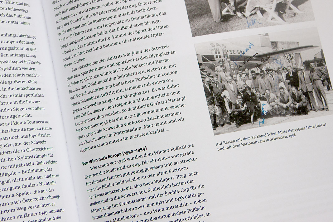
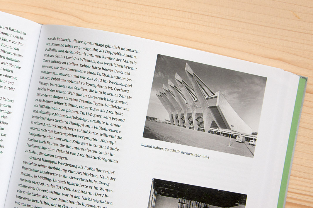 Various impressions of Fußballer Gerhard Hanappi Architekt, entirely set in Sindelar and Acorde.
Puzzling poster for die Graphische features Acorde
As you might know, Acorde was designed to be perfectly suited to all different sizes, from small continuous text to large headlines and big signage. Therefore its large application on this poster is a great example of Acorde’s display qualities. The poster is an advertisement for the renowned graphic design school, die Graphische, in Vienna.
At first sight the poster appears puzzling and you can only read Kryptisch? (Cryptic?) and Dann komm auf die Graphische! (Walk to/join the Graphische!). When you walk a few steps further towards the school (located opposite the poster) and look at the advertisement through a red glass you can suddenly read: Wir haben den Durchblick in der Gestaltung! (We have a clear view on design./We know about design.) The poster was designed by Lydia Körner. Great idea, Lydia!
 At first sight the poster appears puzzling.
 When you look at the advertisement through a red glass you can suddenly read more text.
 Acorde’s large application on this poster is a great example of its display qualities.
Speaking at this year’s Joseph Binder Symposium in Vienna
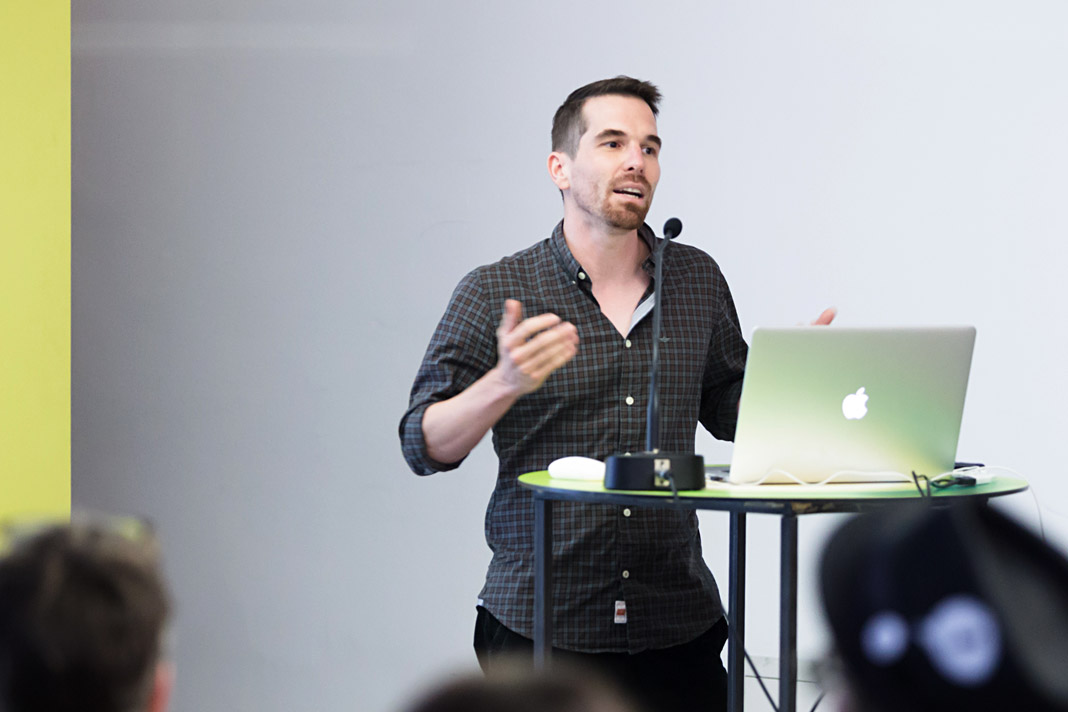
I was invited to speak at this year’s Joseph Binder Symposium which took place two weeks ago in Vienna’s Designforum. There were twelve talks by designers and illustrators in total. All of these talks focused on the value of the sketch during the development process.
The programme was diverse and very interesting and I personally enjoyed the pleasant atmosphere. My lecture was entitled Weiß, Schwarz. Grau! (White, Black. Grey!) and I emphasized the value sketches play in the development of a typeface. It was a great experience to participate in the symposium as a speaker and also as a listener.
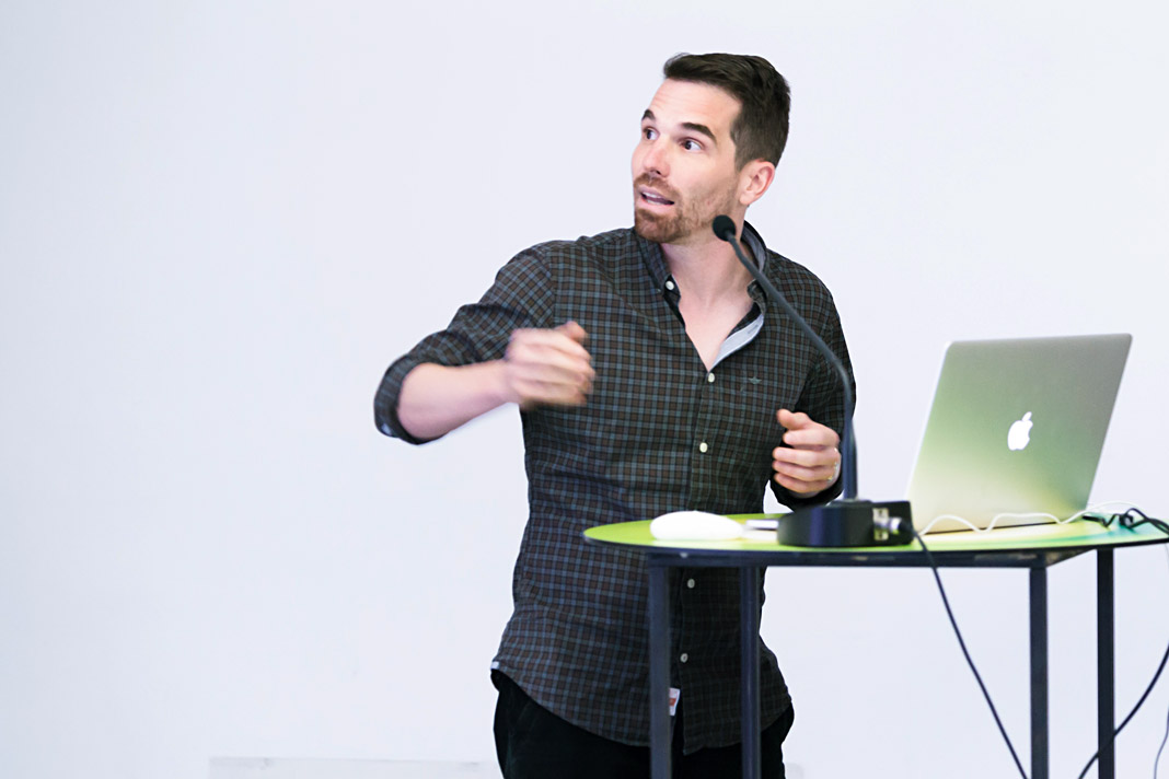 Stefan Willerstorfer emphasized the value of sketching in type design.
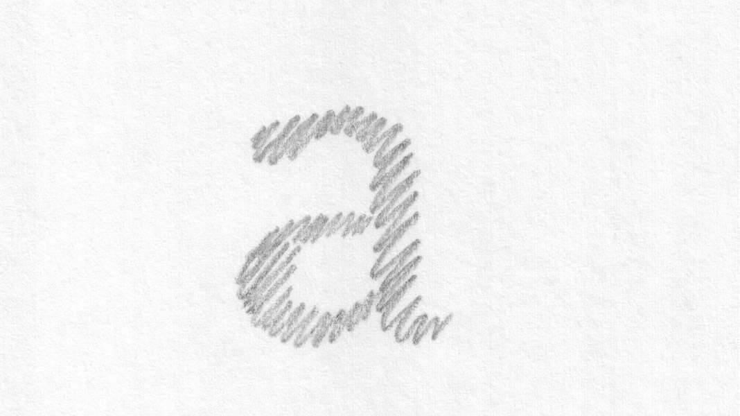 This slide shows an early sketch of the letter a of the Sindelar family.
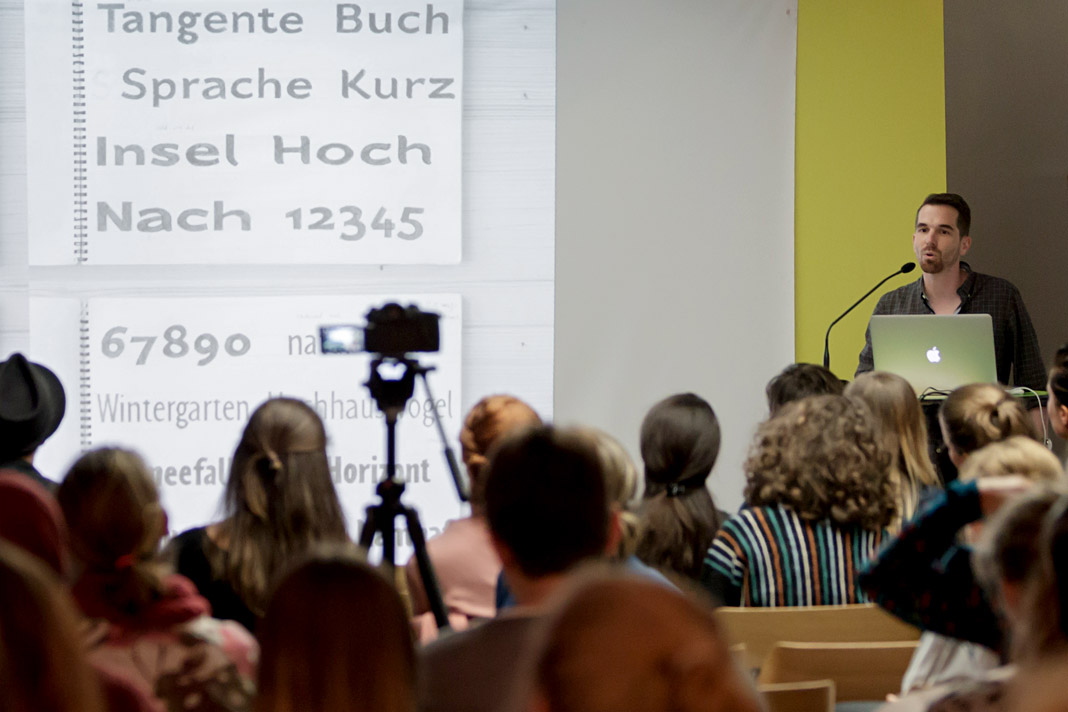
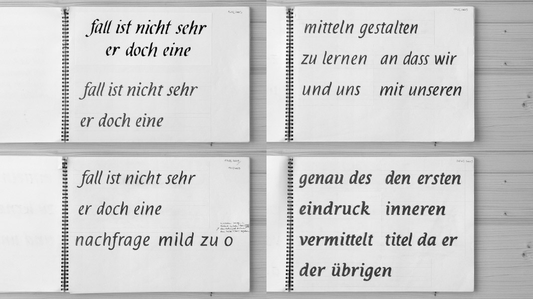 This slide shows various sketches for the Italic styles of the Acorde family.
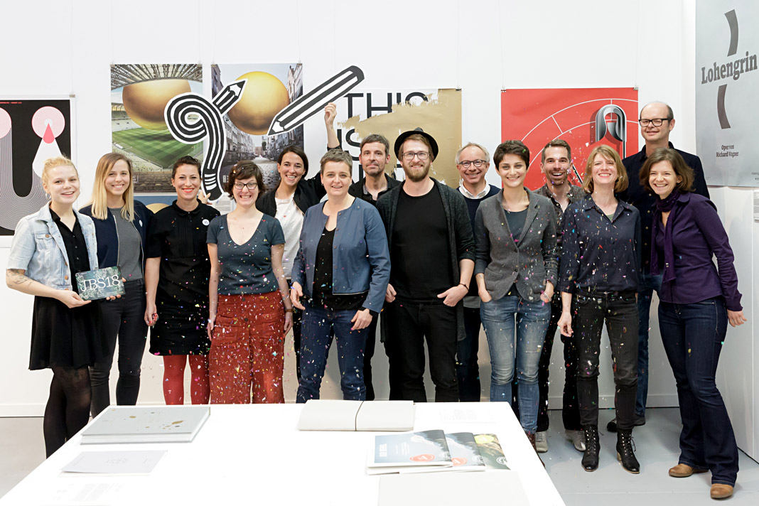 The speakers of this year’s Joseph Binder Symposium in Vienna.
Muntermacher is entirely set in our type families
Muntermacher, that’s what the quarterly journal of the market town of Moosburg in Carinthia (Austria) is called. A Muntermacher is a person or substance that wakes you up. And yes, it does. Great to see a journal from a small market town offering information to its inhabitants in such visual quality.
The magazine was conceived by Austrian architect and journalist Wojciech Czaja and by Austrian graphic designer Helga Innerhofer. As a foundry we are especially proud of this feature: The journal is entirely set in our type families Acorde and Sindelar which complement each other perfectly well.
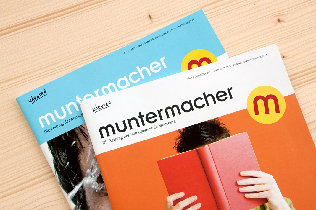 Two covers of the quarterly journal Muntermacher.
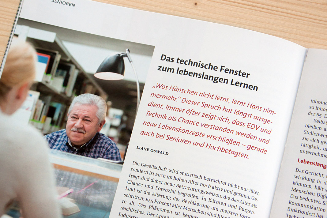
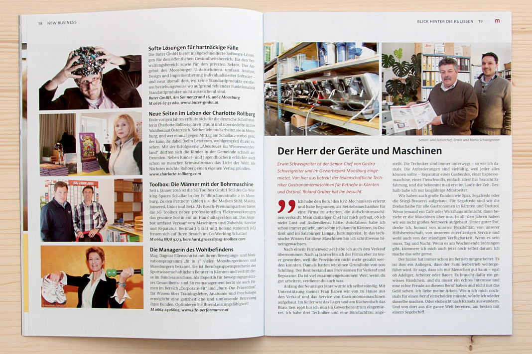
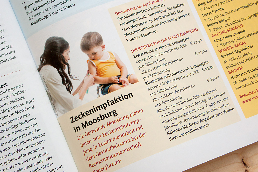
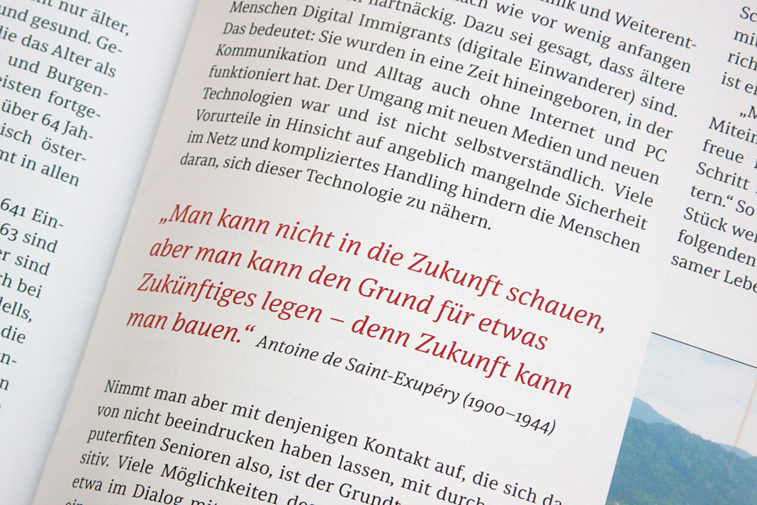
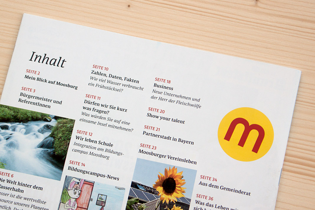 Various impressions of Muntermacher which perfectly show Acorde’s and Sindelar’s excellence.