Blog – Entries tagged as Review
Florian Hardwig reviews Acorde on MyFonts.de
MyFonts.de, the German branch of MyFonts.com, contains a gallery called Fontschau (Font Show), a place for exhibiting and reviewing outstanding typefaces. In his most recent review Florian Hardwig takes a close look at the type family Acorde.
Hardwig describes Acorde’s qualities, its range of applications and compares it with other sans serif typefaces. You can read Hardwig’s review in full length on MyFonts.de. Unfortunately the article is available in German only.

Design Journal and Rolf Rehe recommend Acorde
The Design Journal is a bi-annual magazine covering the issues of news design and journalism. It is published by the Society for News Design (SND), an international organisation for news media professionals and visual communicators. SND was founded in 1979 and has about 1000 members worldwide.
In each issue the international newspaper designer Rolf Rehe recommends three typefaces which are appropriate for application in newspaper design. To give the Design Journal’s readers the possibility of judging the qualities of the typefaces themselves, the whole magazine is set in the recommended typefaces.
In the current issue (No. 112) Acorde is used as a secondary typeface for text as well as for headlines and gives proof of its wide applicability in various sizes. »It combines cool, geometric letter elements with the warmth of humanist sans forms. This results in a friendly yet assertive appearance«, states Rolf Rehe.
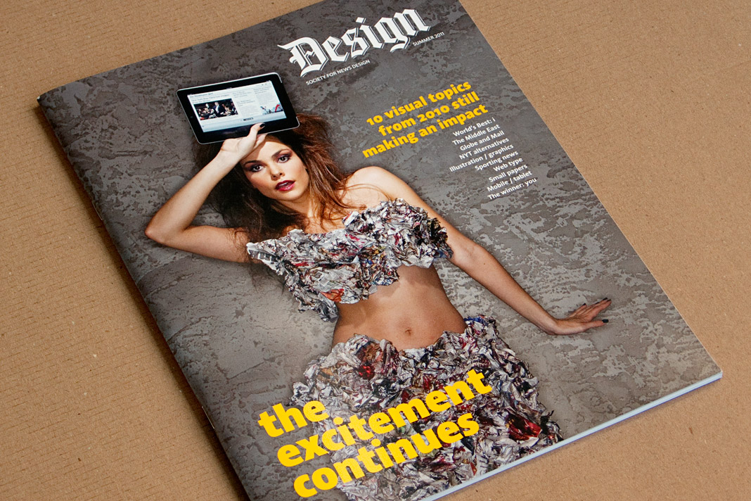 Cover of the summer issue of SND’s Design Journal entirely set in Acorde.
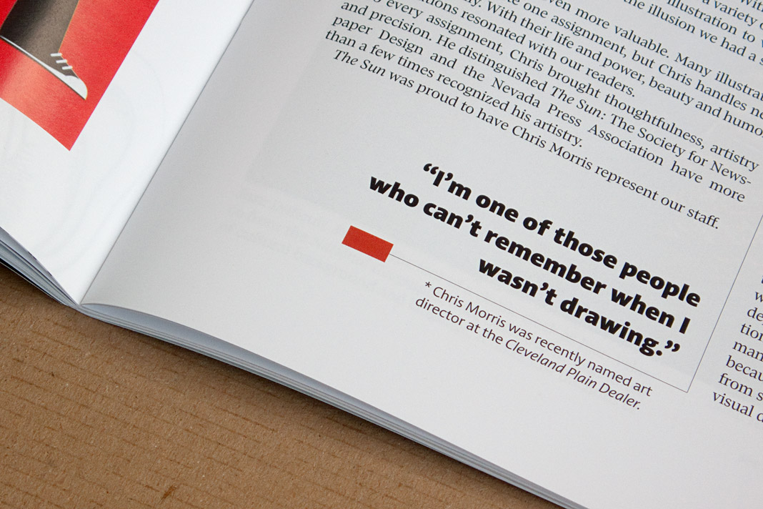
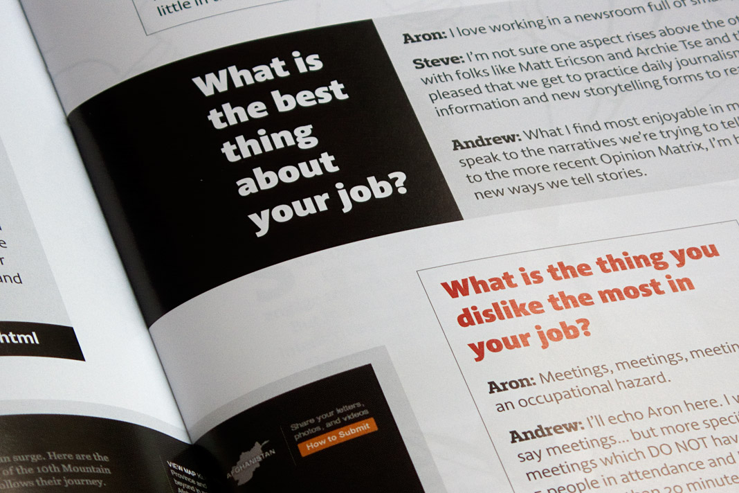
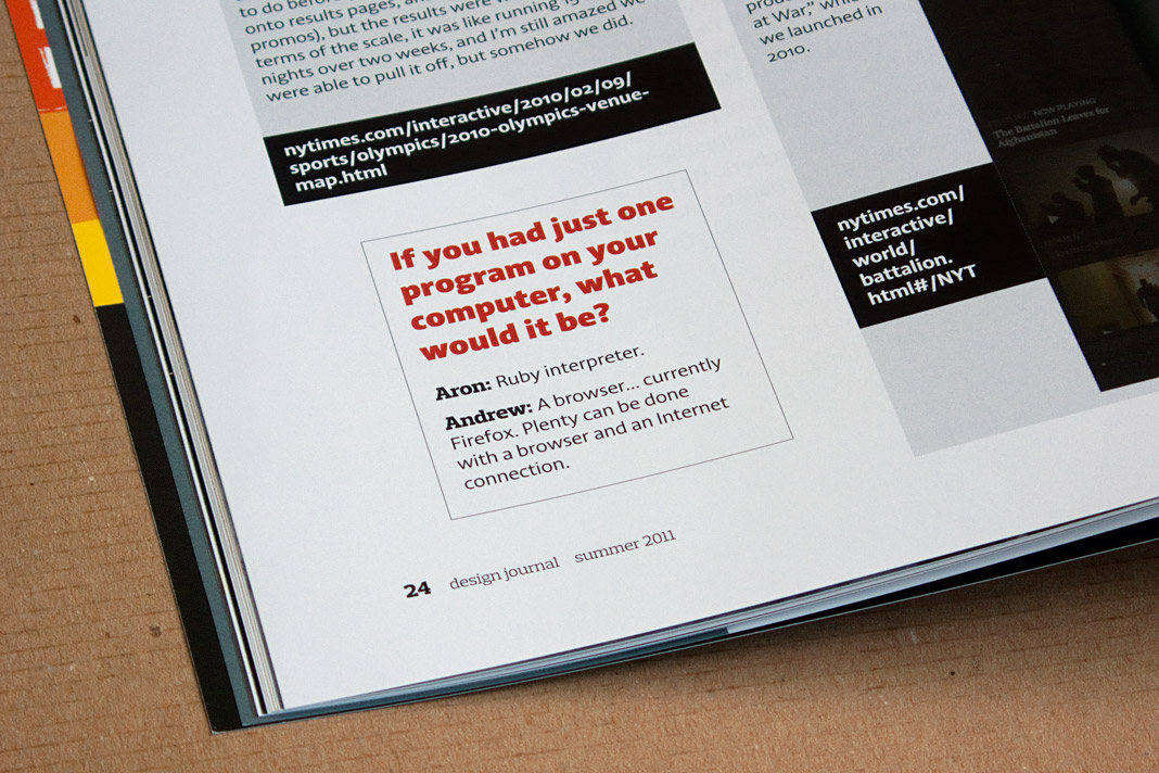
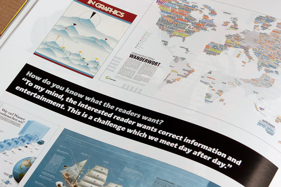
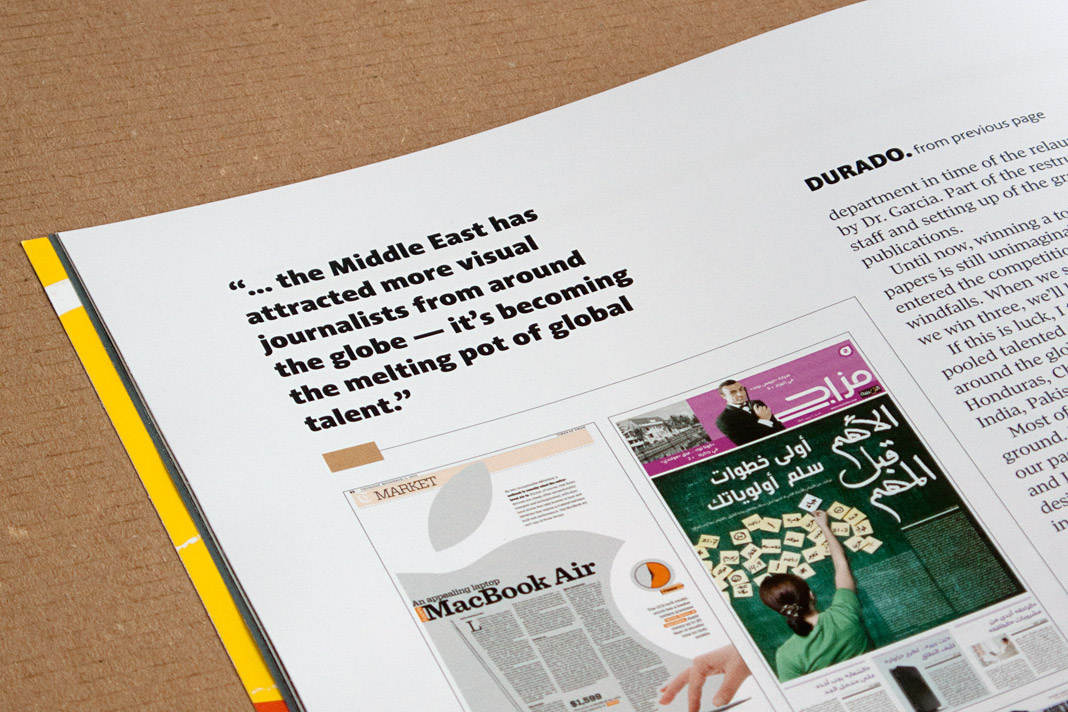
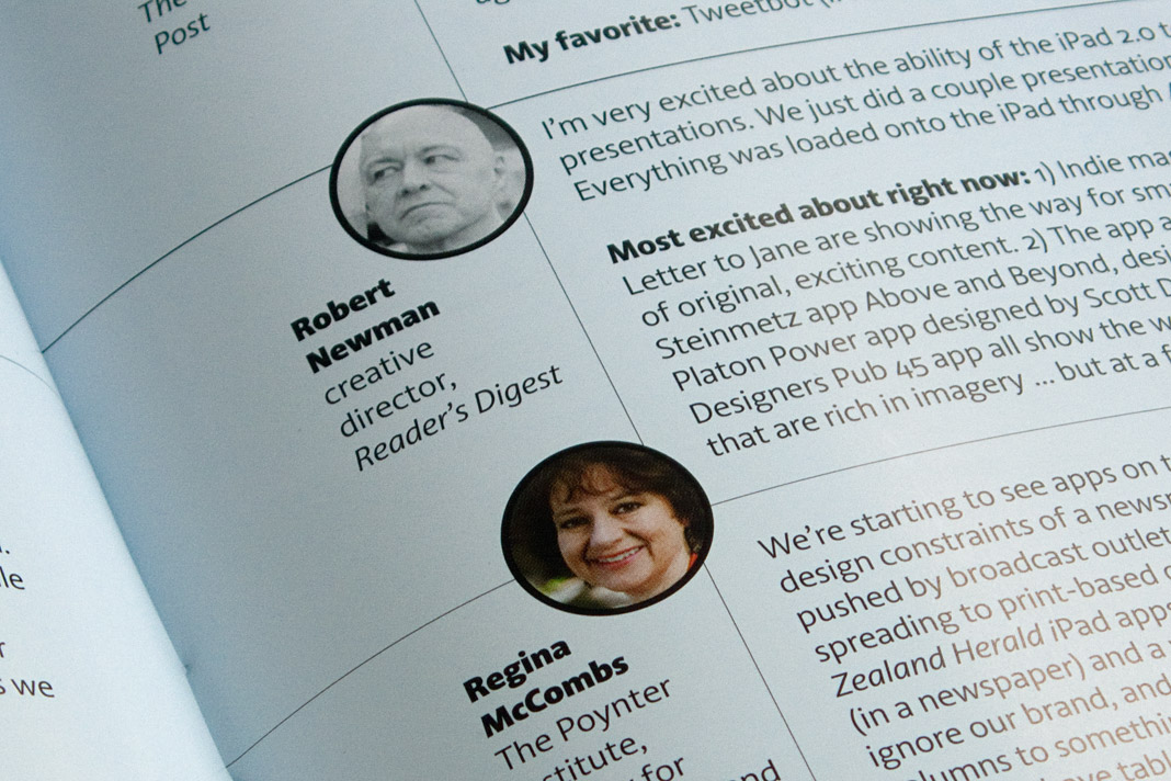
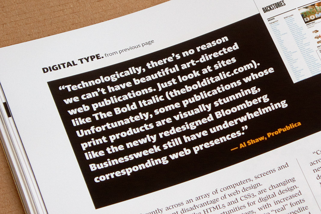
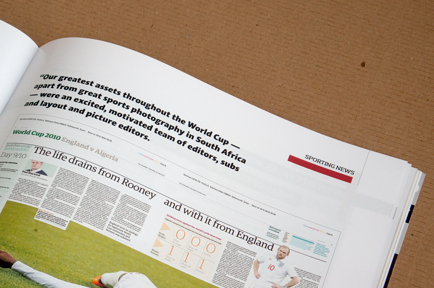 Various impressions of SND’s Design Journal using Acorde.
Austrian publishing magazine Periodicum presents Acorde
Vielgesichtiges Schriftbild (multifaceted type) is the title of Christian Gutschi’s article on the type family Acorde in the current issue of Periodicum (No. 2/2010), the bi-annual magazine by the corporate publishing company Egger & Lerch.
Gutschi emphasises Acorde’s workhorse qualities and its applicability for various applications, conditions and sizes as the article’s title already suggests. The article also gives information on the development process of the typeface and comments on various characteristics of Acorde.
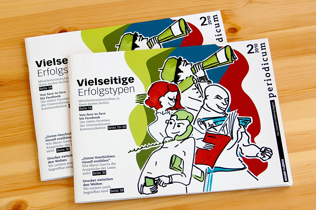 Cover of the publishing magazine Periodicum issue No. 2/2010.
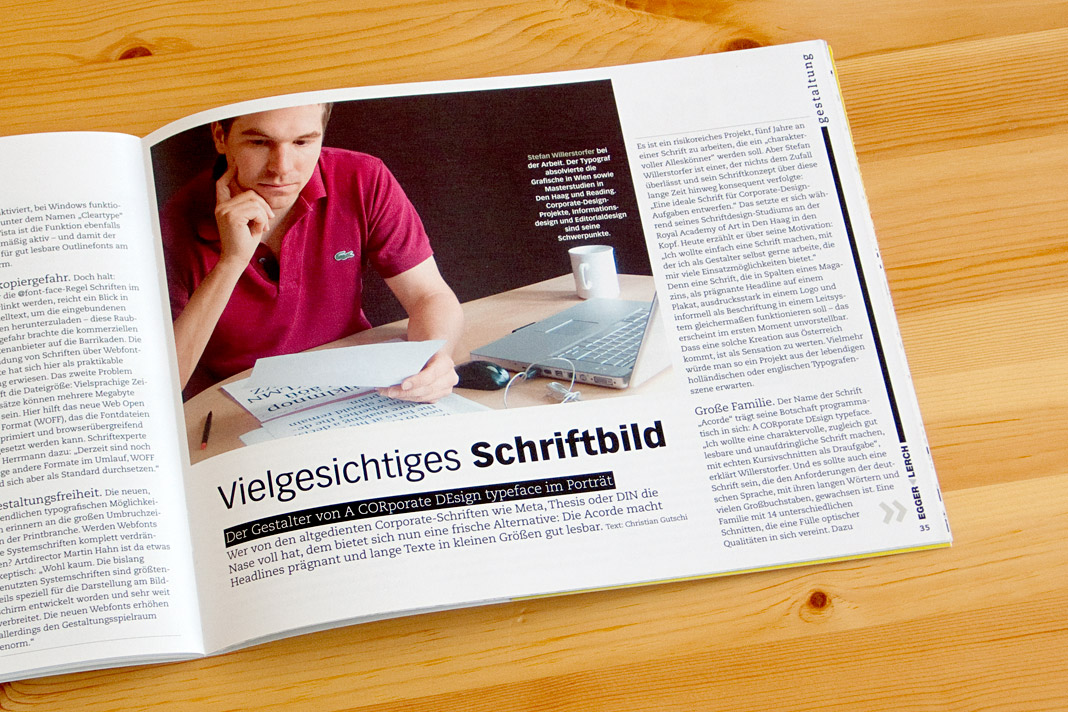
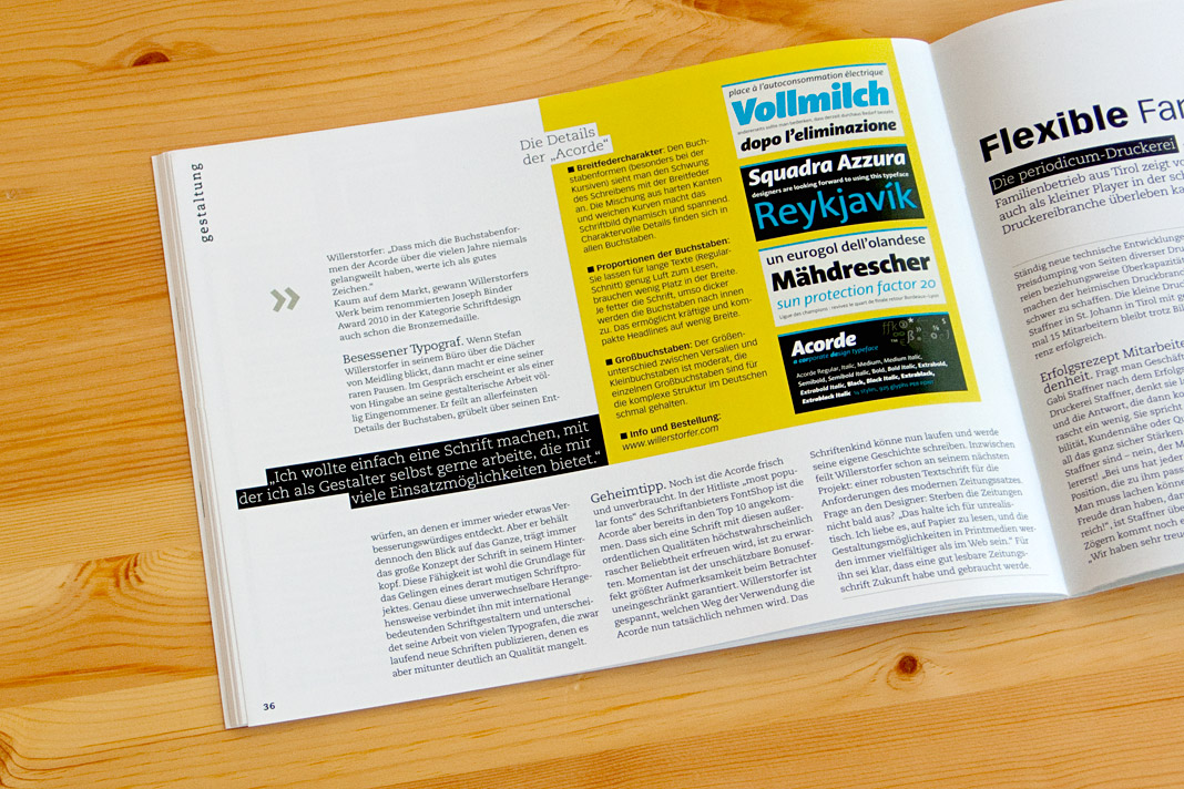 Pages showing the article inside the magazine.
Media journal Graphische Revue presents Acorde
Graphische Revue is an Austrian media and design journal that has been published for more than one hundred years. In the current issue (No. 5/2010) Christian Gutschi introduces the type family Acorde and explains some of its characteristics in his article Acorde: charaktervoller Alleskönner (Acorde: characterful all-rounder).
Further he suggests some potential applicabilities and gives an insight on the values that were important to me as a designer during the development of Acorde. The whole article is set in Acorde which gives the readers an impression of how the type family works in text and in larger sizes.
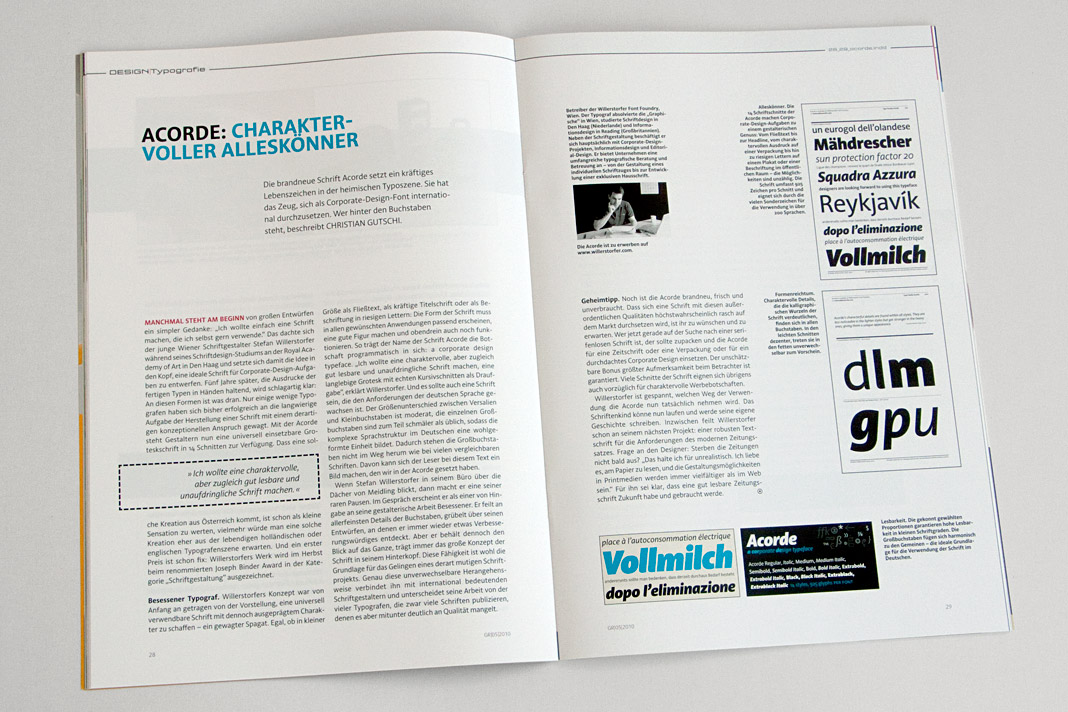 Double page spread of the design journal showing the article about (and set in) Acorde.
4c magazine introduces Acorde as headline typeface
The Austrian printing and design magazine 4c has started using the type family Acorde for headlines in its current issue (No. 6/2010). Acorde’s well-balanced proportions and its harmonious interplay with the magazine’s text face Premiéra make it a perfect choice for this purpose.
In the current issue Rainer Scheichelbauer introduces Acorde to the magazine’s readers. Furthermore he gives a brief overview of my biography and my career as a type designer.
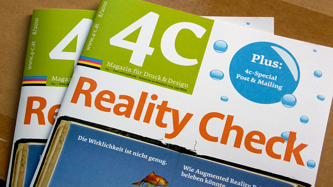 Cover of the printing and design magazine 4c using Acorde.
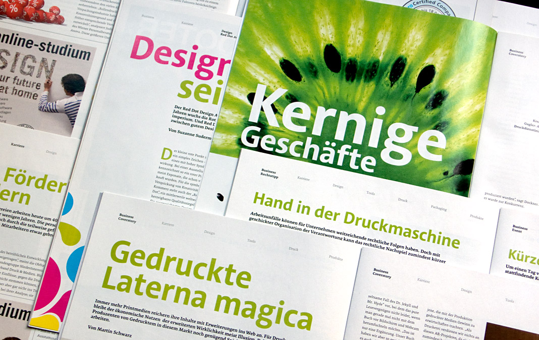 Various double page spreads of 4c using Acorde as headline typeface.