Blog – Entries tagged as United States
The Philippine Daily Inquirer’s new text face: Sindelar
Great news from Asia: The Philippine Daily Inquirer started using Sindelar as their new text face yesterday. The introduction of Sindelar was part of a comprehensive redesign of the newspaper done by the world-renowned media consulting firm García Media.
The Philippine Daily Inquirer is the most widely read broadsheet newspaper in the Philippines with a daily circulation of 260,000 copies. Here at the studio we can’t wait to receive one of these copies and get a closer look at the great role Sindelar plays in the new design.
 Front page of the first issue of the redesigned Philippine Daily Inquirer.
Sindelar wins Communication Arts Award of Excellence
In case you have not seen it yet: That’s what Sindelar looks like in the Communication Arts Typography Annual 6. Sindelar is presented as a winner of Communication Arts’ Typography Competition 2016. Not only on the double page spread but even on the annual’s cover representing T, Y, A, N, and L.

 Various impressions of the Communication Arts Typography Annual 6.
Typography Referenced refers to Acorde
The book Typography Referenced is a comprehensive visual guide to the language, history and practice of typography. It is co-authored by Allan Haley, Richard Poulin, Jason Tselentis, Tony Seddon, Gerry Leonidas, Ina Saltz, Kathryn Henderson, and Tyler Alterman and published by Rockport Publishers, a member of the Quarto Group.
One chapter of the book presents the work of a selected group of influential type designers of the twenty-first century. It is an honour that my work is included in the book and that Acorde is shown in great detail.
 The cover of the new and informative book Typography Referenced.
Design Journal and Rolf Rehe recommend Acorde
The Design Journal is a bi-annual magazine covering the issues of news design and journalism. It is published by the Society for News Design (SND), an international organisation for news media professionals and visual communicators. SND was founded in 1979 and has about 1000 members worldwide.
In each issue the international newspaper designer Rolf Rehe recommends three typefaces which are appropriate for application in newspaper design. To give the Design Journal’s readers the possibility of judging the qualities of the typefaces themselves, the whole magazine is set in the recommended typefaces.
In the current issue (No. 112) Acorde is used as a secondary typeface for text as well as for headlines and gives proof of its wide applicability in various sizes. »It combines cool, geometric letter elements with the warmth of humanist sans forms. This results in a friendly yet assertive appearance«, states Rolf Rehe.
 Cover of the summer issue of SND’s Design Journal entirely set in Acorde.


 Various impressions of SND’s Design Journal using Acorde.
Acorde wins Communication Arts Award of Excellence
Communication Arts has been publishing annuals showing the best in visual communications from around the world since 1959. But still 2011 marks a change. It is the first time – and certainly the beginning of a long tradition – of publishing a distinct annual specifically focused on typography.
The Communication Arts Typography Annual 1 presents the best work in various typographic categories such as books, periodicals, identity, packaging, and typeface design. It is a brilliant achievement that Acorde was among the first typefaces receiving the Communication Arts Award of Excellence in this category.
 The first Communication Arts Typography Annual.
Acorde is shown at TypeCon 2010 in Los Angeles
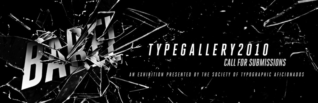
TypeCon is an annual type design conference in the United States presented by the Society of Typographic Aficionados (SOTA) since 1998. This year’s conference is entitled Babel and is held in Los Angeles from August 17 to August 22.
Part of the conference is an exhibition called TypeGallery which showcases a wide selection of new type designs. One of the designs in this year’s exhibition is the type family Acorde.