Blog – Entries tagged as Germany
Loacker redesign featured in German design magazine Page
Have you already had a look at the current issue (04/22) of Page, Germany’s most popular design magazine? Yes, you might have guessed, it contains an article we are really happy about.
 Cover of the current issue (04/22) of Germany’s popular design magazine Page.
The four-page article Detailversessen (detail-obsessed) showcases our redesign of the famous Loacker brand in great detail. As you might know, Loacker is an Italian company based in South Tyrol, producing tasty wafers and chocolate products.
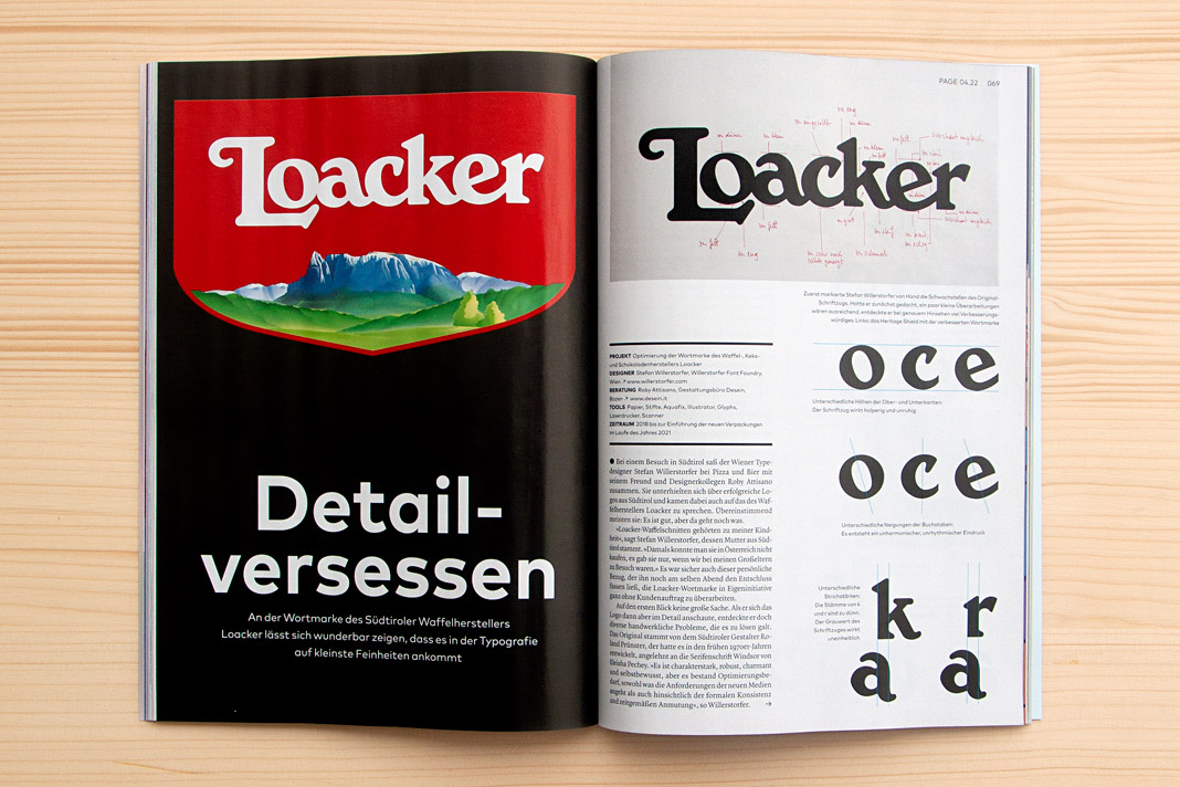 Double page spread showing the new Loacker logotype on the left and the old one on the right.
Interestingly the Loacker redesign did not begin like an ordinary project. There was no order at the beginning of the project. Just an idea – an idea that followed a vivid discussion between two designers while enjoying pizza and beer. Talk about characterful Italian (South Tyrolean) logotypes. At some point we (Roby Attisano and I) agreed that the logotype of Loacker was good but it could get even better. And then I spontaneously decided to do it, to proactively redesign the logotype without an order.
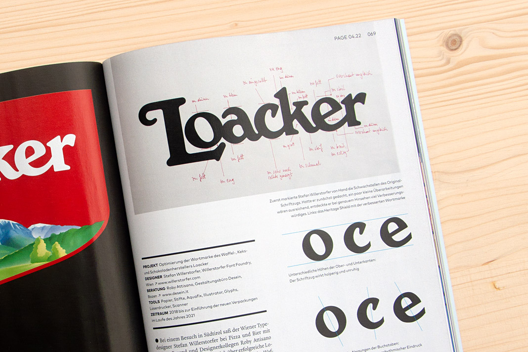 On top you can see written notes for all the corrections to be made to the old Loacker logotype.
The idea of redesigning the Loacker logotype lead to an interesting design process that I really enjoyed. The process was accompanied by Roby Attisano’s valuable feedback. Luckily the Loacker company was so convinced by the redesigned logotype that they decided to buy it and to apply it instead of the old one. We take the company’s decision as a strong compliment and honest praise. It encourages us in our way of paying attention to even small details and providing individual typographic solutions of highest quality.
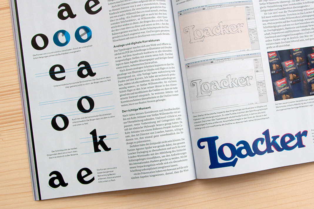 Various inconsistencies of the old logotype on the left. Stages of the design process on the right.
If you want to know more about the story (and are fluent in German) you can read the article in the current issue of Page (04/22). Enjoy the reading.
 The top of the right page shows Roby Attisano (left) and Stefan Willerstorfer in South Tyrol.
The new Yearbook of Type features White, Black. Gray!
I am happy to see my article, White, Black. Gray! – Why Sketching Matters, published in the new Yearbook of Type (#4 2019/20). It is part of a comprehensive series of instructive articles focused on various aspects of type design. My article appears at the beginning of the book in order to reflect that sketching happens at the beginning of the design process, and provides the basis for a typeface’s development.
 Cover of the Yearbook of Type 2019/20, published by Slanted Publishers.

The Yearbook of Type is a practical guide that helps typeface users stay up to date with the latest type design trends and innovations. It showcases detailed presentations of more than 150 type families from around the globe. Highly recommended!
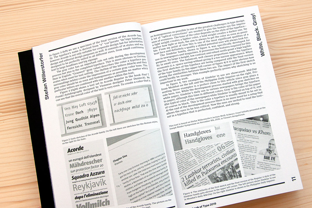 Double page spread presenting the article White, Black. Gray! – Why Sketching Matters.
Typodarium 2019 features Sindelar on October 3
»A fresh font a day keeps the boredom away« is the motto of Typodarium, the popular series of annual tear-off calendars. In its eleventh edition, Typodarium 2019 highlights chromatic typefaces that bring colour and versatility into the design process. Typodarium 2019 features 365 typefaces (one per day) designed by 229 designers from all around the world.
The calendar was designed by Florian Hauer, edited by Raban Ruddigkeit and Lars Harmsen, and published by Verlag Hermann Schmidt. Sindelar is one of the selected typefaces and has been assigned an honourable task: It gives next year’s Day of German Unity, October 3, a dignified typographic appearance.
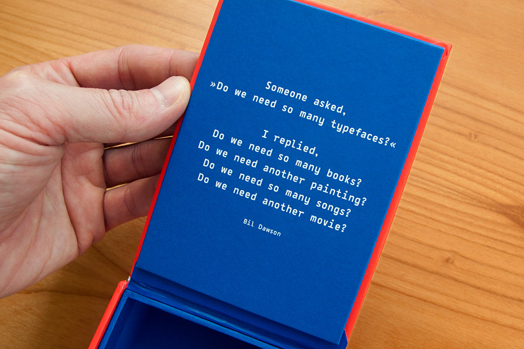 Bil Dawson’s convincing answer to a frequently asked question.
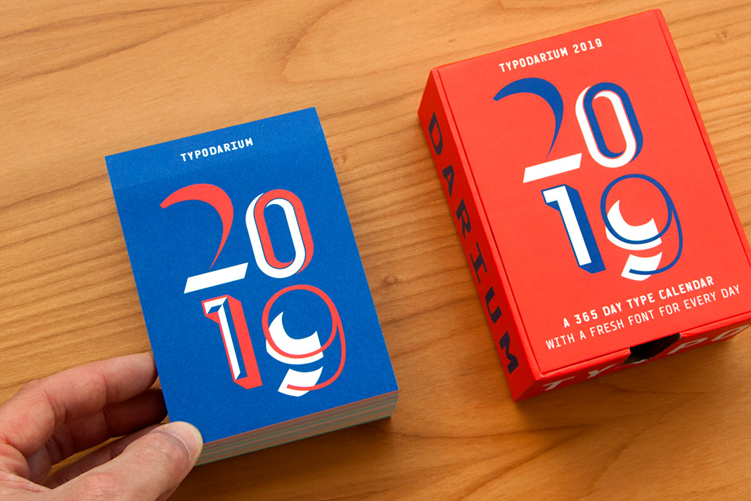 Typodarium 2019 comes with a colourful box for collecting the torn off calendar sheets.
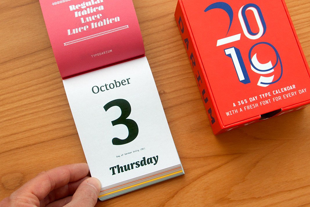 The Day of German Unity, October 3, is set in three different styles of Sindelar.
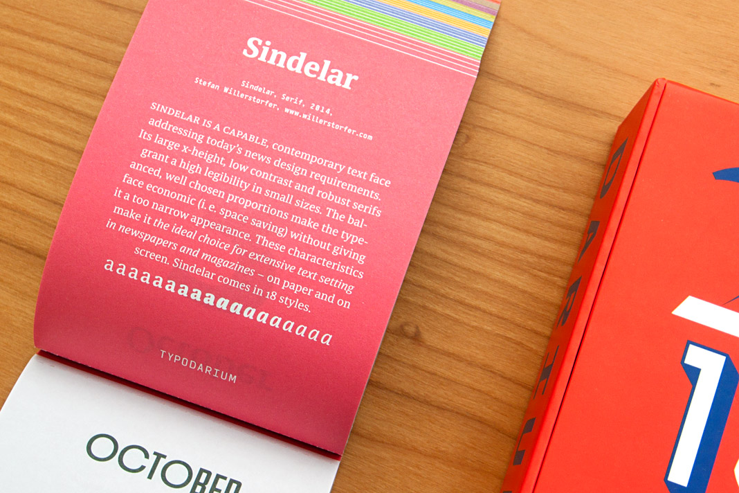 The back side of October 3 contains a short description of Sindelar.
Sindelar is part of Design Next Generation
Design Next Generation – That’s the title of the book presenting all winning entries of DDC’s renowned design competition Gute Gestaltung (Good Design). You may have noticed that we were honoured by winning a DDC Award for Sindelar in the Excellent Arts category. Sindelar is showcased in the book on a double page spread next to other outstanding projects. The book presents excellent designs on more than 430 pages and is published in German and English.
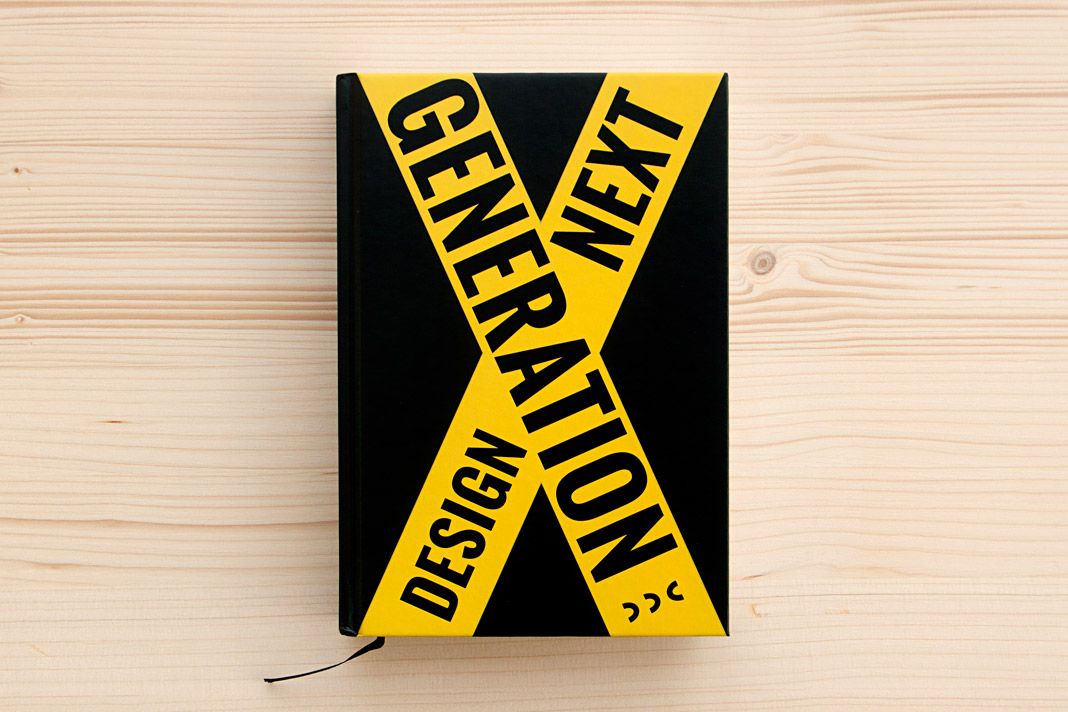 Cover of Design Next Generation, showing all winners of DDC’s design competition.
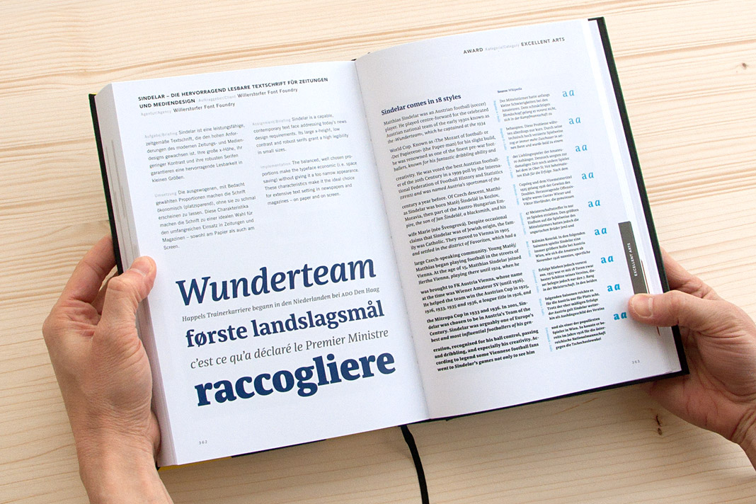 Sindelar succeeded in the category Excellent Arts.
Evangelisches Frankfurt is now typeset in Sindelar
It is always great to see when one of our typefaces perfectly contributes to a great work of design. With this newspaper that’s really the case: Evangelisches Frankfurt is the newspaper of the Protestant Church in Frankfurt. It was designed by German newspaper designer Jan Famira.
The newspaper gets published five times a year and is sent to all Protestants living in Frankfurt free of charge. It seems the newspaper’s new design has easily convinced the audience as the post by a regular reader suggests: »The new design is really well done, very beautiful, appealing, and lively. Thanks a lot for that!« As a foundry we obviously believe that Sindelar, the newspaper’s new text face, plays a major role in this respect.
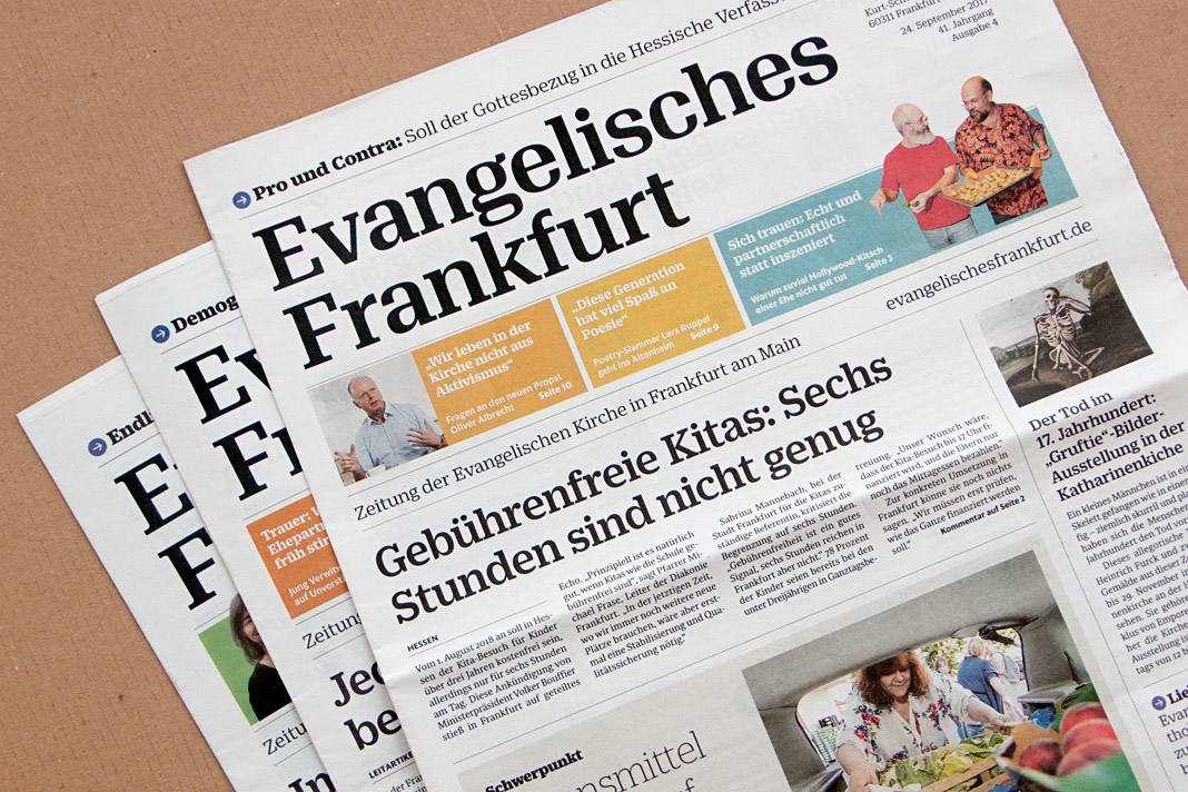 Recent covers of the newspaper of the Protestant Church in Frankfurt.
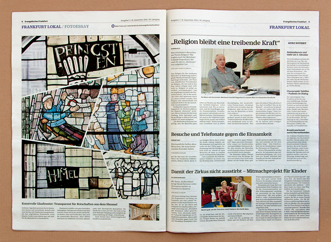
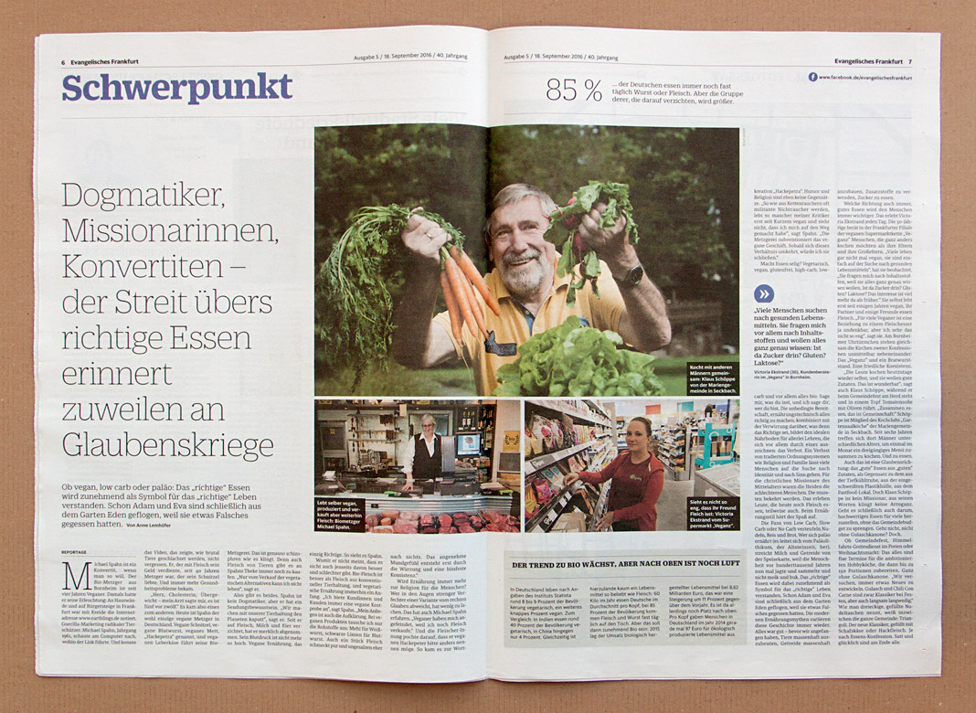
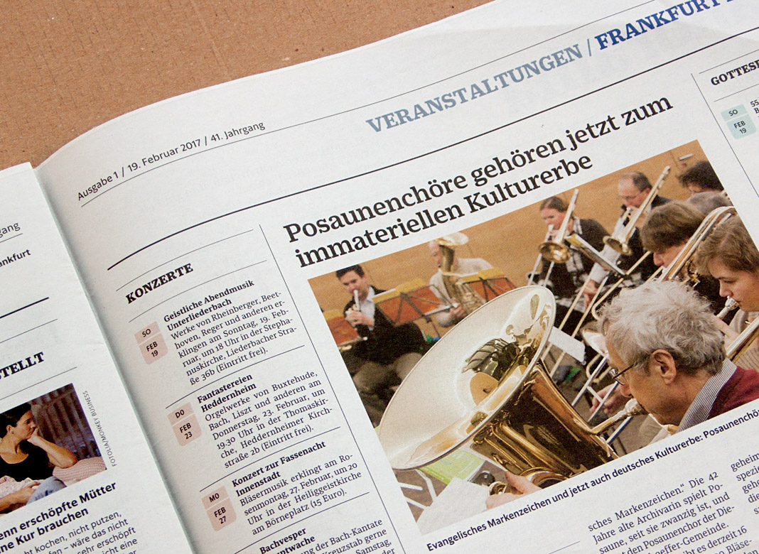
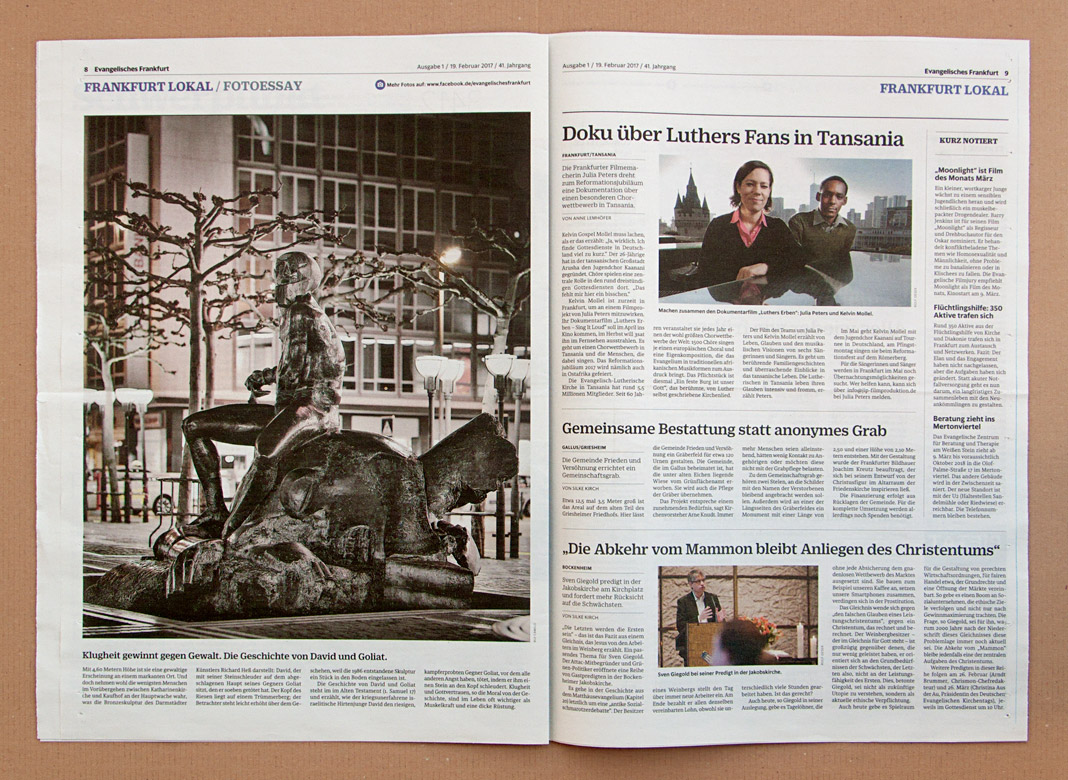
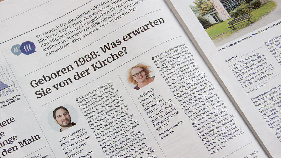
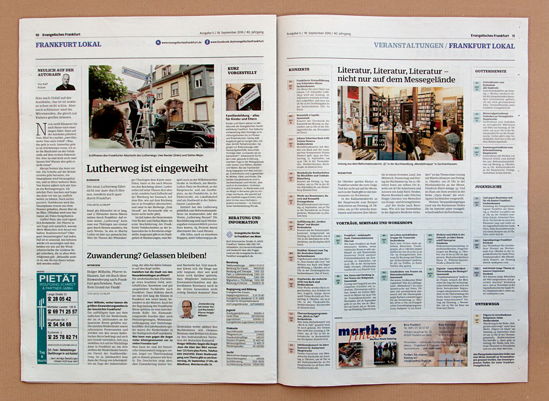 Sindelar’s great legibility qualities can been seen throughout the newspaper.
Yearbook of Type 2 presents Sindelar
Two years after the Yearbook of Type 1, which showcased our type family Acorde, its successor is now on the market: the Yearbook of Type 2. It’s great to contribute to this beautiful compendium again with one of our type families.
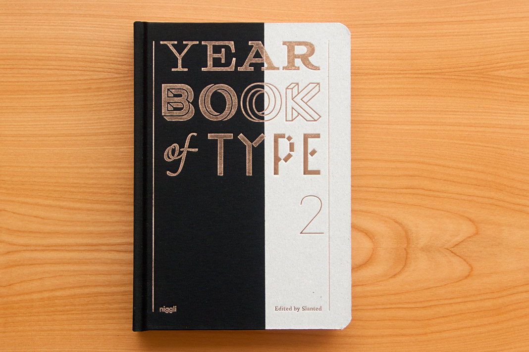 Cover of the Yearbook of Type 2, published by Niggli.
The Yearbook of Type 2 presents new type families from around the globe on more than 400 pages. The book also contains a section with various essays and provides manuals and background information on technical aspects. The book was published by the renowned Swiss publishing house Niggli.
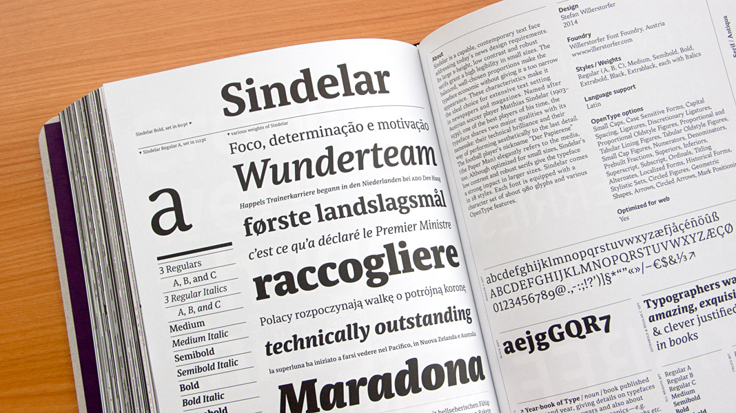
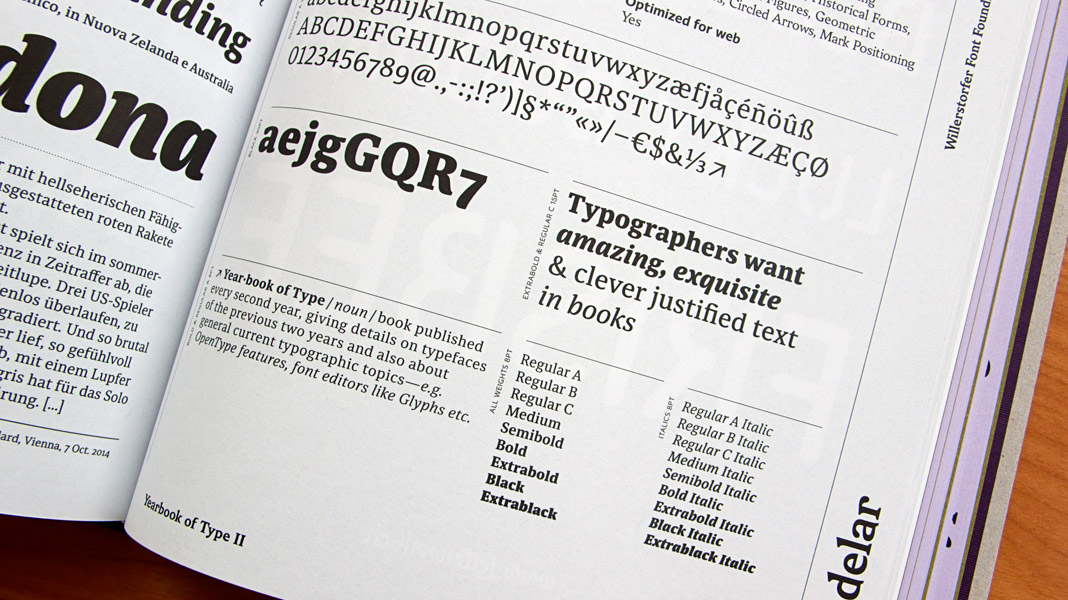 Double page spread showcasing Sindelar in great detail.