Blog – Entries tagged as Stefan Willerstorfer
Loacker redesign featured in German design magazine Page
Have you already had a look at the current issue (04/22) of Page, Germany’s most popular design magazine? Yes, you might have guessed, it contains an article we are really happy about.
 Cover of the current issue (04/22) of Germany’s popular design magazine Page.
The four-page article Detailversessen (detail-obsessed) showcases our redesign of the famous Loacker brand in great detail. As you might know, Loacker is an Italian company based in South Tyrol, producing tasty wafers and chocolate products.
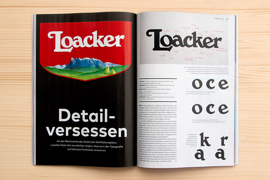 Double page spread showing the new Loacker logotype on the left and the old one on the right.
Interestingly the Loacker redesign did not begin like an ordinary project. There was no order at the beginning of the project. Just an idea – an idea that followed a vivid discussion between two designers while enjoying pizza and beer. Talk about characterful Italian (South Tyrolean) logotypes. At some point we (Roby Attisano and I) agreed that the logotype of Loacker was good but it could get even better. And then I spontaneously decided to do it, to proactively redesign the logotype without an order.
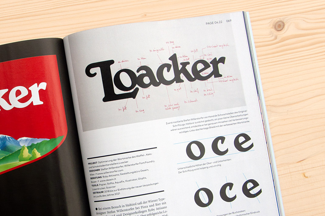 On top you can see written notes for all the corrections to be made to the old Loacker logotype.
The idea of redesigning the Loacker logotype lead to an interesting design process that I really enjoyed. The process was accompanied by Roby Attisano’s valuable feedback. Luckily the Loacker company was so convinced by the redesigned logotype that they decided to buy it and to apply it instead of the old one. We take the company’s decision as a strong compliment and honest praise. It encourages us in our way of paying attention to even small details and providing individual typographic solutions of highest quality.
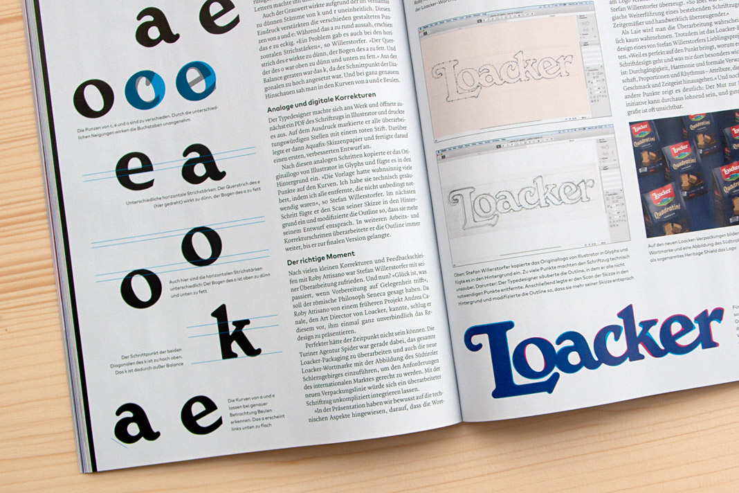 Various inconsistencies of the old logotype on the left. Stages of the design process on the right.
If you want to know more about the story (and are fluent in German) you can read the article in the current issue of Page (04/22). Enjoy the reading.
 The top of the right page shows Roby Attisano (left) and Stefan Willerstorfer in South Tyrol.
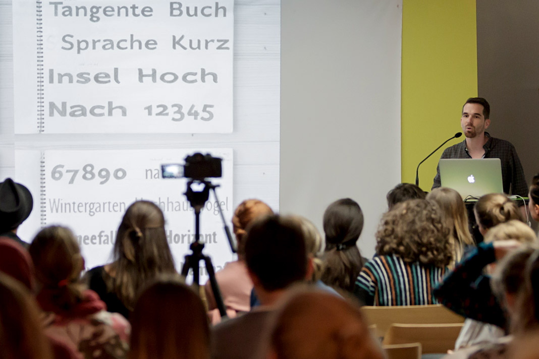
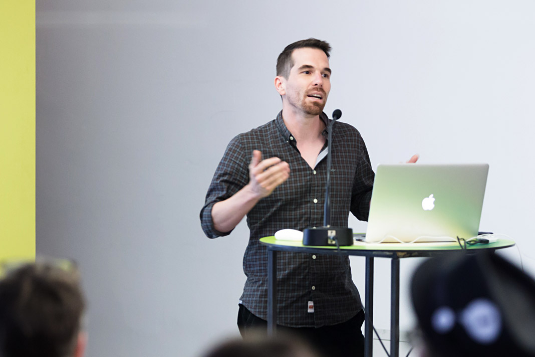
Speaking at this year’s Joseph Binder Symposium in Vienna
I was invited to speak at this year’s Joseph Binder Symposium which took place two weeks ago in Vienna’s Designforum. There were twelve talks by designers and illustrators in total. All of these talks focused on the value of the sketch during the development process.
The programme was diverse and very interesting and I personally enjoyed the pleasant atmosphere. My lecture was entitled Weiß, Schwarz. Grau! (White, Black. Grey!) and I emphasized the value sketches play in the development of a typeface. It was a great experience to participate in the symposium as a speaker and also as a listener.
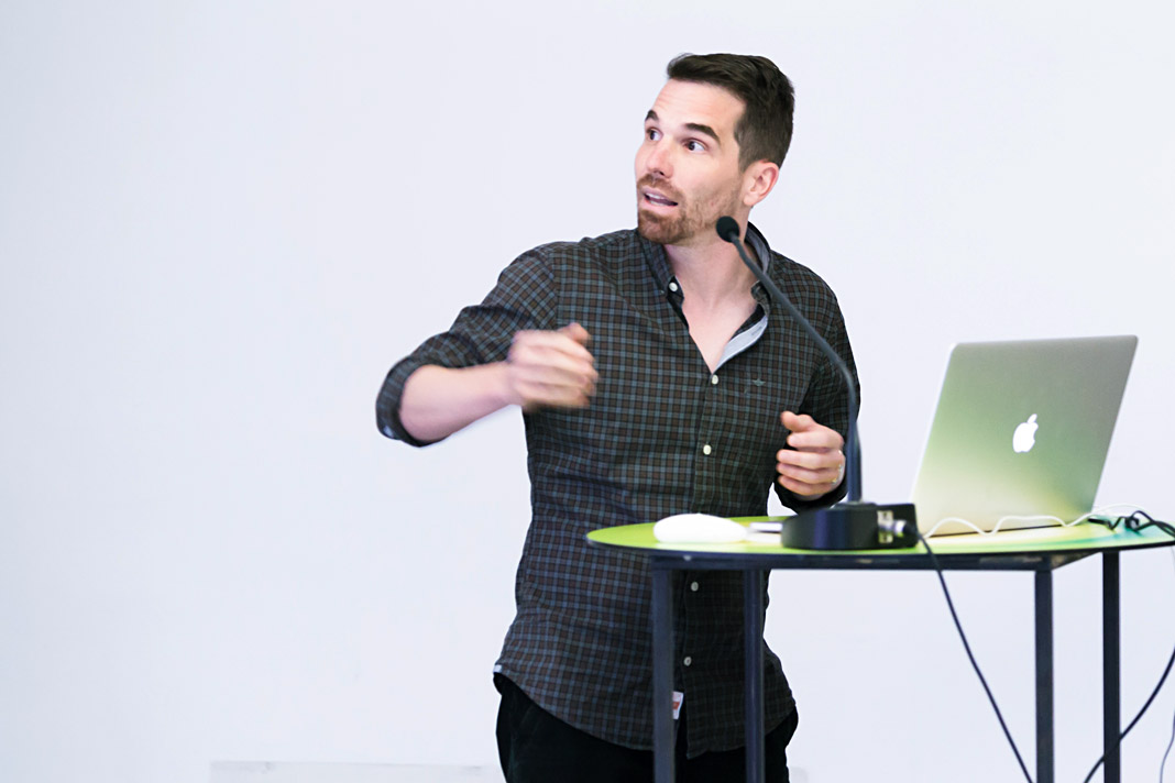 Stefan Willerstorfer emphasized the value of sketching in type design.
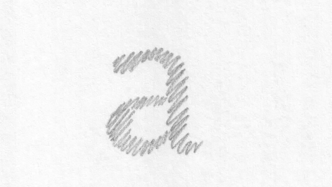 This slide shows an early sketch of the letter a of the Sindelar family.
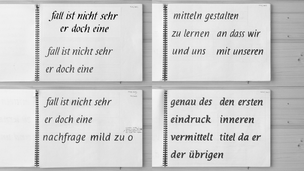 This slide shows various sketches for the Italic styles of the Acorde family.
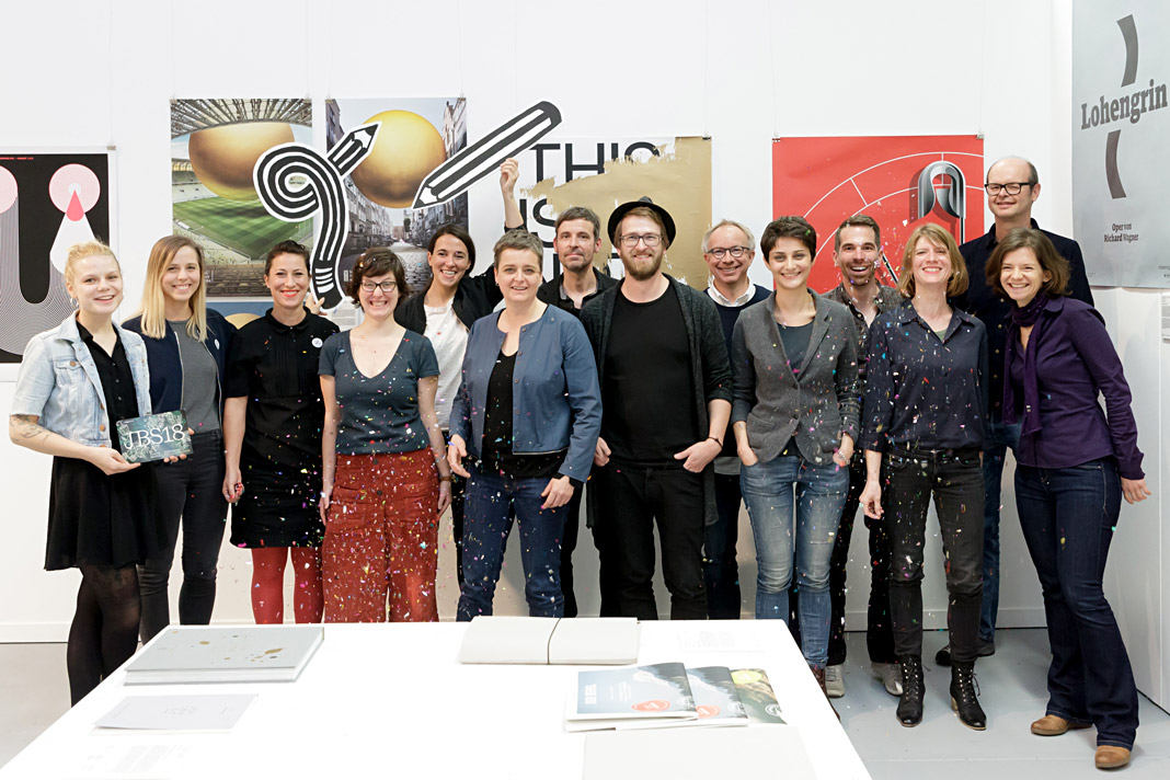 The speakers of this year’s Joseph Binder Symposium in Vienna.
Acorde webfonts are finally available for purchase
Long-awaited by users around the globe and by all people with a passion for humanist sans serifs: Acorde webfonts are finally available for purchase. Since quality always comes first at Willerstorfer Font Foundry, Acorde webfonts were carefully developed and tested. The careful hinting of the core character set was done by German hinting expert Tim Ahrens.
A purchase of Acorde webfonts will greatly contribute to a company’s professionalism and recognisability. New customers now have the possibility to purchase Acorde desktop fonts and Acorde webfonts at the same time, resulting in a generous 50% discount on the lower priced item. Acorde webfonts are exclusively available at willerstorfer.com
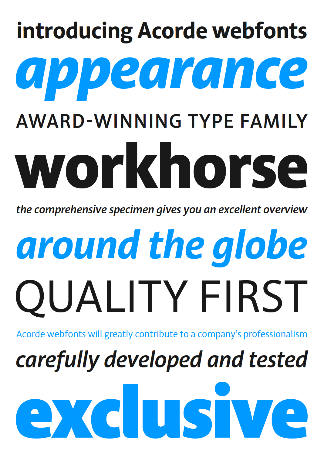 All 14 styles of Acorde are available for web use.
Interview in Chinese design magazine Design 360°
Asia remains a great terrain for us, our typefaces and our expertise. Next to having two major newspaper clients in India (Mid-Day, Mumbai) and in the Philippines (Philippine Daily Inquirer) who use Sindelar as their text face on a daily basis in their print editions, strong interest in our work has also emerged in China.
We were approached by the concept and design magazine Design 360° based in Guangzhou, China, to express our views on quality, legibility, and proper use of western type families. Design 360° is a bi-monthly design magazine published by Sandu Publishing Co. Ltd. dedicated to international design concepts and featuring outstanding worldwide designers. Issue no. 64 is focused on western typeface design in order to live up to the emergent relevance of western typefaces and western typography in China.
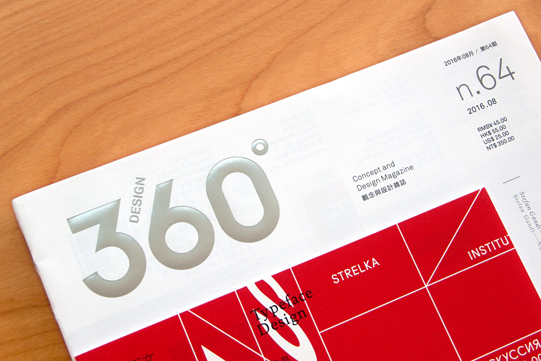 The cover of issue no. 64 of Design 360° focusing on western type design.
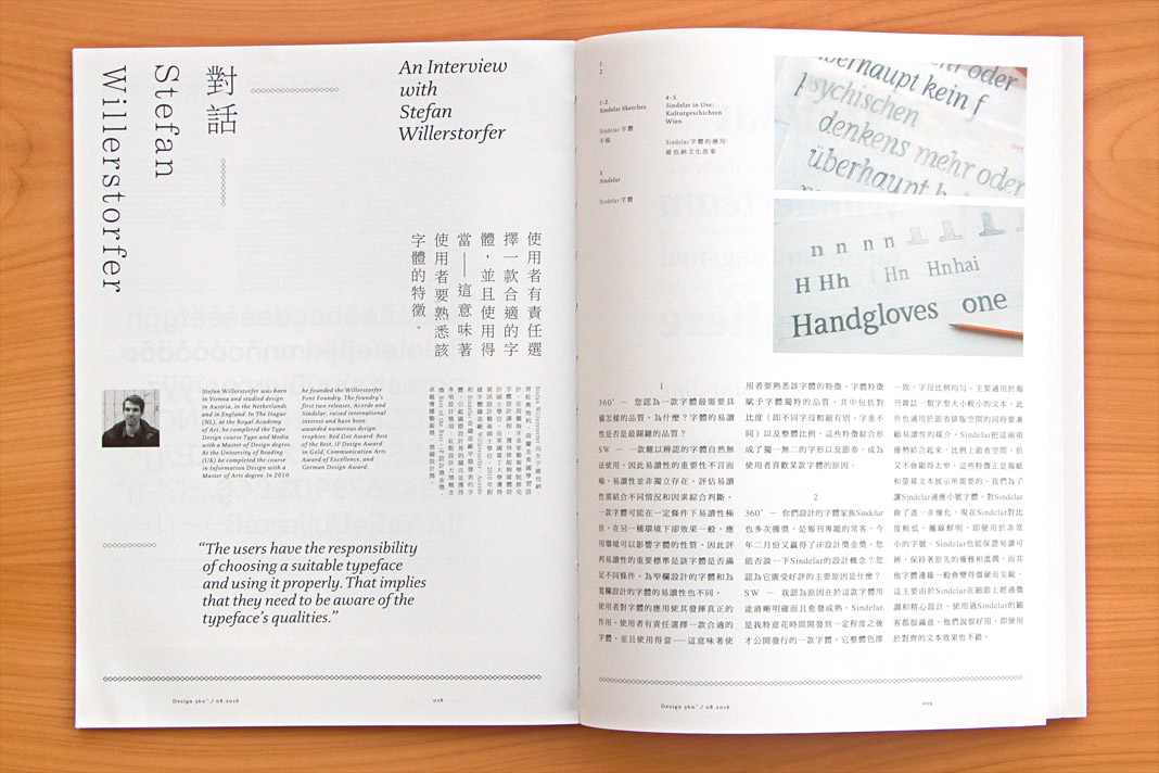
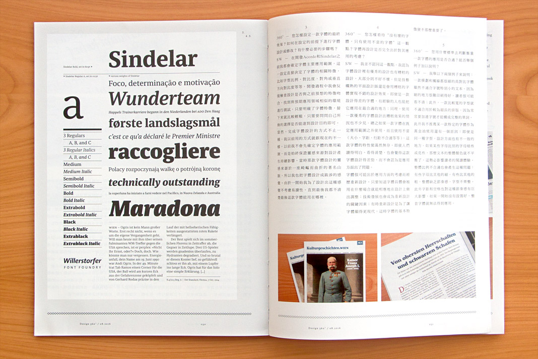 The interview is published bilingually in Chinese and English.
It was a pleasure and a great honour for me to be one of only four western type designers who was asked to talk about their work and their opinions in order to contribute to the knowledge and understanding of western type design among Chinese graphic designers.
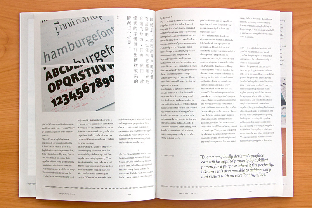
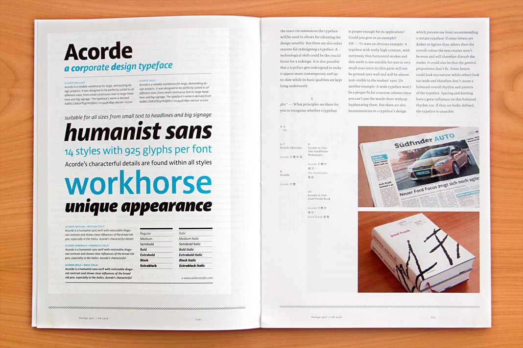 Various impressions of the interview in the concept and design magazine Design 360°.
Sindelar is the Best Work of Applied Typography 26
We have already announced it in December and now you can have a look for yourself: Sindelar is the Best Work in the typeface category of Applied Typography 26 and therefore featured in the Japan Typography Yearbook 2016. Enjoy!
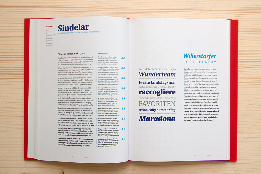
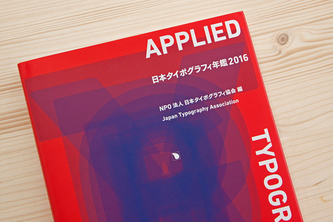
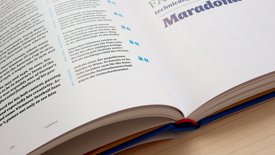
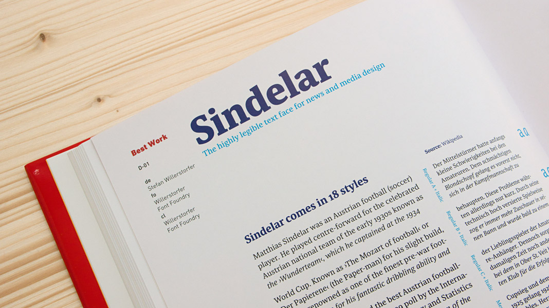 Various impressions of the Japan Typography Yearbook 2016.
Interview in German design magazine Novum
Recently I was interviewed at length by German design magazine Novum. The interview is published in the current issue (07.16) and is available in German and in English. It covers varied issues such as design trends, bespoke typefaces, renowned design prizes, and the work currently being done at Willerstorfer Font Foundry. Recommended reading!
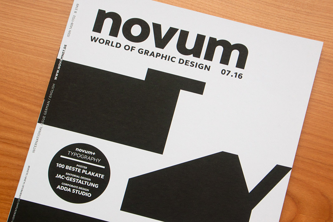

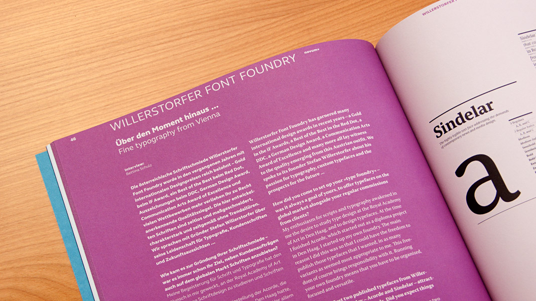 The interview is published bilingually in German and English.