Blog – Insights by Stefan Willerstorfer
Puzzling poster for die Graphische features Acorde
As you might know, Acorde was designed to be perfectly suited to all different sizes, from small continuous text to large headlines and big signage. Therefore its large application on this poster is a great example of Acorde’s display qualities. The poster is an advertisement for the renowned graphic design school, die Graphische, in Vienna.
At first sight the poster appears puzzling and you can only read Kryptisch? (Cryptic?) and Dann komm auf die Graphische! (Walk to/join the Graphische!). When you walk a few steps further towards the school (located opposite the poster) and look at the advertisement through a red glass you can suddenly read: Wir haben den Durchblick in der Gestaltung! (We have a clear view on design./We know about design.) The poster was designed by Lydia Körner. Great idea, Lydia!
 At first sight the poster appears puzzling.
 When you look at the advertisement through a red glass you can suddenly read more text.
 Acorde’s large application on this poster is a great example of its display qualities.
Speaking at this year’s Joseph Binder Symposium in Vienna
I was invited to speak at this year’s Joseph Binder Symposium which took place two weeks ago in Vienna’s Designforum. There were twelve talks by designers and illustrators in total. All of these talks focused on the value of the sketch during the development process.
The programme was diverse and very interesting and I personally enjoyed the pleasant atmosphere. My lecture was entitled Weiß, Schwarz. Grau! (White, Black. Grey!) and I emphasized the value sketches play in the development of a typeface. It was a great experience to participate in the symposium as a speaker and also as a listener.
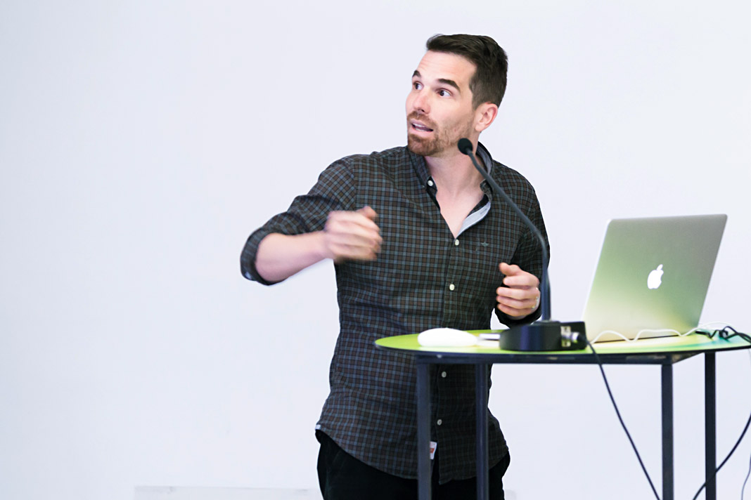 Stefan Willerstorfer emphasized the value of sketching in type design.
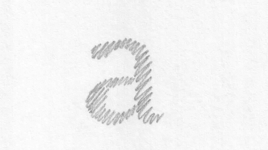 This slide shows an early sketch of the letter a of the Sindelar family.
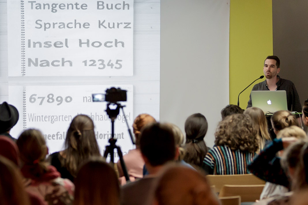
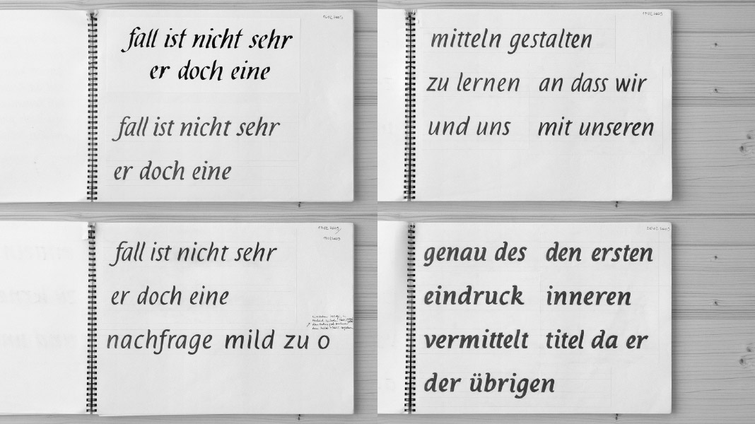 This slide shows various sketches for the Italic styles of the Acorde family.
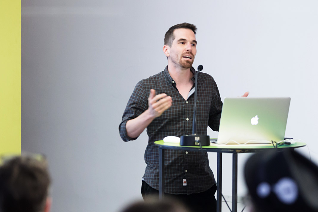
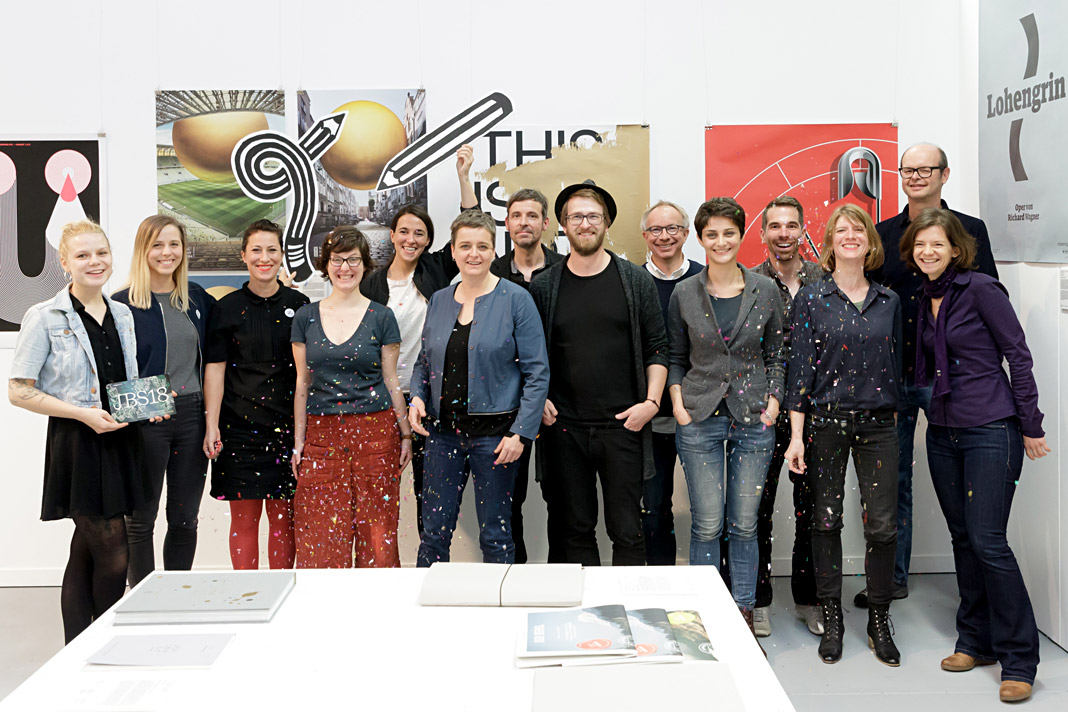 The speakers of this year’s Joseph Binder Symposium in Vienna.
Typodarium 2019 features Sindelar on October 3
»A fresh font a day keeps the boredom away« is the motto of Typodarium, the popular series of annual tear-off calendars. In its eleventh edition, Typodarium 2019 highlights chromatic typefaces that bring colour and versatility into the design process. Typodarium 2019 features 365 typefaces (one per day) designed by 229 designers from all around the world.
The calendar was designed by Florian Hauer, edited by Raban Ruddigkeit and Lars Harmsen, and published by Verlag Hermann Schmidt. Sindelar is one of the selected typefaces and has been assigned an honourable task: It gives next year’s Day of German Unity, October 3, a dignified typographic appearance.
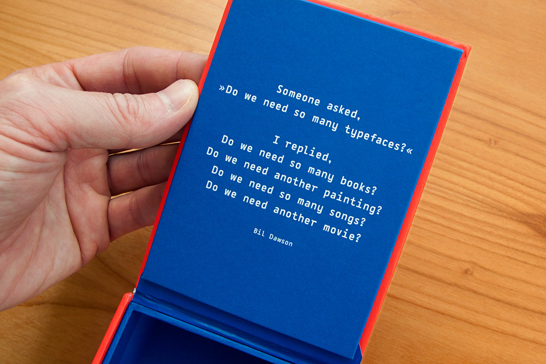 Bil Dawson’s convincing answer to a frequently asked question.
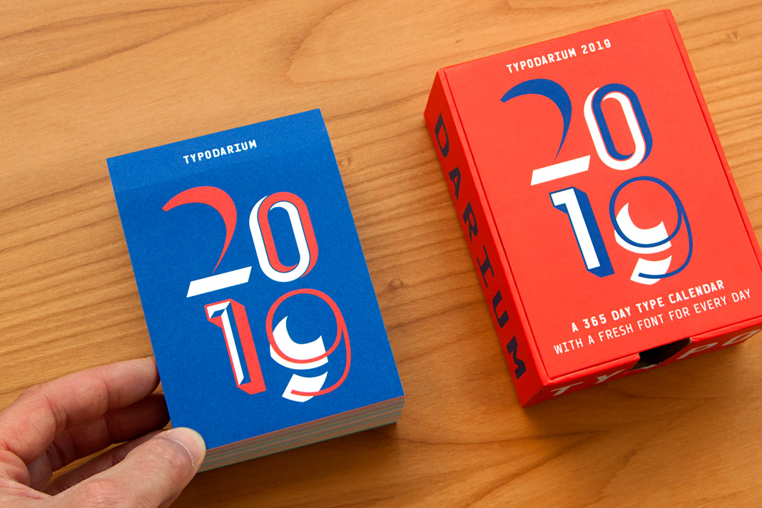 Typodarium 2019 comes with a colourful box for collecting the torn off calendar sheets.
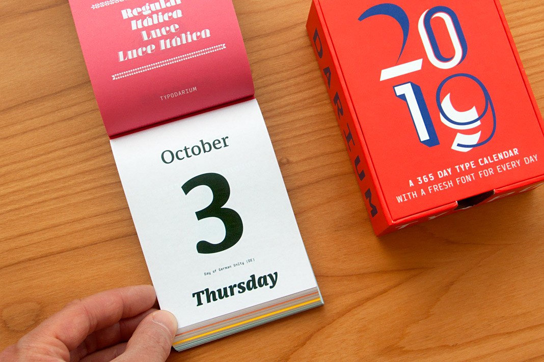 The Day of German Unity, October 3, is set in three different styles of Sindelar.
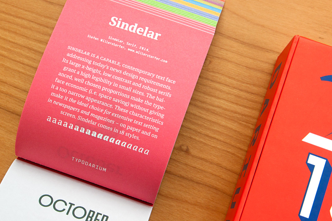 The back side of October 3 contains a short description of Sindelar.
Muntermacher is entirely set in our type families
Muntermacher, that’s what the quarterly journal of the market town of Moosburg in Carinthia (Austria) is called. A Muntermacher is a person or substance that wakes you up. And yes, it does. Great to see a journal from a small market town offering information to its inhabitants in such visual quality.
The magazine was conceived by Austrian architect and journalist Wojciech Czaja and by Austrian graphic designer Helga Innerhofer. As a foundry we are especially proud of this feature: The journal is entirely set in our type families Acorde and Sindelar which complement each other perfectly well.
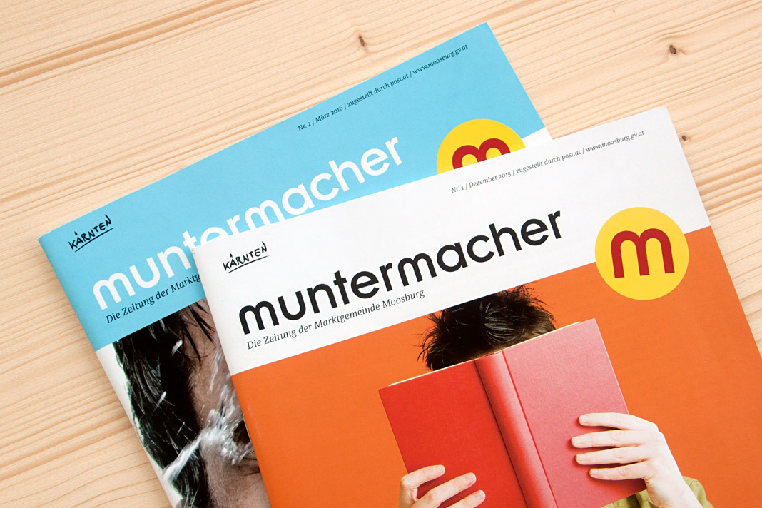 Two covers of the quarterly journal Muntermacher.
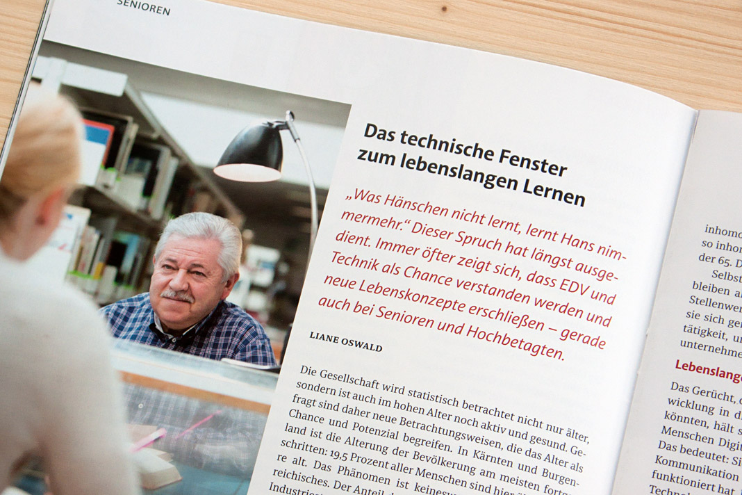
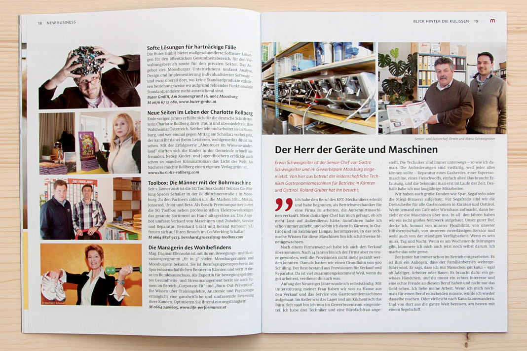
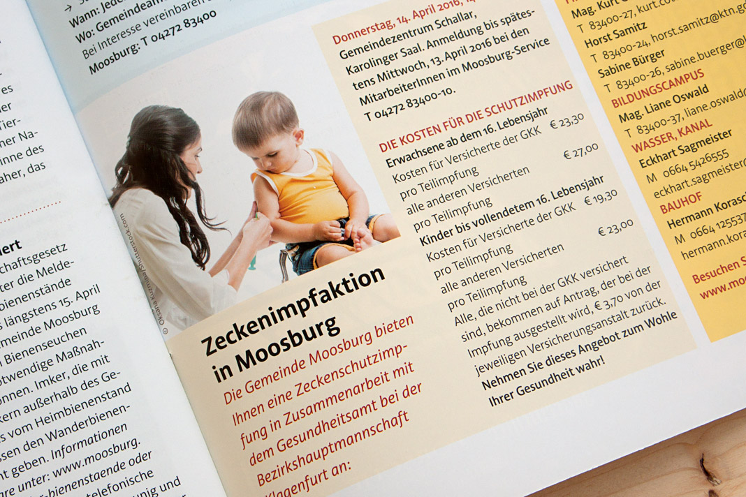
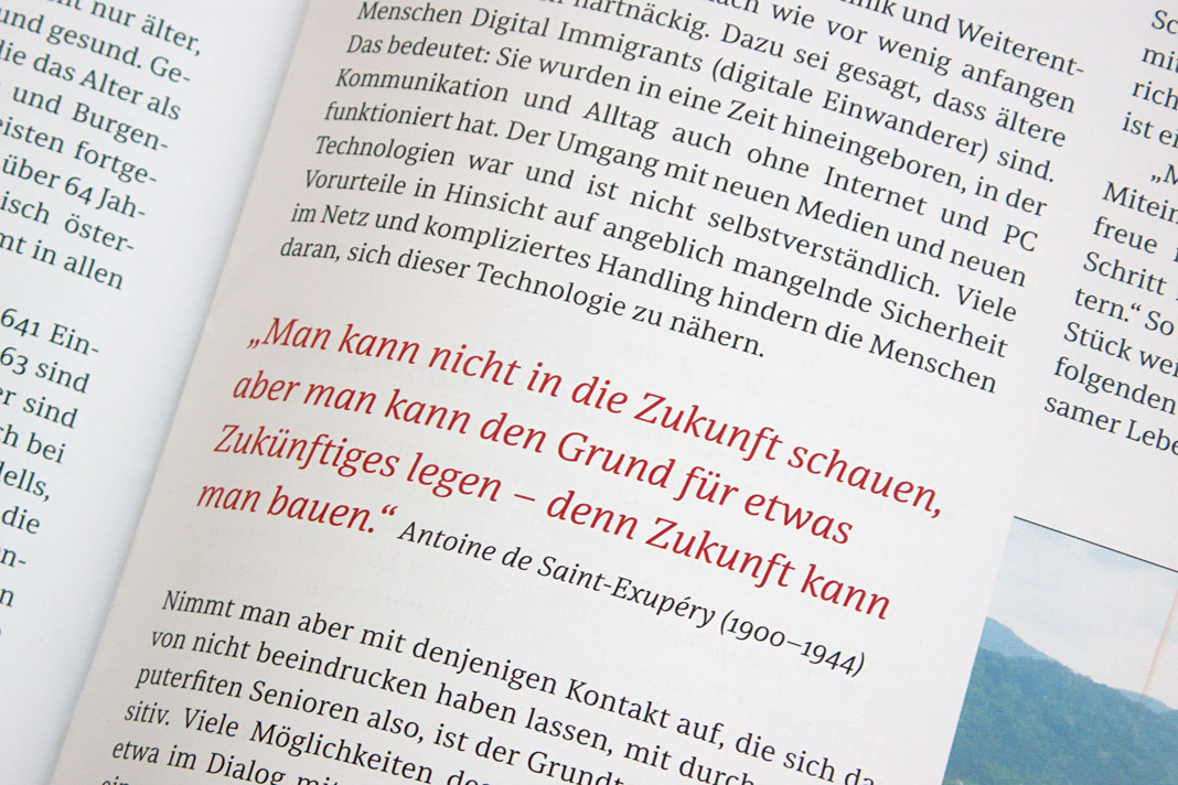
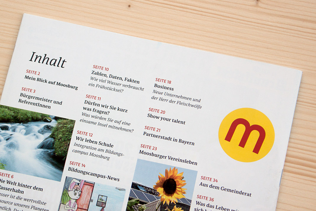 Various impressions of Muntermacher which perfectly show Acorde’s and Sindelar’s excellence.
Exhibition book Subtext: Typedesign is now available
You want to know more about the thriving Austrian type design scene? In case you missed the popular type design exhibition, Subtext: Typedesign, which took place in Vienna in April and May 2017: The book accompanying the exhibition is now available for purchase at the renowned Swiss publishing house Niggli. It introduces and documents the designs of more than 50 designers and foundries working locally and worldwide and presents more than 450 pages of recent Austrian type designs.
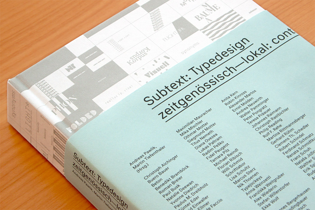 Cover of the exhibition book Subtext: Typedesign.
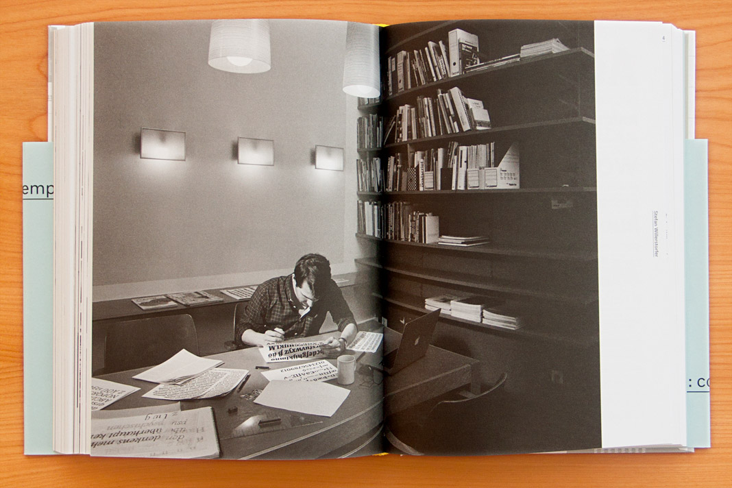 Double page spread showing a focused Stefan Willerstorfer at work.
As one of Austria’s leading foundries our work is showcased in the book in great detail. The typefaces in the book are not only shown as specimens but also in real use. In addition, the book contains a comprehensive text section in which well-known authors from various cultures and academic disciplines explore their relationships to type design. Definitely worth a read!
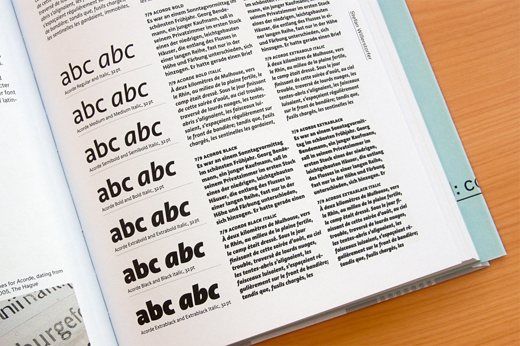
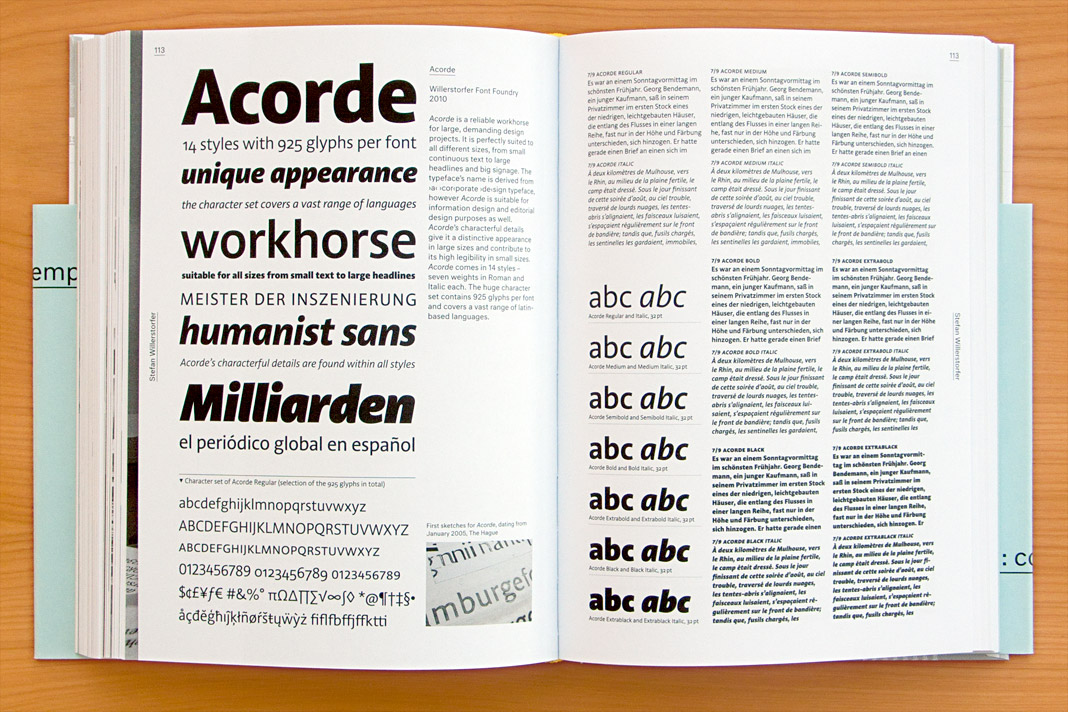 Double page spread presenting all 14 styles of Acorde.
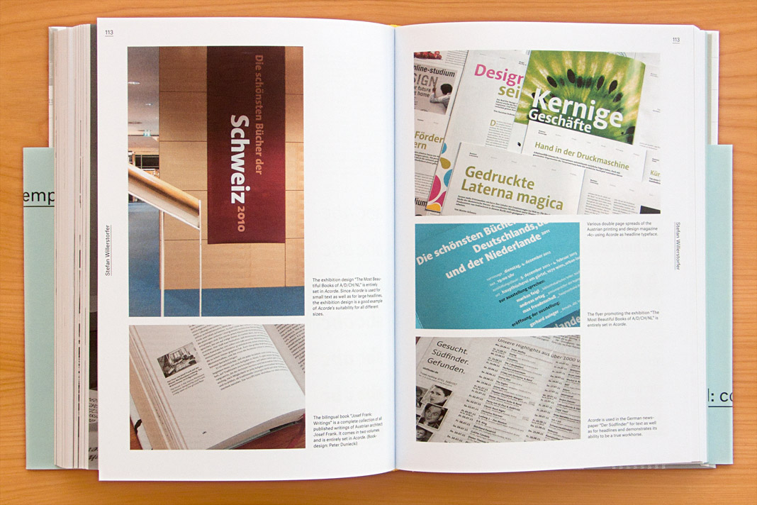 Double page spread showcasing Acorde in use.
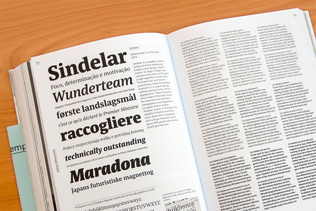 Double page spread presenting all 18 styles of Sindelar.
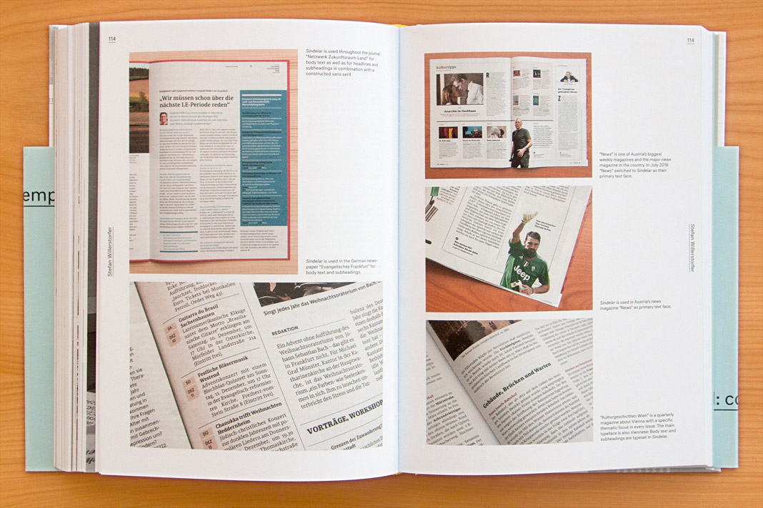 Double page spread showcasing Sindelar in use.
Sindelar is part of Design Next Generation
Design Next Generation – That’s the title of the book presenting all winning entries of DDC’s renowned design competition Gute Gestaltung (Good Design). You may have noticed that we were honoured by winning a DDC Award for Sindelar in the Excellent Arts category. Sindelar is showcased in the book on a double page spread next to other outstanding projects. The book presents excellent designs on more than 430 pages and is published in German and English.
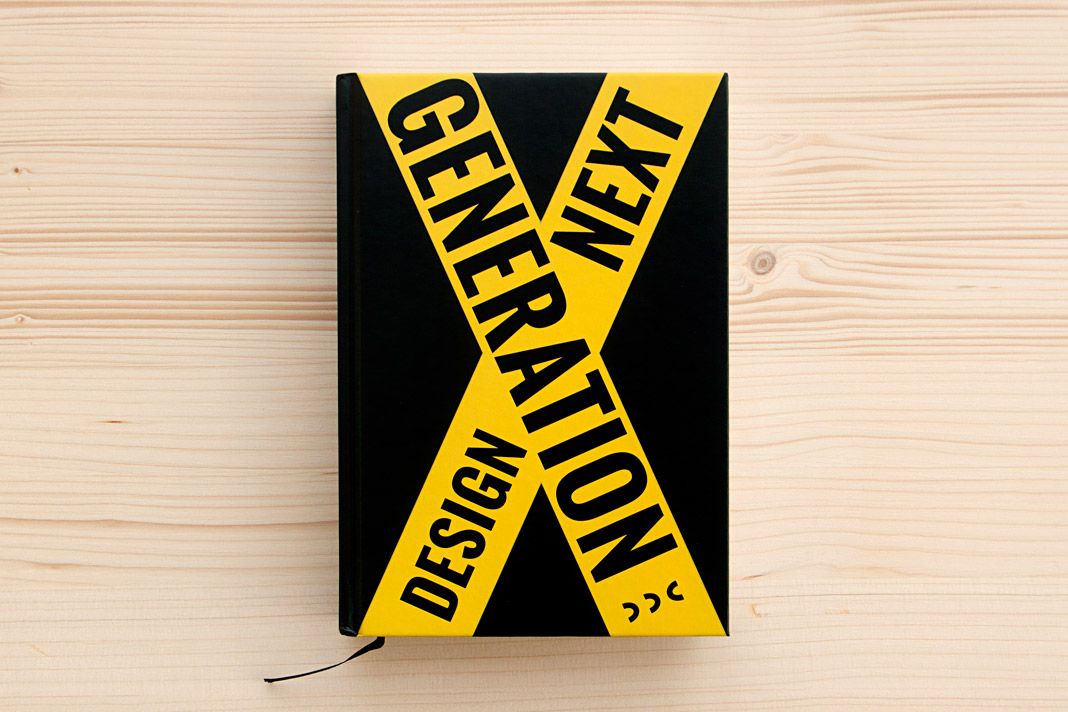 Cover of Design Next Generation, showing all winners of DDC’s design competition.
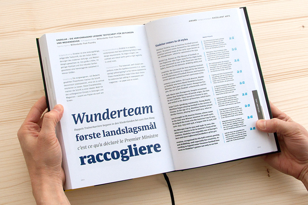 Sindelar succeeded in the category Excellent Arts.