Blog – Entries tagged as Typographische Gesellschaft Austria
Exhibition book Subtext: Typedesign is now available
You want to know more about the thriving Austrian type design scene? In case you missed the popular type design exhibition, Subtext: Typedesign, which took place in Vienna in April and May 2017: The book accompanying the exhibition is now available for purchase at the renowned Swiss publishing house Niggli. It introduces and documents the designs of more than 50 designers and foundries working locally and worldwide and presents more than 450 pages of recent Austrian type designs.
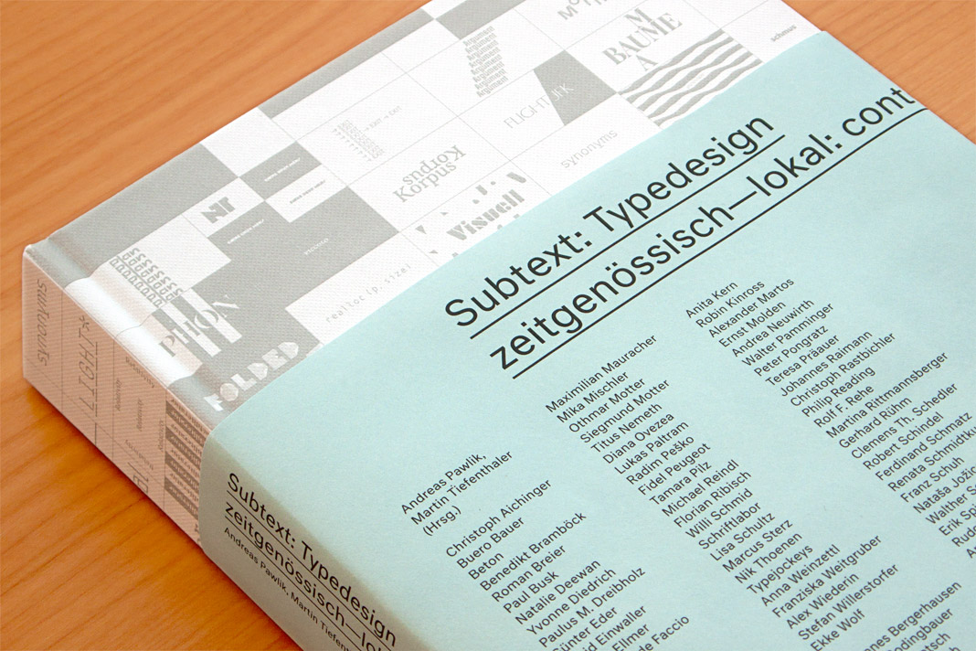 Cover of the exhibition book Subtext: Typedesign.
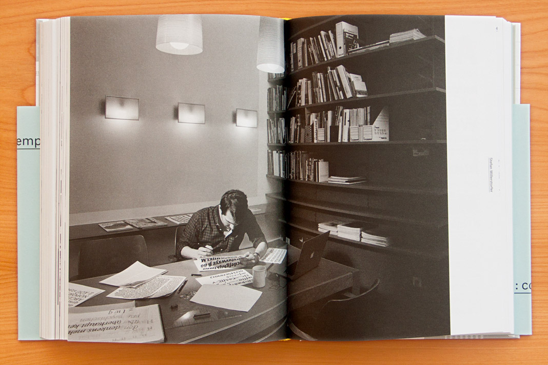 Double page spread showing a focused Stefan Willerstorfer at work.
As one of Austria’s leading foundries our work is showcased in the book in great detail. The typefaces in the book are not only shown as specimens but also in real use. In addition, the book contains a comprehensive text section in which well-known authors from various cultures and academic disciplines explore their relationships to type design. Definitely worth a read!
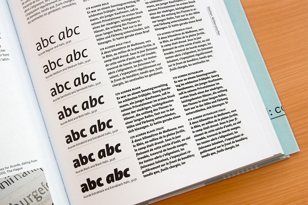
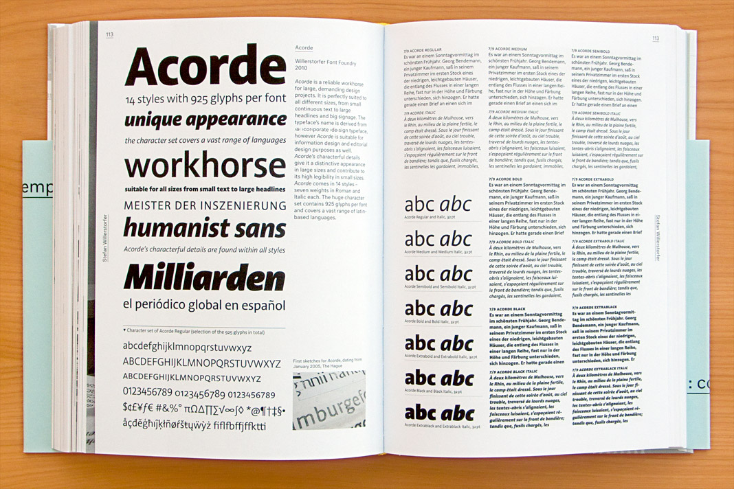 Double page spread presenting all 14 styles of Acorde.
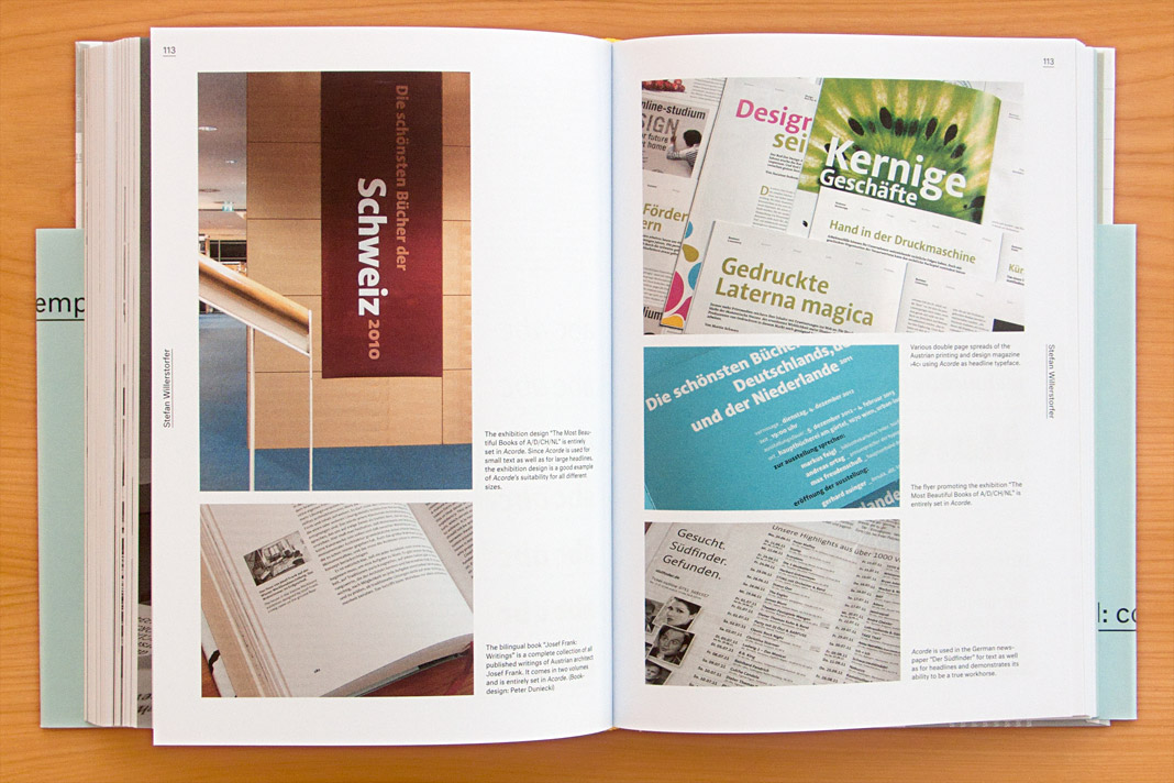 Double page spread showcasing Acorde in use.
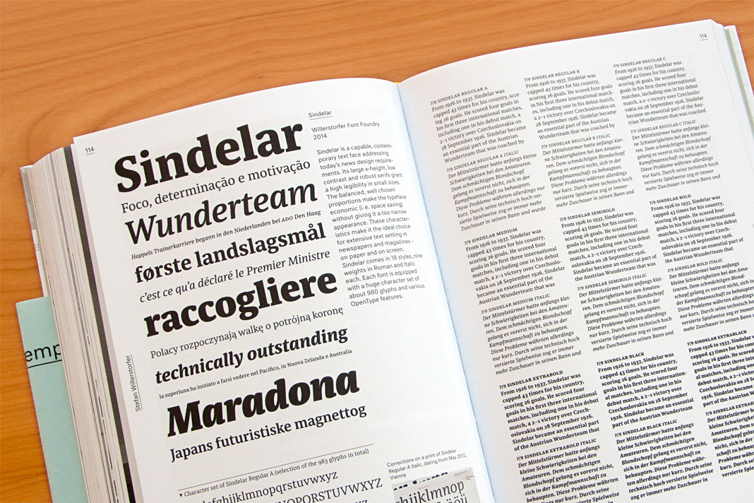 Double page spread presenting all 18 styles of Sindelar.
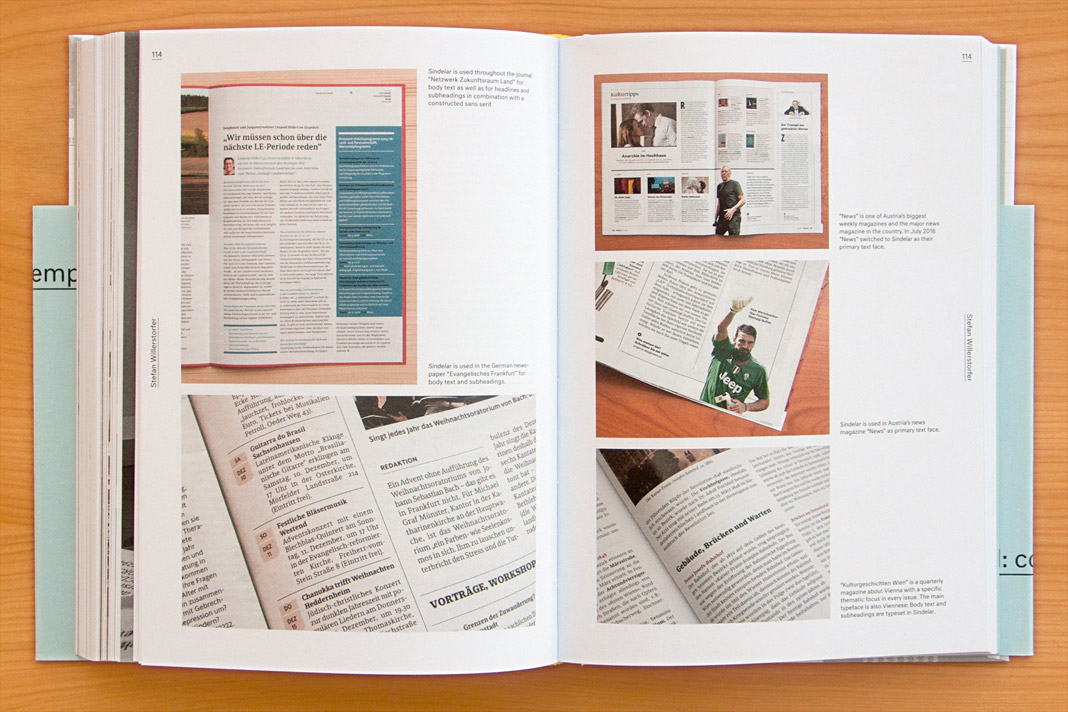 Double page spread showcasing Sindelar in use.
Austrian design exhibition Subtext: Typedesign in Vienna
Yesterday the opening of the design exhibition Subtext: Typedesign took place at the Designforum in Vienna’s Museumsquartier. The opening was a great success and attracted more than 500 people. The exhibition subtitled zeitgenössisch–lokal: contemporary–austrian showcases Austrian type designs from the last fifteen years and impressively documents the liveliness of the Austrian type design scene.
The exhibition is organised by the Typographic Society Austria (tga – Typographische Gesellschaft Austria) and was curated by Andreas Pawlik and Martin Tiefenthaler.
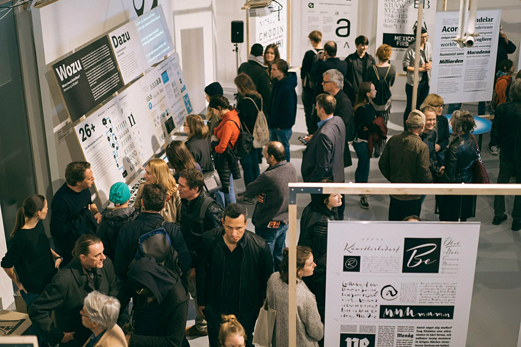
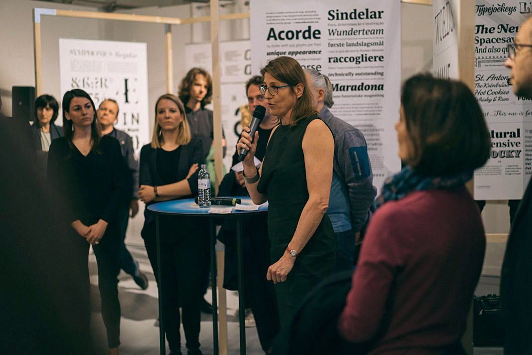 Anita Kern speaking at the opening in front of a poster showcasing Acorde and Sindelar.
At the opening Anita Kern, an Austrian graphic designer, writer, and profound expert on Austrian design history, spoke about the history and the current state of Austrian type design.
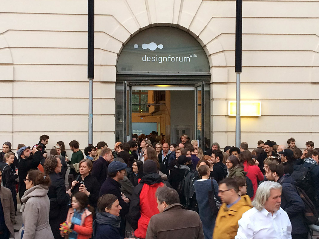 Even the Designforum’s entrance was crowded with visitors at the opening.
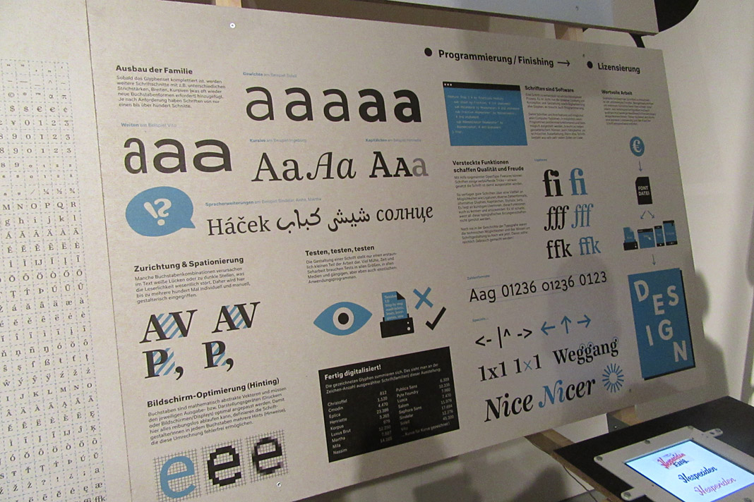 This informative chart explains the workflow during the development of a type family.
Here at Willerstorfer Font Foundry we are proud that our award winning type families Acorde and Sindelar are part of this beautiful exhibition.
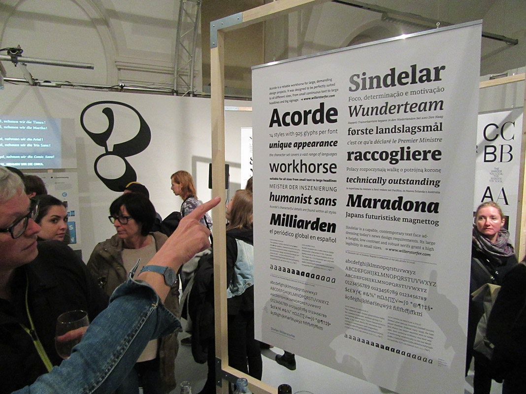
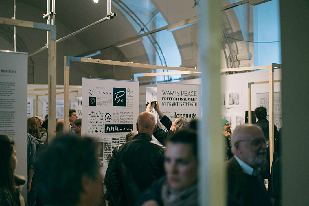
If you happen to be in Vienna use the opportunity to get more insights on Austrian type design and visit the exhibition at the Designforum. The exhibition will be on show until the 26th of May 2017. More detailed information is available here.
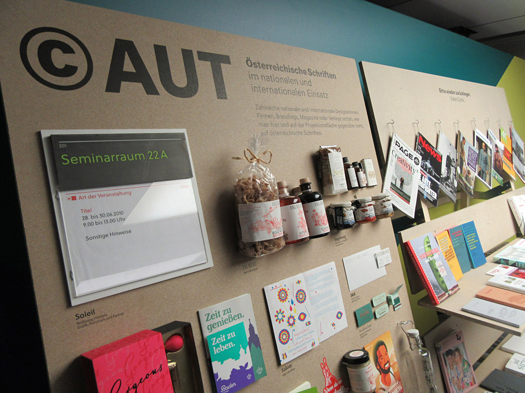
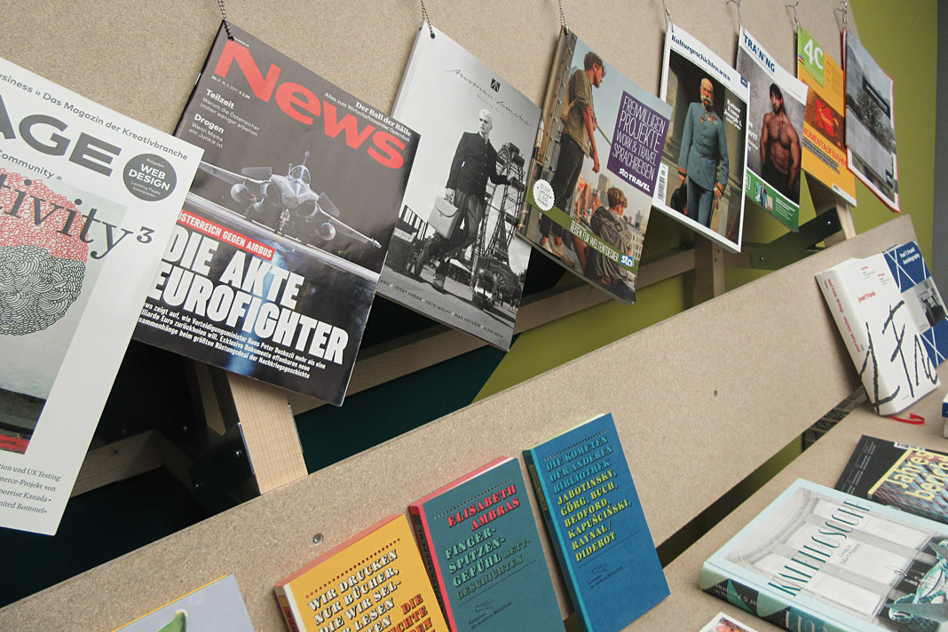 A selection of magazines, newspapers, books, and other products that use Austrian type families.
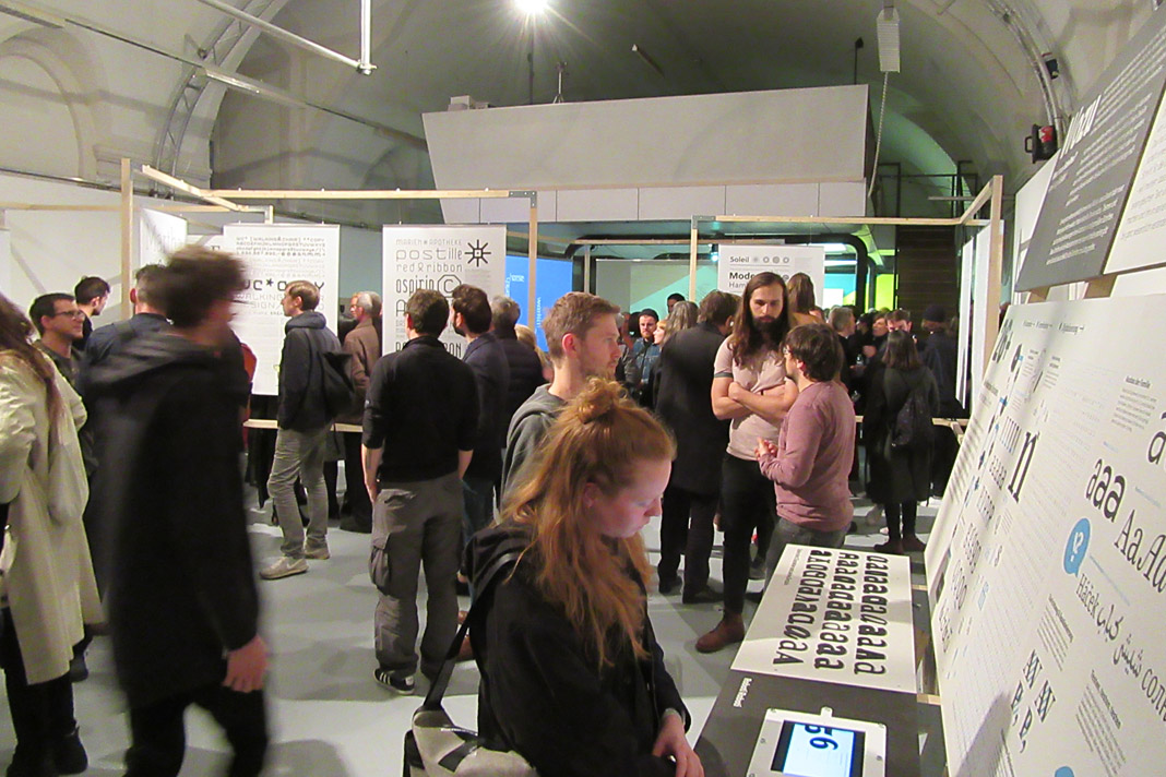
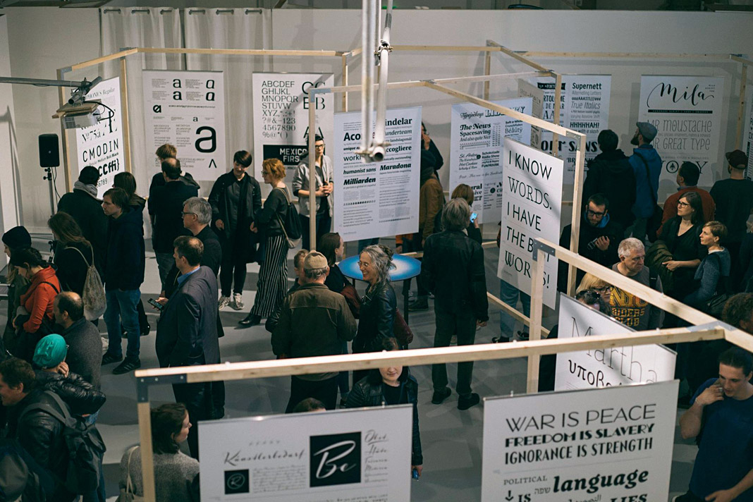 Visitors at the opening looking at and discussing about Austrian type design.
Acorde presents the most beautiful books of A/D/CH/NL
Like every year the Typographic Society Austria (tga – Typographische Gesellschaft Austria) shows the most beautiful books of Austria, Germany, Switzerland, and the Netherlands in cooperation with the Vienna Public Libraries and the Association of Austrian Book Trade.
The most beautiful books of 2011 can be seen in the Central Library in Vienna from December 5, 2012 to February 4, 2013. Once again (since its introduction last year) the exhibition design is entirely set in the type family Acorde. Since Acorde is used for small text (labels, signs, flyers) as well as for large headlines, the exhibition design is a good example of Acorde’s suitability for all different sizes.
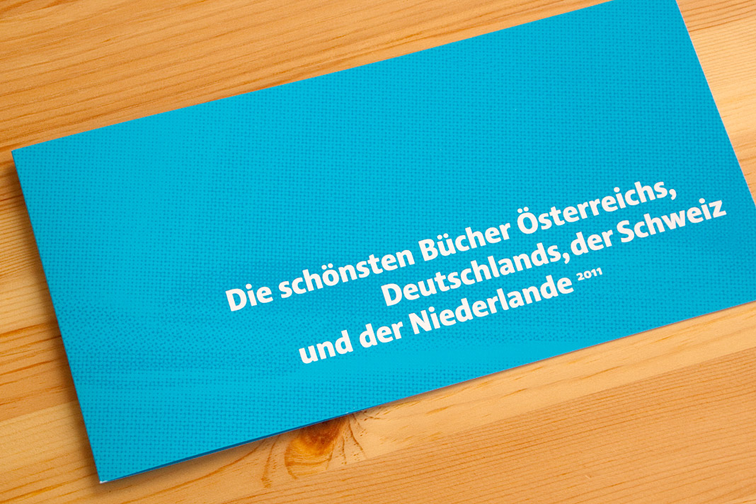
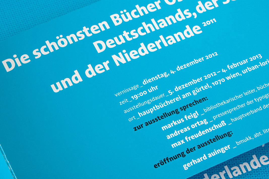 The flyer promoting the exhibition was designed by Austrian designer Erich Monitzer.
Acorde presents the most beautiful books of A/D/CH/NL
Like every year the Typographic Society Austria (tga – Typographische Gesellschaft Austria) shows the most beautiful books of Austria, Germany, Switzerland, and the Netherlands in cooperation with the Vienna Public Libraries and the Association of Austrian Book Trade.
The most beautiful books of 2010 can be seen in the Central Library in Vienna from December 7, 2011 to February 4, 2012. The exhibition design is entirely set in Acorde. Since Acorde is used for small text (labels, signs, flyers) as well as for large headlines, the exhibition design is a good example of Acorde’s suitability for all different sizes.
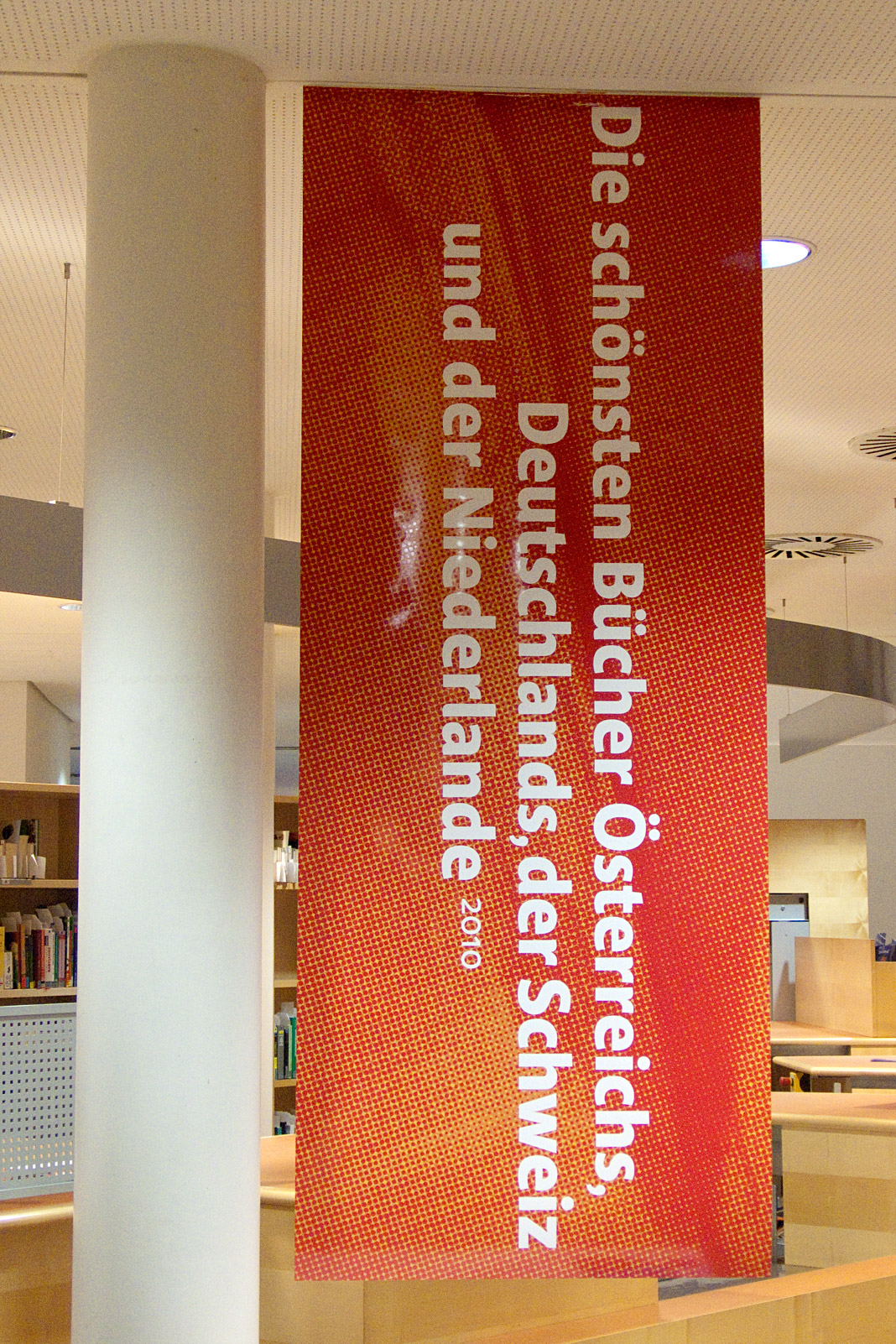
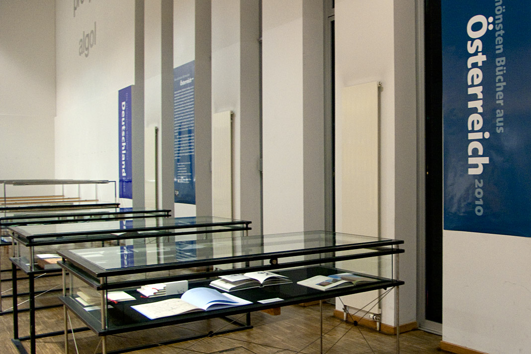
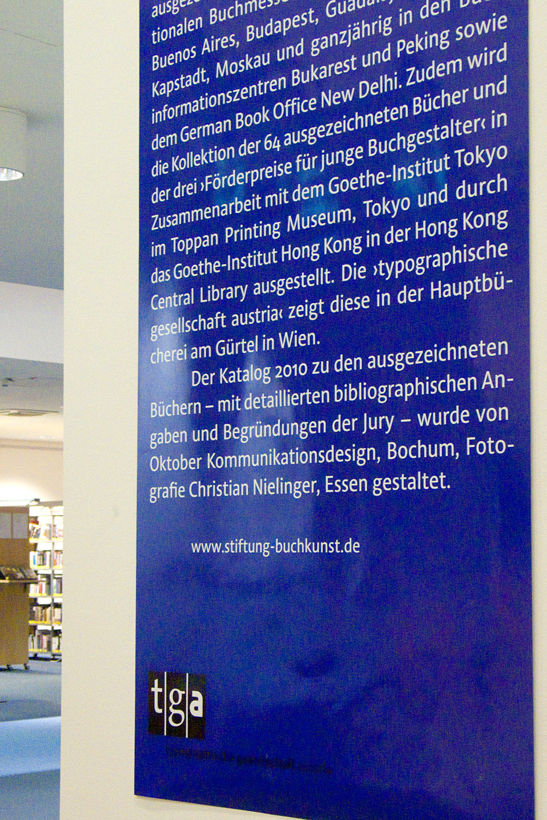
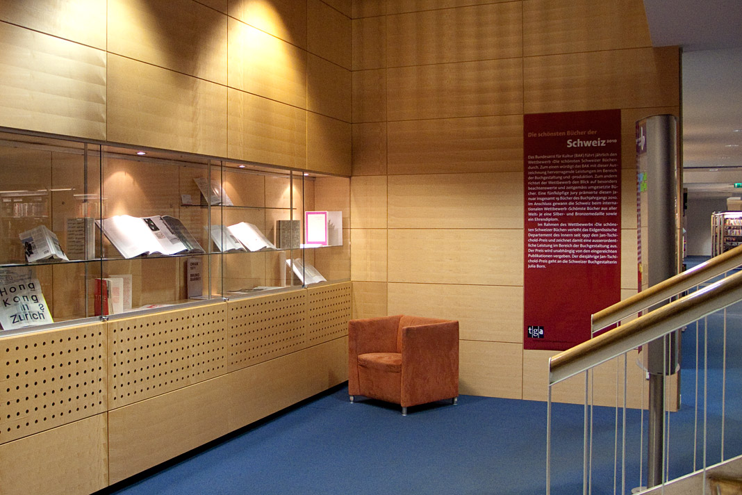
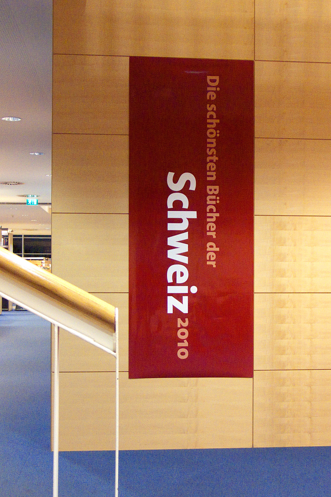 Some impressions from the exhibition of the most beautiful books in Vienna.