Blog – Entries tagged as Journal
Muntermacher is entirely set in our type families
Muntermacher, that’s what the quarterly journal of the market town of Moosburg in Carinthia (Austria) is called. A Muntermacher is a person or substance that wakes you up. And yes, it does. Great to see a journal from a small market town offering information to its inhabitants in such visual quality.
The magazine was conceived by Austrian architect and journalist Wojciech Czaja and by Austrian graphic designer Helga Innerhofer. As a foundry we are especially proud of this feature: The journal is entirely set in our type families Acorde and Sindelar which complement each other perfectly well.
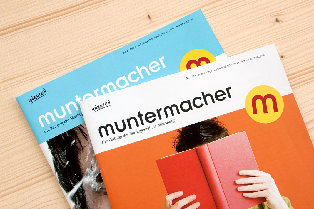 Two covers of the quarterly journal Muntermacher.
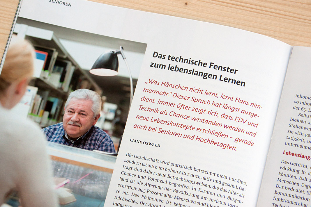
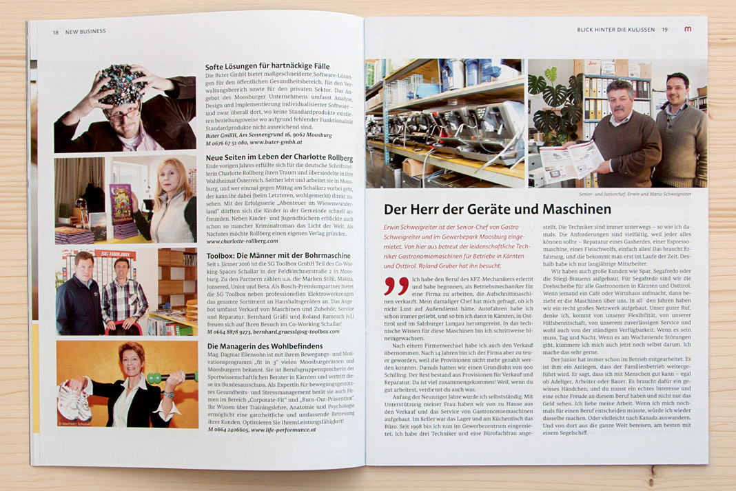
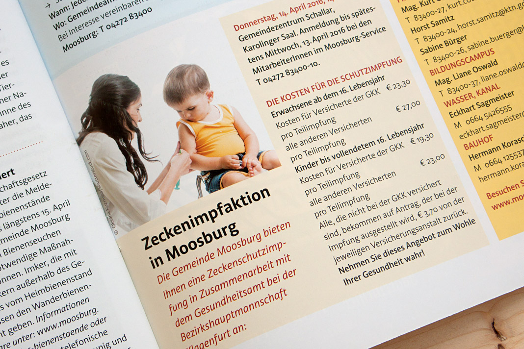
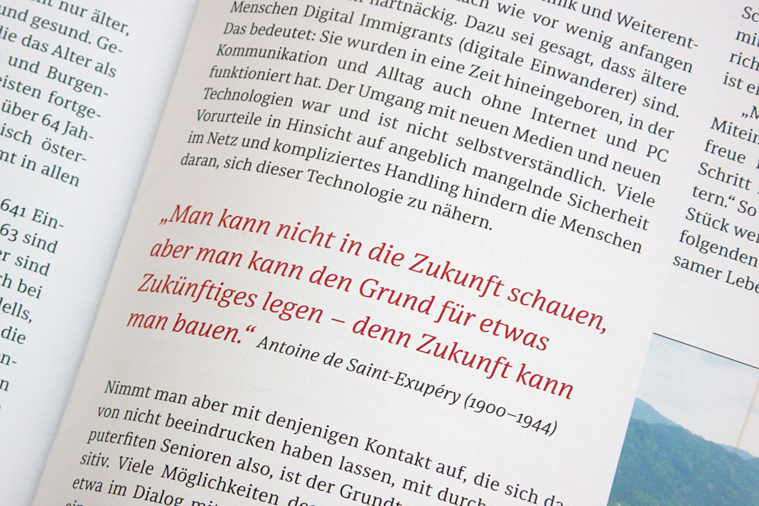
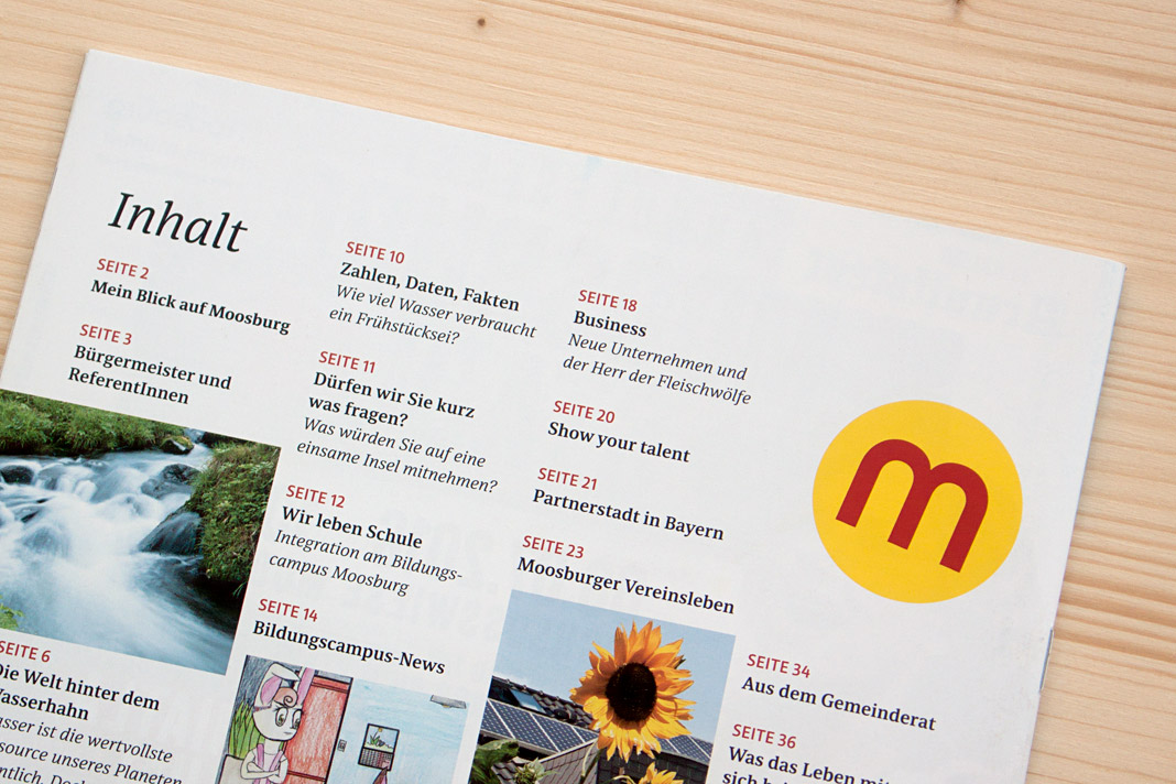 Various impressions of Muntermacher which perfectly show Acorde’s and Sindelar’s excellence.
Netzwerk Zukunftsraum Land is typeset in Sindelar
Another great example of Sindelar in use: Netzwerk Zukunftsraum Land is a journal for rural development published quarterly by the association of the same name. The association was installed by the Austrian Federal Ministry of Agriculture, Forestry, Environment and Water Management and acts on behalf of the Ministry.
Sindelar is used throughout the journal for body text as well as for headlines and subheadings in combination with a constructed sans serif typeface.
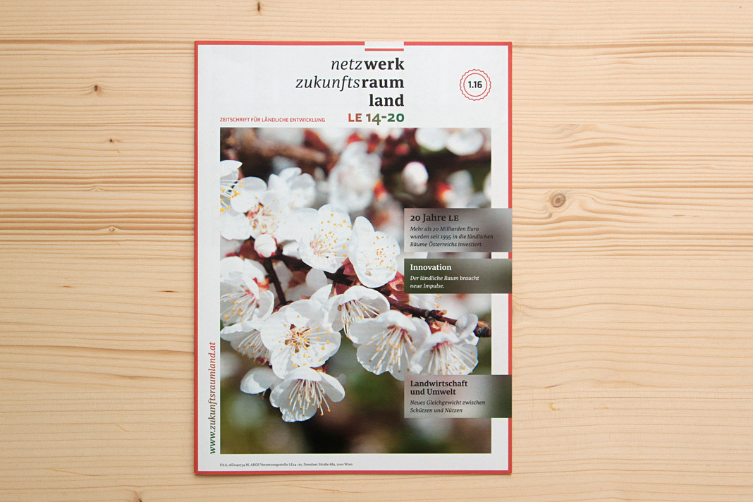 Cover of Netzwerk Zukunftsraum Land, set in Sindelar.
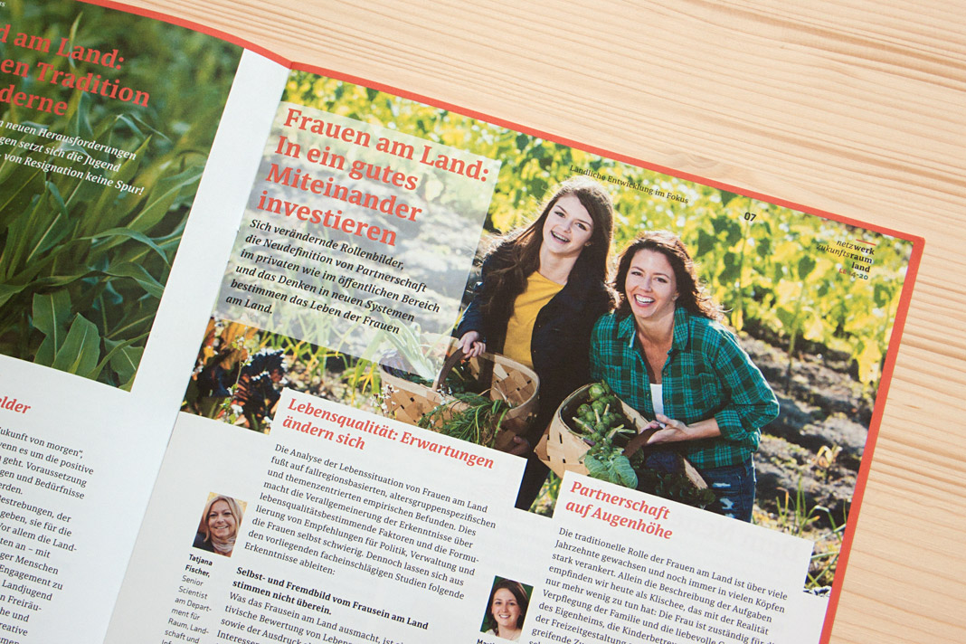
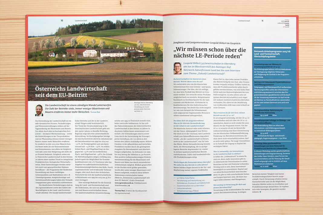
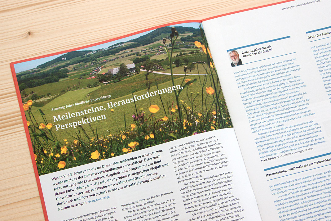
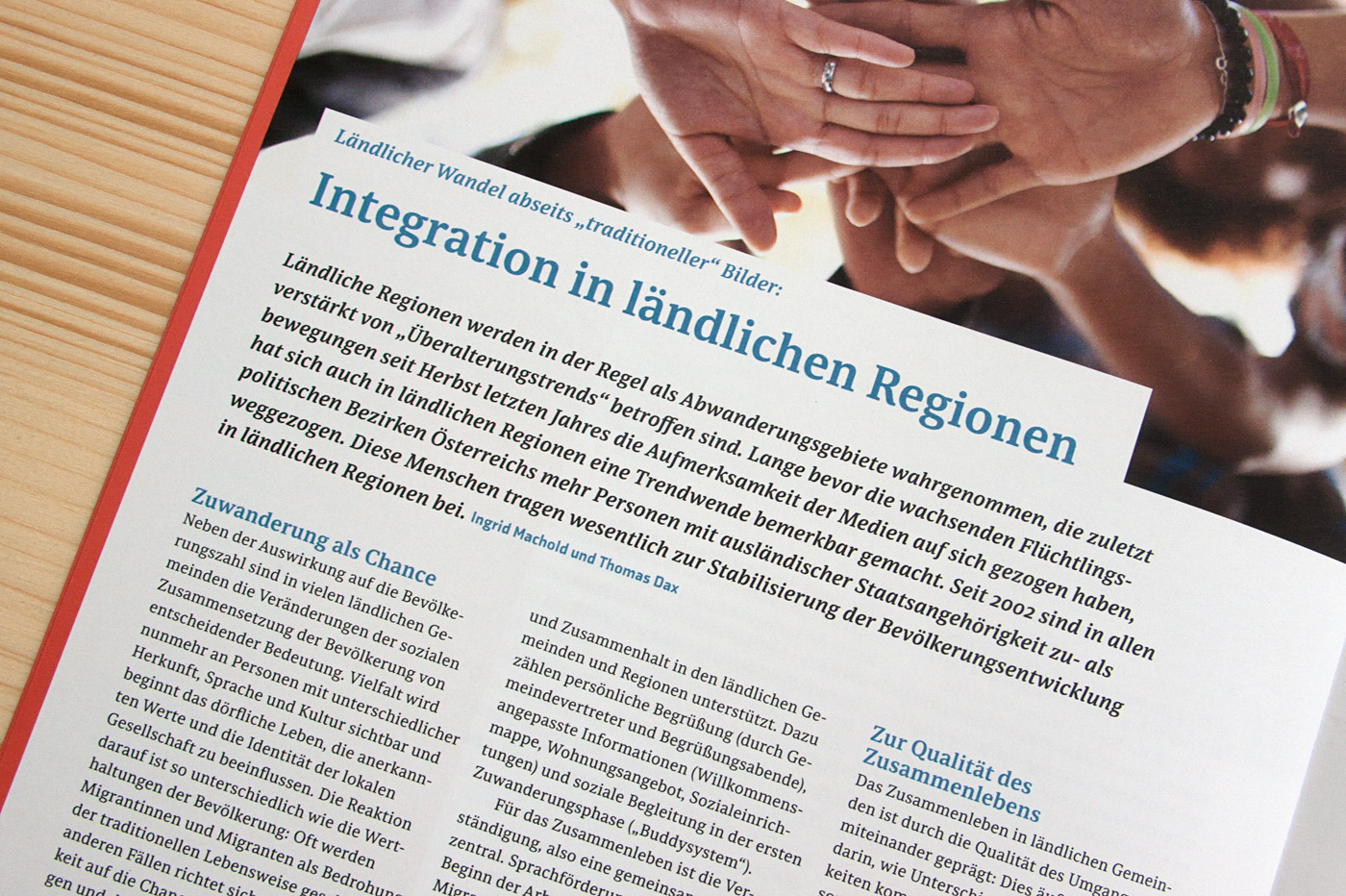
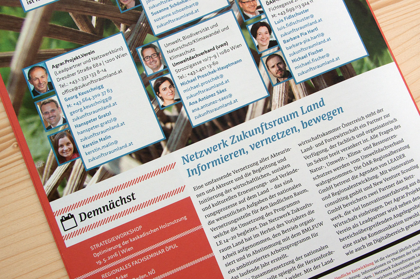 Various impressions of Netzwerk Zukunftsraum Land, designed by Andrea Neuwirth.
Design Journal and Rolf Rehe recommend Acorde
The Design Journal is a bi-annual magazine covering the issues of news design and journalism. It is published by the Society for News Design (SND), an international organisation for news media professionals and visual communicators. SND was founded in 1979 and has about 1000 members worldwide.
In each issue the international newspaper designer Rolf Rehe recommends three typefaces which are appropriate for application in newspaper design. To give the Design Journal’s readers the possibility of judging the qualities of the typefaces themselves, the whole magazine is set in the recommended typefaces.
In the current issue (No. 112) Acorde is used as a secondary typeface for text as well as for headlines and gives proof of its wide applicability in various sizes. »It combines cool, geometric letter elements with the warmth of humanist sans forms. This results in a friendly yet assertive appearance«, states Rolf Rehe.
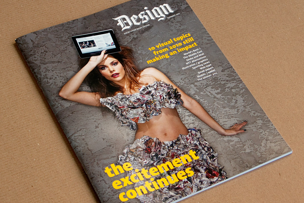 Cover of the summer issue of SND’s Design Journal entirely set in Acorde.
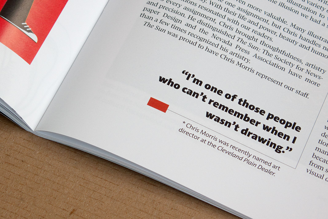
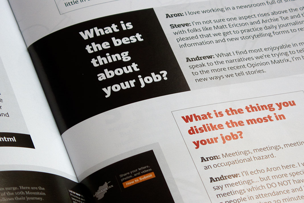
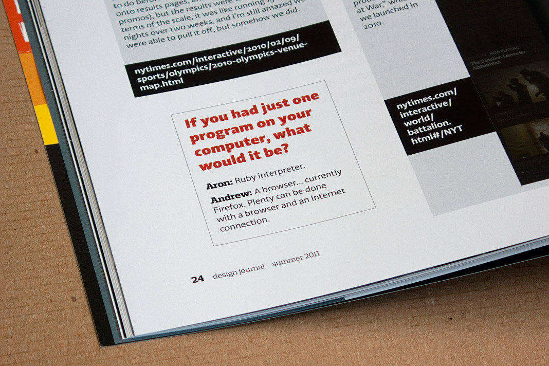
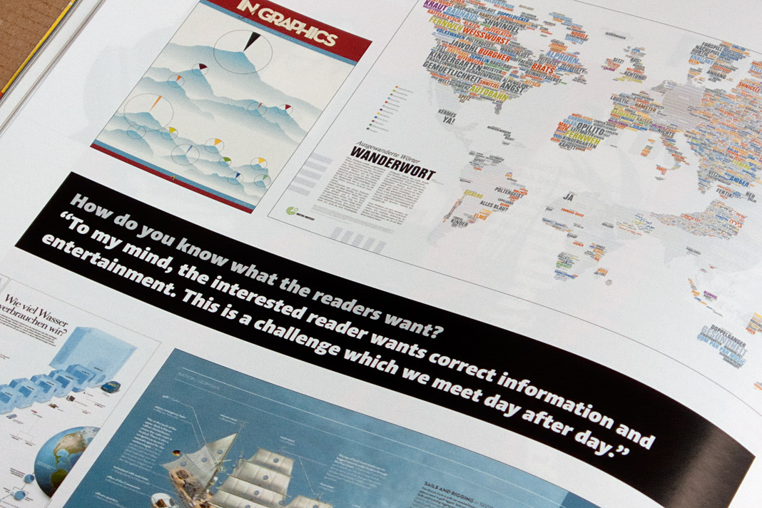
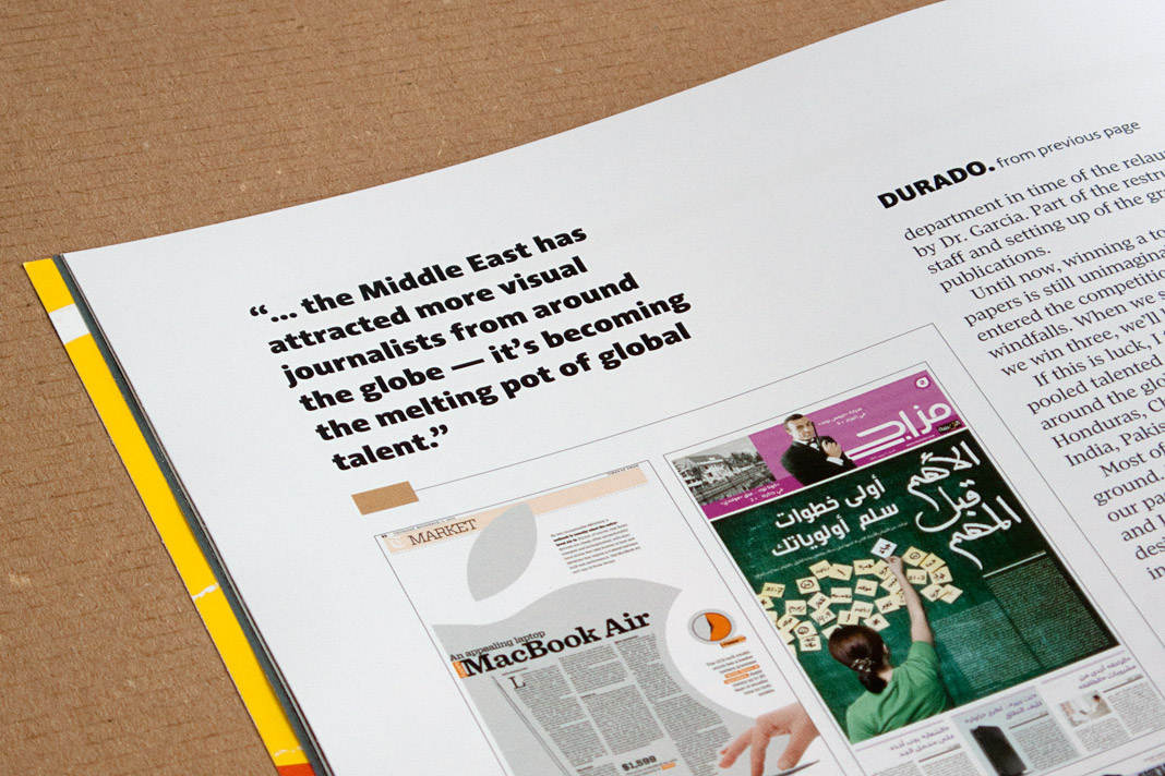
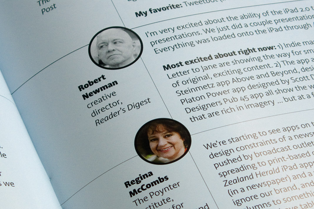
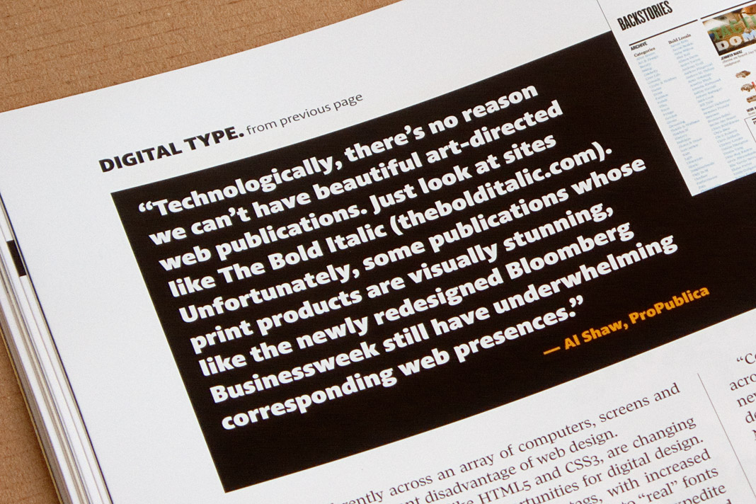
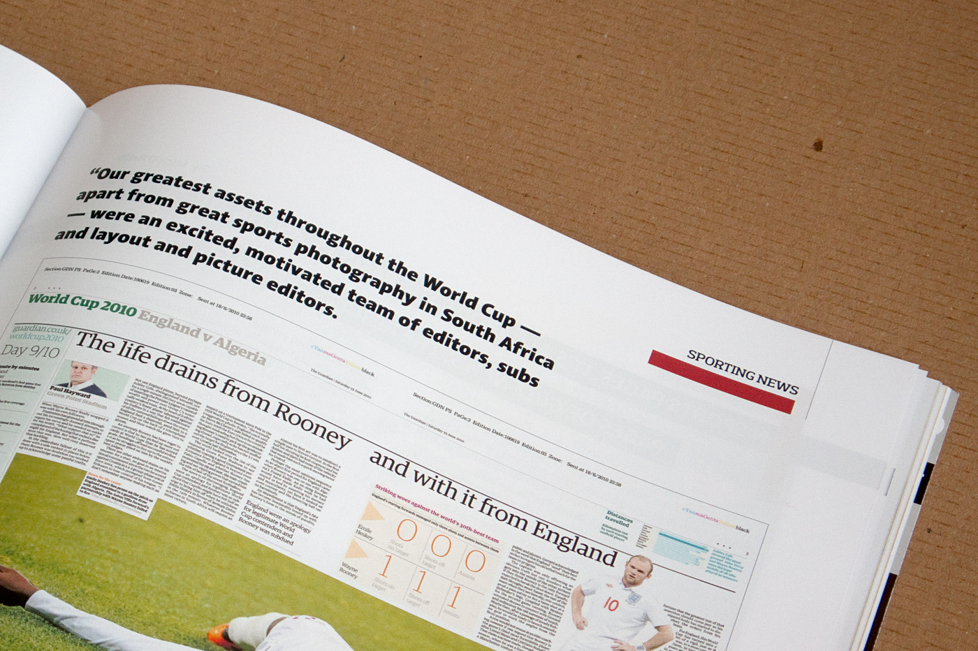 Various impressions of SND’s Design Journal using Acorde.