Blog – Insights by Stefan Willerstorfer
Josef Frank’s writings set in Acorde
The bilingual book Josef Frank: Writings is a complete collection of all published writings of Austrian architect Josef Frank, one of the main protagonists of Classical Modernism. It comes in two volumes and consists of nearly 900 pages in total. Since the whole publication is entirely set in Acorde, it is probably amongst the publications where Acorde’s workhorse qualities can be judged most easily.
 Both covers of the two-volume book show the enlarged signature of Josef Frank.
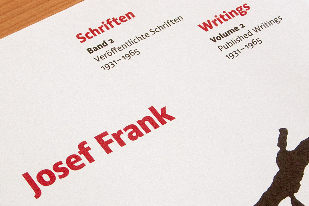
The two-volume book was designed by Austrian book designer Peter Duniecki who explains his choice of Acorde as follows. »Die verwendete Schrift spiegelt die Zeit der Wiener Moderne. Modern, klar, nicht so hart, runder, eben wienerischer als die Internationale Moderne. Ihre hervorragende Lesbarkeit würde Josef Frank zu schätzen wissen.« (The chosen typeface reflects the era of Viennese Modernism. Modern, pure, not so hard, rounder, just more Viennese than the International Modernism. Josef Frank would appreciate its outstanding legibility.)
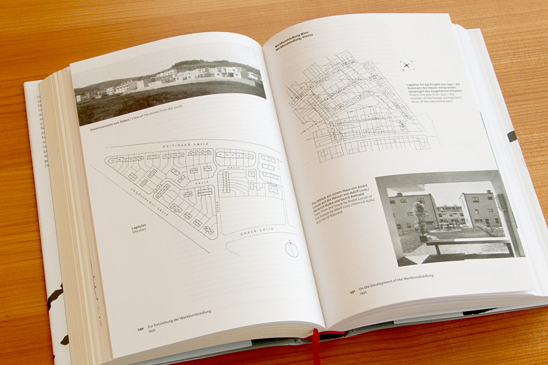
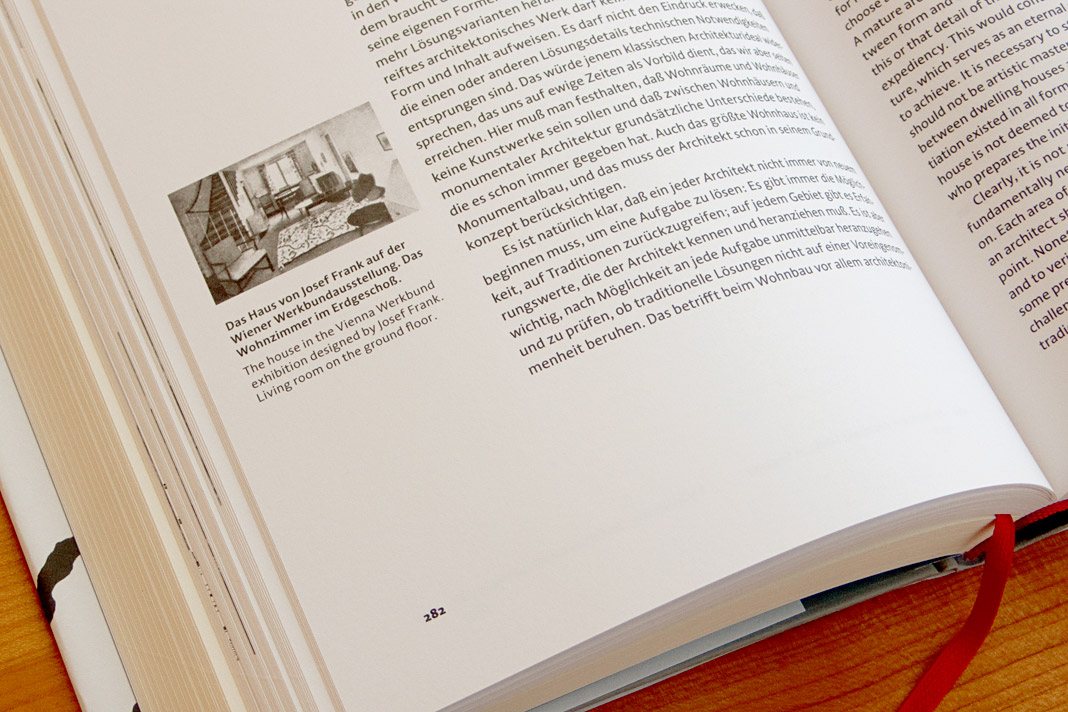
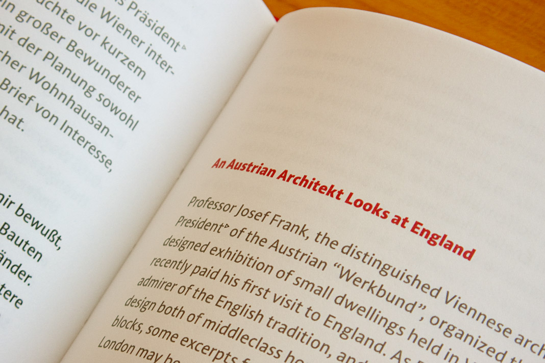 Various impressions of the publication on Josef Frank’s writings, designed by Peter Duniecki.
Publishing house facultas.wuv features Acorde
The Viennese publishing house facultas.wuv uses two italic styles of Acorde as the main dynamic visual element on the cover of one of their newest publications, a reference book of political science. The publication, entitled Theoriearbeit in der Politikwissenschaft (Academic Writing in Political Science) addresses the demands of students in political science doing their master’s studies. The book cover was designed by Austrian designer Martin Tiefenthaler.
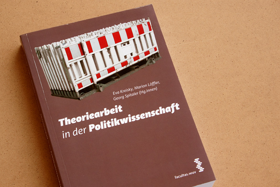 Cover of the book Theoriearbeit in der Politikwissenschaft (Academic Writing in Political Science).
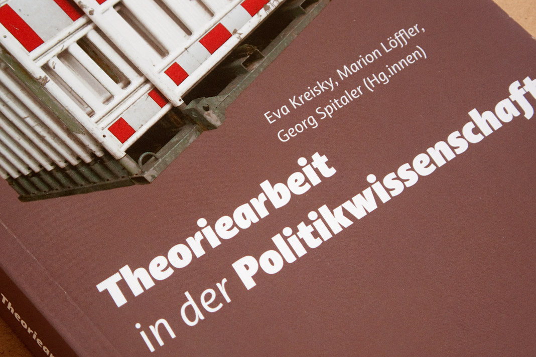 The italic styles of Acorde establish a dynamic contrast to the static photograph.
Slanted #19 – Acorde is one of the super families
The current issue of the quarterly magazine Slanted – Typografie & Grafik Design deals with large type families, so-called super families. Due to their wide range of different styles (various weights, as well as widths or optical sizes) they are able to perform a great variety of different tasks and provide the typographer with a huge set of tools to choose from.
Acorde is one of the selected super families. It offers a large amount of different weights and was designed to be perfectly suited to all different sizes, from small continuous text to large headlines and big signage. Next to the presentation of the selected super families, the magazine also shows a large amount of family photographs taking the term super family literally. Pictures of families from various places as well as portraits of royal families.
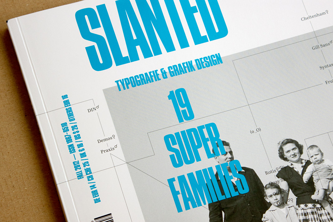 Cover of the current issue of the magazine Slanted focusing on super families.
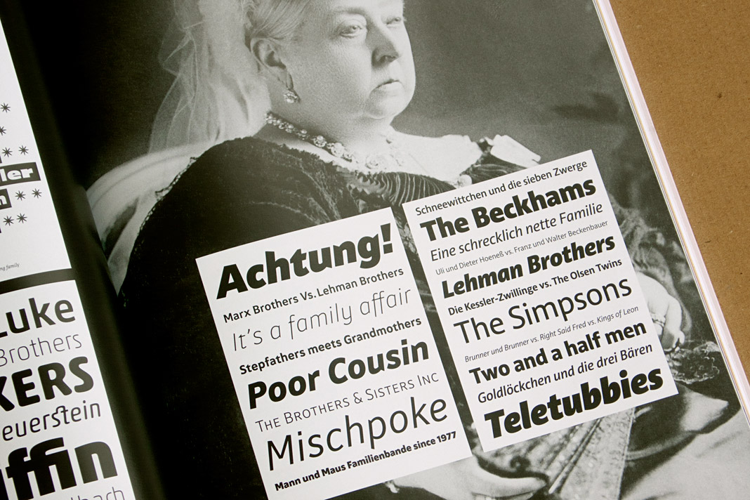 Royal family meets super family: Queen Victoria holds Acorde in her hands.
Typodarium 2013 features Acorde on November 28
Typodarium 2013 is the fifth edition of a series of annual calendars edited by the duo Lars Harmsen and Raban Ruddigkeit and published by Verlag Hermann Schmidt Mainz. It is now available and features 365 typefaces (one per day) designed by more than 212 designers from 33 countries.
The typefaces for the fifth edition were selected by a renowned international jury consisting of Donald Beekman, Indra Kupferschmid, Dan Reynolds, Carlos Segura, and Panos Vassiliou. Acorde is one of the typefaces on display and has been allocated a nice task: It gives Thanksgiving Day (US) on Thursday November 28 a suitable typographic appearance.
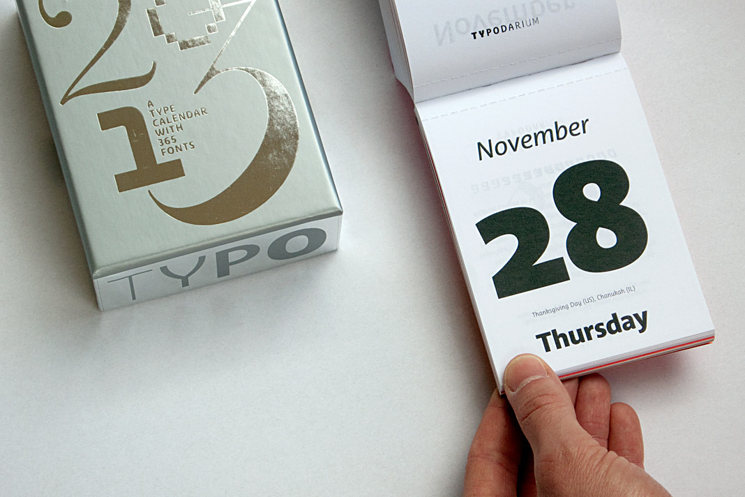 The front side of November 28 shows three different styles of Acorde.
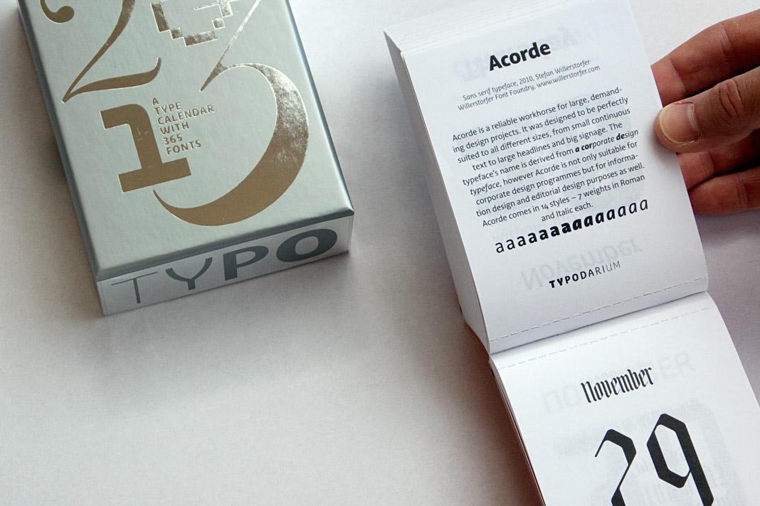 The back side of November 28 contains a short description of Acorde.
Typography Referenced refers to Acorde
The book Typography Referenced is a comprehensive visual guide to the language, history and practice of typography. It is co-authored by Allan Haley, Richard Poulin, Jason Tselentis, Tony Seddon, Gerry Leonidas, Ina Saltz, Kathryn Henderson, and Tyler Alterman and published by Rockport Publishers, a member of the Quarto Group.
One chapter of the book presents the work of a selected group of influential type designers of the twenty-first century. It is an honour that my work is included in the book and that Acorde is shown in great detail.
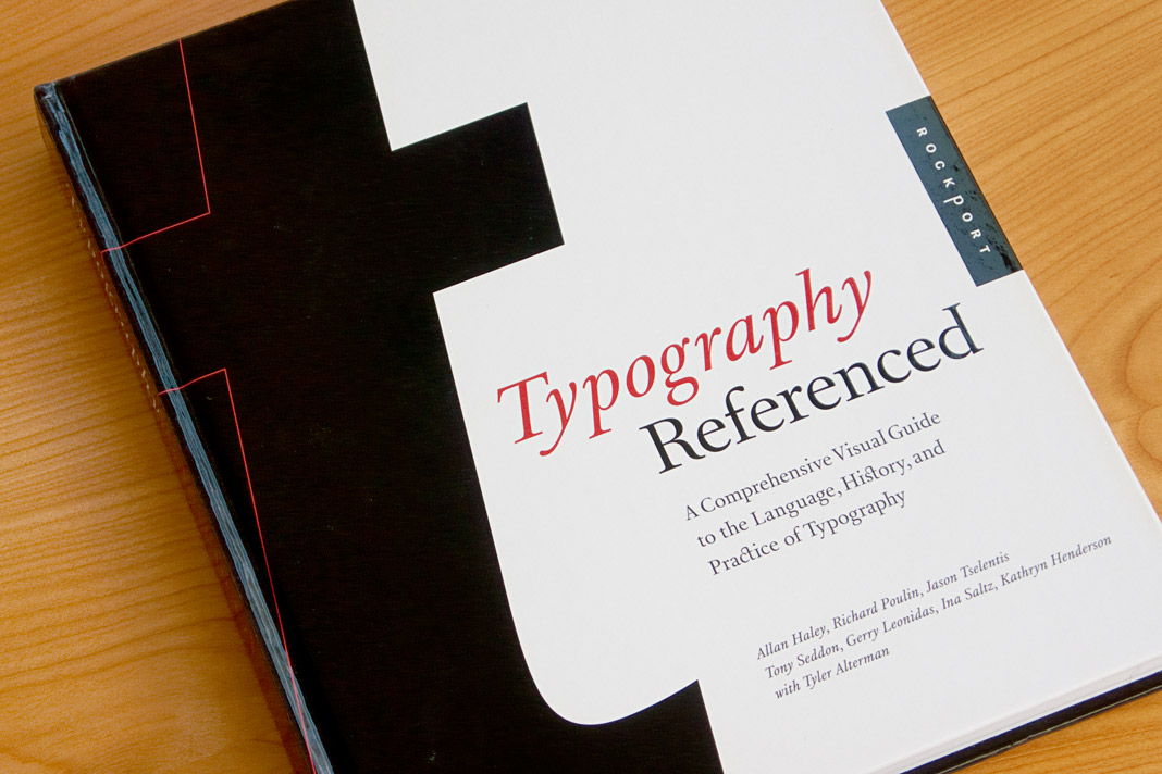 The cover of the new and informative book Typography Referenced.
Acorde presents the most beautiful books of A/D/CH/NL
Like every year the Typographic Society Austria (tga – Typographische Gesellschaft Austria) shows the most beautiful books of Austria, Germany, Switzerland, and the Netherlands in cooperation with the Vienna Public Libraries and the Association of Austrian Book Trade.
The most beautiful books of 2010 can be seen in the Central Library in Vienna from December 7, 2011 to February 4, 2012. The exhibition design is entirely set in Acorde. Since Acorde is used for small text (labels, signs, flyers) as well as for large headlines, the exhibition design is a good example of Acorde’s suitability for all different sizes.
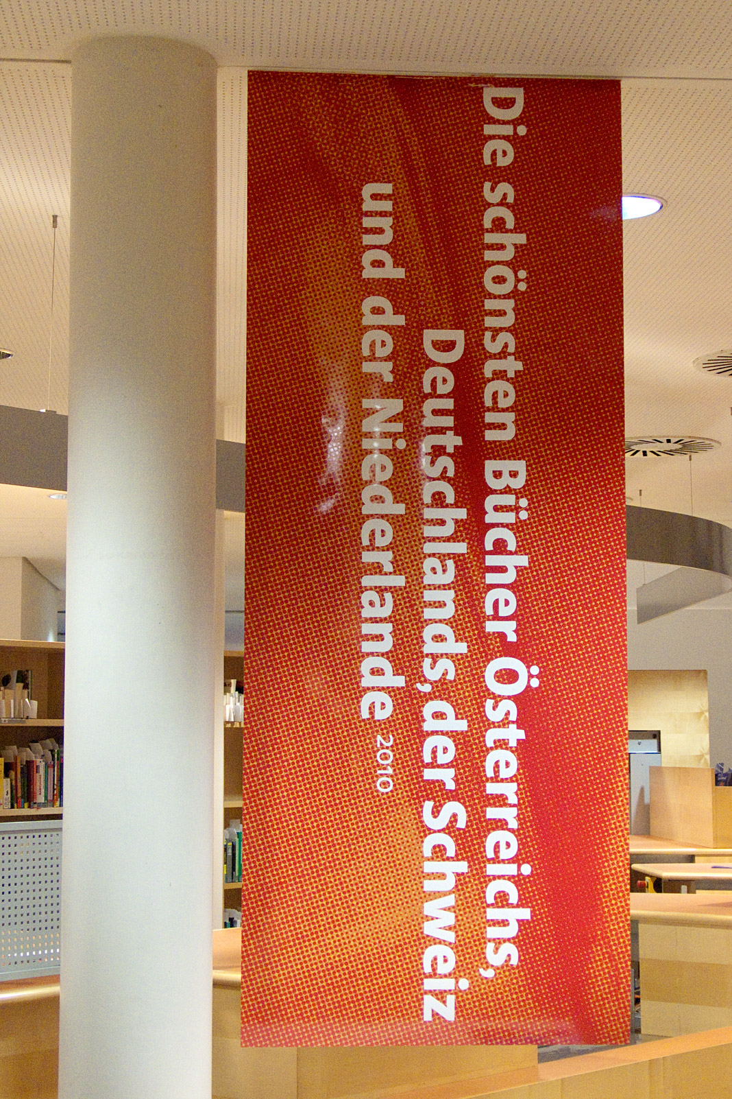
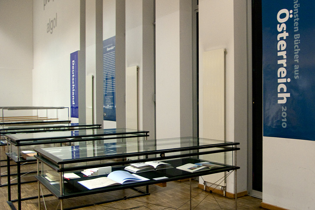
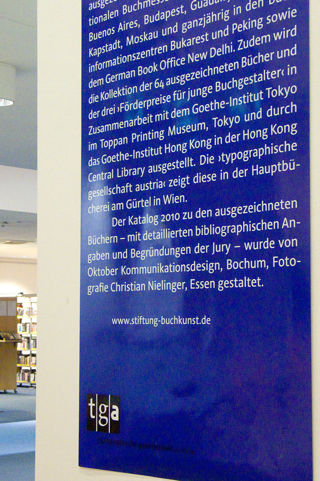
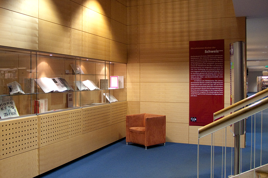
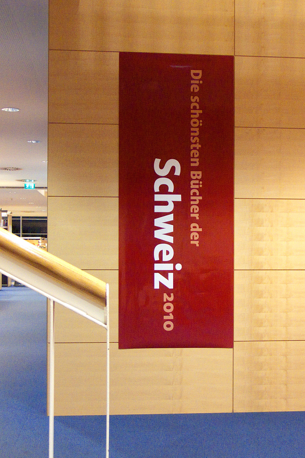 Some impressions from the exhibition of the most beautiful books in Vienna.