Blog – Insights by Stefan Willerstorfer
Acorde wins Communication Arts Award of Excellence
Communication Arts has been publishing annuals showing the best in visual communications from around the world since 1959. But still 2011 marks a change. It is the first time – and certainly the beginning of a long tradition – of publishing a distinct annual specifically focused on typography.
The Communication Arts Typography Annual 1 presents the best work in various typographic categories such as books, periodicals, identity, packaging, and typeface design. It is a brilliant achievement that Acorde was among the first typefaces receiving the Communication Arts Award of Excellence in this category.
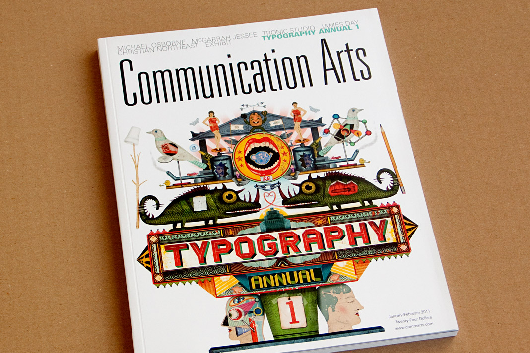 The first Communication Arts Typography Annual.
Austrian publishing magazine Periodicum presents Acorde
Vielgesichtiges Schriftbild (multifaceted type) is the title of Christian Gutschi’s article on the type family Acorde in the current issue of Periodicum (No. 2/2010), the bi-annual magazine by the corporate publishing company Egger & Lerch.
Gutschi emphasises Acorde’s workhorse qualities and its applicability for various applications, conditions and sizes as the article’s title already suggests. The article also gives information on the development process of the typeface and comments on various characteristics of Acorde.
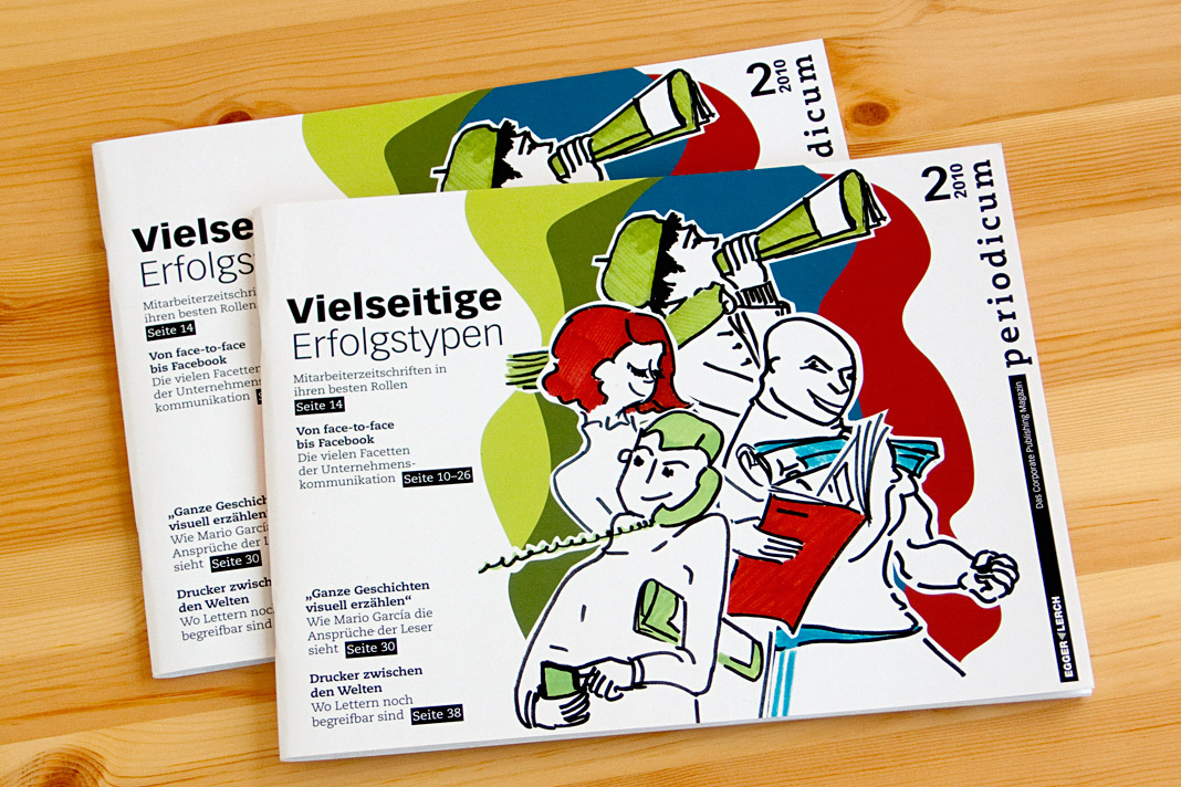 Cover of the publishing magazine Periodicum issue No. 2/2010.
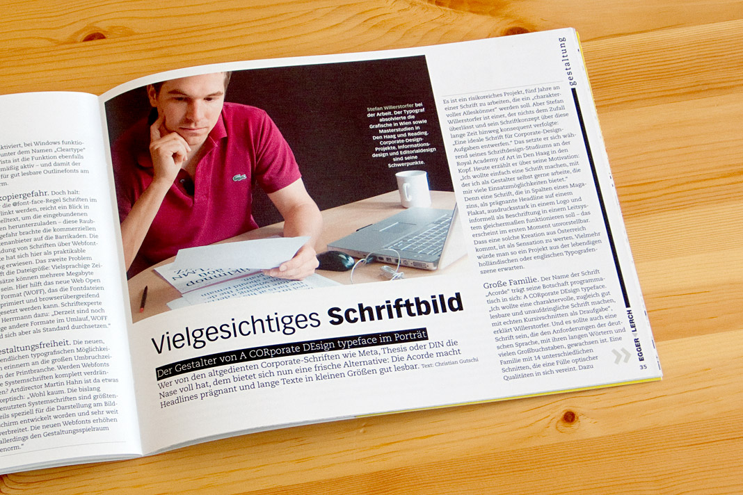
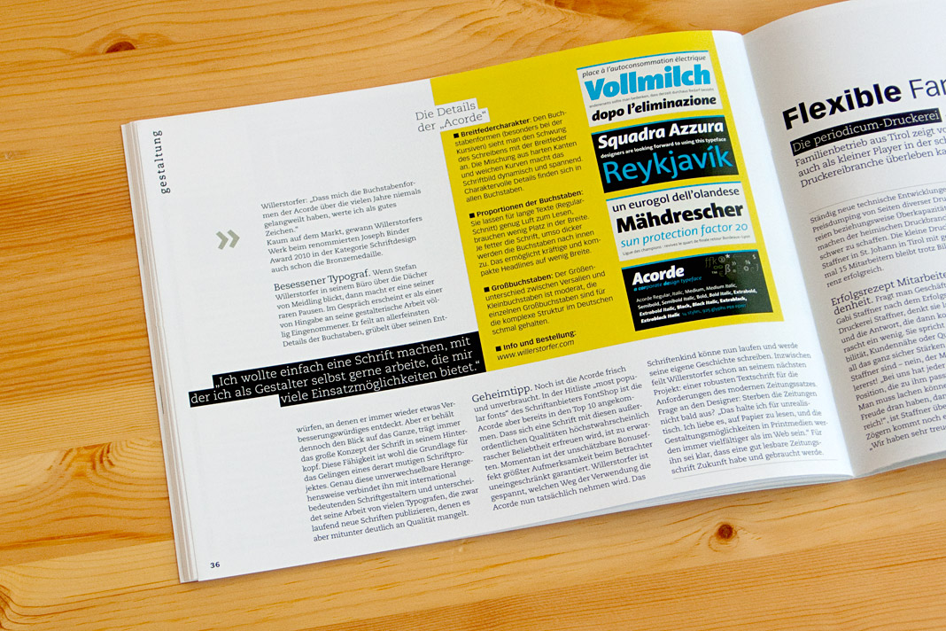 Pages showing the article inside the magazine.
Publishing house edition a relies on Acorde
The Viennese publishing house, edition a, uses the type family Acorde as one of the main visual elements on two of their books’ covers and as the headline typeface inside these two books.
One of the books is called Donnerwetter, a non-fiction book on weather by Austrian TV weather presenter Marcus Wadsak, the other one Vorsicht Vertrauen, a non-fiction book on economics by Manfred Berger and Arne Johannsen.
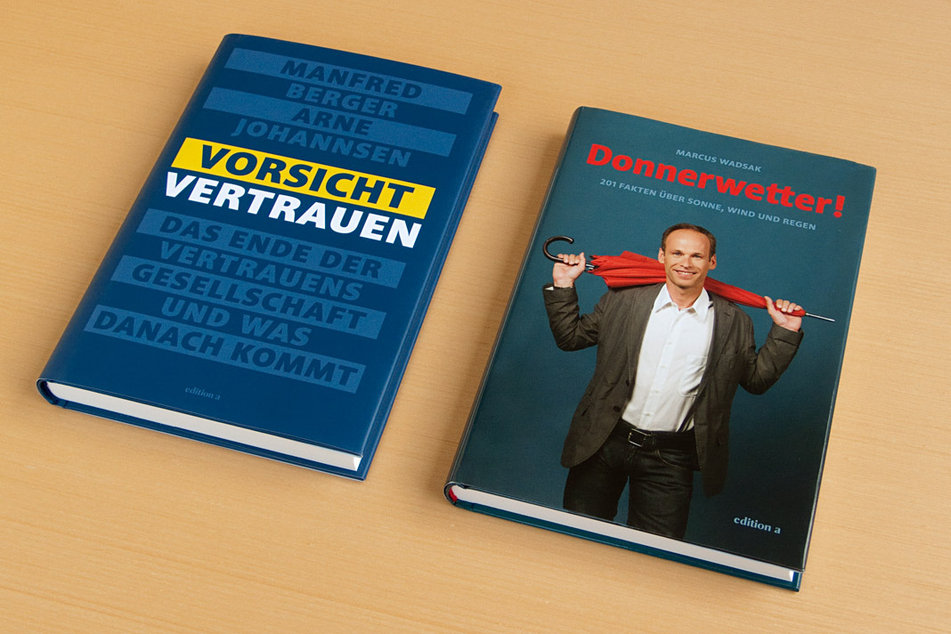 The covers of the two non-fiction books are entirely set in Acorde.
Acorde wins the Joseph Binder Award in Bronze
The Joseph Binder Award is a biennial international design competition organised by Design Austria, Austria’s only professional association and service organisation representing the interests of designers from all creative disciplines. The jury of this year’s competition was chaired by Dutch design icon Gert Dumbar, and consisted of renowned international experts such as Lo Breier and Olaf Hajek.
Although Design Austria has been awarding the Joseph Binder Award since 1996, this year’s competition was the first one to have the category type design as a design discipline on its own. Introducing awards for this discipline reflects the growing significance and recognition of type design in Austria. It is a great honour that Acorde was one of the first typefaces to receive the highly respected Joseph Binder Award in this new category.

 Double page spread of the Joseph Binder Award catalogue showing Acorde.
I Love Typography presents The making of Acorde
»I liked Stefan Willerstorfer’s new typeface Acorde so much, that I asked him to write about it for ILT«, states John Boardley, British-born writer, publisher, and graphic designer, who founded the world’s most popular typography blog ILT (I Love Typography) in 2007.
Thus if you want to learn more about the making of Acorde just head to I Love Typography. It is just one of many reasons for having a look at this very well made website dealing with the various aspects of typography. One can really feel that the founder’s motivation for starting this website was his true passion for and interest in typography.

Media journal Graphische Revue presents Acorde
Graphische Revue is an Austrian media and design journal that has been published for more than one hundred years. In the current issue (No. 5/2010) Christian Gutschi introduces the type family Acorde and explains some of its characteristics in his article Acorde: charaktervoller Alleskönner (Acorde: characterful all-rounder).
Further he suggests some potential applicabilities and gives an insight on the values that were important to me as a designer during the development of Acorde. The whole article is set in Acorde which gives the readers an impression of how the type family works in text and in larger sizes.
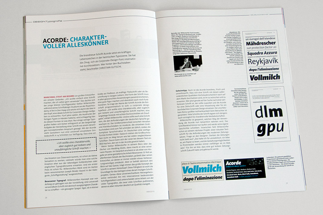 Double page spread of the design journal showing the article about (and set in) Acorde.