Blog – Insights by Stefan Willerstorfer
Florian Hardwig reviews Acorde on MyFonts.de
MyFonts.de, the German branch of MyFonts.com, contains a gallery called Fontschau (Font Show), a place for exhibiting and reviewing outstanding typefaces. In his most recent review Florian Hardwig takes a close look at the type family Acorde.
Hardwig describes Acorde’s qualities, its range of applications and compares it with other sans serif typefaces. You can read Hardwig’s review in full length on MyFonts.de. Unfortunately the article is available in German only.

Design Journal and Rolf Rehe recommend Acorde
The Design Journal is a bi-annual magazine covering the issues of news design and journalism. It is published by the Society for News Design (SND), an international organisation for news media professionals and visual communicators. SND was founded in 1979 and has about 1000 members worldwide.
In each issue the international newspaper designer Rolf Rehe recommends three typefaces which are appropriate for application in newspaper design. To give the Design Journal’s readers the possibility of judging the qualities of the typefaces themselves, the whole magazine is set in the recommended typefaces.
In the current issue (No. 112) Acorde is used as a secondary typeface for text as well as for headlines and gives proof of its wide applicability in various sizes. »It combines cool, geometric letter elements with the warmth of humanist sans forms. This results in a friendly yet assertive appearance«, states Rolf Rehe.
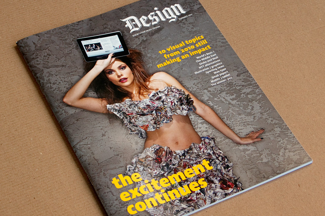 Cover of the summer issue of SND’s Design Journal entirely set in Acorde.
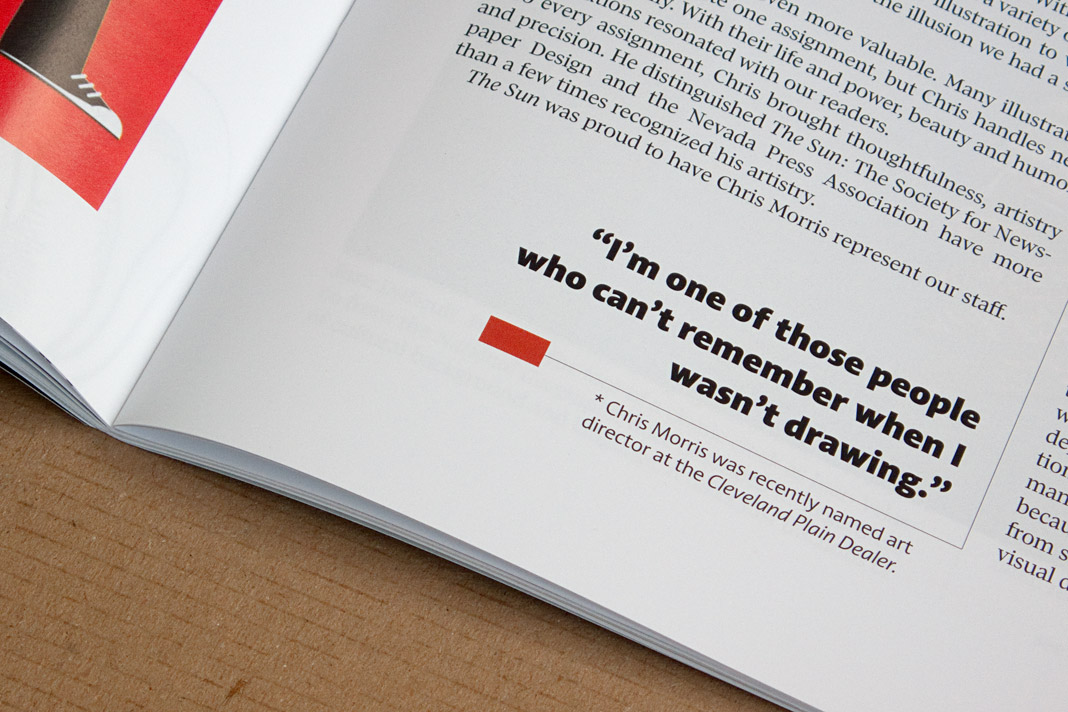
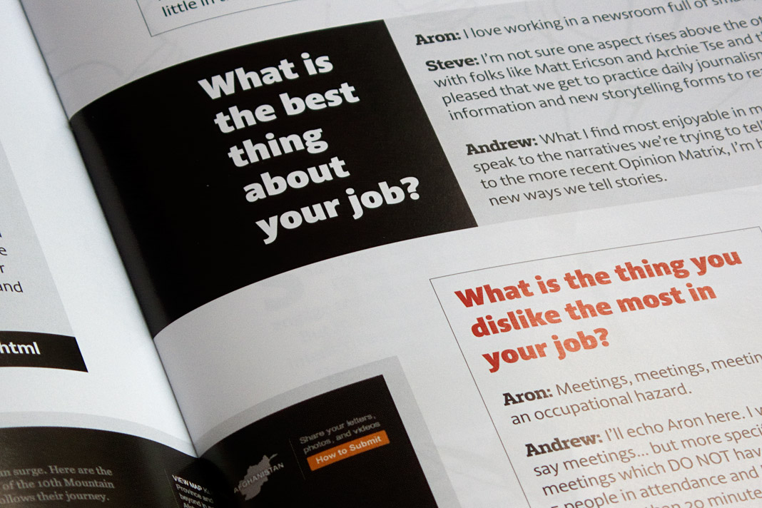
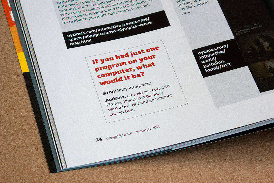
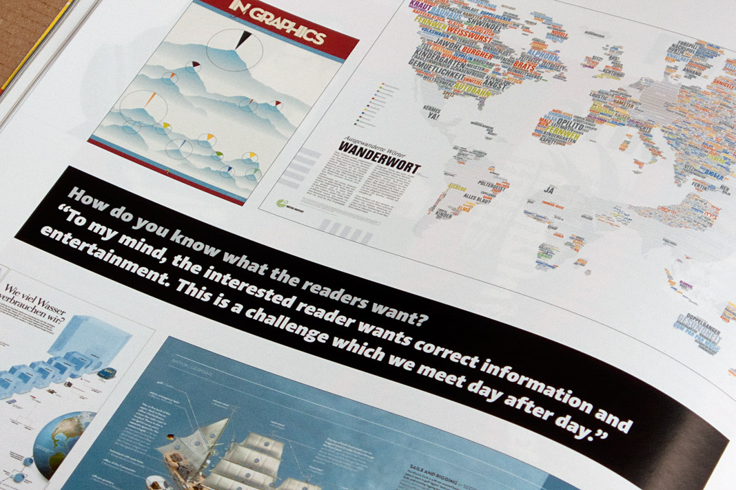
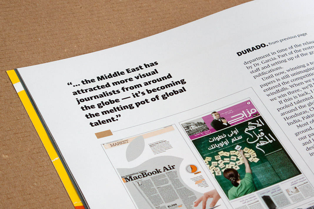
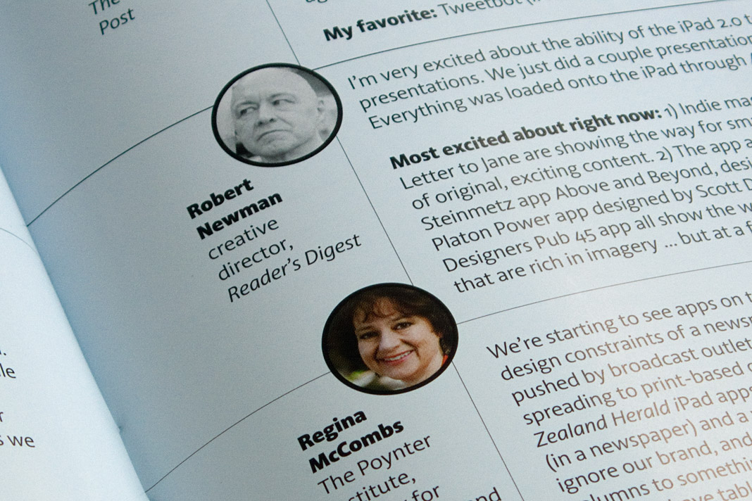
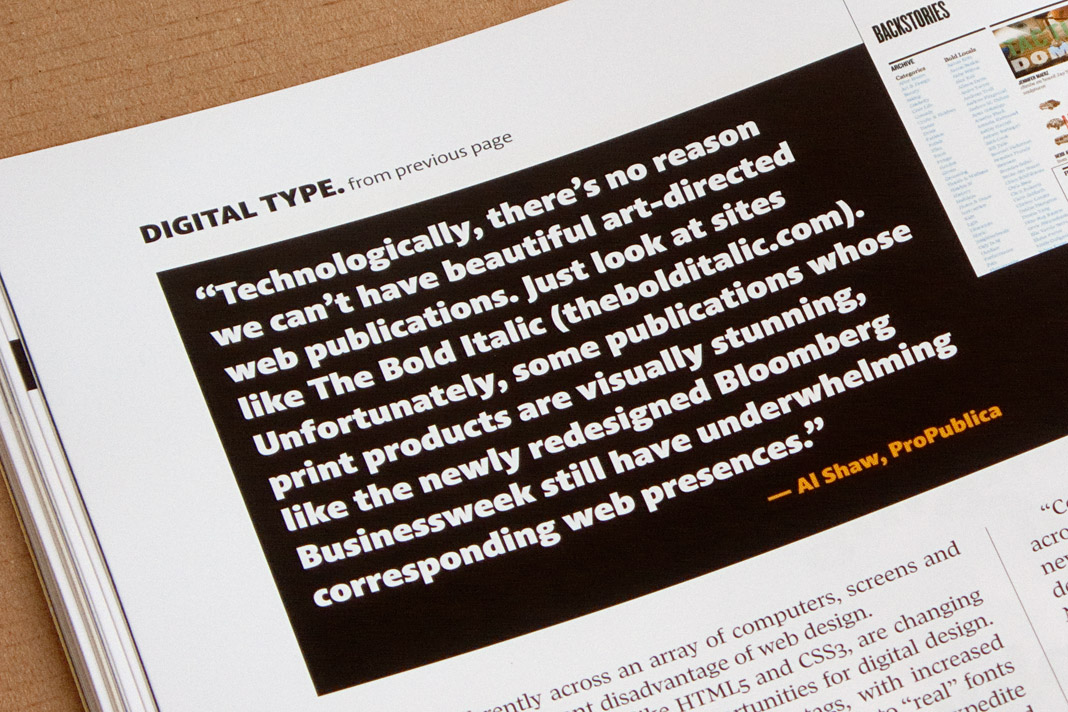
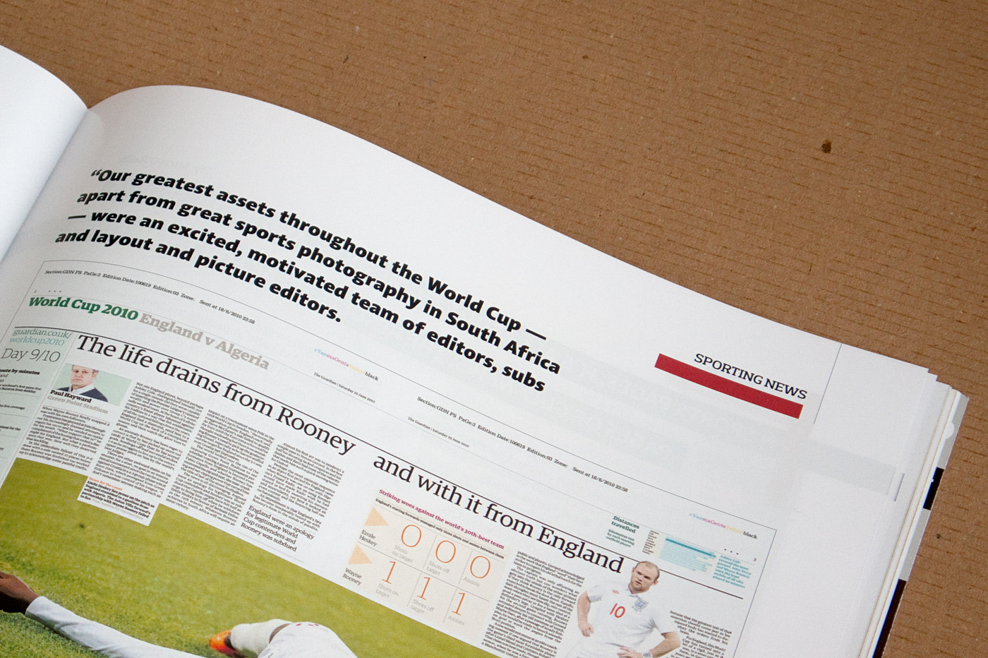 Various impressions of SND’s Design Journal using Acorde.
Typodarium 2012 features Acorde on January 26
The Typodarium 2012, a calendar edited by Lars Harmsen and Raban Ruddigkeit and published by Verlag Hermann Schmidt Mainz is now available and features 366 typefaces (one per day) designed by more than 250 designers from 32 countries.
In order to enhance the typographic quality of this year’s calendar, all entries were chosen by a renowned international jury consisting of Roger Black, Michel Chanaud, Yves Peters, Hubert Jocham, and Christian Schwartz. Acorde is one of the selected typefaces and performs the task of presenting Thursday January 26 with great pleasure.
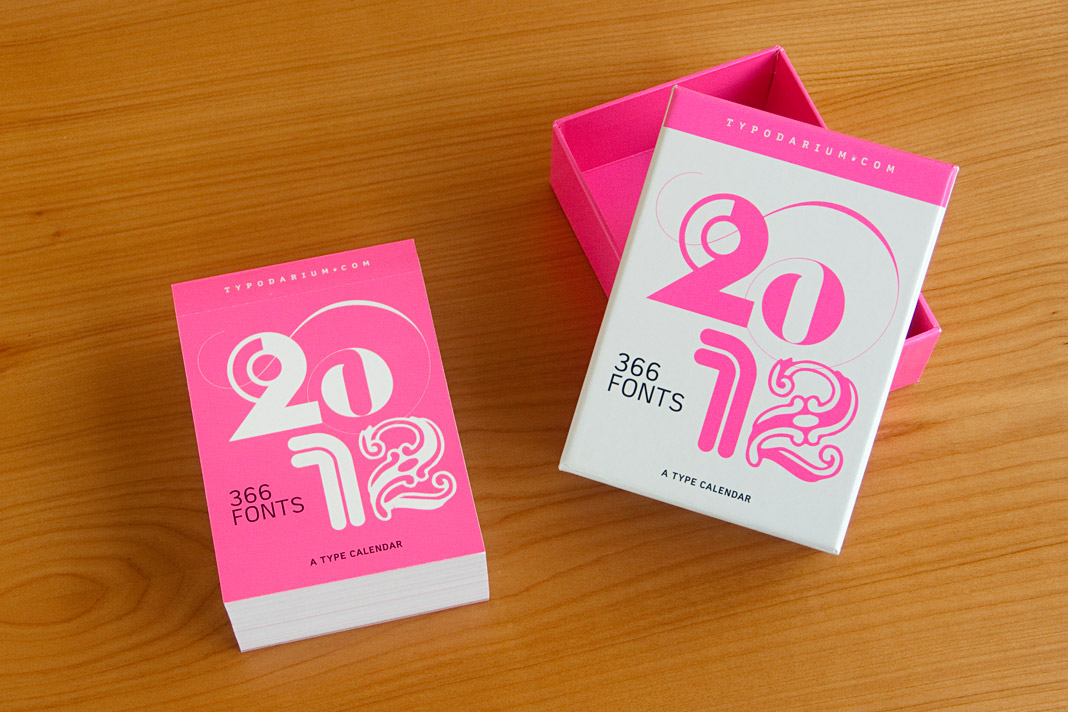 The calendar comes with a box for collecting the torn off calendar sheets.
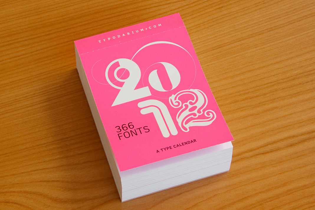 The cover of the 2012 edition of the Typodarium calendar.
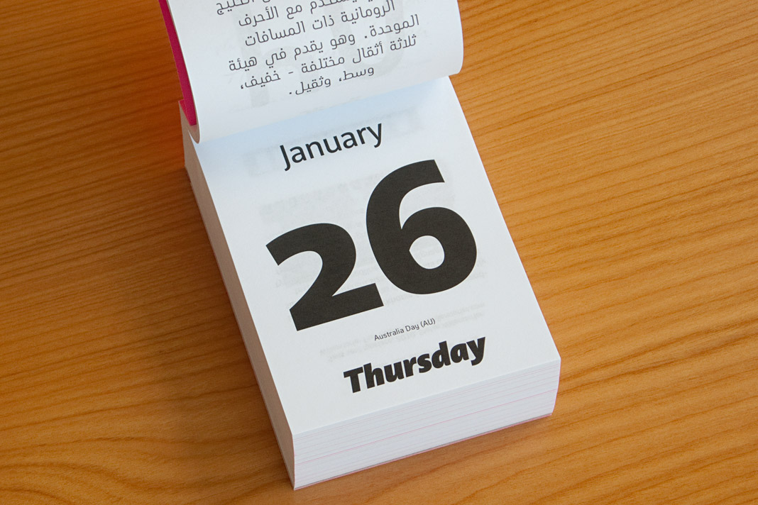 The front side of January 26 shows three different styles of Acorde.
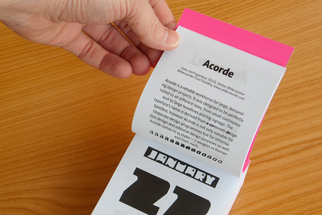 The back side of January 26 contains a short description of Acorde.
Acorde is nominated for the German Design Award 2012
The German Design Award (Deutscher Designpreis) is the most prestigious German design competition covering the disciplines of communication design and product design. It is organised by the German Design Council (Rat für Formgebung). Outstanding projects are nominated by an internationally renowned jury to participate in the competition. Only projects which have already won a well-respected design award are eligible for nomination. That is why the German Design Award is subtitled the Champions League of Design.
It is a great honour that Acorde is nominated for the German Design Award 2012 and competing with well-selected international design projects for this prestigious design award.
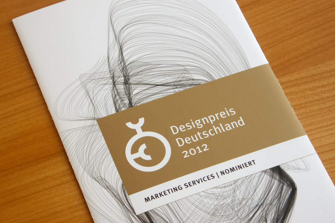 Nomination for the German Design Award 2012.
DA Mitteilungen presents The making of Acorde
Since my article about the making of Acorde raised a lot of interest on the world’s most popular typography blog, I Love Typography (ILT), during autumn last year, I decided to translate the article to German and to make it specially available to Austrian designers with an interest in type and typography as well.
The article was published by Design Austria, Austria’s professional association and service organisation representing the interests of designers from all creative disciplines, appearing in its quarterly published journal DA Mitteilungen (issue No. 2/2011).
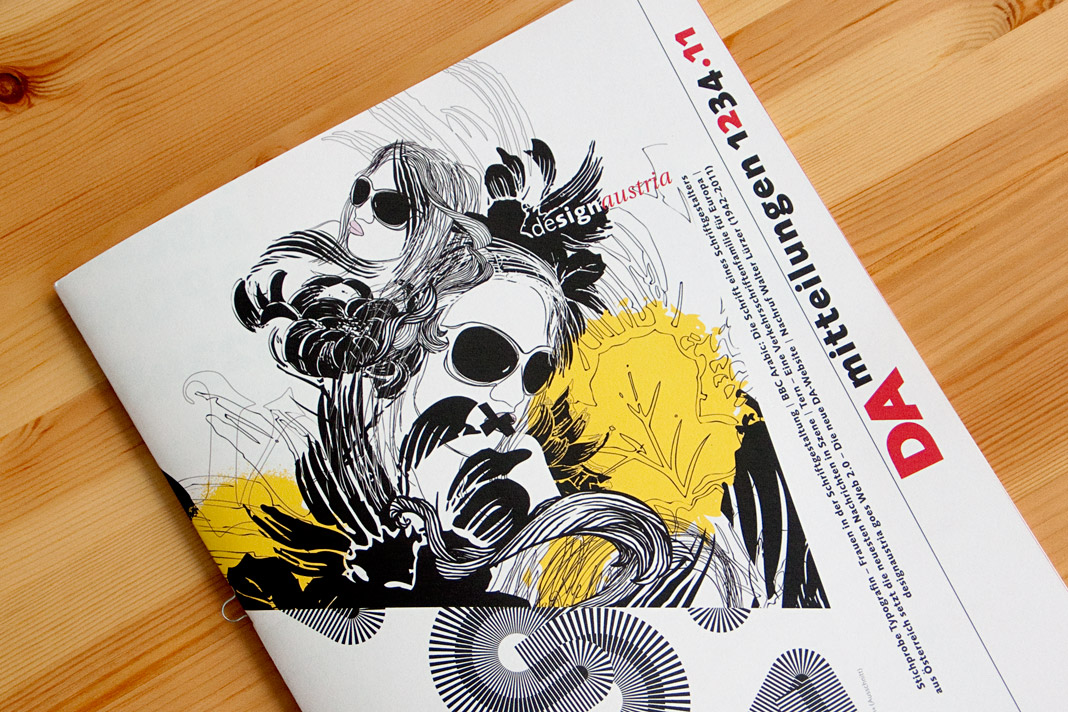 The cover of DA Mitteilungen issue No. 2/2011.
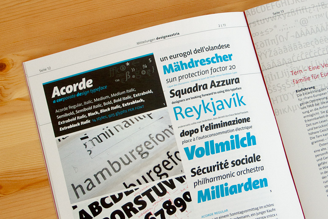 Double page spread showing the article on Acorde.
German newspaper INFO – Der Südfinder trusts in Acorde
The German newspaper INFO – Der Südfinder is a regional newspaper in Baden-Württemberg with a circulation of more than half a million copies. German newspaper designer Hans Peter Janisch restructured the newspaper and brought its appearance up to date. The new design was presented at the end of May.
The centrepiece of the revised typography was the introduction of Acorde as the newspaper’s main typeface. Acorde is used for text as well as for headlines and demonstrates its ability to be a true workhorse. It perfectly contributes to the fresh and modern feel of the newspaper.
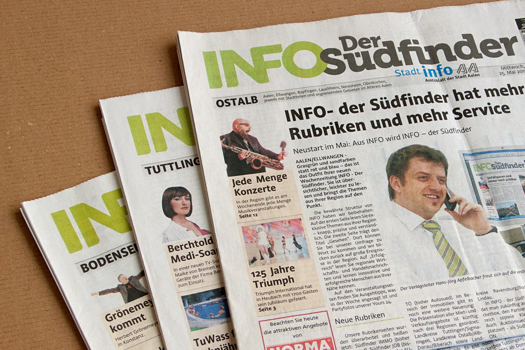 Cover of the first issue of the redesigned newspaper.
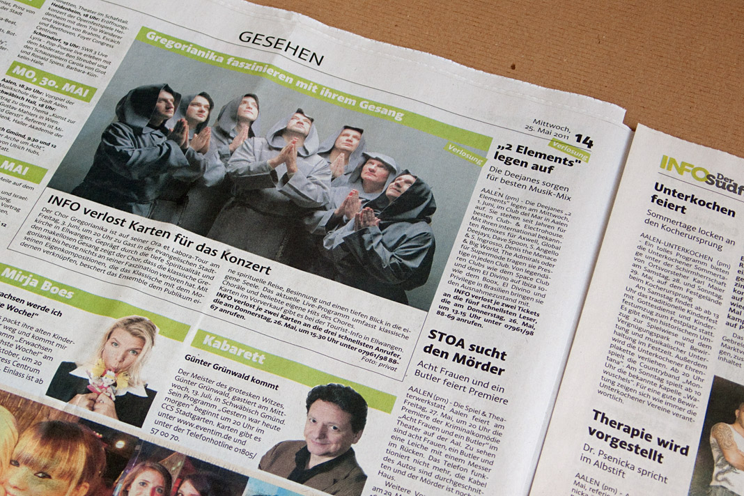
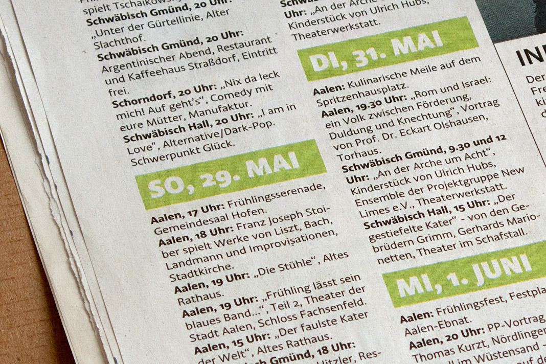
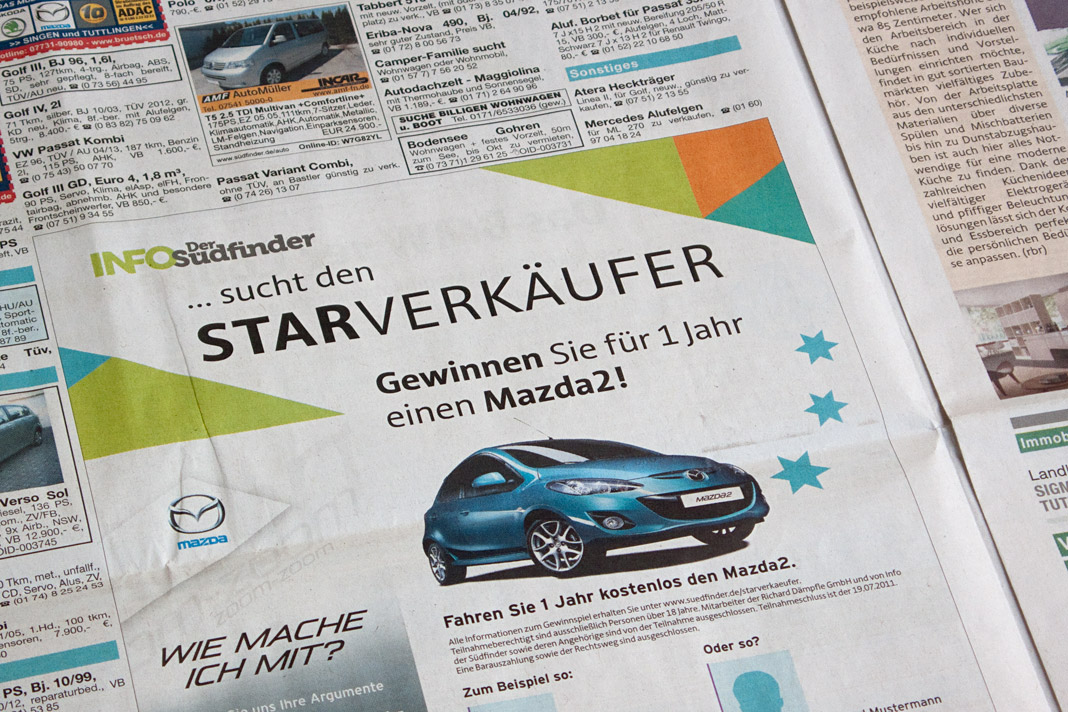
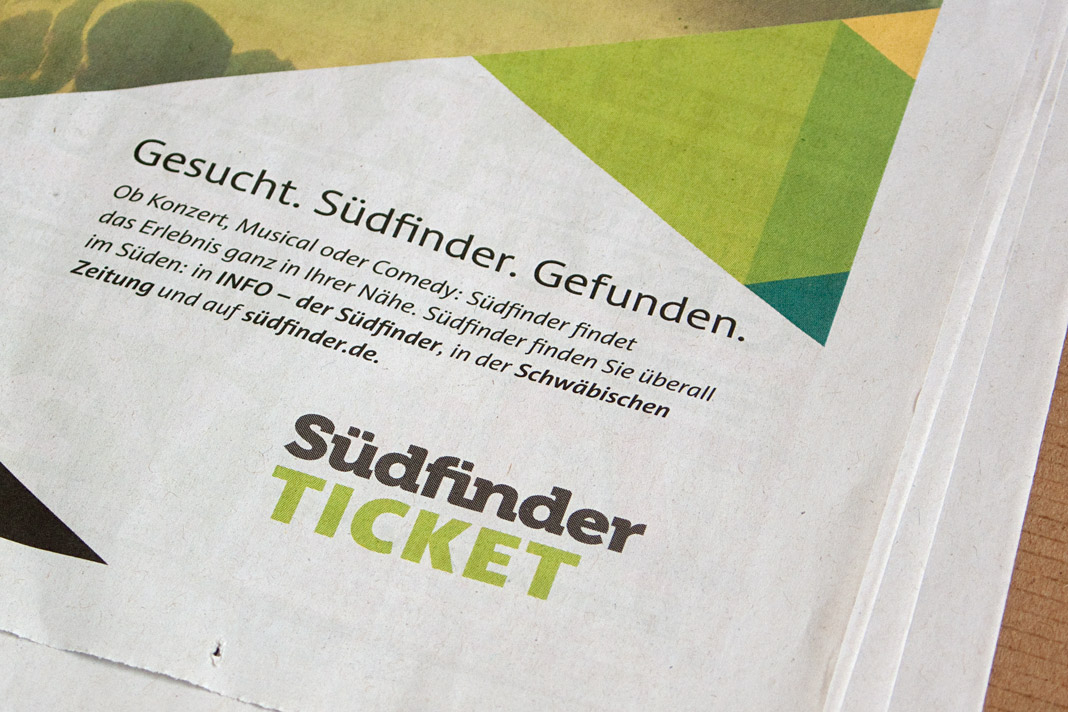
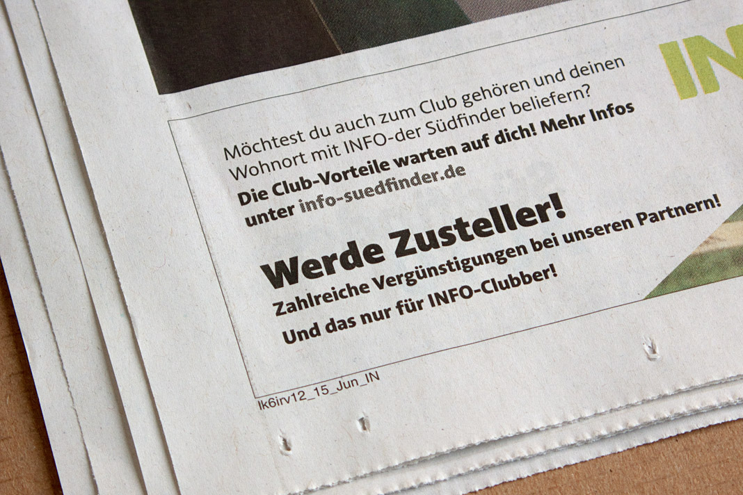
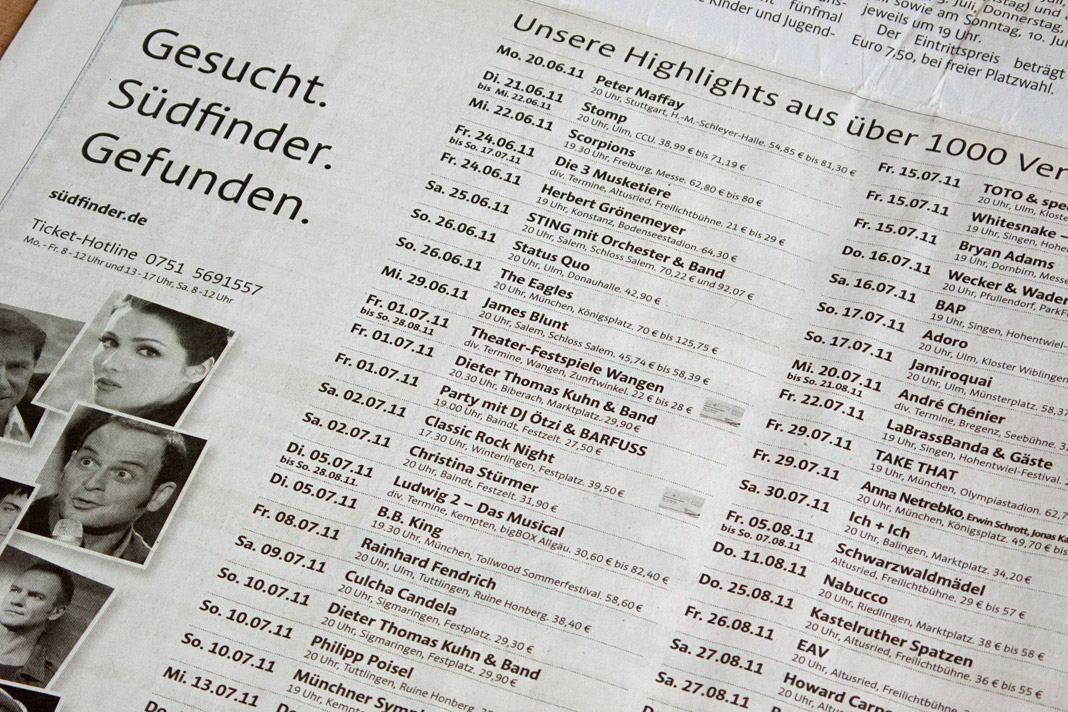
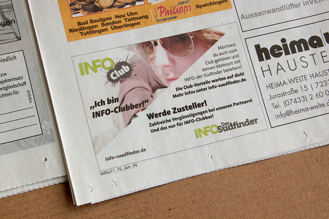
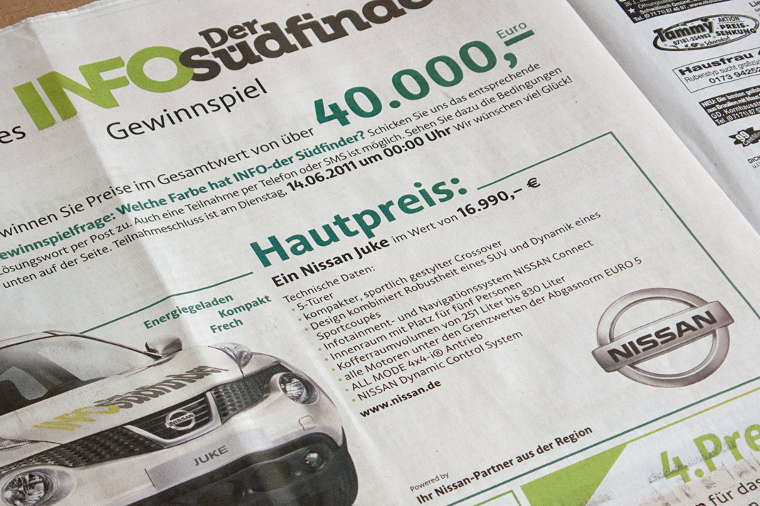
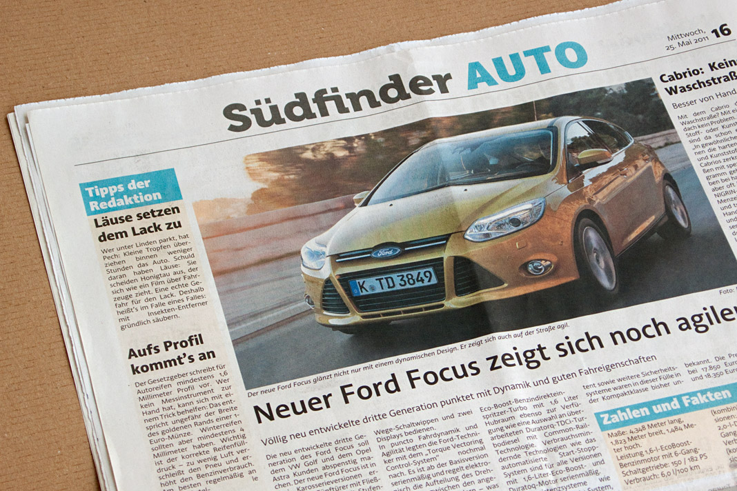
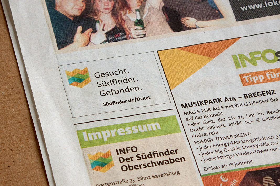 Various impressions of the newspaper’s new appearance.