Blog – Insights by Stefan Willerstorfer
Typodarium 2012 features Acorde on January 26
The Typodarium 2012, a calendar edited by Lars Harmsen and Raban Ruddigkeit and published by Verlag Hermann Schmidt Mainz is now available and features 366 typefaces (one per day) designed by more than 250 designers from 32 countries.
In order to enhance the typographic quality of this year’s calendar, all entries were chosen by a renowned international jury consisting of Roger Black, Michel Chanaud, Yves Peters, Hubert Jocham, and Christian Schwartz. Acorde is one of the selected typefaces and performs the task of presenting Thursday January 26 with great pleasure.
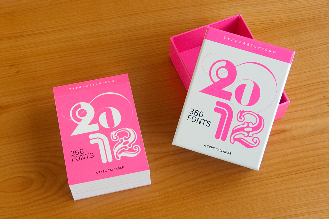 The calendar comes with a box for collecting the torn off calendar sheets.
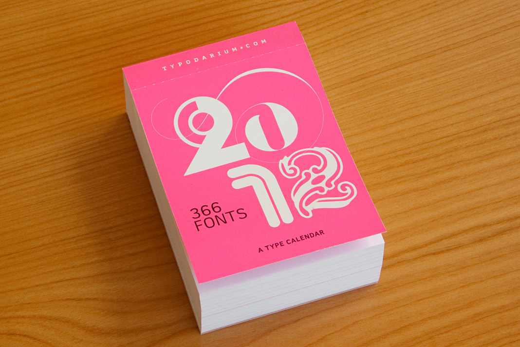 The cover of the 2012 edition of the Typodarium calendar.
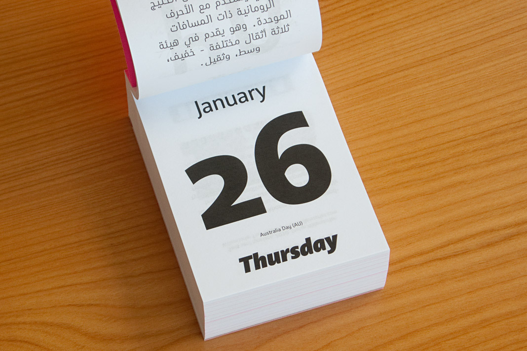 The front side of January 26 shows three different styles of Acorde.
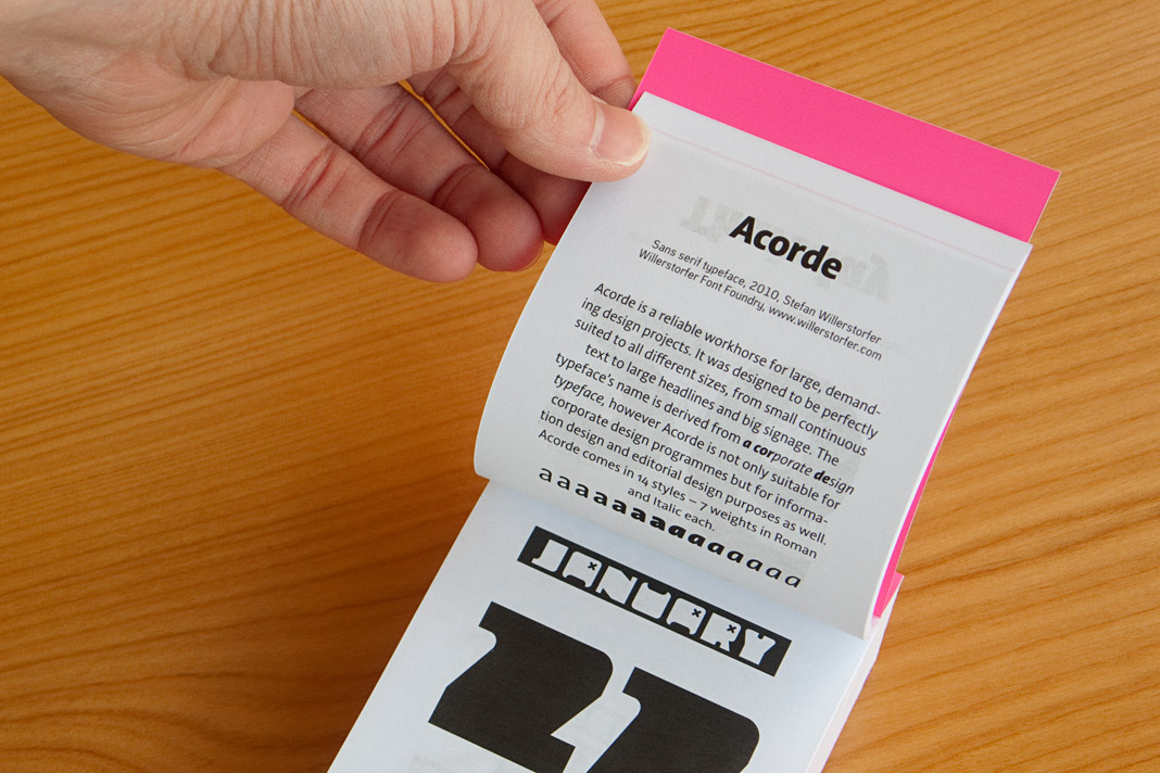 The back side of January 26 contains a short description of Acorde.
Acorde is nominated for the German Design Award 2012
The German Design Award (Deutscher Designpreis) is the most prestigious German design competition covering the disciplines of communication design and product design. It is organised by the German Design Council (Rat für Formgebung). Outstanding projects are nominated by an internationally renowned jury to participate in the competition. Only projects which have already won a well-respected design award are eligible for nomination. That is why the German Design Award is subtitled the Champions League of Design.
It is a great honour that Acorde is nominated for the German Design Award 2012 and competing with well-selected international design projects for this prestigious design award.
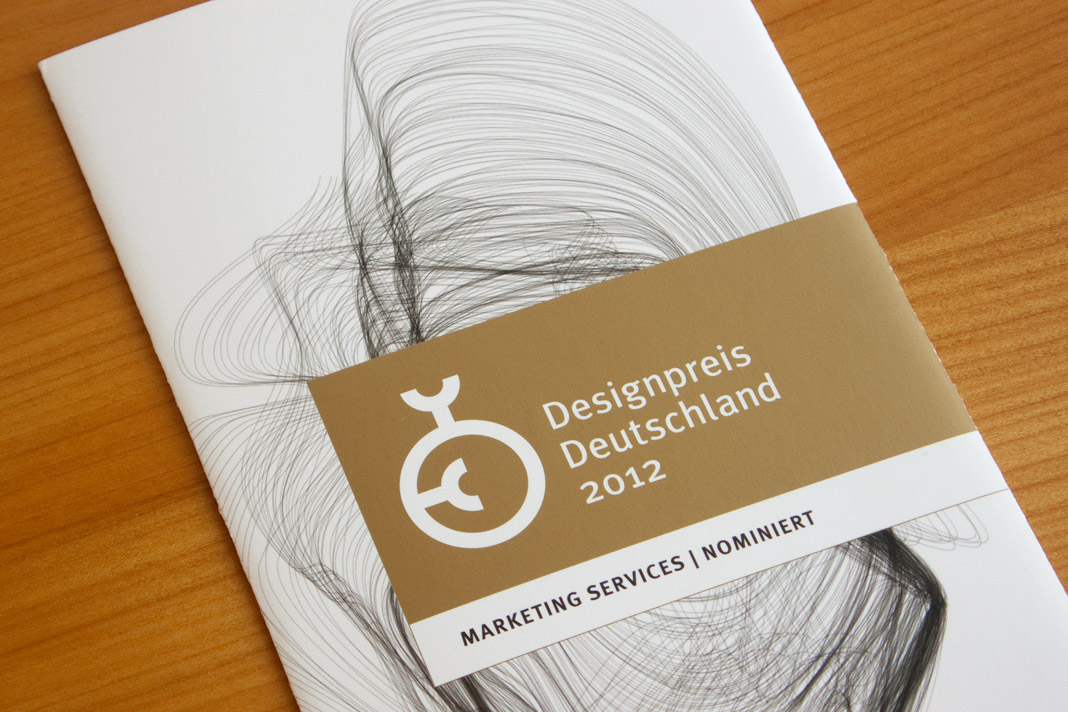 Nomination for the German Design Award 2012.
DA Mitteilungen presents The making of Acorde
Since my article about the making of Acorde raised a lot of interest on the world’s most popular typography blog, I Love Typography (ILT), during autumn last year, I decided to translate the article to German and to make it specially available to Austrian designers with an interest in type and typography as well.
The article was published by Design Austria, Austria’s professional association and service organisation representing the interests of designers from all creative disciplines, appearing in its quarterly published journal DA Mitteilungen (issue No. 2/2011).
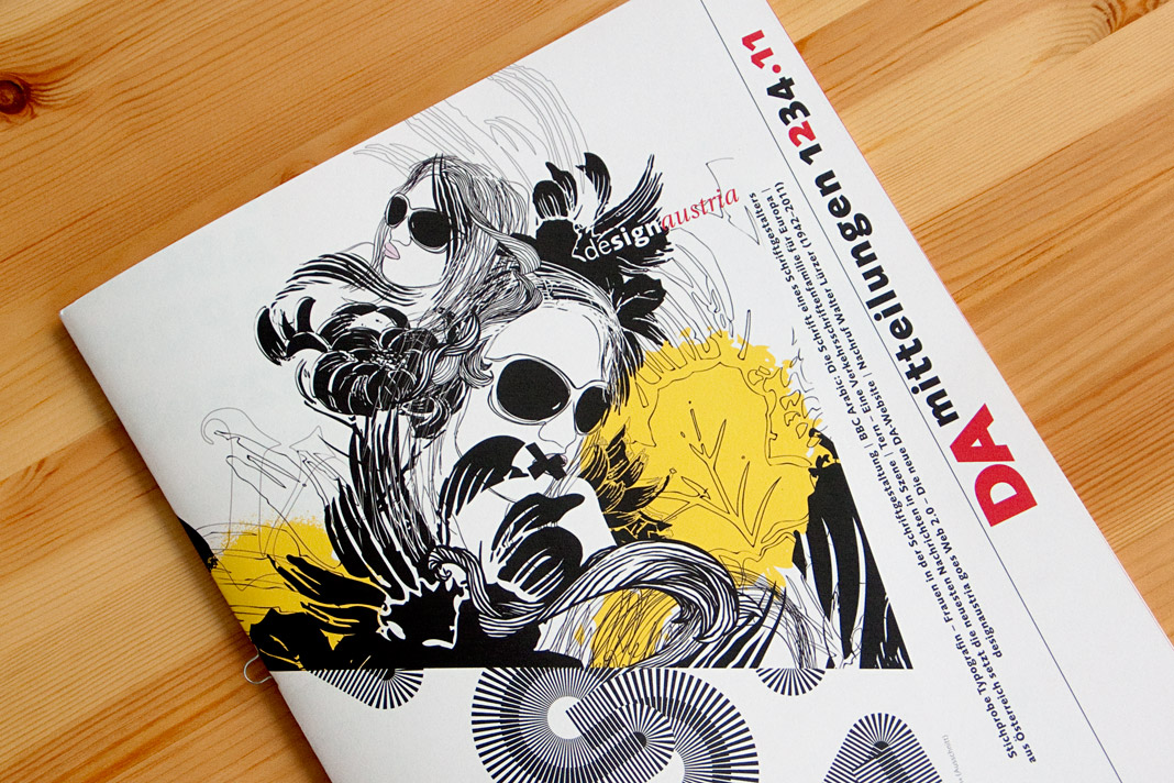 The cover of DA Mitteilungen issue No. 2/2011.
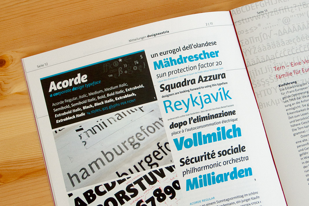 Double page spread showing the article on Acorde.
German newspaper INFO – Der Südfinder trusts in Acorde
The German newspaper INFO – Der Südfinder is a regional newspaper in Baden-Württemberg with a circulation of more than half a million copies. German newspaper designer Hans Peter Janisch restructured the newspaper and brought its appearance up to date. The new design was presented at the end of May.
The centrepiece of the revised typography was the introduction of Acorde as the newspaper’s main typeface. Acorde is used for text as well as for headlines and demonstrates its ability to be a true workhorse. It perfectly contributes to the fresh and modern feel of the newspaper.
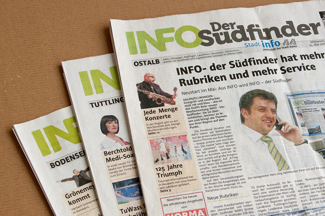 Cover of the first issue of the redesigned newspaper.
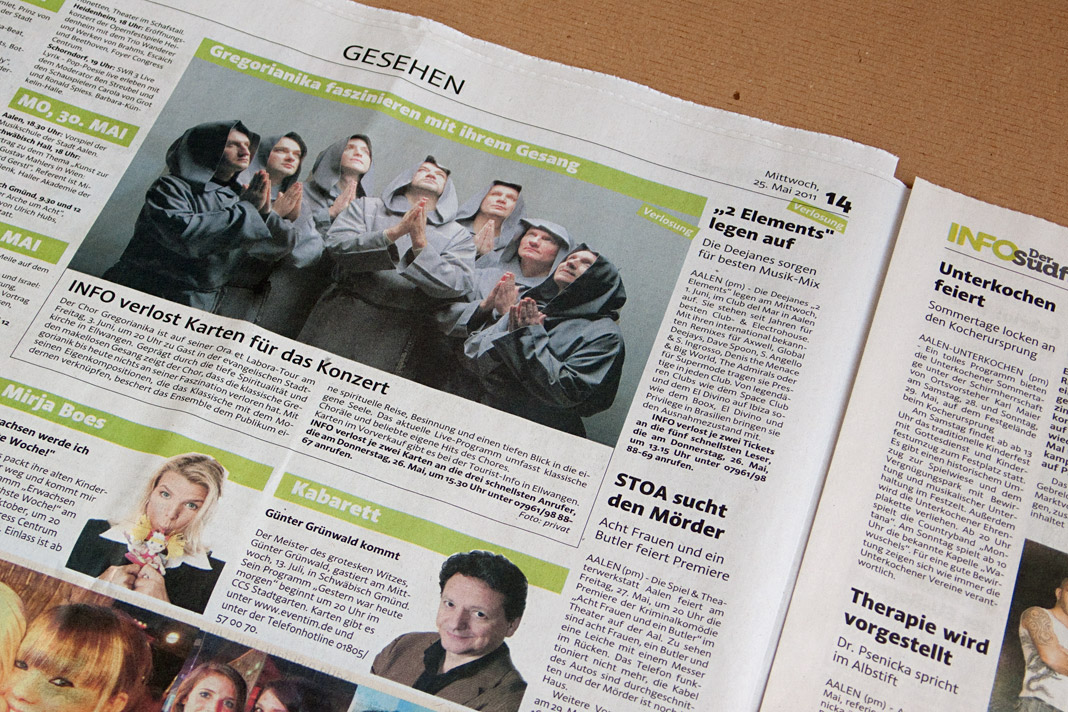
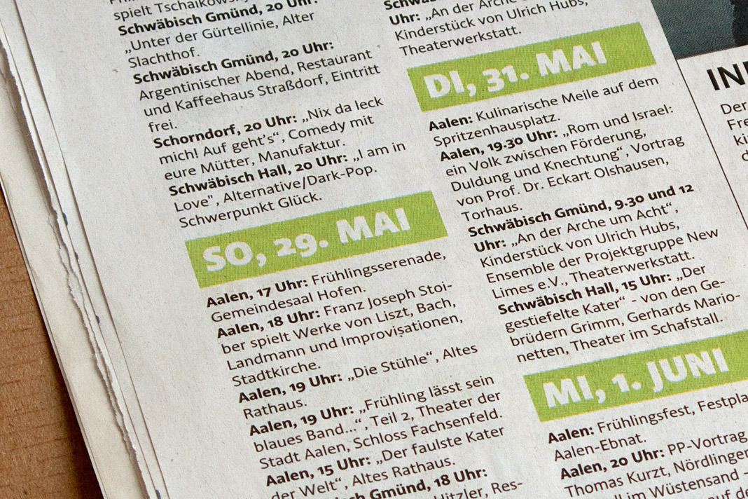
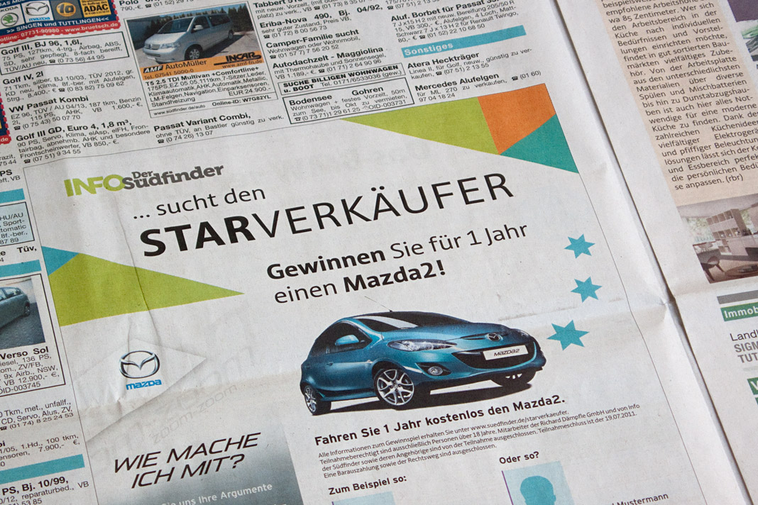
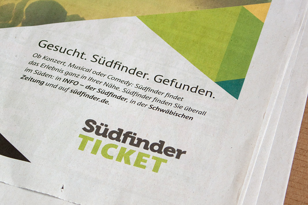
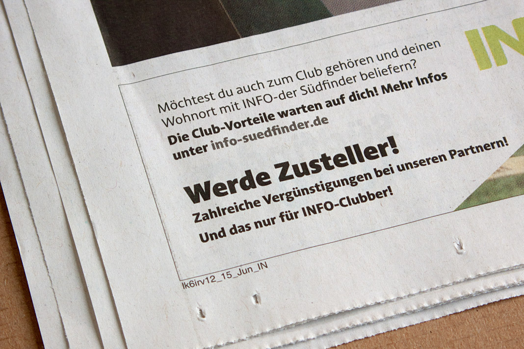
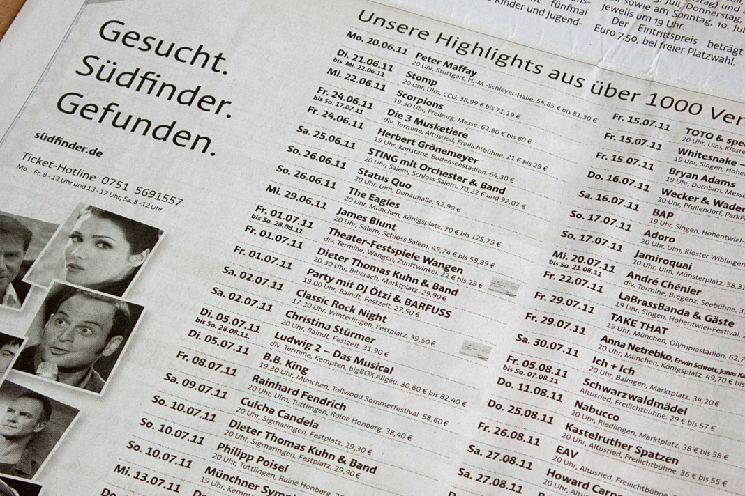
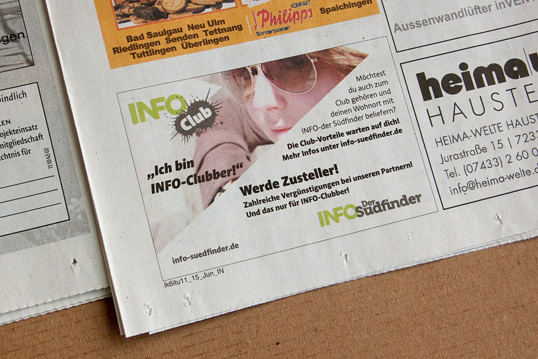
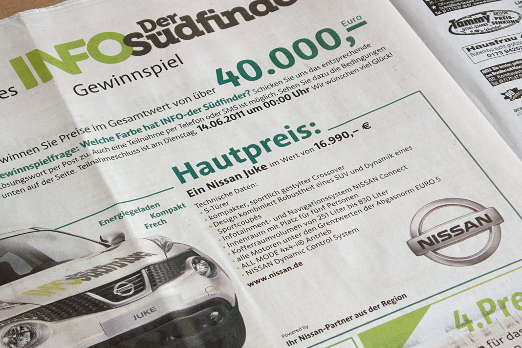
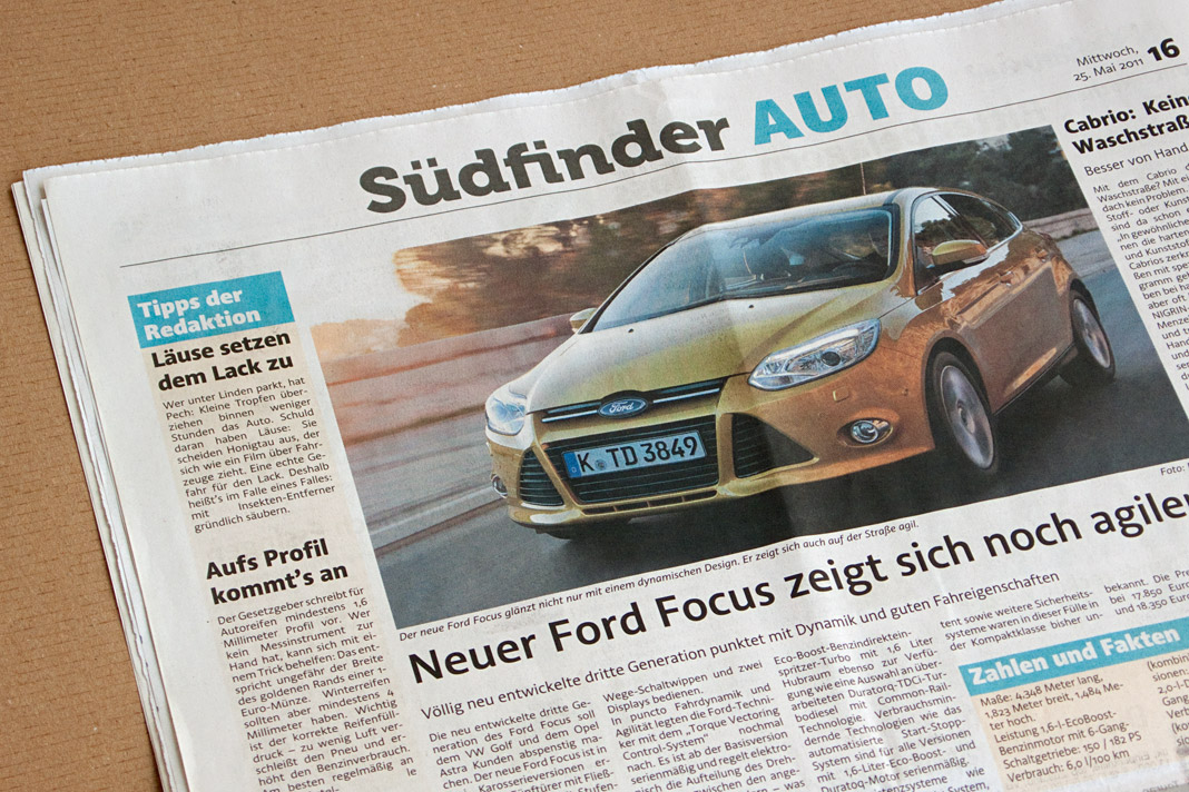
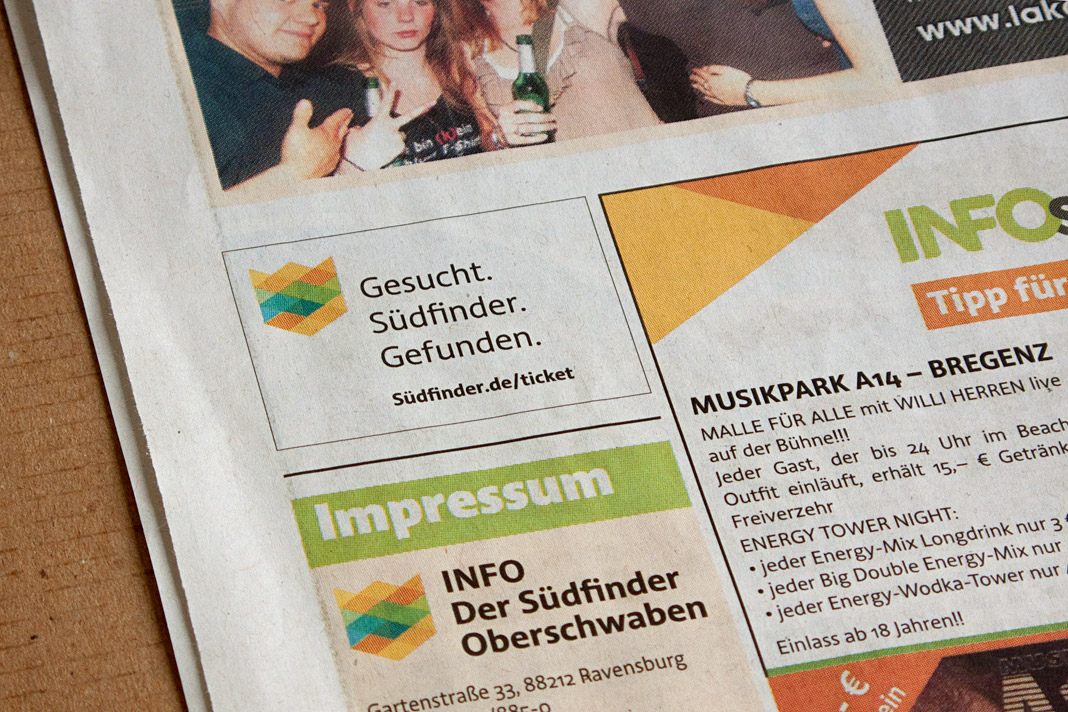 Various impressions of the newspaper’s new appearance.
Acorde succeeds at D&AD
The London-based organisation D&AD (formerly known as British Design & Art Direction) has been celebrating outstanding work in design and advertising for almost 50 years. It was founded in 1962 by a group of designers and art directors including David Bailey, Terence Donovan and Alan Fletcher.
In D&AD’s annual competition work is judged in 25 different award categories by 25 different specialist juries. Year after year the very best work is showcased in the renowned D&AD annual book. This year’s typography section features Acorde among a handful of carefully chosen typefaces.
 The judging of the D&AD Awards in London.
Acorde wins the Grand Prize of Applied Typography 21
Applied Typography is an international design competition organised by Japan Typography Association, Tokyo. The design competition awards prizes in about a dozen different typographic design categories such as editorial design, visual identity and type design. While Best Work awards are given to several selected entries receiving high ratings in each category, the Grand Prize is awarded only to a single work or designer in the competition judged as particularly outstanding.
As you can imagine, I feel very honoured by receiving the Grand Prize for the type family Acorde. »Its intelligent and broad-brushed element is very beautiful and the readability and visibility are of high grade, which resulted in getting everyone’s favour without reservations«, explains judging committee chairman Tsuyokatsu Kudo, about the jury’s decision to award Acorde the Grand Prize of this year’s design competition.
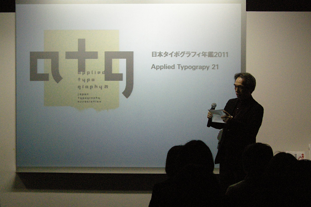 Judging committee chairman Tsuyokatsu Kudo opens the ceremony of Applied Typography 21.
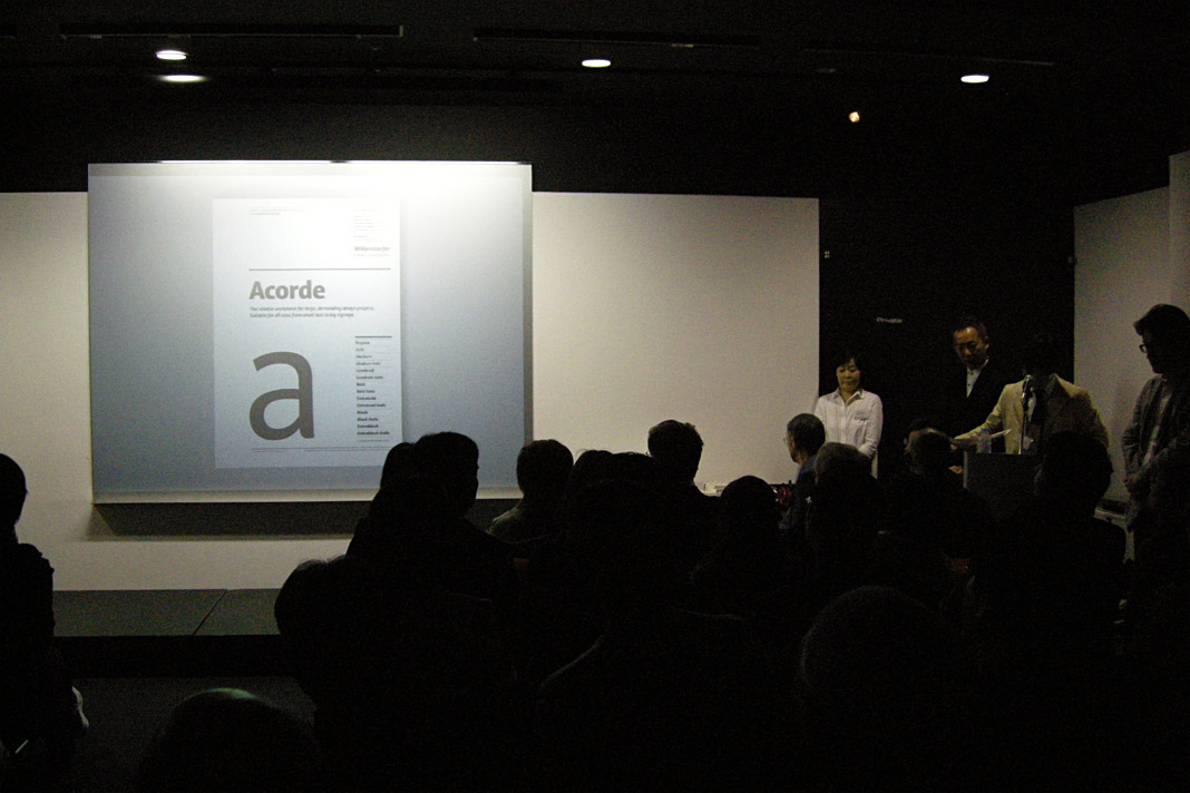 The Grand Prize of Applied Typography 21 goes to the type family Acorde.
Jury member Yoshimaru Takahashi states that »although the inclination to break with foundation is going around the present world of typography, the message of reconsidering its foundation to produce a high quality functional beauty can be seen in this work.« His colleague Toshiyasu Nanbu adds that Acorde is a typeface »that literally walks the royal road of typography.« I guess he is as curious as I am about where this road will further lead Acorde.
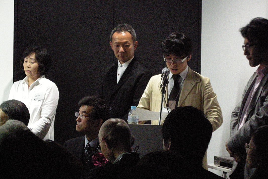 Yuki Nishimura reads out my written comment on winning the Grand Prize for Acorde.
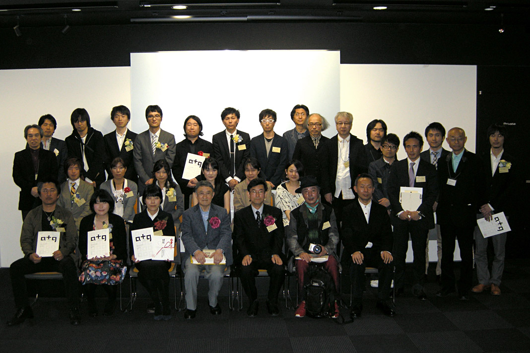 Group photo of award winners and jury members of Applied Typography 21.
 Chatting, eating and drinking at the party succeeding the official part of the ceremony.