Blog – Entries tagged as Willerstorfer Font Foundry
Interview in German design magazine Novum
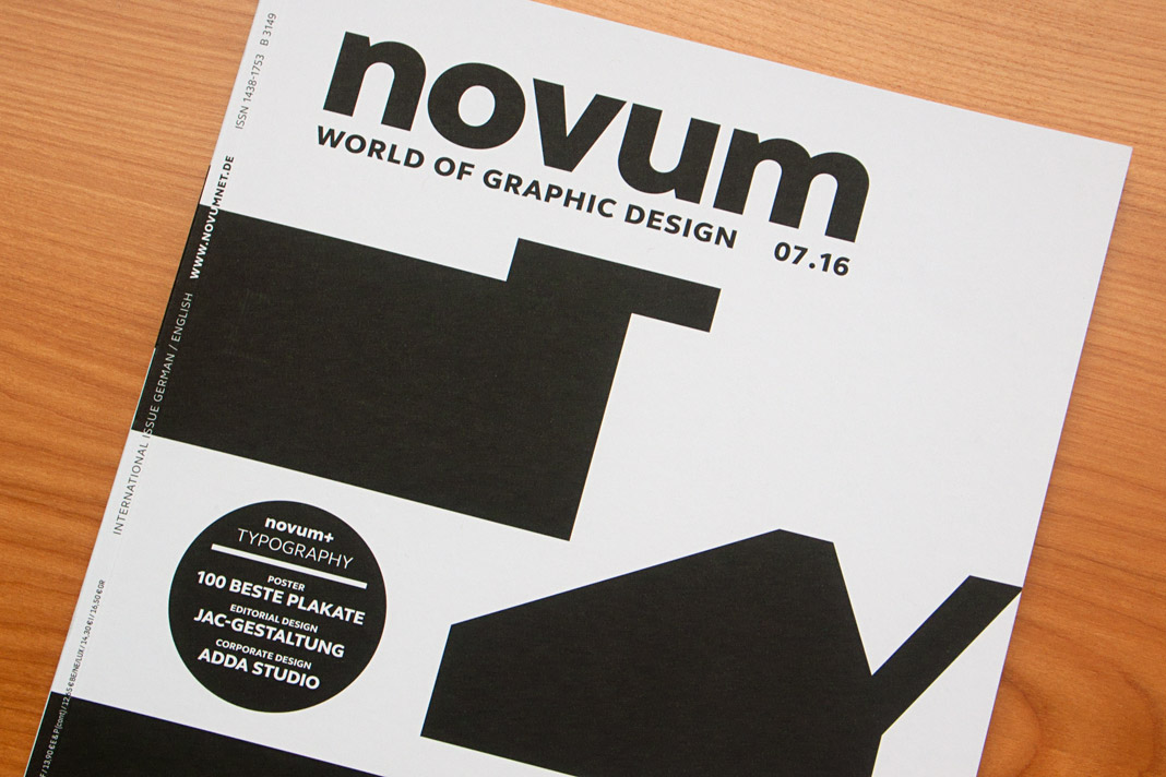
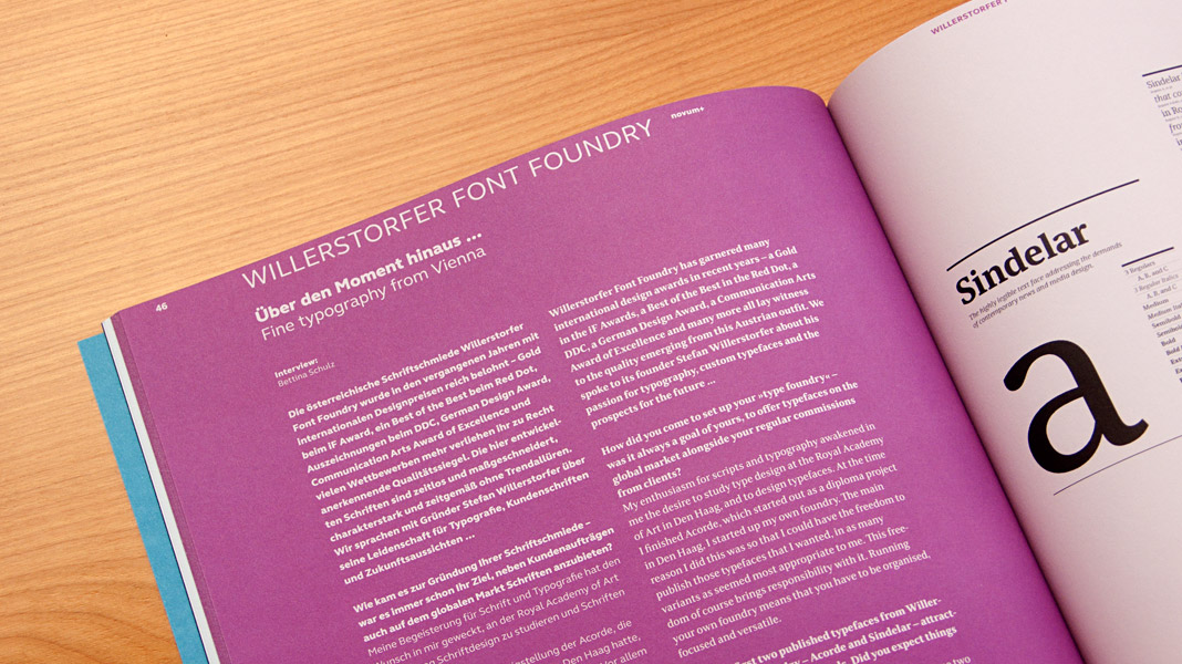
Recently I was interviewed at length by German design magazine Novum. The interview is published in the current issue (07.16) and is available in German and in English. It covers varied issues such as design trends, bespoke typefaces, renowned design prizes, and the work currently being done at Willerstorfer Font Foundry. Recommended reading!


 The interview is published bilingually in German and English.
Interview at FreeTypography’s Typography Blog
Recently I was interviewed at length by FreeTypography’s Typography Blog. If you are interested in learning more about my work and the motivation and values behind it, please head to FreeTypography.
Among other things you can read about the development of Acorde and Sindelar, their specific purposes and qualities, and the similarities these two type families have in common.
 Read about Stefan Willerstorfer, his work, and his opinions at FreeTypography’s Typography Blog.
Acorde/Sindelar Bundles are now available
Sindelar and Acorde complement each other perfectly. Thus many clients are interested in using both type families alongside one another. The Acorde/Sindelar Bundle reflects this demand and merges all 14 styles of Acorde and all 18 styles of Sindelar into an attractive bundle of 32 styles. All styles are fully equipped with a huge character set and numerous OpenType features.
In addition there is also a bundle of the small packages of Acorde and Sindelar available. It consists of four styles of Acorde and four styles of Sindelar. It is more easily affordable than the full bundle but also offers great design possibilities and still decreases the price per style.
Sindelar, a news and media text face, is now available
I am pleased to announce that after a long period of elaborate development, my second type family, Sindelar, is now available. It is the ideal text face choice for newspapers and magazines, comes in 18 styles and was designed between 2009 and 2014. Sindelar is published by Willerstorfer Font Foundry and is available for purchase here.
 Sindelar, a news and media text face, is now available.
About Sindelar
Sindelar is a capable, contemporary text face addressing today’s news design requirements. Its large x-height, low contrast and robust serifs grant a high legibility in small sizes. The balanced, well chosen proportions make the typeface economic (i.e. space saving) without giving it a too narrow appearance. These characteristics make it the ideal choice for extensive text setting in newspapers and magazines – on paper and on screen (webfonts available soon).
Named after famous Austrian football (soccer) player Matthias Sindelar (1903–1939), one of the best players of his time, the typeface shares two major qualities with its namesake: their technical brilliance and their way of performing aesthetically to the last detail. The football player’s nickname Der Papierene (the Paper-man) elegantly refers to the media too.
Although optimised for small sizes, Sindelar’s low contrast and robust serifs give the typeface a strong impact and an unmistakable personality in larger sizes. Sindelar’s calligraphic influences can be noticed in the Italics best. The italic letters are inclined by slightly different angles, respecting the letters’ shapes and proportions and resulting in a balanced, yet vivid appearance. Sindelar comes in 18 styles – nine weights in Roman and Italic each. Each font is equipped with a huge character set of about 980 glyphs and various OpenType features.
 Sindelar is the ideal text face choice for newspapers and magazines.
The comprehensive specimen PDF gives you an excellent overview of the type family Sindelar. It shows various samples of all styles, the full character set, and informs you of all supported OpenType features. Download the Sindelar Specimen PDF here.
 Sindelar comes in 18 styles – nine weights in Roman and Italic each.