Blog – Insights by Stefan Willerstorfer
Austrian design exhibition Subtext: Typedesign in Vienna
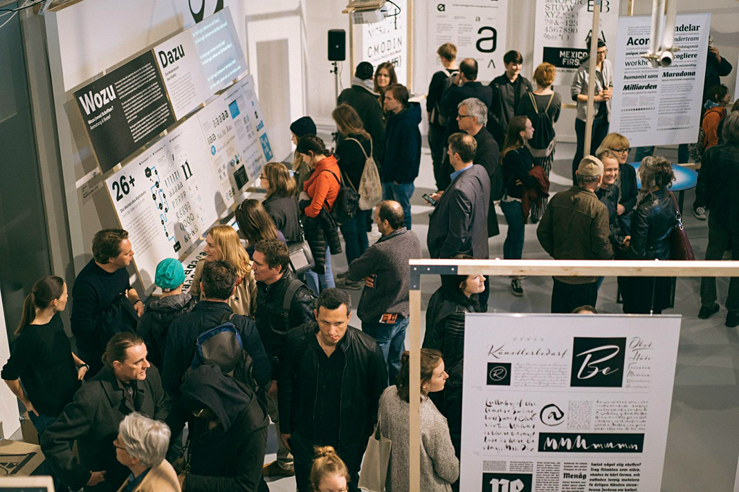
Yesterday the opening of the design exhibition Subtext: Typedesign took place at the Designforum in Vienna’s Museumsquartier. The opening was a great success and attracted more than 500 people. The exhibition subtitled zeitgenössisch–lokal: contemporary–austrian showcases Austrian type designs from the last fifteen years and impressively documents the liveliness of the Austrian type design scene.
The exhibition is organised by the Typographic Society Austria (tga – Typographische Gesellschaft Austria) and was curated by Andreas Pawlik and Martin Tiefenthaler.
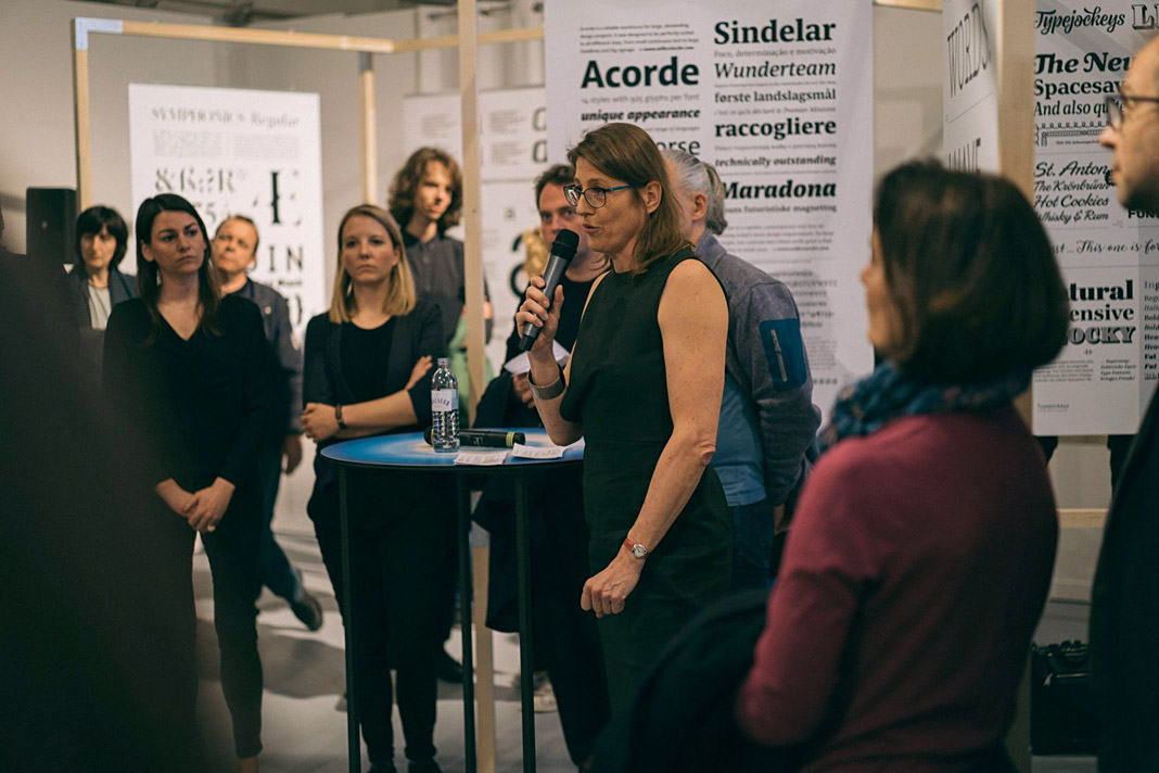 Anita Kern speaking at the opening in front of a poster showcasing Acorde and Sindelar.
At the opening Anita Kern, an Austrian graphic designer, writer, and profound expert on Austrian design history, spoke about the history and the current state of Austrian type design.
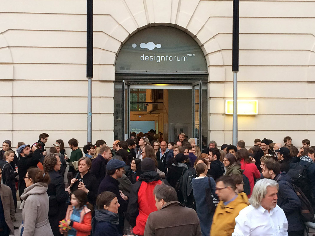 Even the Designforum’s entrance was crowded with visitors at the opening.
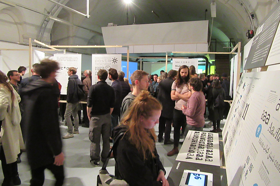
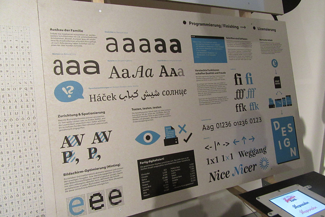 This informative chart explains the workflow during the development of a type family.
Here at Willerstorfer Font Foundry we are proud that our award winning type families Acorde and Sindelar are part of this beautiful exhibition.
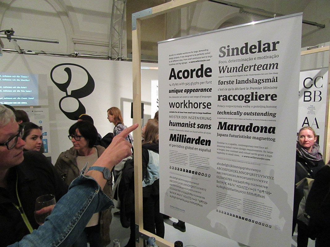
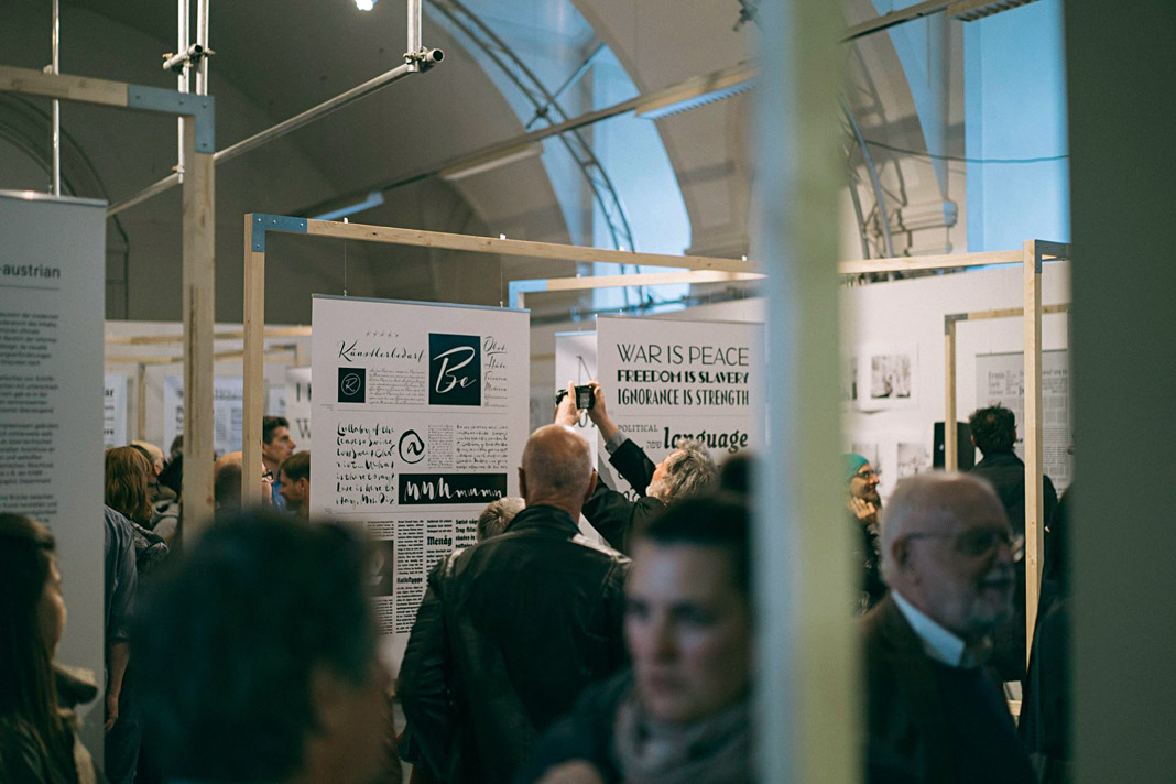
If you happen to be in Vienna use the opportunity to get more insights on Austrian type design and visit the exhibition at the Designforum. The exhibition will be on show until the 26th of May 2017. More detailed information is available here.
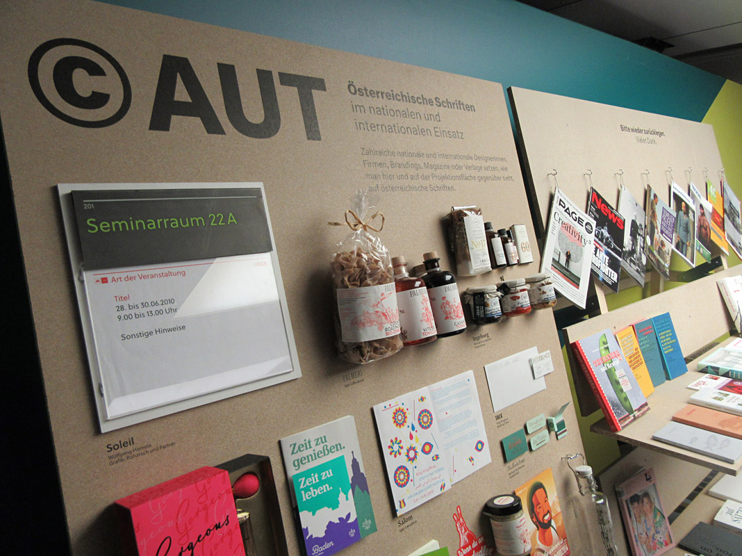
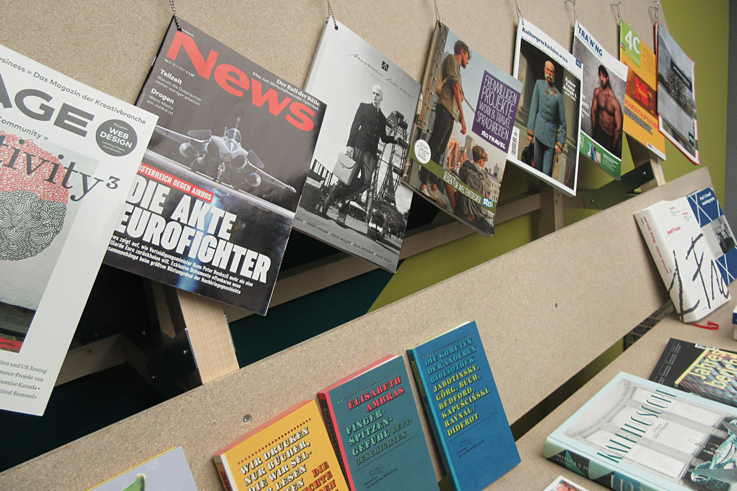 A selection of magazines, newspapers, books, and other products that use Austrian type families.
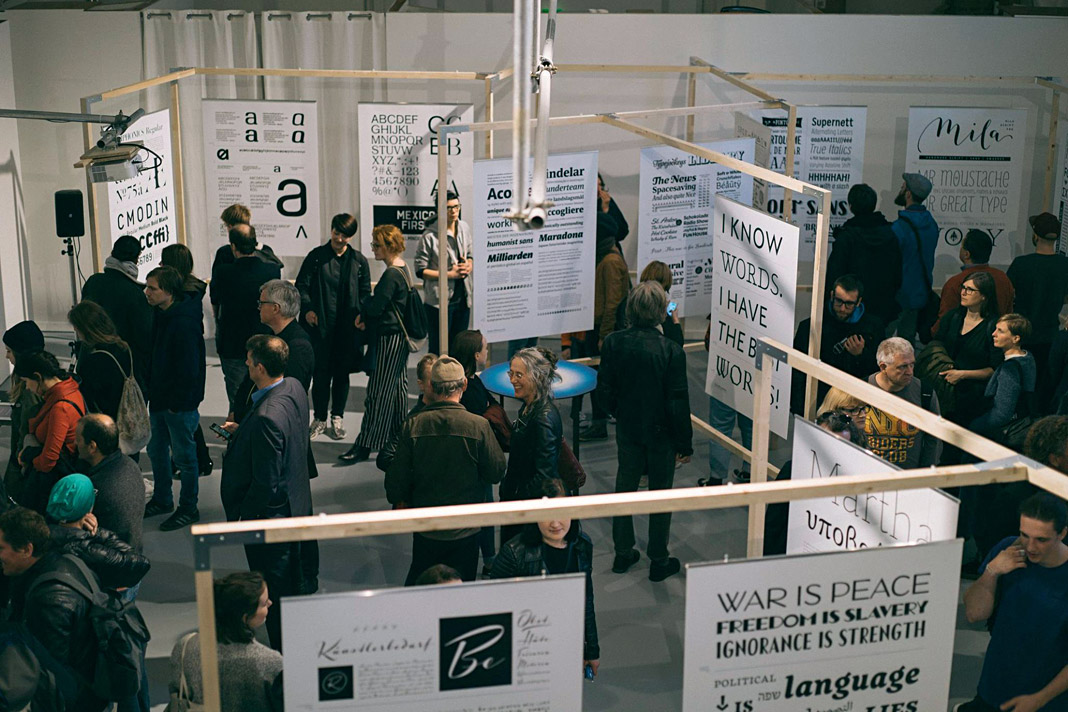 Visitors at the opening looking at and discussing about Austrian type design.
Paul T. Frankl’s autobiography entirely set in Acorde
Another great example of Acorde in use: Paul T. Frankl’s autobiography offers a unique insight into the rise of American modernism from an insider’s point of view. It sheds light on Paul T. Frankl and his contemporaries as well as on Austrian and American culture in the first half of the twentieth century.
The book was edited by Christopher Long and Aurora McClain and designed by Austrian book designer Peter Duniecki. It is entirely set in Acorde.
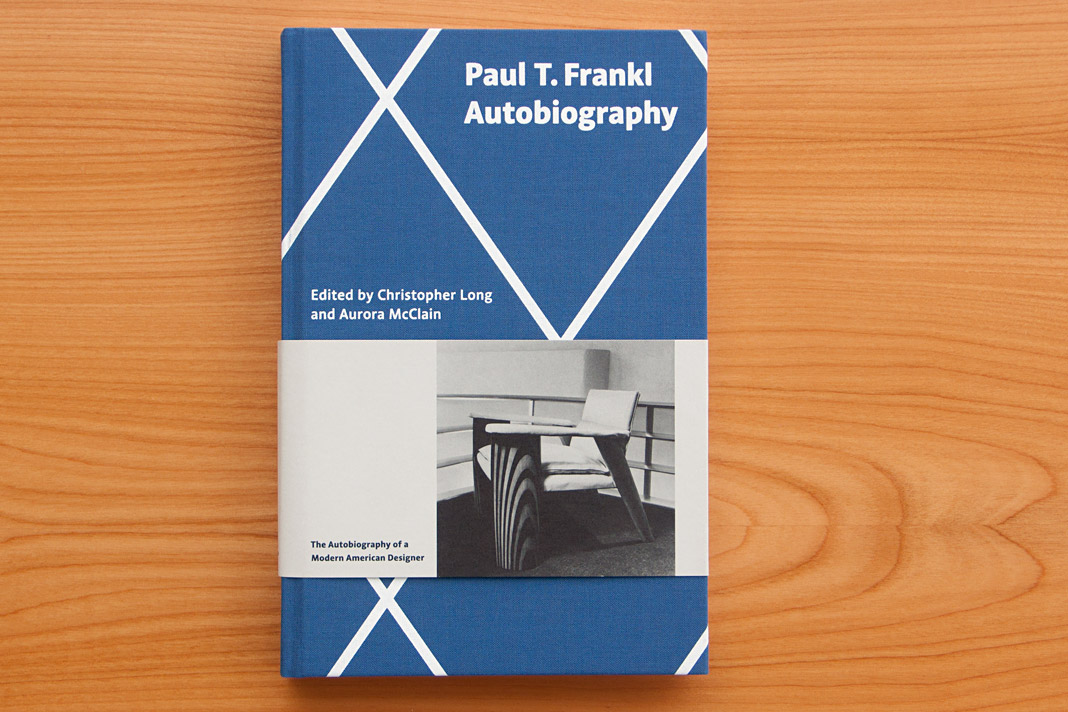 Cover of Paul T. Frankl’s autobiography, set in Acorde.
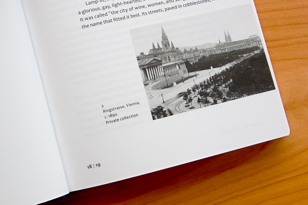
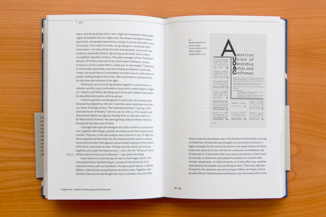
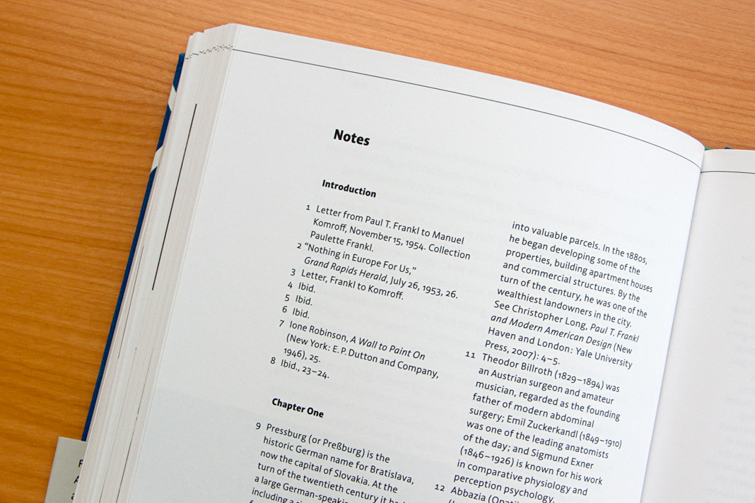
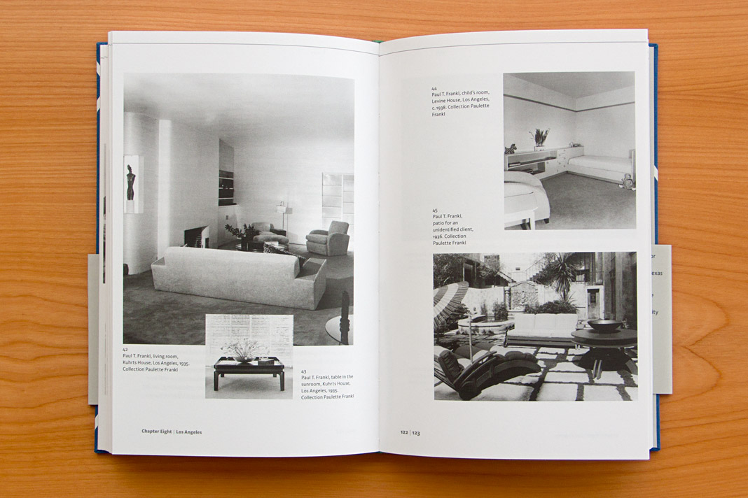
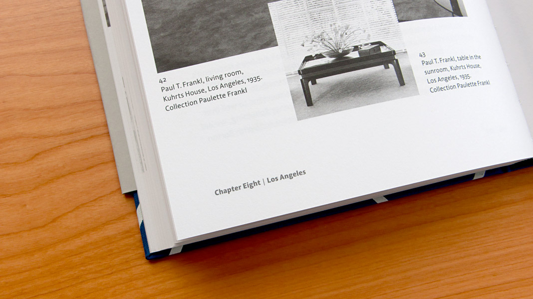
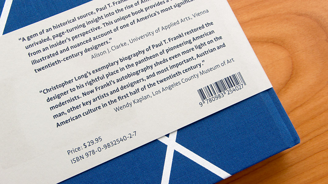 Various impressions of Frankl’s autobiography, designed by Peter Duniecki.
The Philippine Daily Inquirer’s new text face: Sindelar
Great news from Asia: The Philippine Daily Inquirer started using Sindelar as their new text face yesterday. The introduction of Sindelar was part of a comprehensive redesign of the newspaper done by the world-renowned media consulting firm García Media.
The Philippine Daily Inquirer is the most widely read broadsheet newspaper in the Philippines with a daily circulation of 260,000 copies. Here at the studio we can’t wait to receive one of these copies and get a closer look at the great role Sindelar plays in the new design.
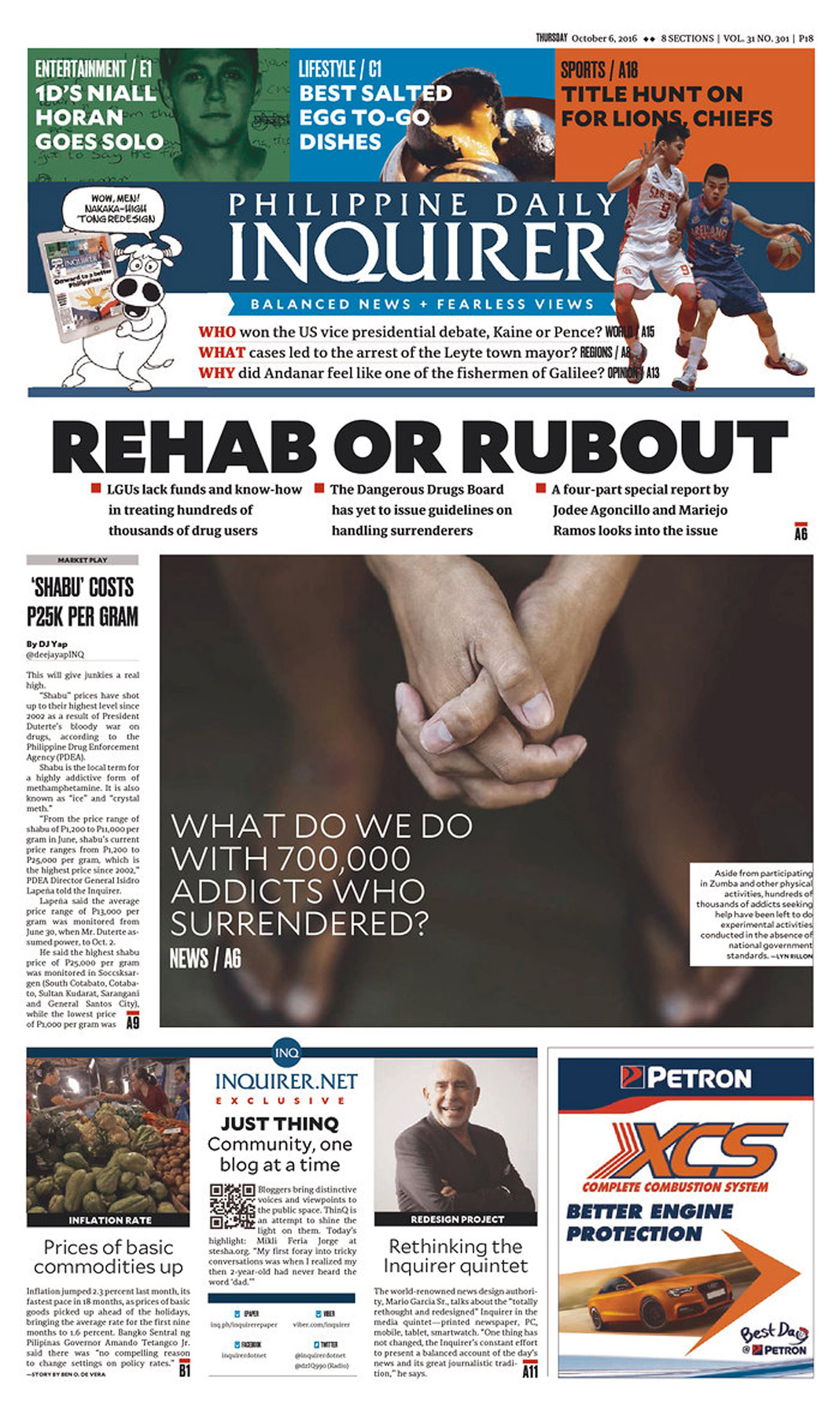 Front page of the first issue of the redesigned Philippine Daily Inquirer.
Magazine News switched to Sindelar as their text face
Now that’s great news: Austrian magazine News switched to Sindelar as their primary text face. Good choice!
News is one of Austria’s biggest weekly magazines and the major news magazine in the country. It has a circulation of about 160,000 copies and covers various topics such as politics, business, culture, and sports.
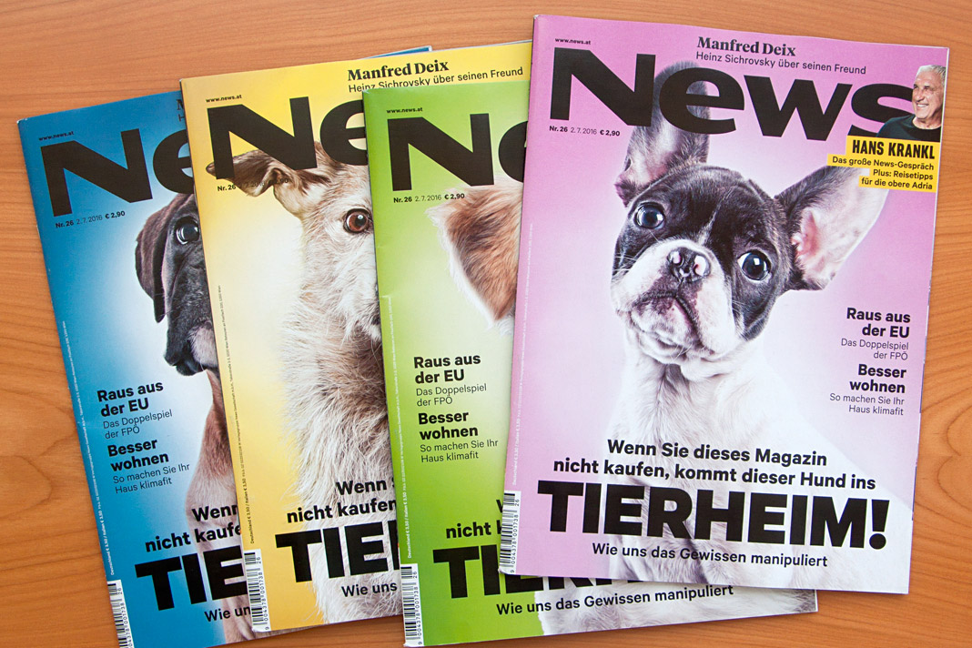
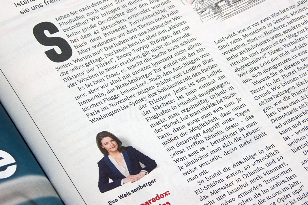
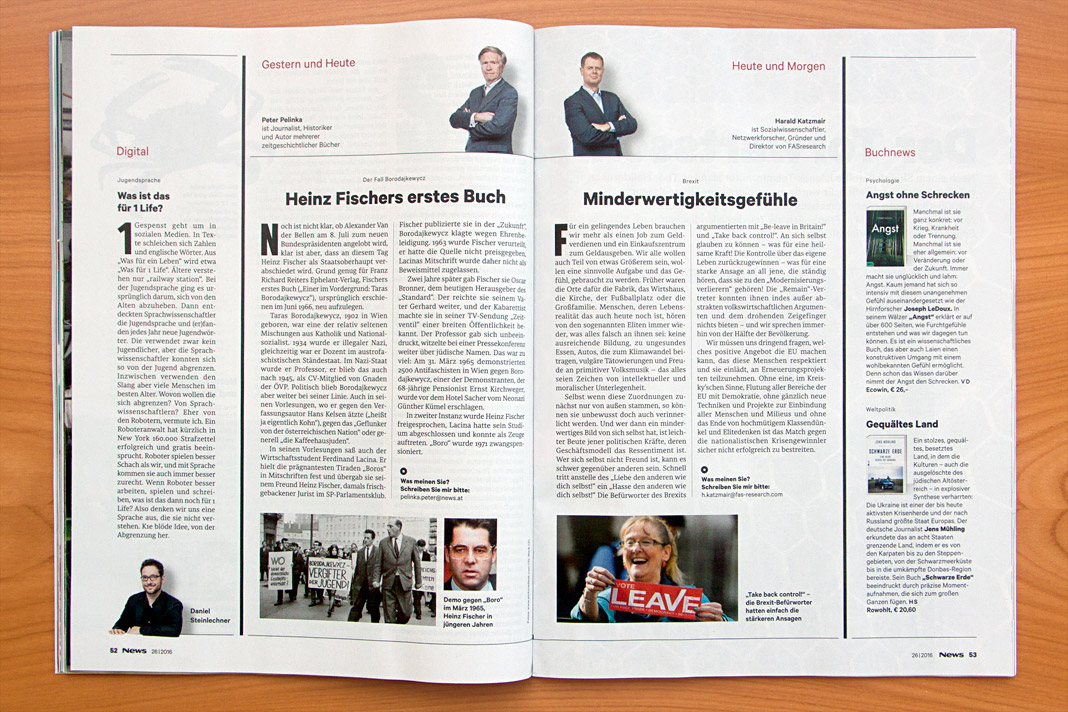
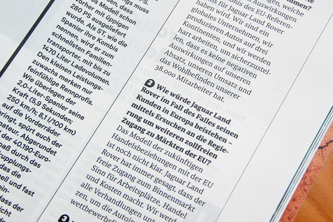
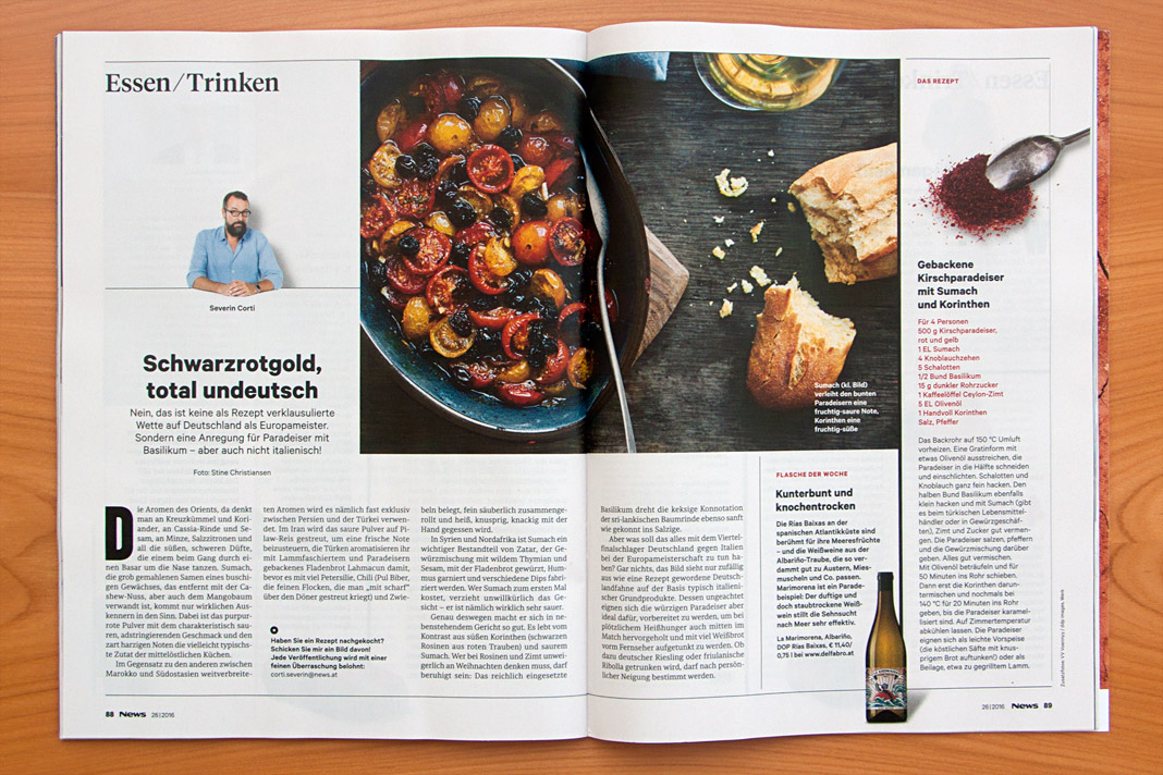
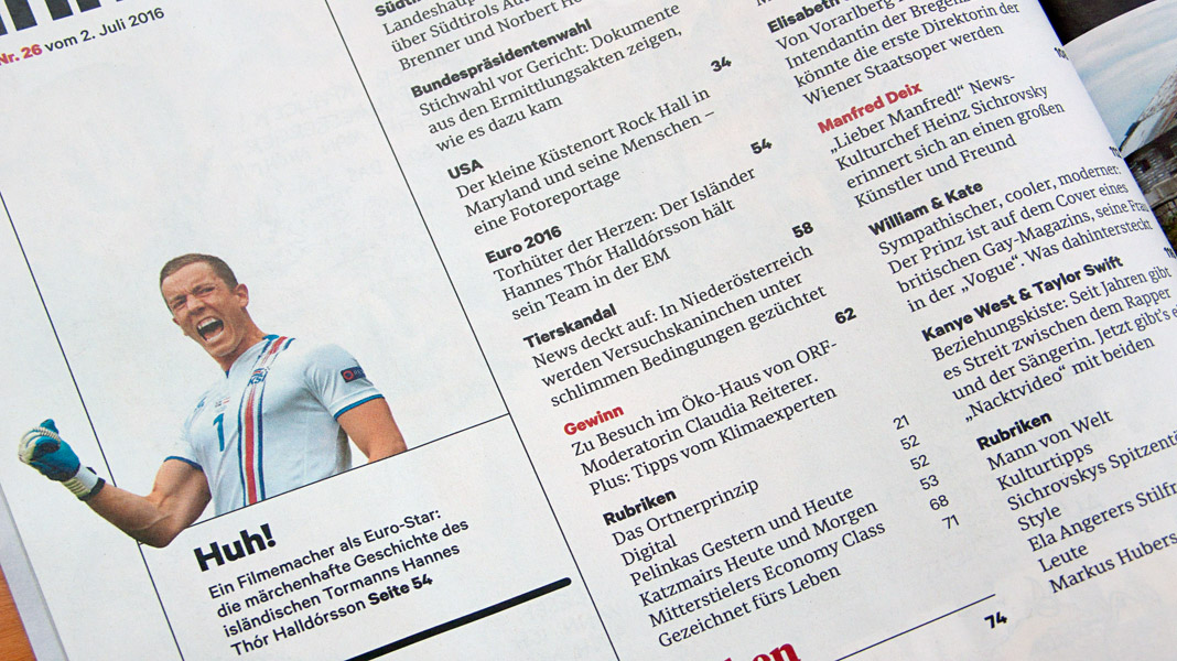
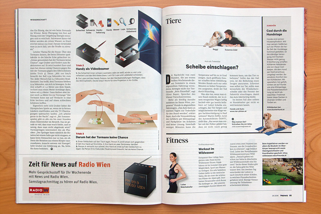
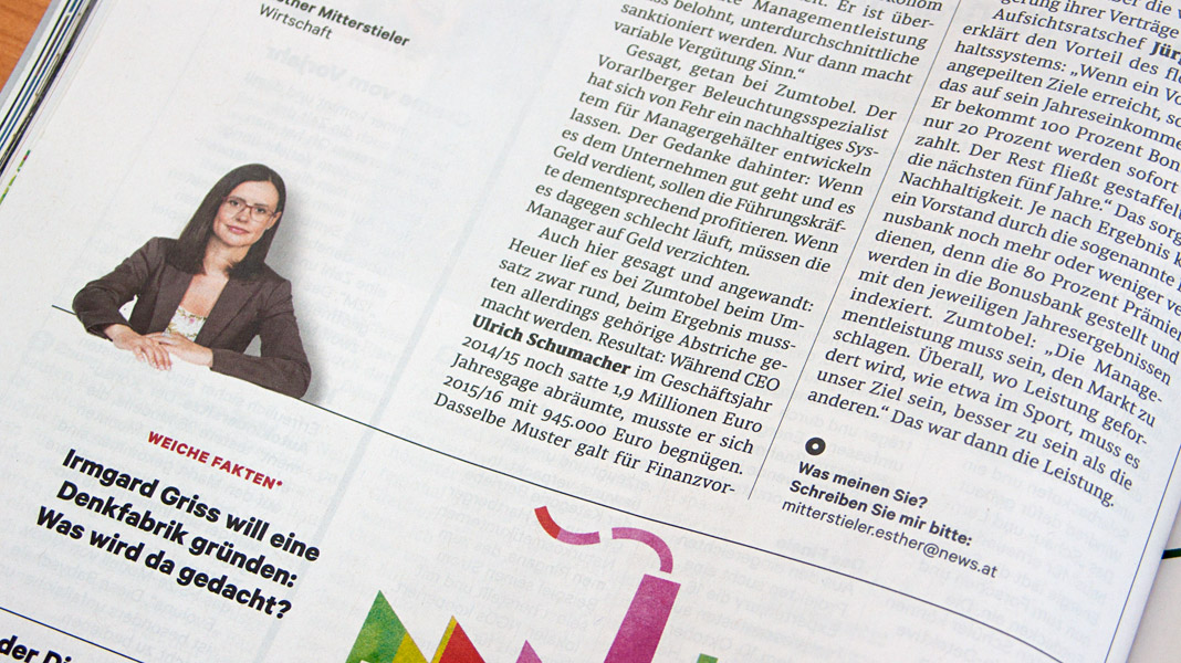
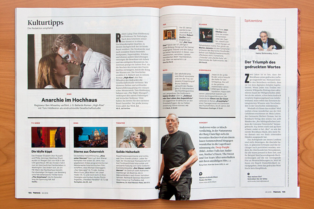
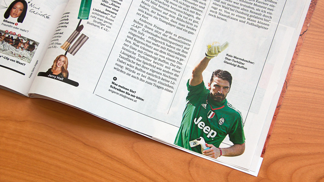 Convince yourself of Sindelar’s qualities by having a look at News’ double page spreads.
Yearbook of Type 2 presents Sindelar
Two years after the Yearbook of Type 1, which showcased our type family Acorde, its successor is now on the market: the Yearbook of Type 2. It’s great to contribute to this beautiful compendium again with one of our type families.
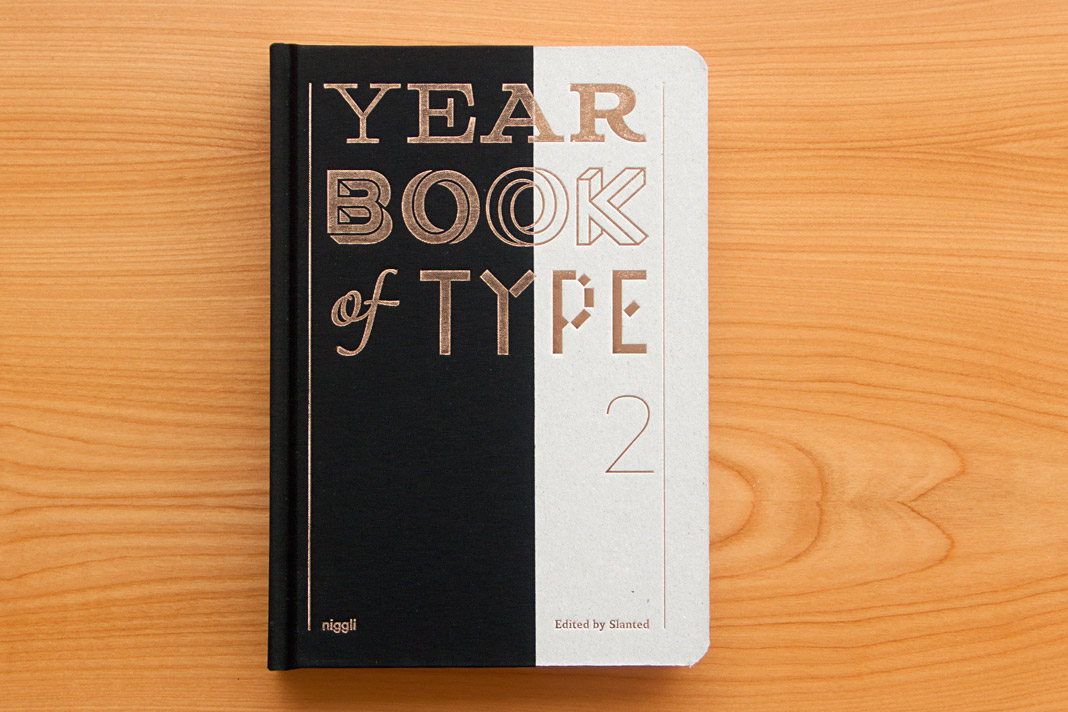 Cover of the Yearbook of Type 2, published by Niggli.
The Yearbook of Type 2 presents new type families from around the globe on more than 400 pages. The book also contains a section with various essays and provides manuals and background information on technical aspects. The book was published by the renowned Swiss publishing house Niggli.
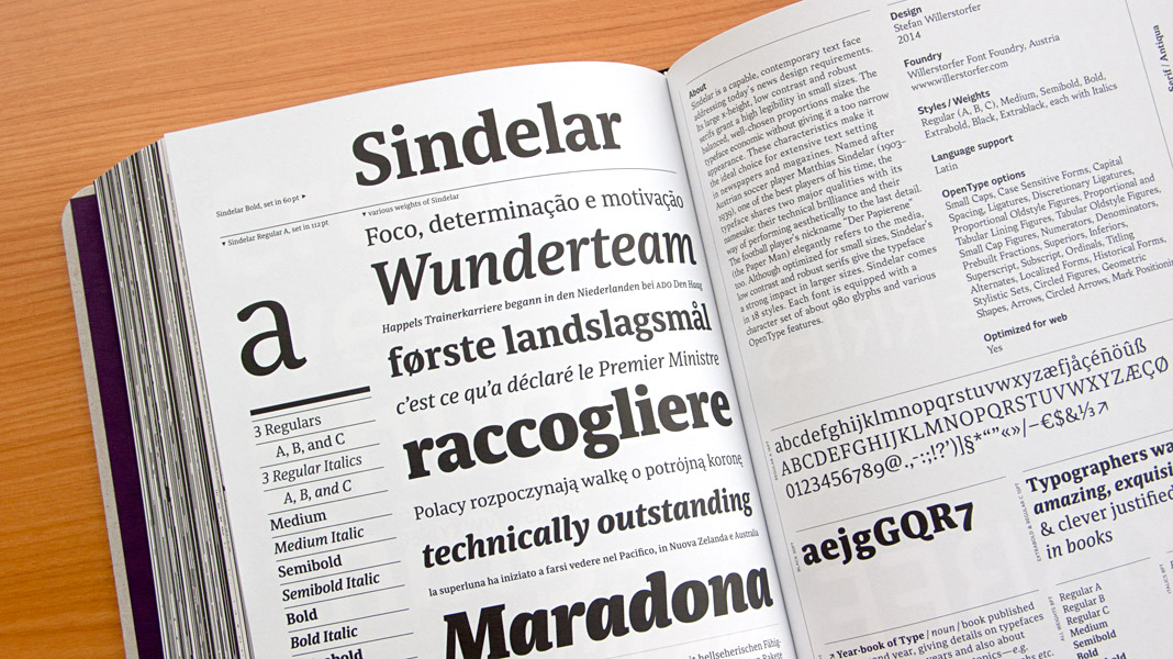
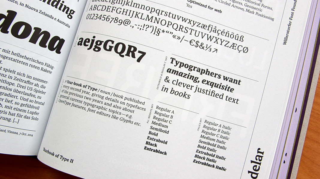 Double page spread showcasing Sindelar in great detail.
Sindelar is the Best Work of Applied Typography 26
We have already announced it in December and now you can have a look for yourself: Sindelar is the Best Work in the typeface category of Applied Typography 26 and therefore featured in the Japan Typography Yearbook 2016. Enjoy!
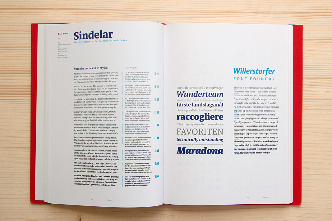
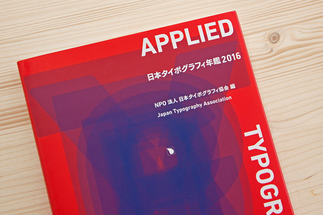
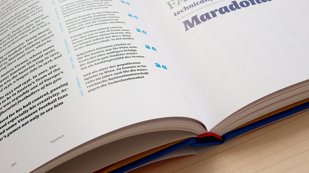
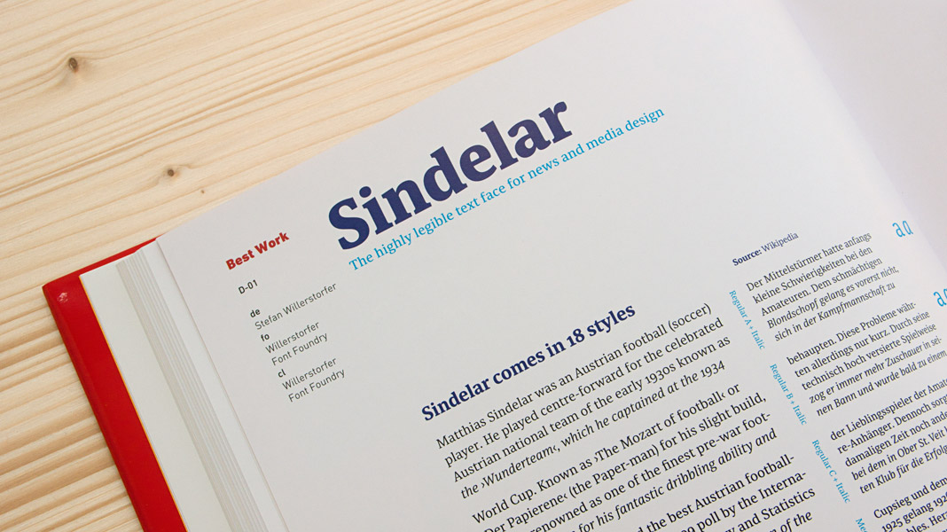 Various impressions of the Japan Typography Yearbook 2016.