Blog – Insights by Stefan Willerstorfer
Acorde joyfully celebrates St. Patrick’s Day 2015
As a special ingredient to St. Patrick’s Day 2015, Acorde joins the worldwide celebrations in giving your calendar an appropriate typographic appearance. Take a look at Typodarium 2015 whilst drinking a pint of Guinness or a shot of Irish Whiskey. Feel the Irish vibe and enjoy!
 Ingredients for a perfect St. Patrick’s Day: Irish Whiskey, Guinness and Acorde on your calendar.
Acorde/Sindelar Bundles are now available
Sindelar and Acorde complement each other perfectly. Thus many clients are interested in using both type families alongside one another. The Acorde/Sindelar Bundle reflects this demand and merges all 14 styles of Acorde and all 18 styles of Sindelar into an attractive bundle of 32 styles. All styles are fully equipped with a huge character set and numerous OpenType features.
In addition there is also a bundle of the small packages of Acorde and Sindelar available. It consists of four styles of Acorde and four styles of Sindelar. It is more easily affordable than the full bundle but also offers great design possibilities and still decreases the price per style.
Sindelar, a news and media text face, is now available
I am pleased to announce that after a long period of elaborate development, my second type family, Sindelar, is now available. It is the ideal text face choice for newspapers and magazines, comes in 18 styles and was designed between 2009 and 2014. Sindelar is published by Willerstorfer Font Foundry and is available for purchase here.
 Sindelar, a news and media text face, is now available.
About Sindelar
Sindelar is a capable, contemporary text face addressing today’s news design requirements. Its large x-height, low contrast and robust serifs grant a high legibility in small sizes. The balanced, well chosen proportions make the typeface economic (i.e. space saving) without giving it a too narrow appearance. These characteristics make it the ideal choice for extensive text setting in newspapers and magazines – on paper and on screen (webfonts available soon).
Named after famous Austrian football (soccer) player Matthias Sindelar (1903–1939), one of the best players of his time, the typeface shares two major qualities with its namesake: their technical brilliance and their way of performing aesthetically to the last detail. The football player’s nickname Der Papierene (the Paper-man) elegantly refers to the media too.
Although optimised for small sizes, Sindelar’s low contrast and robust serifs give the typeface a strong impact and an unmistakable personality in larger sizes. Sindelar’s calligraphic influences can be noticed in the Italics best. The italic letters are inclined by slightly different angles, respecting the letters’ shapes and proportions and resulting in a balanced, yet vivid appearance. Sindelar comes in 18 styles – nine weights in Roman and Italic each. Each font is equipped with a huge character set of about 980 glyphs and various OpenType features.
 Sindelar is the ideal text face choice for newspapers and magazines.
The comprehensive specimen PDF gives you an excellent overview of the type family Sindelar. It shows various samples of all styles, the full character set, and informs you of all supported OpenType features. Download the Sindelar Specimen PDF here.
 Sindelar comes in 18 styles – nine weights in Roman and Italic each.
Typotopografie focuses on Vienna in its fifth issue
Typotopografie is a publication series focusing on the typographic characteristics of a selected city in each issue. Starting with Munich, followed by Düsseldorf, Berlin, and Leipzig, now it’s Vienna’s turn to be in the focus of attention.
 Cover of Typotopografie, focusing on Vienna in its fifth issue.
The publication is subtitled with The magazine about design, typography and printing in urban centres and that is what you can expect: Interviews with Vienna’s most famous type designers, the design work of graphic designers with a strong interest in typography and entertaining essays and background information.

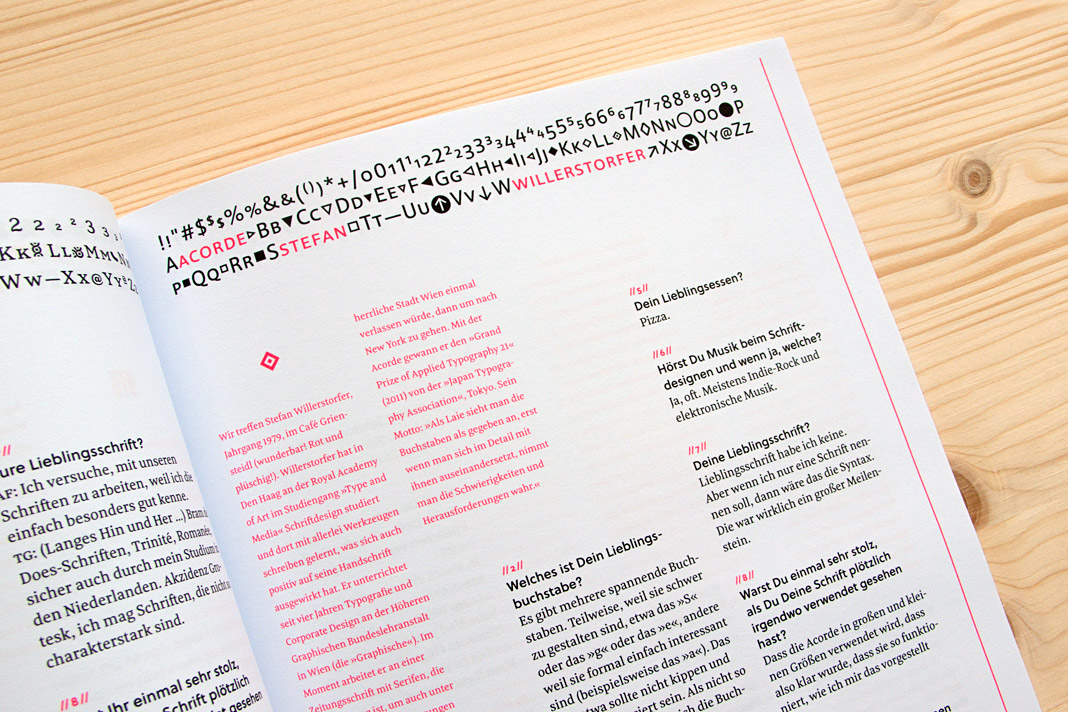
 Typotopografie features an interview with Stefan Willerstorfer.
Yearbook of Type 1 presents Acorde
The Yearbook of Type 1 is an independent compendium of high quality typefaces published by the renowned Swiss publishing house Niggli. It presents a selection of more than 180 of the best contemporary type families on more than 450 pages.
The selected typefaces come from all over the world and were released during the last three years. The type family Acorde is one of the selected typefaces. Due to its name (starting with an A) the double page spread presenting Acorde appears in the front part of the book.
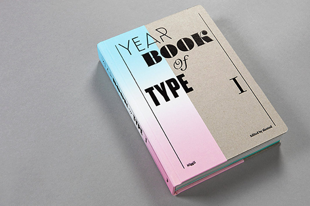 The cover of the first issue of Slanted’s Yearbook of Type.
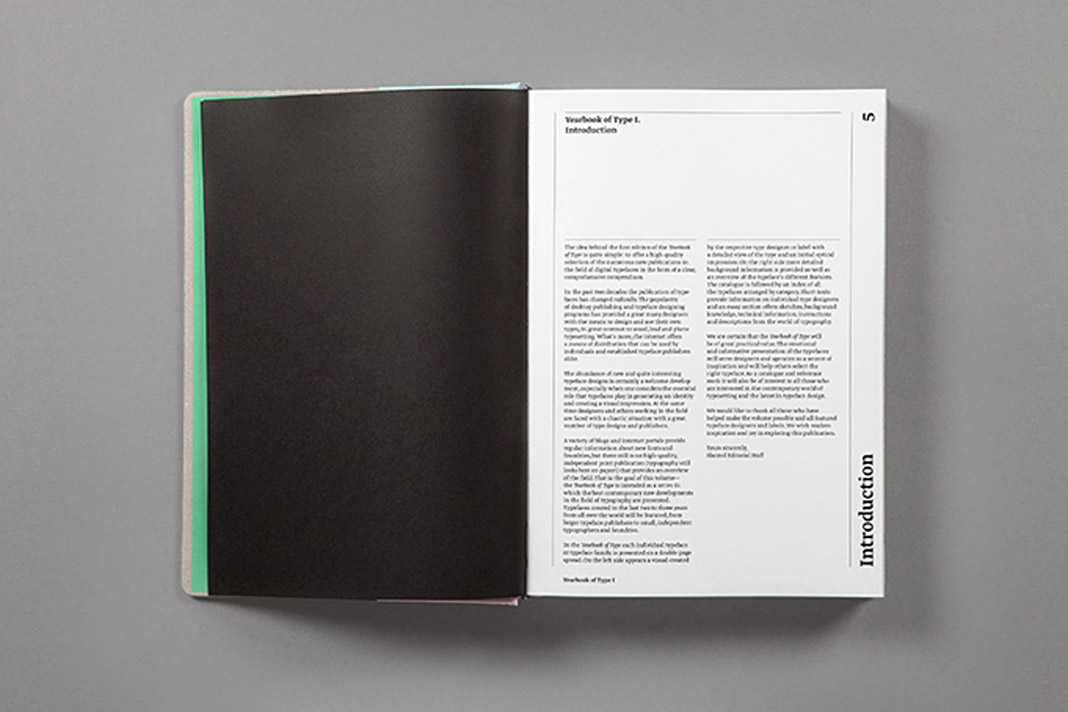
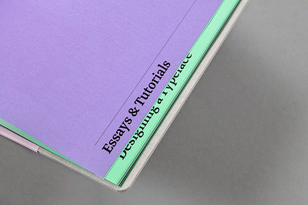
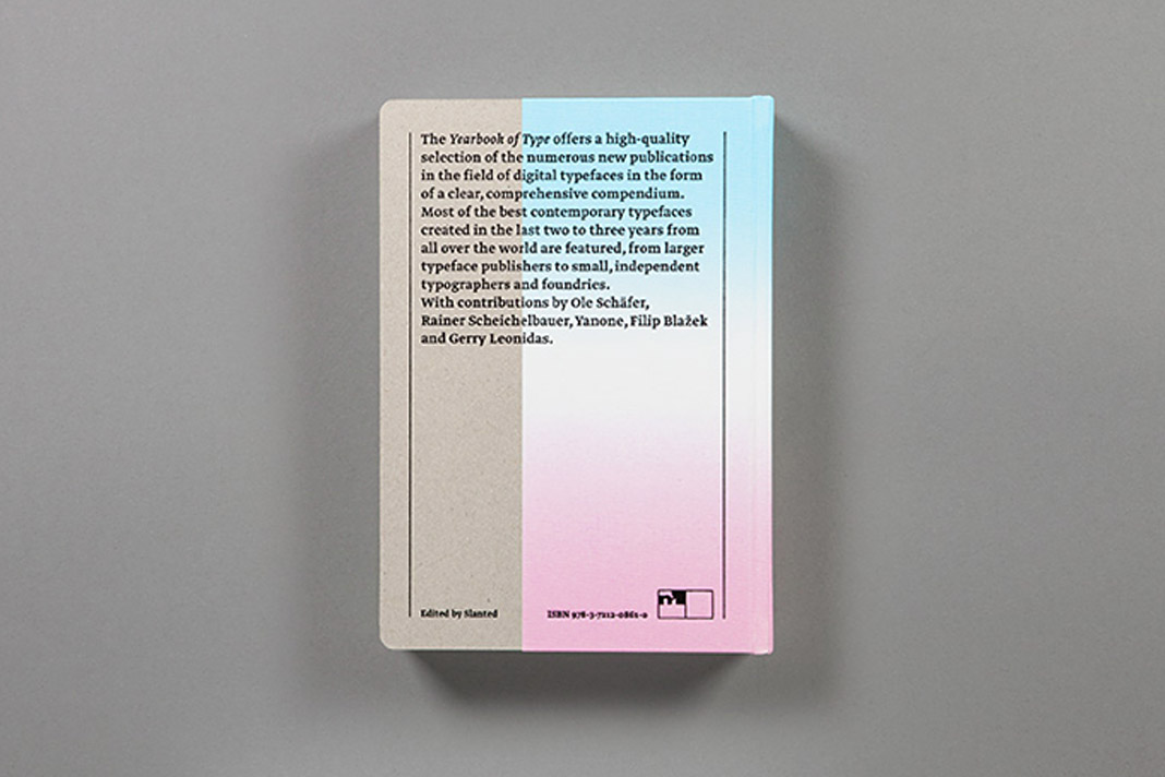 Various impressions of the first Yearbook of Type.
Typefaces by Austrian Designers – No. 22: Acorde
Design Austria is the only professional association and service organisation in Austria representing the interests of designers from all creative disciplines. Among many other activities Design Austria publishes a popular series of type specimens called Schriften österreichischer DesignerInnen (Typefaces by Austrian Designers).
Issue No. 22 showcases the type family Acorde, presents all of its styles in various sizes (from small to large), its huge character set as well as the large number of supported OpenType features.
 The cover of the 22nd issue of Design Austria’s popular series of type specimens.


 Various impressions of the publication showcasing the type family Acorde.