Blog – Insights by Stefan Willerstorfer
I Love Typography presents The making of Acorde
»I liked Stefan Willerstorfer’s new typeface Acorde so much, that I asked him to write about it for ILT«, states John Boardley, British-born writer, publisher, and graphic designer, who founded the world’s most popular typography blog ILT (I Love Typography) in 2007.
Thus if you want to learn more about the making of Acorde just head to I Love Typography. It is just one of many reasons for having a look at this very well made website dealing with the various aspects of typography. One can really feel that the founder’s motivation for starting this website was his true passion for and interest in typography.

Media journal Graphische Revue presents Acorde
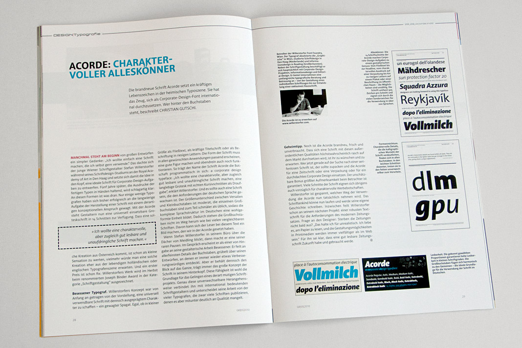
Graphische Revue is an Austrian media and design journal that has been published for more than one hundred years. In the current issue (No. 5/2010) Christian Gutschi introduces the type family Acorde and explains some of its characteristics in his article Acorde: charaktervoller Alleskönner (Acorde: characterful all-rounder).
Further he suggests some potential applicabilities and gives an insight on the values that were important to me as a designer during the development of Acorde. The whole article is set in Acorde which gives the readers an impression of how the type family works in text and in larger sizes.
 Double page spread of the design journal showing the article about (and set in) Acorde.
4c magazine introduces Acorde as headline typeface
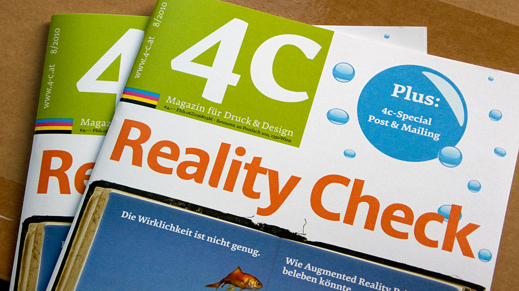
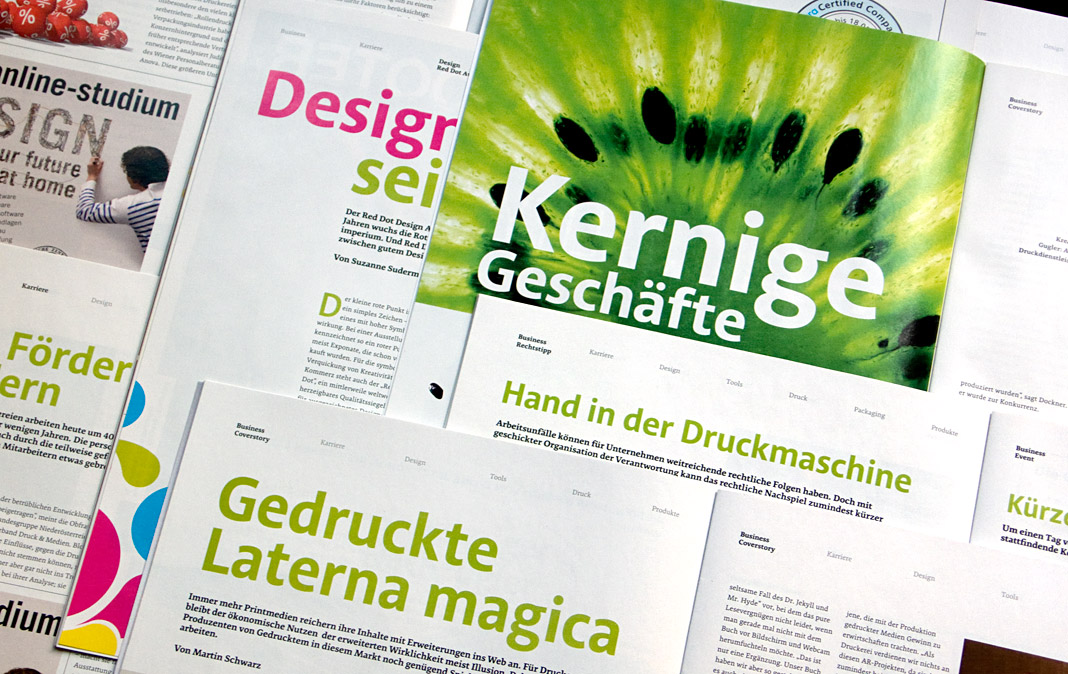
The Austrian printing and design magazine 4c has started using the type family Acorde for headlines in its current issue (No. 6/2010). Acorde’s well-balanced proportions and its harmonious interplay with the magazine’s text face Premiéra make it a perfect choice for this purpose.
In the current issue Rainer Scheichelbauer introduces Acorde to the magazine’s readers. Furthermore he gives a brief overview of my biography and my career as a type designer.
 Cover of the printing and design magazine 4c using Acorde.
 Various double page spreads of 4c using Acorde as headline typeface.
Acorde is shown at TypeCon 2010 in Los Angeles
TypeCon is an annual type design conference in the United States presented by the Society of Typographic Aficionados (SOTA) since 1998. This year’s conference is entitled Babel and is held in Los Angeles from August 17 to August 22.
Part of the conference is an exhibition called TypeGallery which showcases a wide selection of new type designs. One of the designs in this year’s exhibition is the type family Acorde.
