Blog – Insights by Stefan Willerstorfer
Redesign of the world famous Loacker brand
As you know, we care about details. How much details matter can easily be seen in our redesign of the world famous Loacker brand, a leading producer of wafers and chocolate products. While the old logotype had a lot of character, charm, individuality, and robustness there was still room for improvement.
 Loacker’s old logotype had a lot of character.
The redesign process was focused on keeping the logotype’s striking, original qualities and resolving its formal and technical weaknesses at the same time. Our work resulted in a logotype that is better suitable for all applications in print and on screen.
 Loacker’s new logotype kept all the character and strongly improved in quality and style.
There are no more formal inconsistencies and technical deficiencies within the new logotype. Letter combinations which used to be too tight were loosened, making the overall spacing between letters more consistent. The shapes of the letters are now better related and the logotype’s overall colour is more even. All these corrections result in a perfectly balanced and rhythmic appearance.
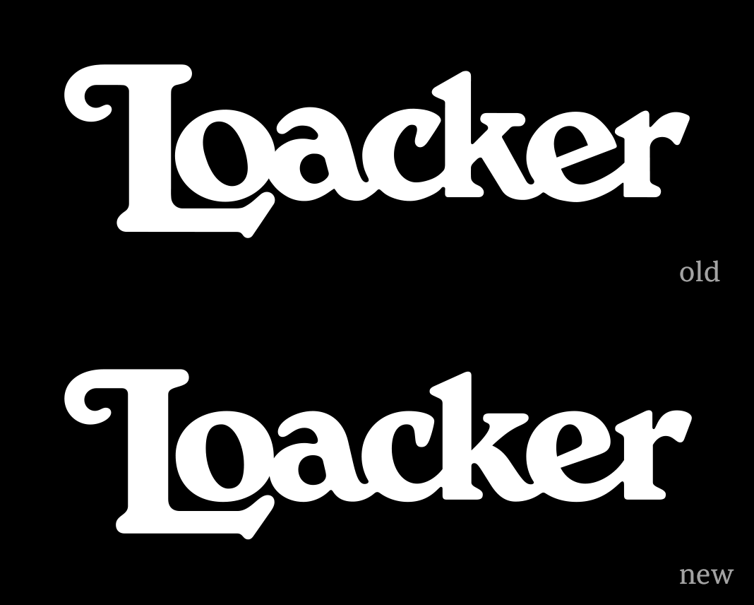 This animation clearly shows all the differences between the old and the new version.
Convince yourself and see how the logotype has improved on various levels. All corrections were made with the requirements of modern packaging and communication in mind. The redesigned logotype proves to be more legible on paper and on screen – especially in small sizes. It was introduced in 2021 and is applied on the packaging and in other applications within the Heritage Shield (a combination of the redesigned logotype and an illustration of the South Tyrolean mountain Schlern).
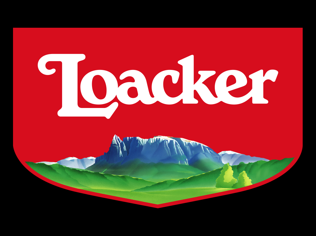 The new logotype within the Heritage Shield. The shield was designed by Torinese agency, Spider.
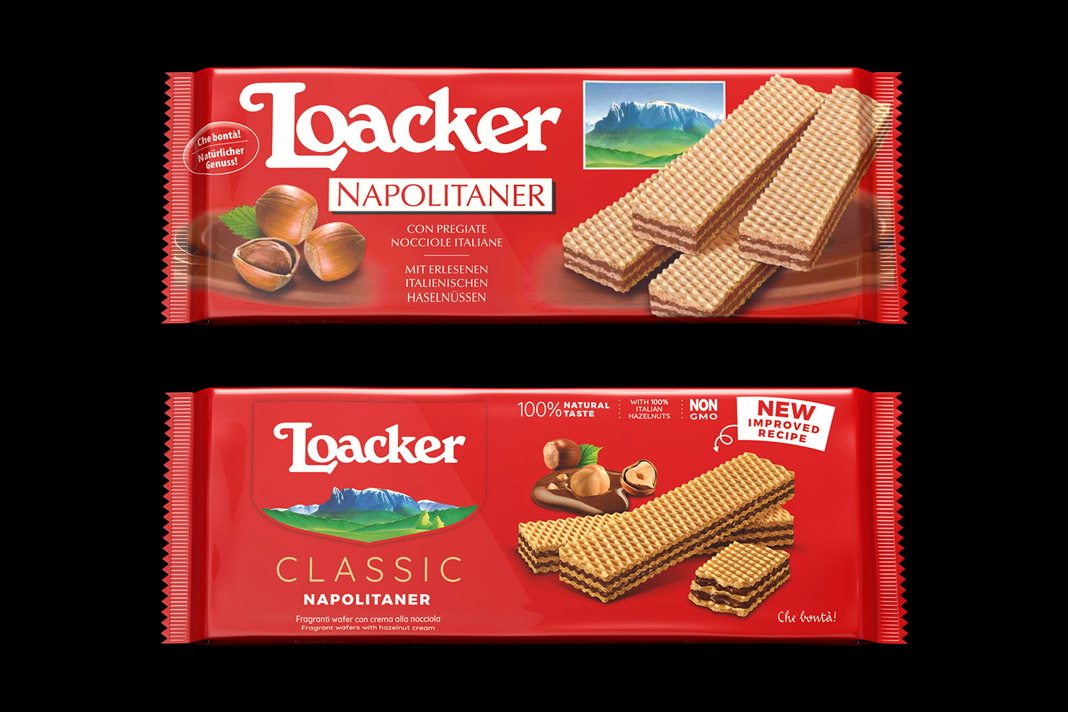 The old and the new packaging of Loacker’s famous Neapolitan wafers.
The new packaging (also introduced in 2021) as well as the Heritage Shield were designed by the Torinese agency, Spider. The logotype’s typographic redesign was carried out in close collaboration with Roby Attisano (Desein, Bolzano). We really enjoyed the great teamwork!
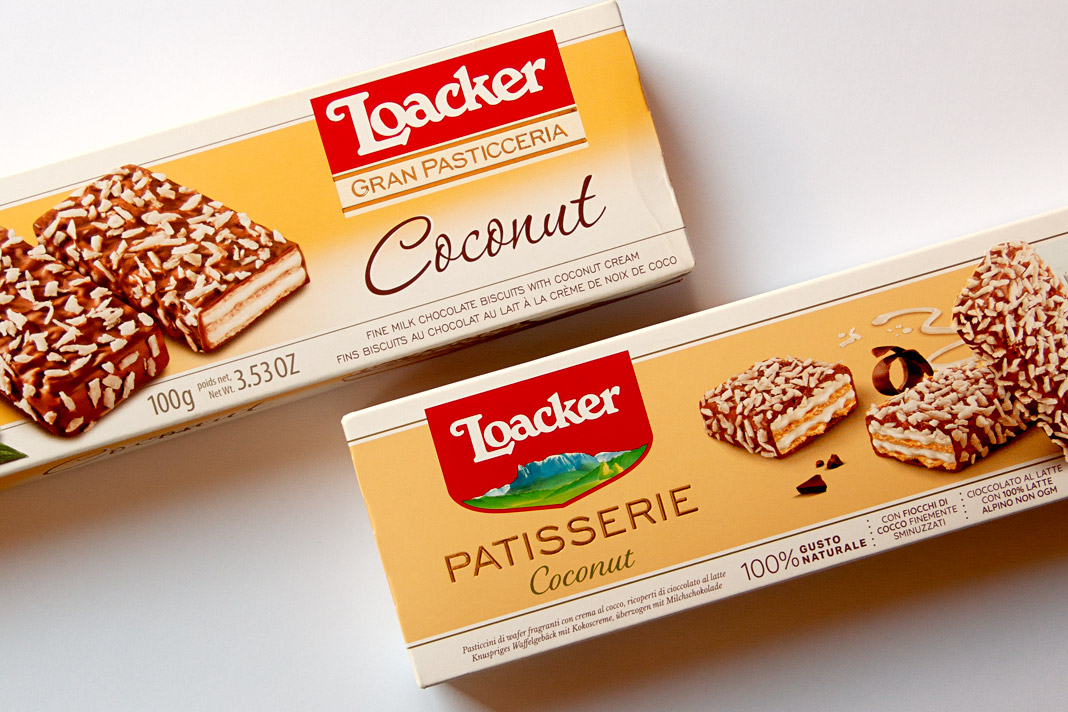 Another great example of Loacker’s old and new packaging design.
Have you tried Loacker wafers, yet? You should! As you might know, Loacker has been producing wafers and chocolate specialties in South Tyrol (northern Italy) for almost 100 years now. They really know how to do it. Yum yum!
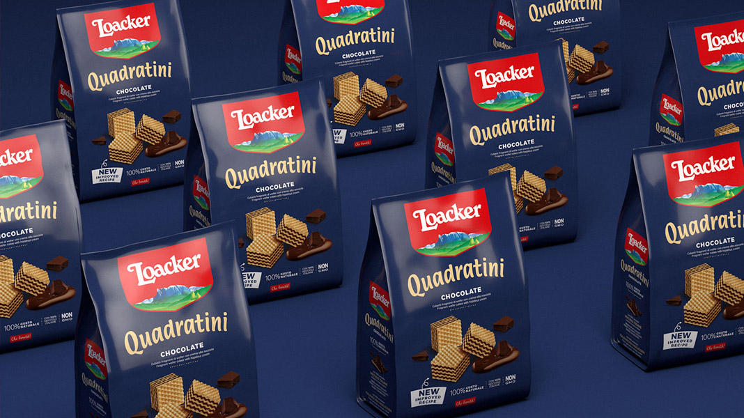 Loacker’s world famous Quadratini cubes.
Where Bézier curves rule
On our summer trip to Andorra we (and probably any type designer) couldn’t resist passing through the French town of Béziers. It didn’t come as a surprise that you enter the town by a perfectly drawn roundabout. Bézier curves rule. Especially here!


 Various impressions of the French town of Béziers.
Sindelar is still in the News
Austrian magazine News switched to Sindelar as their primary text face five years ago. Since then Sindelar has been offering high legibility to the magazine’s readers and is continuing to do so.
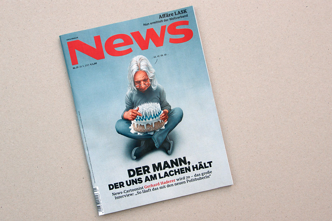 Cover of a recent issue of the magazine News.
News is one of Austria’s biggest weekly magazines and the major news magazine in the country. It has a circulation of about 160,000 copies and covers various topics such as politics, business, culture, and sports.
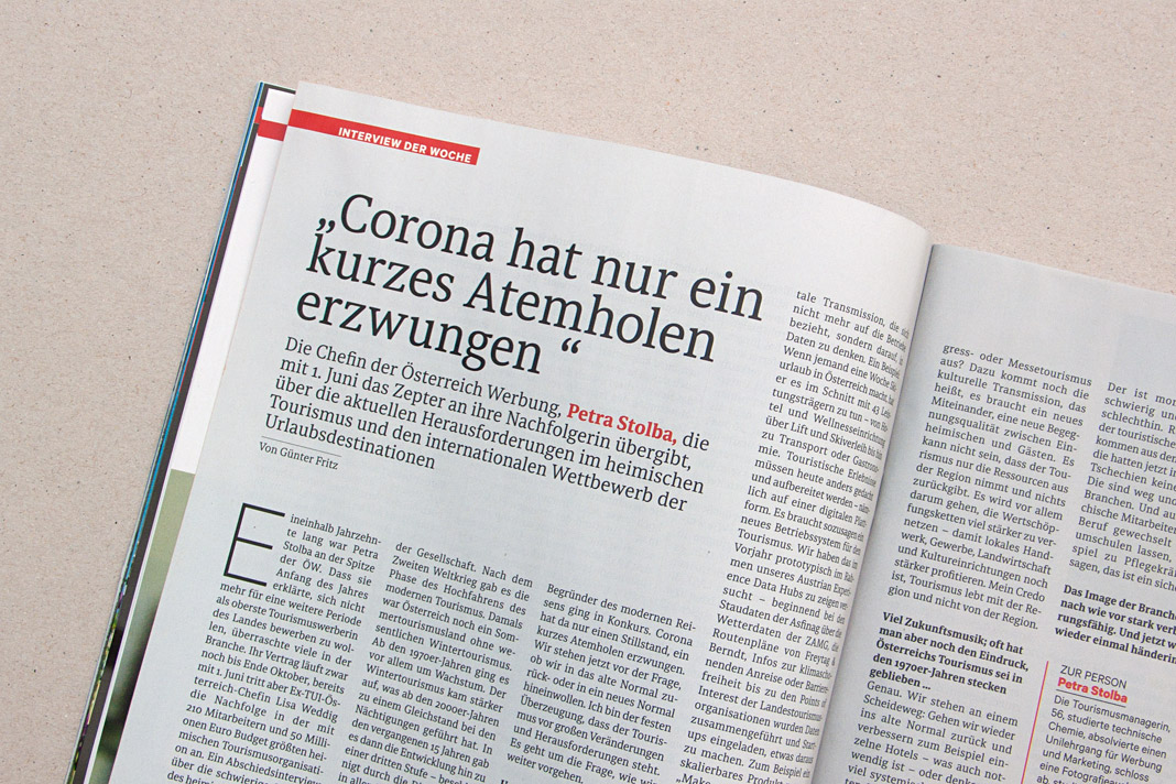
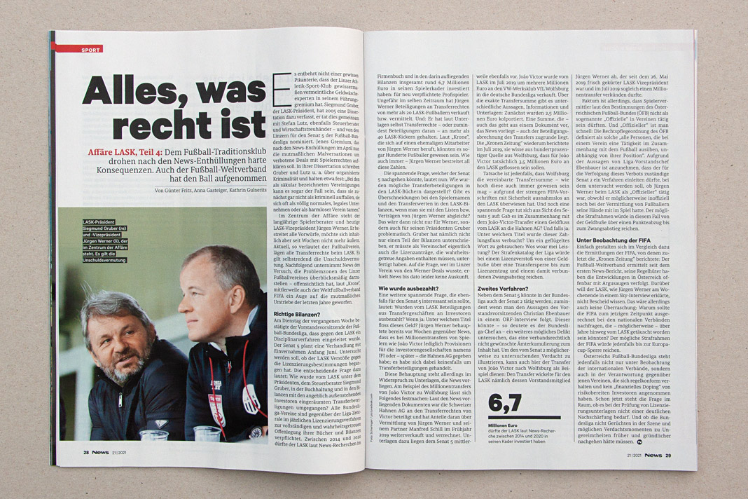
 Various impressions of a recent issue of the magazine, mainly set in Sindelar.
Happy birthday, Acorde!
Happy birthday, Acorde! And it’s a significant one indeed. Ten years are really something to celebrate. Acorde has been delighting designers and readers around the globe for a decade now and will continue to do so.

In the past ten years we’ve had customers from six different continents. So there is only one continent missing. As you may have guessed, it’s Antarctica. But who knows, maybe that will change within the next decade. We are confidently looking forward to it!
The new Yearbook of Type features White, Black. Gray!
I am happy to see my article, White, Black. Gray! – Why Sketching Matters, published in the new Yearbook of Type (#4 2019/20). It is part of a comprehensive series of instructive articles focused on various aspects of type design. My article appears at the beginning of the book in order to reflect that sketching happens at the beginning of the design process, and provides the basis for a typeface’s development.
 Cover of the Yearbook of Type 2019/20, published by Slanted Publishers.

The Yearbook of Type is a practical guide that helps typeface users stay up to date with the latest type design trends and innovations. It showcases detailed presentations of more than 150 type families from around the globe. Highly recommended!
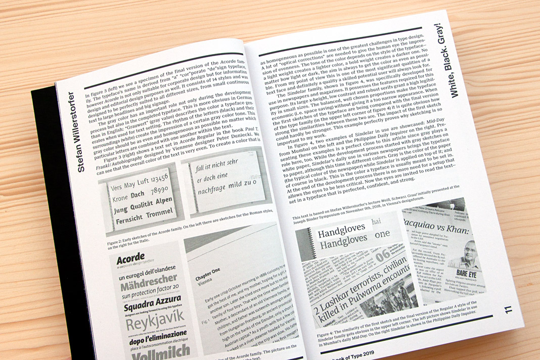 Double page spread presenting the article White, Black. Gray! – Why Sketching Matters.
Wienerberger’s new logotype: Our bespoke design solution
Wienerberger’s new logotype has been in use for some time now and we are still very proud of it. The logotype exemplarily proves all the advantages of an individual design solution. Since it is not based on an existing typeface but drawn from scratch, all design decisions could be made much more accurately. All letters are optimised for their exact position and sequence within the logotype.
 Wienerberger’s new logotype is a bespoke design solution.
Wienerberger is one of Austria’s largest companies and the world’s largest brick producer. It is a leading supplier of clay roof tiles, concrete pavers, and pipe systems in Europe. The Wienerberger Group operates 195 production sites in 30 countries.
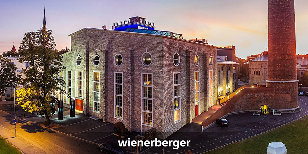
The high demands of this international player are perfectly met by the new logotype which is as individual as the company itself. The development of the logotype was done in close collaboration with the Viennese branding agency Brainds. I really enjoyed the professional collaboration and was very happy to contribute my type design expertise to this interesting project.
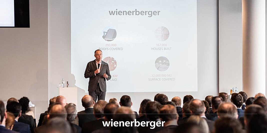
This year Wienerberger celebrates its 200th anniversary. The first half of 2019 was the best half year in Wienerberger’s history. As the logotype’s designer I am willing to believe that the new logotype also contributed its share to this success.

 Various applications of Wienerberger’s new logotype.