Blog – Insights by Stefan Willerstorfer
Kulturgeschichten Wien relies on Sindelar
As Viennese as it gets: Kulturgeschichten Wien is a quarterly magazine about Vienna with a specific thematic focus in every issue. The magazine’s first issue is dedicated to former Austrian Emperor Franz Joseph I. whose death was commemorated for the 100th time in 2016.
The magazine is written, designed, typeset, and printed in Vienna. Even the main typeface is Viennese: The whole body text is typeset in Sindelar.
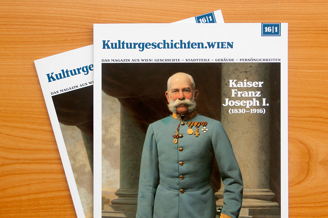 Cover of the first issue of Kulturgeschichten Wien.
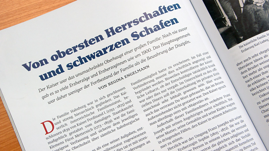
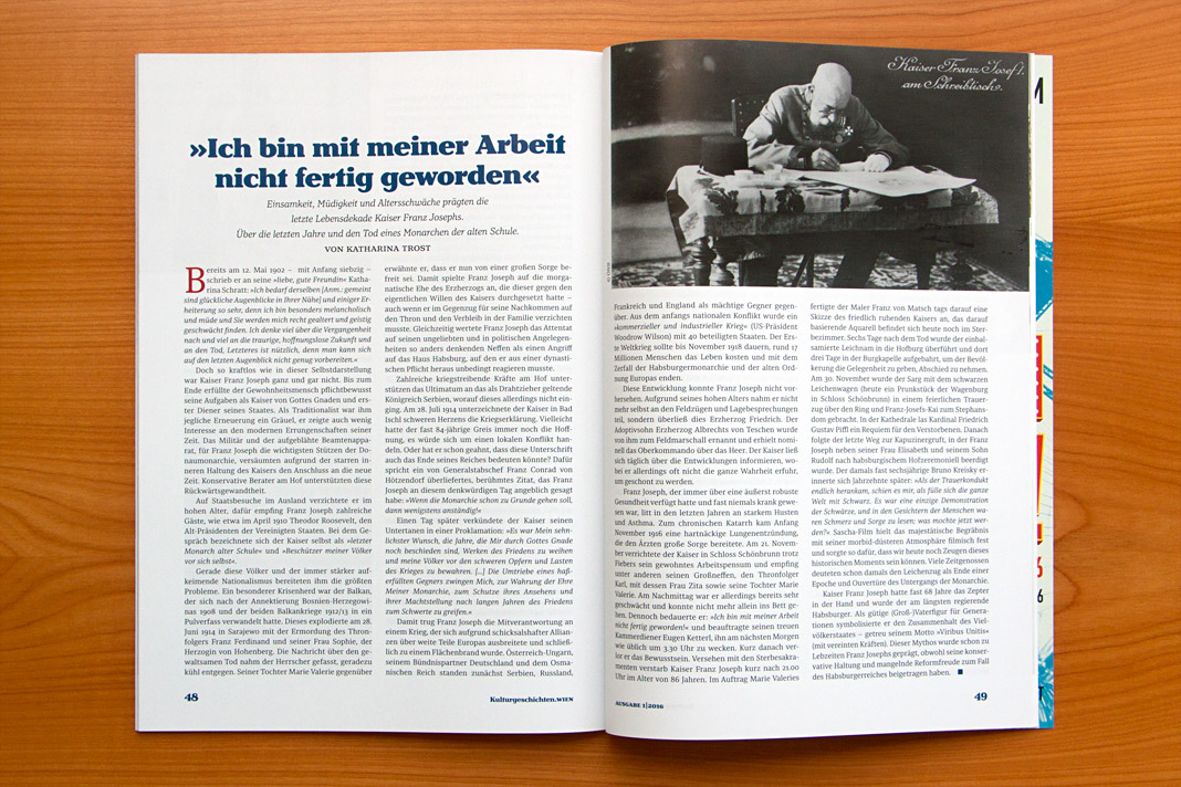
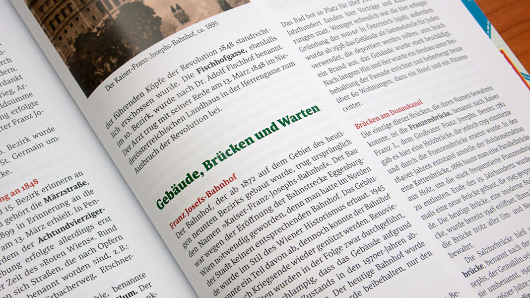
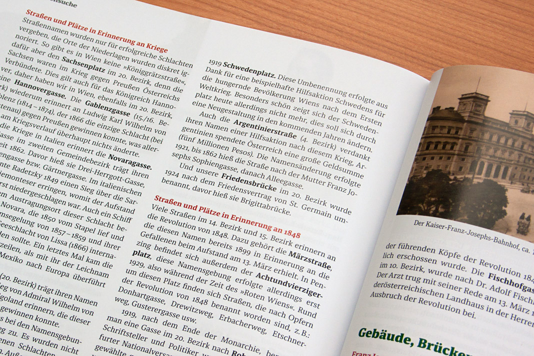
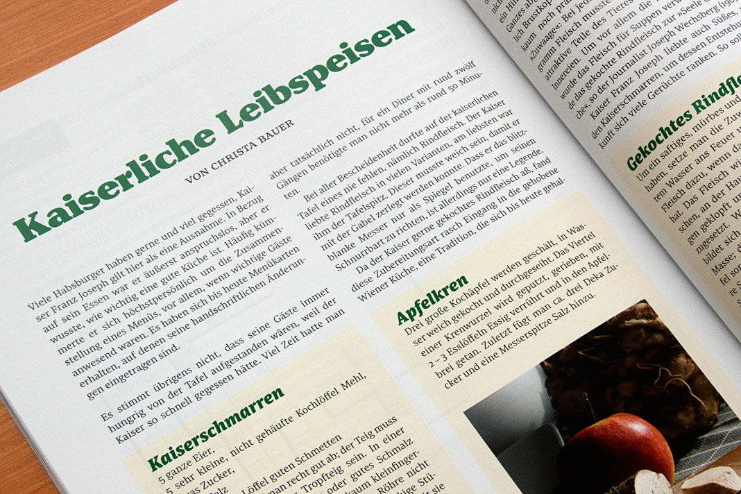 Various impressions of Kulturgeschichten Wien, designed by Gernot Winter.
Netzwerk Zukunftsraum Land is typeset in Sindelar
Another great example of Sindelar in use: Netzwerk Zukunftsraum Land is a journal for rural development published quarterly by the association of the same name. The association was installed by the Austrian Federal Ministry of Agriculture, Forestry, Environment and Water Management and acts on behalf of the Ministry.
Sindelar is used throughout the journal for body text as well as for headlines and subheadings in combination with a constructed sans serif typeface.
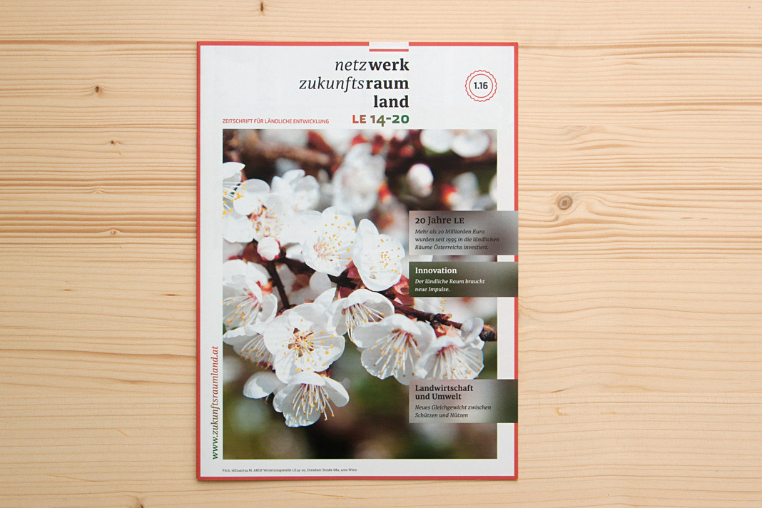 Cover of Netzwerk Zukunftsraum Land, set in Sindelar.
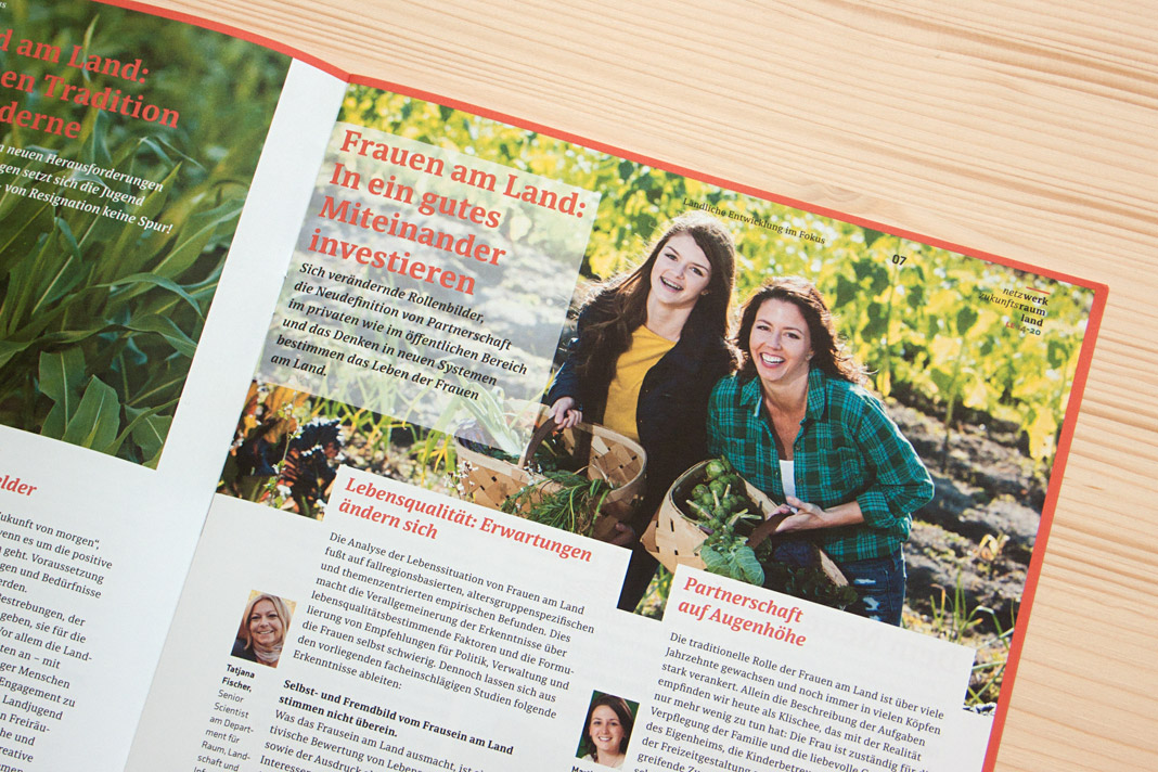
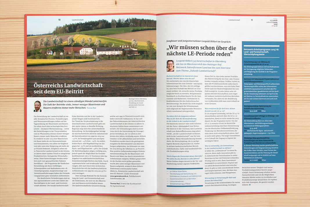
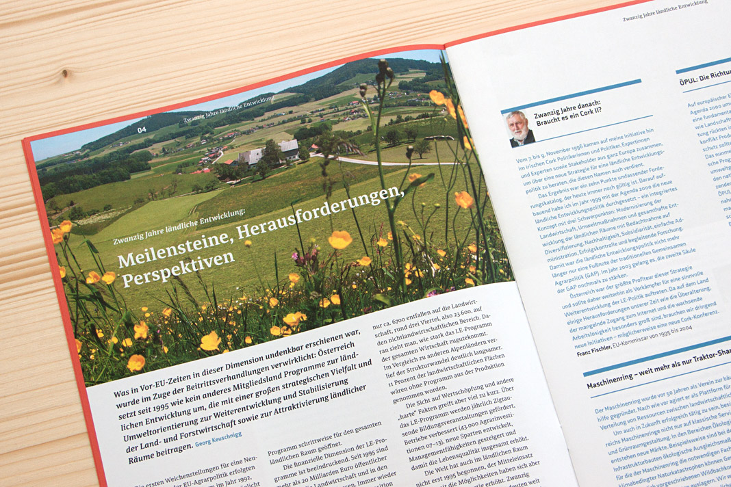
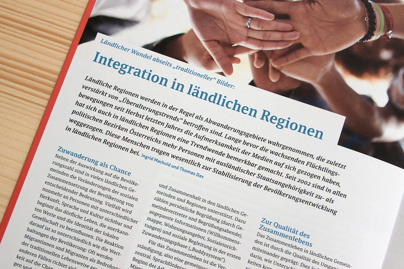
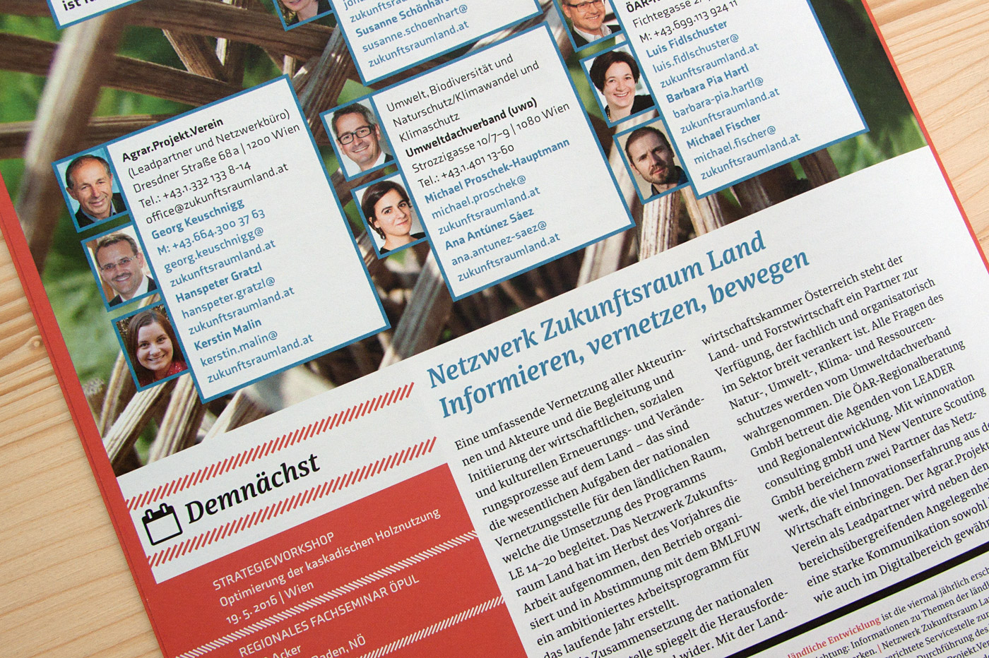 Various impressions of Netzwerk Zukunftsraum Land, designed by Andrea Neuwirth.
Acorde webfonts are finally available for purchase
Long-awaited by users around the globe and by all people with a passion for humanist sans serifs: Acorde webfonts are finally available for purchase. Since quality always comes first at Willerstorfer Font Foundry, Acorde webfonts were carefully developed and tested. The careful hinting of the core character set was done by German hinting expert Tim Ahrens.
A purchase of Acorde webfonts will greatly contribute to a company’s professionalism and recognisability. New customers now have the possibility to purchase Acorde desktop fonts and Acorde webfonts at the same time, resulting in a generous 50% discount on the lower priced item. Acorde webfonts are exclusively available at willerstorfer.com
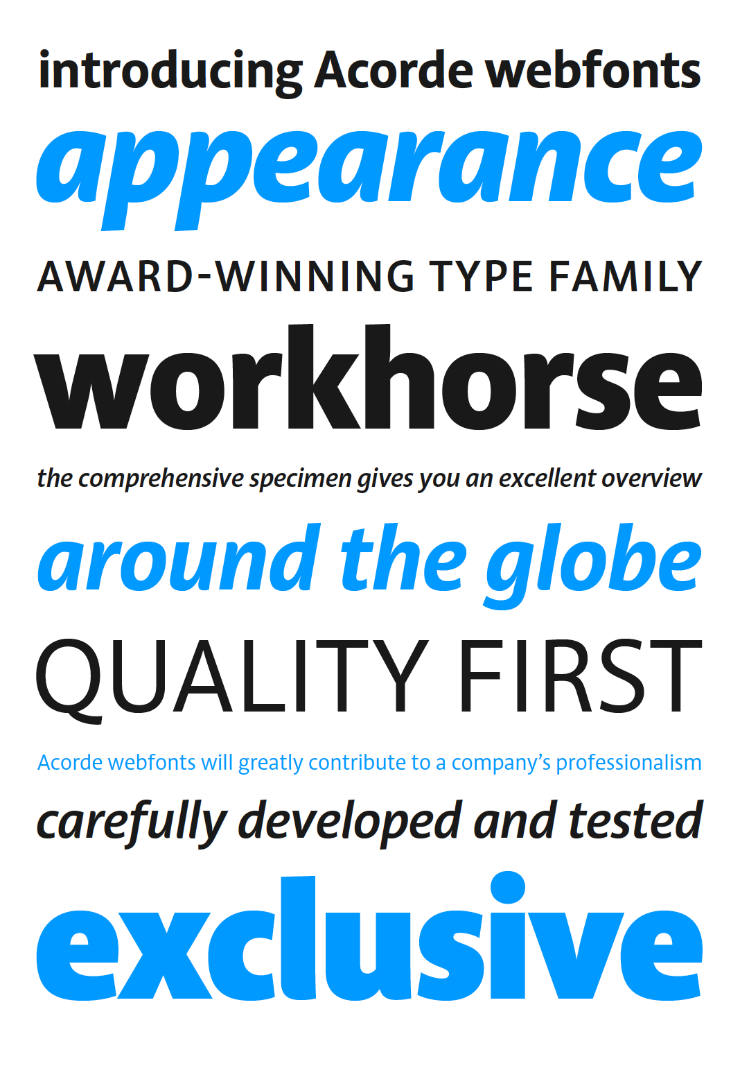 All 14 styles of Acorde are available for web use.
News from Mumbai: Sindelar is Mid-Day’s new text face
Next to the Philippine Daily Inquirer in Makati (Metro Manila), another large Asian newspaper also started using Sindelar as their new text face in 2016: India’s morning daily newspaper Mid-Day from Mumbai.
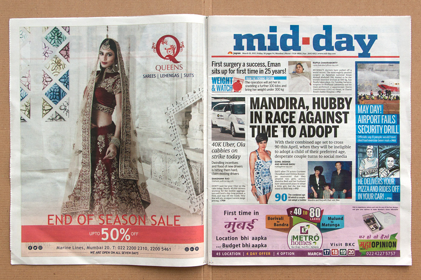
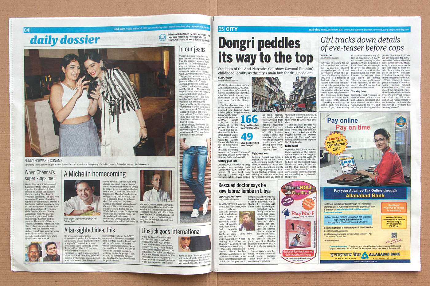
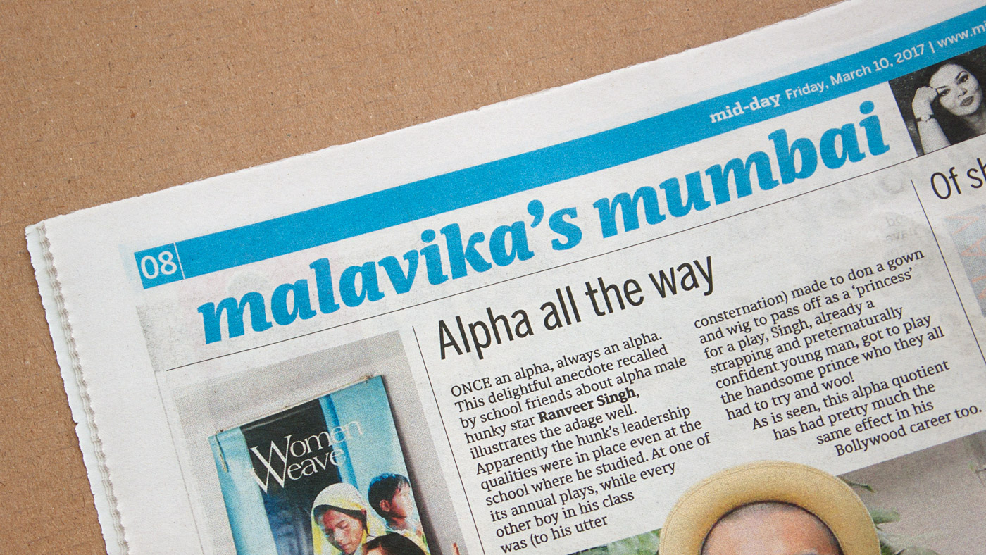
Mid-Day is a mainstream newspaper in compact format that carries the following sections from Monday to Saturday: local news, national news, international news, lifestyle, films, and sports. Of these sections, local news is stated as the tabloid’s key focus. The newspaper was established in Mumbai in 1979 and has an estimated readership base of half a million people. It is among the top 10 Indian newspapers by readership.
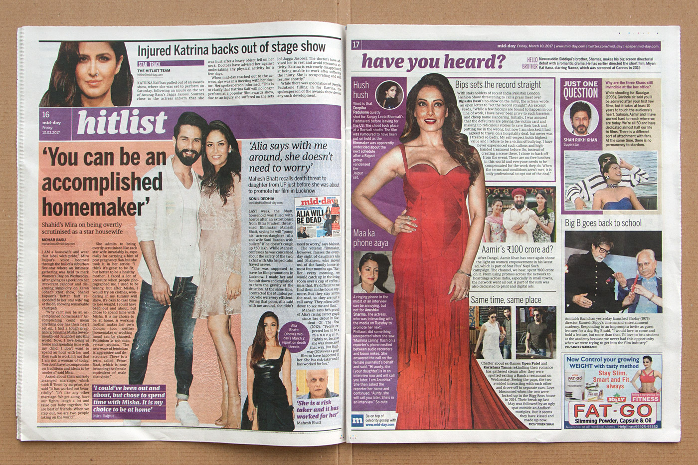
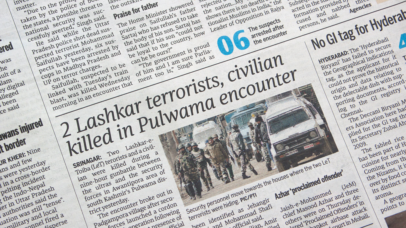
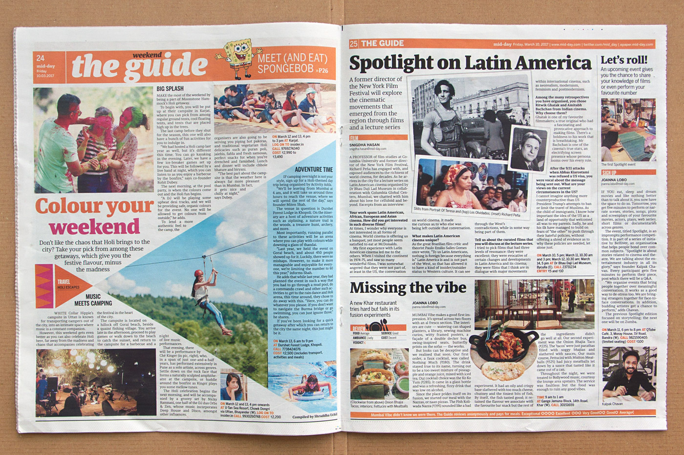
Since its introduction in 2016, Sindelar has been used in the newspaper for text as well as for headlines and appears in combination with the sans serif typeface Benton Sans.

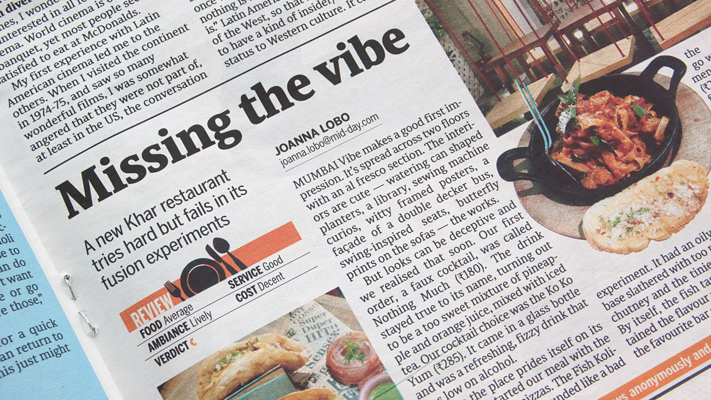

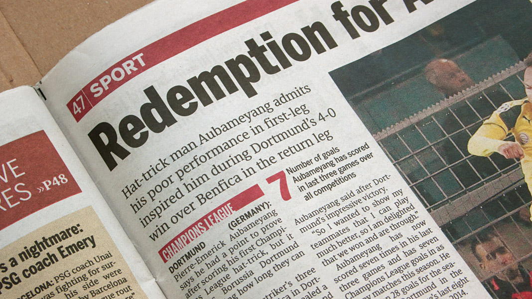 Various impressions of the newspaper’s new typographic appearance.
That’s how Sindelar is applied in the Philippine Daily Inquirer
We have mentioned it before and it’s great news indeed: The Philippine Daily Inquirer started using Sindelar as their new text face in October 2016. The Philippine Daily Inquirer is the most widely read broadsheet newspaper in the Philippines with a daily circulation of 260,000 copies.
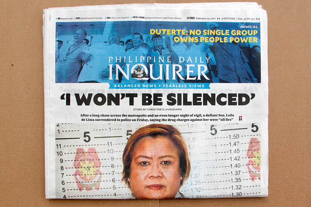
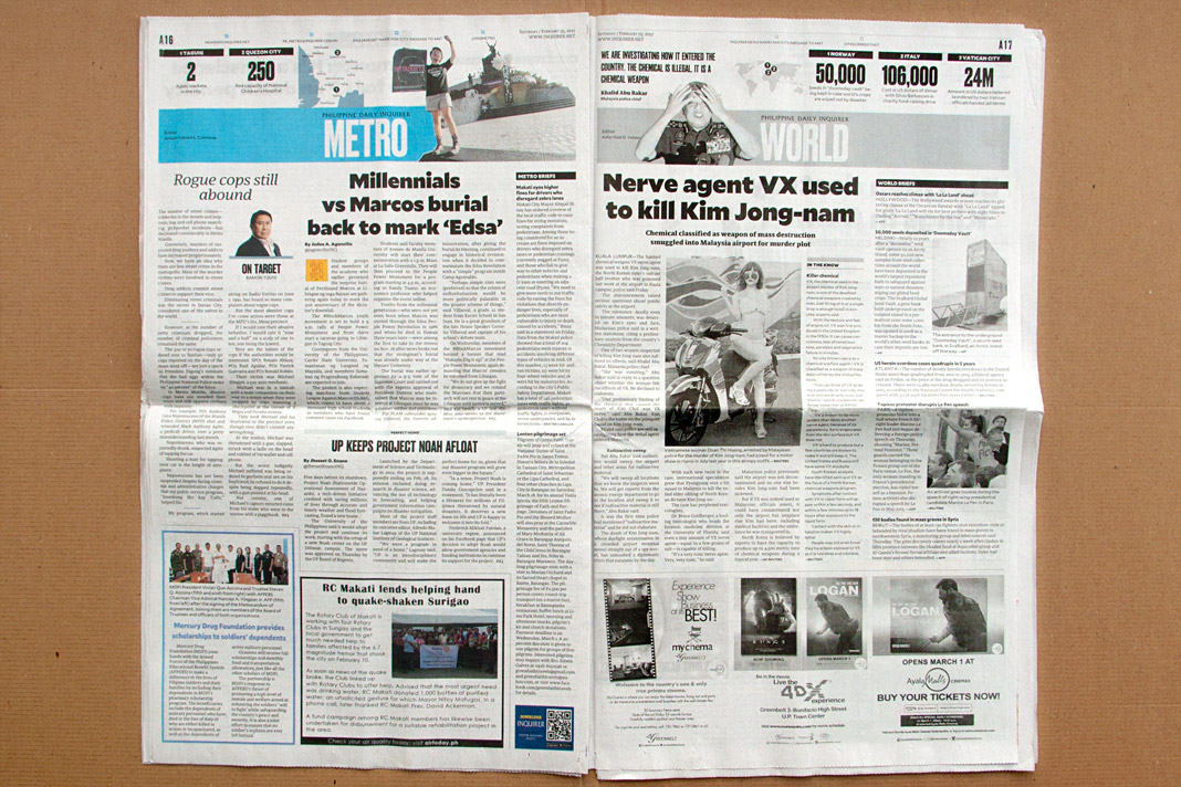
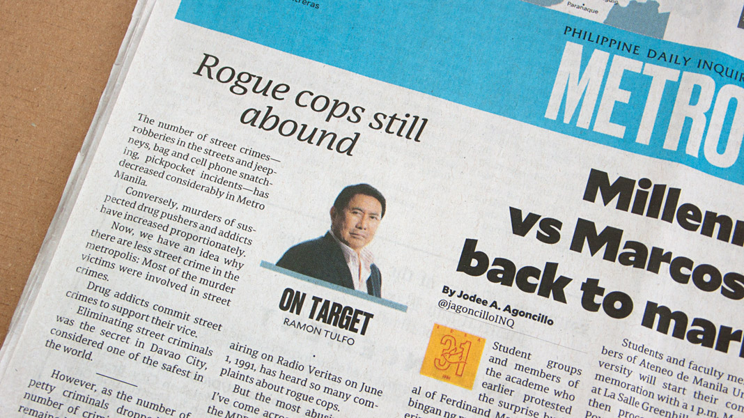
In the meantime a huge package from Asia containing quite a few different issues of the daily newspaper has arrived here in Vienna and we have had the time to look at the application of Sindelar in great detail.
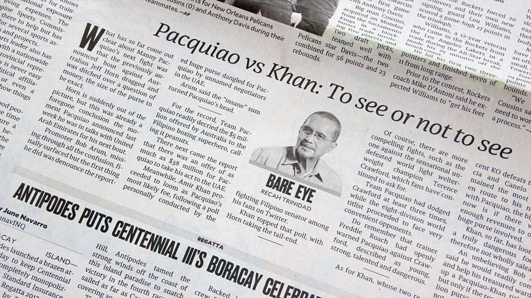
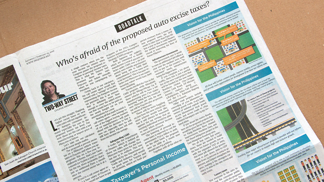
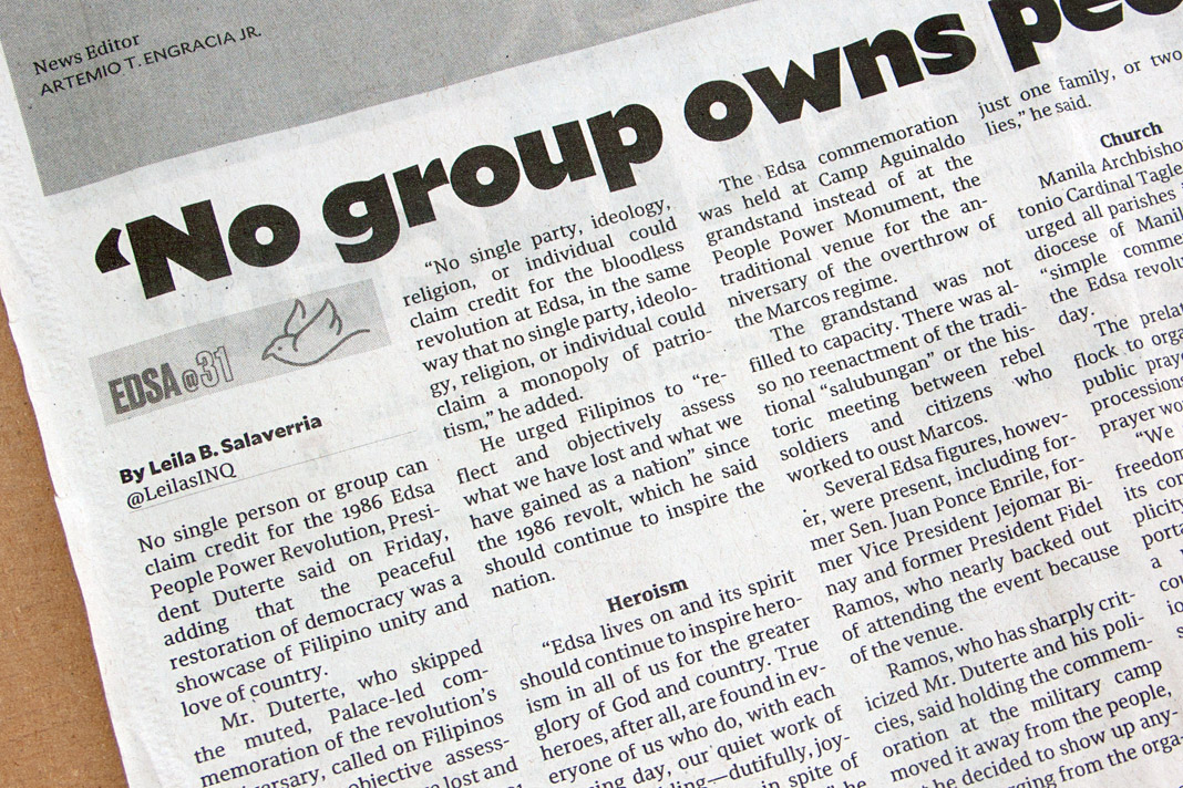
In order to share this experience with you, we selected exemplary pages and took photographs of them. Within the newspaper, Sindelar is combined with two other high-quality typefaces: Tobias Frere-Jones’ Mallory and Commercial Type’s Druk.
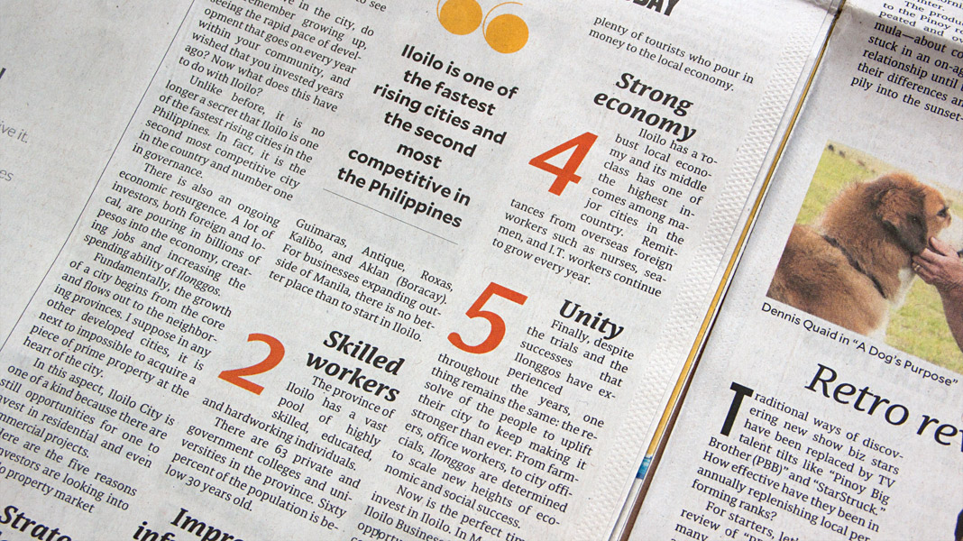
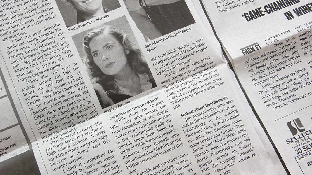
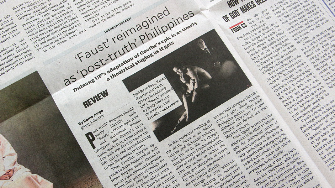 Various impressions of the newspaper’s new appearance.
Interview in Chinese design magazine Design 360°
Asia remains a great terrain for us, our typefaces and our expertise. Next to having two major newspaper clients in India (Mid-Day, Mumbai) and in the Philippines (Philippine Daily Inquirer) who use Sindelar as their text face on a daily basis in their print editions, strong interest in our work has also emerged in China.
We were approached by the concept and design magazine Design 360° based in Guangzhou, China, to express our views on quality, legibility, and proper use of western type families. Design 360° is a bi-monthly design magazine published by Sandu Publishing Co. Ltd. dedicated to international design concepts and featuring outstanding worldwide designers. Issue no. 64 is focused on western typeface design in order to live up to the emergent relevance of western typefaces and western typography in China.
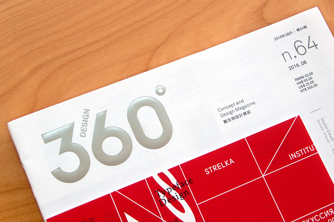 The cover of issue no. 64 of Design 360° focusing on western type design.
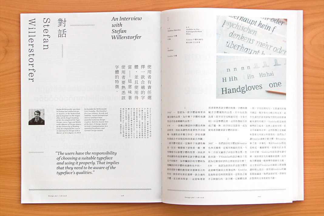
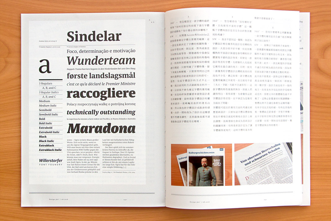 The interview is published bilingually in Chinese and English.
It was a pleasure and a great honour for me to be one of only four western type designers who was asked to talk about their work and their opinions in order to contribute to the knowledge and understanding of western type design among Chinese graphic designers.
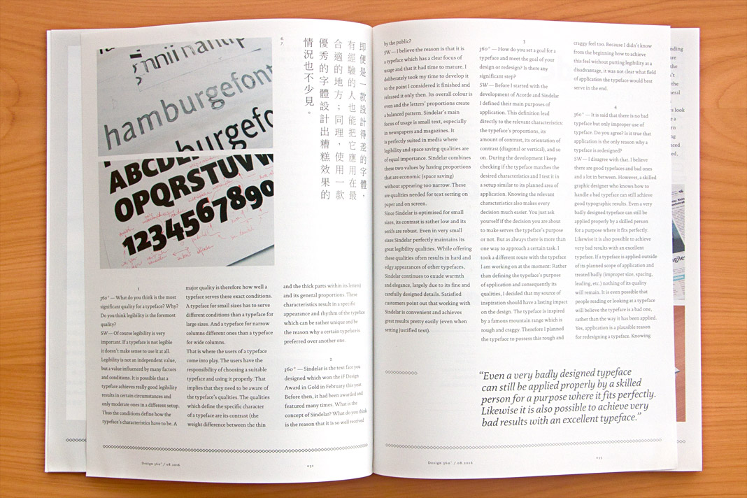
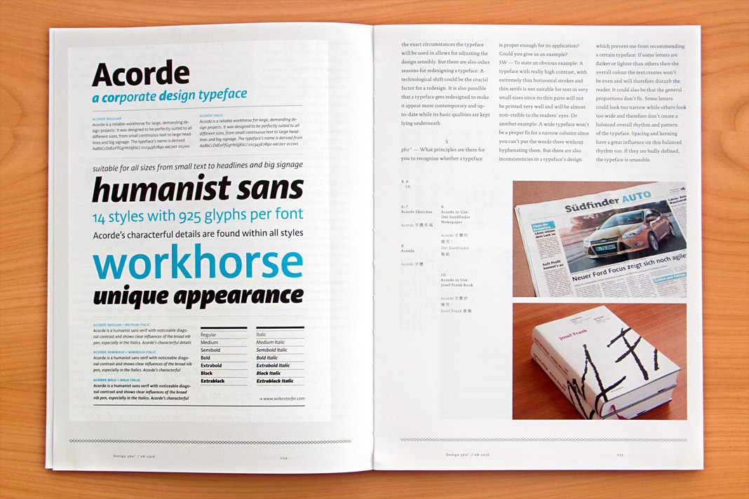 Various impressions of the interview in the concept and design magazine Design 360°.