Blog – Entries tagged as Page Magazine
Loacker redesign featured in German design magazine Page
Have you already had a look at the current issue (04/22) of Page, Germany’s most popular design magazine? Yes, you might have guessed, it contains an article we are really happy about.
 Cover of the current issue (04/22) of Germany’s popular design magazine Page.
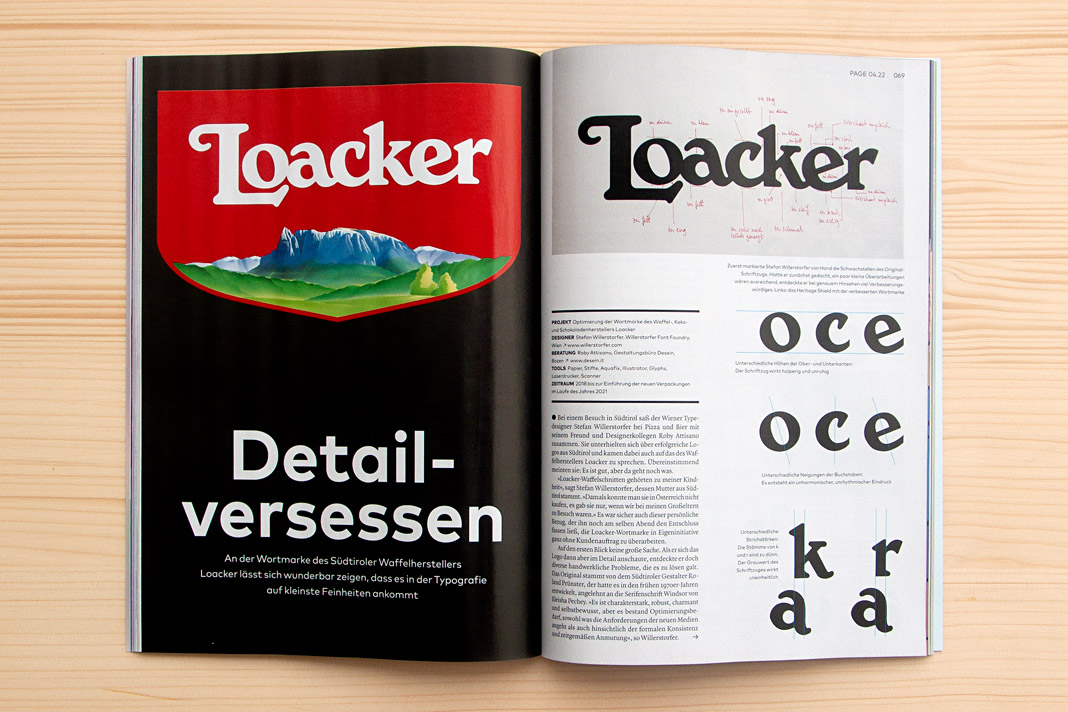
The four-page article Detailversessen (detail-obsessed) showcases our redesign of the famous Loacker brand in great detail. As you might know, Loacker is an Italian company based in South Tyrol, producing tasty wafers and chocolate products.
 Double page spread showing the new Loacker logotype on the left and the old one on the right.
Interestingly the Loacker redesign did not begin like an ordinary project. There was no order at the beginning of the project. Just an idea – an idea that followed a vivid discussion between two designers while enjoying pizza and beer. Talk about characterful Italian (South Tyrolean) logotypes. At some point we (Roby Attisano and I) agreed that the logotype of Loacker was good but it could get even better. And then I spontaneously decided to do it, to proactively redesign the logotype without an order.
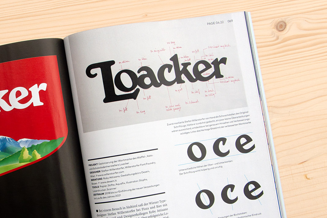
 On top you can see written notes for all the corrections to be made to the old Loacker logotype.
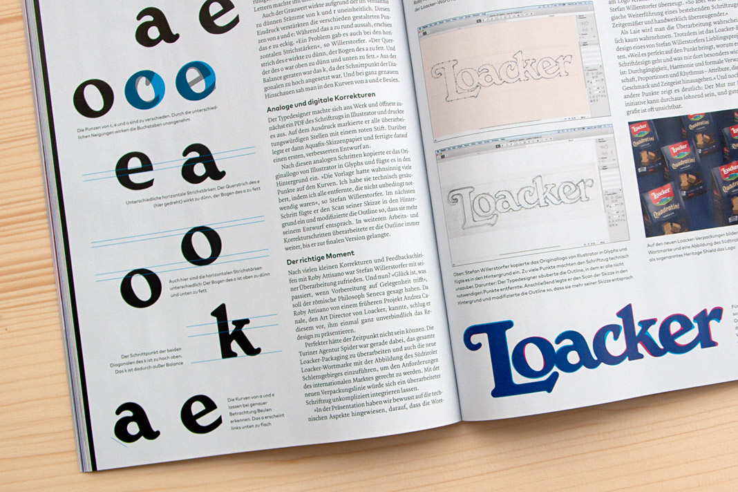
The idea of redesigning the Loacker logotype lead to an interesting design process that I really enjoyed. The process was accompanied by Roby Attisano’s valuable feedback. Luckily the Loacker company was so convinced by the redesigned logotype that they decided to buy it and to apply it instead of the old one. We take the company’s decision as a strong compliment and honest praise. It encourages us in our way of paying attention to even small details and providing individual typographic solutions of highest quality.
 Various inconsistencies of the old logotype on the left. Stages of the design process on the right.
If you want to know more about the story (and are fluent in German) you can read the article in the current issue of Page (04/22). Enjoy the reading.
 The top of the right page shows Roby Attisano (left) and Stefan Willerstorfer in South Tyrol.